Receive a presentation of services and expert advice
The best people in the industry oversee your brand development process
Best branding agency and graphic design studio – WeLoveBrands❤️
 WeLoveBrands.pptx

The best people in the industry oversee your brand development process
People associate the color blue with different concepts and sensations: the sky, water, the depths of the ocean, or freedom. Despite the difference in perceptions, most people agree on one thing - love for the color blue. Perhaps this is why blue is one of the most commonly used colors in logo design.
On the other hand, blue is often chosen for logo design because of the qualities it conveys to people on a subconscious level. Read the article about what message the blue color and its shades convey, which industries are suitable for blue and light blue logos, and which ones are better off abandoning this palette.
As studies show, a person surrounded by blue changes his perception of time - it seems to slow down, become smoother and more viscous. This effect is obtained due to the fact that blue color has a calming effect on the psyche - it reduces anxiety, calms, relieves tension, and relaxes. As a rule, blue is chosen by people who strive for order and stability. At the same time, this color gives a feeling of space, air, freedom.
Basic blue is an intense color, so its influence on the human psyche is quite strong. An interesting fact about the color blue: if you want to conduct successful business negotiations with conflicting or capricious partners, wear a deep blue suit - it reduces the manifestation of emotionality. If we analyze the color blue in general, then it is a symbol of clear consciousness, the source of life, calmness and depth. The deeper and darker the color becomes, the stronger its calming effect on a person.
Traditionally, in the business world, blue is associated with coolness, masculinity, silence and tranquility. It carries a sense of honor, loyalty, high intelligence, stability, harmony, trust, conservatism, security, loyalty, order and stability. These characteristics have made blue so popular in the business world that it is one of the most commonly used colors in logo design today. However, it cannot be categorically stated that blue is a message of only reliability and tranquility. This would be too one-sided a view of its psycho-emotional impact. Like any other color, blue has many shades that evoke completely different emotions (sometimes radically different).
 |
Cobalt is the color of high-tech style . Intense, powerful, dynamic and electrifying. Cobalt gives a feeling of rich life, sonority and strength. | |
 |
Azure is a sea color. This is an incredibly stylish cool shade that gives you a feeling of freshness, coolness and cleanliness. | |
 |
Aquamarine is the color of fidelity in the USA and mourning in China. This is the color of the sky, infinite height and peace. Gives a feeling of freedom, coolness, lightness, purity and peace. | |
 |
Turquoise is the color of purity, harmony and peace of mind. A beautiful unusual shade - lively, rich, tasty. It is used quite rarely, so it is perfect for self-expression. | |
 |
Rich blue is a technological and quite complex color. This shade gives a feeling of stability, trust, professionalism, dignity and intelligence. Ideal as a corporate color. | |
 |
Petrol is an unusual color. This is a mysterious shade with a taste of mystery and mysticism. A slightly muted color that gives a feeling of sophistication, uniqueness, and elitism. |
Using just six shades of blue as an example, you can see how different they are from each other and what a different mood each of them carries. Thanks to such variety, depth and richness of shades, the blue palette is able to convey any emotions and sensations to everyone who sees the logo.
The blue color palette can have not only positive implications for business, but also negative ones. Therefore, choosing the right shade must be approached responsibly. Let's take a closer look at how companies with a blue logo might be perceived.
Positive perceptions in business: loyalty, trust, honesty, tact, care, reliability, responsibility, conservatism, perseverance, striving for ideals, orderliness, authority, devotion, thoughtfulness, calmness, tranquility.
Negative perceptions in business: rigidity, deceitfulness, unkindness, anger, complacency, superstition, emotional instability, depression, excessive conservatism, predictability, weakness, inexorability, coldness.
If you make a mistake and choose the wrong tone, you can earn a reputation as a cold, overly conservative and unfriendly company. You don’t want that kind of reputation for yourself, do you? Therefore, order a logo design in blue from the professional designers of the WeLoveBrands studio. We will select the perfect shade of blue or light blue that will convey only positive emotions.
When designing logos for overseas companies, it is important to remember that people in different countries may perceive the color blue differently. This is due to the cultural heritage and traditions of each country. If in Ukraine the blue color is perceived positively and is even the basic color of national symbols, then in China it evokes negative emotions, being the color of mourning. Therefore, be extremely careful when choosing a logo color for a foreign company.
North America - faith, masculinity, stability, freedom, liberalism; among Native Americans - defeat, trouble, anxiety;
Japan – meanness, fraud, mistrust;
China, Hong Kong - mourning, immortality, feminine color;
Egypt - virtue, truth, protection, protection from evil;
India is the color of God Krishna, the national color of sports, the color of truth;
Latin America – mourning, truth, serenity;
Ukraine – strength, health, confidence, stability, patronage;
Europe – divinity, harmony, unity, devotion.
As you can see, in some countries blue is not the best choice for logo design, while in others it is simply a must-have.
When choosing a logo color, be sure to consider your business area. The blue palette is not suitable for every activity, and in some cases it may cause the wrong reaction or look out of place. Let's look at it in detail.
Blue and cyan colors create a feeling of trust, honesty, and security. They are also often associated with the process of communication between people, with communication. That is why blue and cyan colors are the most popular choice for the design of logos for social networks and instant messengers.
The blue or light blue color of the logo is often chosen by companies that are engaged in the development of new technology and equipment, scientific research in the world of electronics and instrument making. These colors are a priority for IT companies. The choice of a blue palette is explained by the desire of these companies to relieve emotional tension in people who are stressed due to the emergence of new technologies. Also, a blue or light blue logo will reassure those who have a real fear of technology in general.
The blue palette evokes a feeling of trust, reliability and stability. Thanks to this message, blue and cyan logos are well suited for financial organizations and structures related to money and personal data of clients. These could be banks, logistics companies, investment funds, insurance companies, etc. Before investing money, many people carefully choose the most reliable bank, because the safety of capital comes first for them. And the color blue gives a feeling of reliability and security. Therefore, financial institutions with a blue or cyan logo are much more likely to be chosen by clients.
Most airlines have blue and light blue logos, as these shades are inextricably linked with the color of the sky. This is understandable and logical. But what do cars have to do with the color blue? It seems like none. Meanwhile, it is the blue logos that adorn the largest automobile manufacturing plants in the world - Ford, BMW, Volkswagen, etc. They chose the color blue because it gives a feeling of reliability and safety (this also applies to airlines). And these are one of the main requirements of buyers for cars. It is obvious that these automotive giants bet on blue and were right.
One of the strongest associations with the color blue is responsibility. And this property is inextricably linked with reliability. Obviously, this is why many private clinics and medical institutions choose blue for their logo. An additional advantage of the blue palette is that it calms, relieves stress, reduces emotionality, and relaxes. Agree, in medicine this effect is very important.
Many personal care and personal care brands have chosen a blue or light blue logo for a reason. Such shades are associated with purity and freshness, so they are great for designing the identity of such brands. Look at the example.
Chain hypermarkets - hardware stores, grocery stores, construction stores - quite often use blue in their logo design. This is due to the fact that stores try to convey a feeling of reliability, confidence and quality through the color blue. But there is one danger here. Made in monochrome, blue logos for supermarkets can look a little distant and cold. And this certainly does not stimulate visitors to make purchases (at least impulsive ones).
To avoid this effect, chain hypermarkets use tricks: they use blue only as the background of the logo or dilute it with other bright accents. Look how the largest foreign and Ukrainian chain stores did it:
There are areas of business in which the calming and calming effect of blue is completely inappropriate.
Blue color not only calms the nervous system. He also suppresses his appetite and appears cold and somewhat distant. Agree, this is not at all the effect that food establishments need. Don't believe me? Then look at the logos of famous chain restaurants, which we intentionally repainted blue:
Doesn't look too attractive, does it? And it certainly doesn't induce appetite. Therefore, we recommend that owners of restaurants, cafes and other “edible” establishments refrain from using blue logos.
What is a holiday? This is laughter, fun, joy, life over the edge. What is the color blue? Stability, confidence, peace and tranquility. This creates a mental inconsistency. These are absolutely not the feelings that a holiday organization company should convey. Here's a look at what the logos of such companies would look like in blue:
The calm, monotonous and cool blue color palette is not very suitable for children's themes. Especially when it comes to the logo of a children's entertainment center. It is better for such companies to use bright, lively, dynamic and “tasty” colors that create a feeling of joy, fun and celebration. Look how bad the logos of famous children's entertainment centers would look if they were in blue:
Made only in blue and cyan tones, such logos look monotonous, boring and completely devoid of dynamics and energy. Such logo design for children's centers is not able to create the right mood and attract the attention of the target audience - children and their parents. Therefore, a blue monochrome logo is not suitable for this line of business.
If you are sure that blue or cyan color is ideal for your company logo, order a logo design from the WeLoveBrands studio. What should those who really want blue in their logo do, but are not sure that a monochrome palette will create the desired effect? Moreover, contact the specialists of the WeLoveBrands studio. Our professional designers know how to strike the right balance of colors so that your logo communicates the right message to your target audience.
Color combinations in a logo require a particularly careful approach. After all, incorrectly chosen shades can “harm” the eyes, cause negative emotions or even aggression. To prevent such situations from arising, we have selected the 3 best combinations with blue and cyan colors - you can safely build on them when choosing the ideal “companion” for the blue logo.
|
|
Dark blue and mustard. |
| These colors are deeper and more complex than the usual blues and yellows. Using such a tandem in logo design will show your individuality and ability to have a non-standard vision. Rich and thick yellow color harmoniously balances its soft warmth with some coldness of the blue tint. Despite the muted nature of both colors, this combination looks bright, rich and quite dynamic. | |
|
|
|
|
|
Deep blue and light green. |
| Two extremely natural shades harmoniously complement each other, creating a feeling of freshness, lightness, and juiciness. The combination of the color of young foliage and the rich blue of the spring sky has a beneficial effect on the psyche of the beholder, calms and pacifies. This color tandem evokes only positive emotions, increasing audience loyalty. | |
|
|
|
|
|
Deep navy blue and pink. |
| Logos with a combination of dark blue and pink convey a feeling of strength, trust and reliability. At the same time, this unconventional combination looks modern, fresh and stylish. | |
Fashion is changing not only to blue and cyan colors in general, but also to their shades. Some are considered outdated and unfashionable, others receive the status of the coolest, stylish and relevant. Here's a tip to make it easier to navigate the trends: dull, faded, muted shades of blue are best avoided in logo design. And although such colors are now at the peak of popularity in clothing, dullness is inappropriate in a logo. This identity element should be expressive.
Use bright, rich, rich shades of blue and cyan. They are dynamic, modern and suitable for almost any type of business. Here are the most popular shades of blue and cyan today:

Even if you have never wondered how the color of your office interior affects your business and what color is related to the type of your activity, we recommend that you think about it. We have already said above that color has a powerful effect on the human psyche. But his influence does not end there. Color is very strongly interconnected with energy: the right color promotes its appearance, the wrong color suppresses it. This applies not only to employees, but to the business as a whole.
Blue is the element of water. This color fills with the energy of wisdom, calmness, strength and confidence. At the same time, it helps to increase self-esteem and strengthen abilities. Blue color has a beneficial effect on the psyche: it calms, pacifies, and restores peace of mind. Therefore, it is best suited for people who strive for spiritual growth, contemplation and enrichment of the inner world. This is the color of creative people, as it helps to find hidden abilities and unlock potential.
But even such a calm color must be used with caution. Because an overabundance of blue shades in the interior makes people sad, despondent and emotionally depressed.
It is important to remember that blue is suitable for emotionally strong and stable people with a stable psyche - it helps them achieve goals, strengthen and develop their best qualities. The blue palette is not suitable for people prone to depression, self-examination, doubt and dramatization.
An office in blue tones increases concentration, relieves stress, and stimulates you to achieve your goals and results.
Water is the native element for business, which is directly related to communication and communication. This could be the field of tourism, transport, journalism, etc. If the communication function predominates in your business, then blue is the perfect color. It is desirable that it be present not only in the office interior design, but also in the corporate identity and logo design.
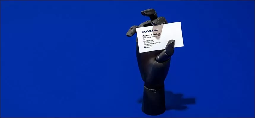
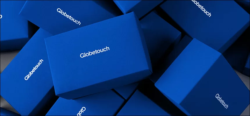
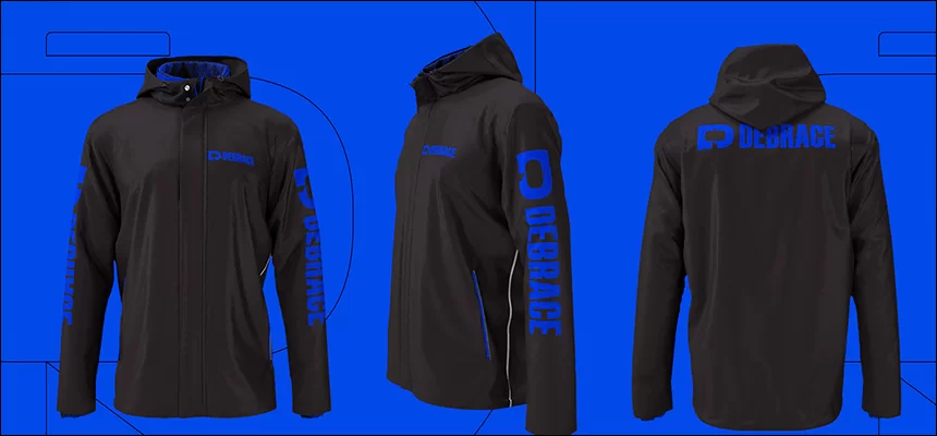
See what kind of identity design we have already done for other companies in different shades of the blue palette:
Convinced that the blue palette is perfect for your business? Order a logo and corporate identity design in blue tones from the best specialists - designers from the WeLoveBrands studio.