Get a presentation of services and expert advice
Best people in the industry oversee your branding process
Best branding agency and graphic design studio – WeLoveBrands❤️
Do you know what potential clients pay attention to first? To your image. And the image, first of all, is made up of a well-designed logo. After all, no matter how hard you try, people are greeted by their clothes. So you won’t be able to get away with creating a cool logo.
Without a logo, it will be quite difficult for a company’s image to exist. Without it, you can’t make a cool sign or design a website. Even an Instagram account will look suspicious.
And now, imagine, we finally convinced you to make a logo. And you created the treasured emblem. But there are no more buyers. What is the reason? Let's look at the most common mistakes.
You try to fit as much information about yourself into your logo as possible and fill it with an abundance of incompatible shades. The result is a strange “porridge” that is difficult to perceive. And if you have added almost all the colors of the Pantone palette there, hurry to change the logo.

The average consumer may see dozens or even hundreds of logos per day. And your task is to hook. Therefore, throw standard template logos aside. Maximum creativity.

The wrong color choice in a logo is one of the most common problems among companies. After all, color is what affects the perception of your logo, and, accordingly, the entire company. We can safely say that color “makes the difference.”
One of the main tasks of the logo is the presentation of the company. A person, looking at it, should immediately understand what your activity is related to. By the way, we don’t recommend using just letters for your logo - the market is already full of them.

And in order for your symbolism to be remembered by a potential buyer, you should pay attention to its “color”. Because each color evokes a certain emotion in a person. And those designers who use these weapons usually create cool logos. How to choose the right tone and what do you eat it with? Read on.
Let's use an example. Every person has a color that suits them the most and the least. It depends on the shade of hair, skin, age and so on. And if he wears something of the wrong color, he will feel insecure and look less attractive.
The same goes with logos for different areas of business. If a certain logo color doesn't suit your industry, the logo will turn off potential customers. Because all tones influence a person’s subconscious in their own way. Pay attention not only to how pleasant a particular shade is to your eye, but also to its psychological meaning. Then your brand will be remembered better and the associations will be only positive.
Also has weight and relevance of color for the logo. There are trends for different tones. What colors are the most popular at the moment? Read on.
If you want your future logo to be created based on several colors or shades, they must be visually balanced with each other. There are several ways to select color combinations for your logo:
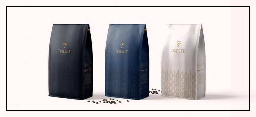
The main task of packaging is to make the product (if we are talking about food and drinks) seem as appetizing as possible. This can be achieved by enhancing various impressions:
By harmoniously intertwining the emotional, visual and rational components of design, you can capture both the attention of a potential buyer and a segment of a certain market. However, keep in mind that the success of a business depends not only on successful design, but also on successful management. This can be clearly seen in successful companies, where design thinking plays an important role in all areas of activity.
Modern trends dictate their rules not only for clothing or interiors, but also for the design of company logos. The colors that we see on signs and main pages of online stores most often also have a certain fashion. What tones are most in demand now?
blue. This cool color and all its shades are in most cases associated with the color of the sky and water. It calms you down and helps you concentrate. Blue is especially loved by IT companies and food manufacturers.
red. The most aggressive and emotional. This color carries provocative and energetic messages that tend to attract attention. It increases heart rate and breathing, and activates the pituitary gland. It can often be seen in the “edible”, medical and other industries associated with incentives to action.
yellow. Joyful and optimistic color! It evokes only positive emotions. Also associated with the sun. This is probably why it leaves a warm aftertaste on the soul. Companies producing household goods and appliances take advantage of this most actively. It is also loved by food industry owners.
green. It is associated with freshness, tranquility, and good health. This color is most preferred by IT companies and beverage manufacturers.
violet. One of the most mysterious tones. Noble and sophisticated. In a word, royal. It is especially often chosen by financial companies and sweets manufacturers.
black. Expensive color. There is nothing superfluous in it. Prestigious, timeless and sophisticated. Most of all, he is loved by companies that sell expensive goods. And for good reason. After all, the color looks super expensive.

White, orange, gold and pink are also popular. But it is important to decide which one will become your corporate logo color. To do this, consider the scope of your business and the preferences of the target audience. Well, we will tell you how to do this in the next paragraph.
We will never tire of repeating that the right color is the key to a successful logo. And, moreover, the shade will be individual for each company. Since it depends on what industry you are developing your business in and what audience you are counting on attracting. If you choose the perfect color scheme based on these features, you will definitely expand your audience.
Each color carries a specific message. A person feels it on a subconscious level. So to make your brand recognizable, you need to choose colors that will evoke certain associations.
First of all, pay attention to what feelings this or that shade awakens in a person. For example, scarlet will excite the nervous system. And therefore, it is able to motivate a potential buyer to take decisive action. But the color of orange will evoke a feeling of warmth and homeliness in your soul. What about other colors?
White. Despite its neutrality, it feeds a person with energy. It drives away fears and darkness, removes negativity. It will also charge you with energy and motivate you to new victories. On the other hand, this color symbolizes emptiness and purity. In logos it is most often chosen as a background, since it cannot exist by itself

Black. The most mysterious color. He's calm. It's addictive and relaxing. In logos, it most often symbolizes stability and self-confidence. It is he who will help express his rich experience and steadfastness. It is chosen more often than usual by serious, world-famous organizations. It is used where there is no longer a need to attract the attention of customers, because they come to them themselves.


Blue. Depth, calm and a certain coldness. These are the associations that come to mind when looking at the color blue. It spiritualizes, gives a feeling of peace and eternity. It is the most popular in the business palette. After all, in addition to calmness, it also inspires success. In logos it will mean confidence, loyalty, recognition. However, due to the fact that it is most often disassembled into logos, you need to approach its use with originality. Simple letters won't work. It needs to be remembered.

Green. The color of nature has a positive effect on the nervous system. Green = prosperity and life itself. It means respect and calm. True, its excess can mean inexperience and envy. But in logos it symbolizes functionality, novelty, and financial prosperity. Means natural freshness and optimism.

Yellow. Bright and cheerful color! What can I say, real sun! It gives positive emotions and looks unusual in logos. But it is better not to use shades of yellow in their pure form. True, if you overdo it, it can carry an alarming message.

Pink. Naivety and softness, a kind of innocence and femininity - this is how the color pink can be described. If you want to show through your logo that you are a caring company, then choose this tone.

Now you know what color to choose for your logo to accurately convey your desired message to the customer. However, it is important to choose a tone that will suit your particular area of business.
Research shows that logo color influences the purchasing decision of 60-80% of consumers. This means that color can make or break your sales. Therefore, one of the most important factors when choosing a color is the industry in which you are establishing a company.
Which color suits each business area most and least?
|
|
|
|
Perfect for:
|
Will not work:
|
|
|
|
|
Perfect for:
|
Will not work:
|
|
|
|
|
Perfect for:
|
Will not work:
|
|
|
|
|
Perfect for:
|
Will not work:
|
|
|
|
|
Perfect for:
|
Will not work:
|
|
|
|
|
Perfect for:
|
Will not work:
|
|
|
|
|
Perfect for:
|
Will not work:
|
To select a color for a logo online, special services have been developed to help designers. Here are 15 of the best:
As you know, there are no monochromatic logos. And they always use at least two or three colors. Therefore, it is very important to choose an equally ideal ally to match your ideal shade. Below we provide a list of the coolest combinations. We hope you find your logo combination.
We want to say right away that almost all colors look great with black or white. Although white suits blue, red and black the most. And for black - red, lilac, yellow and orange.
The most successful combinations:
 |
Yellow+lilac |  |
Gold+olive |  |
Pink+mint green | |||||
 |
Purple+gray |  |
Grey+fuchsia |
|
Green+creamy white | |||||
 |
Lemon+cherry red |  |
Blue+pink |  |
Red+brown | |||||
 |
Beige+emerald |
As you can see, you need to carefully select decent colors for your logo. Research your target audience, your industry, etc. Well, be sure to study the psychological impact of each color on a person. Moreover, on our blog you can find introductory articles on each color.
Well, if you are not sure that you can create a logo and paint it in the appropriate color, then we advise you to turn to professionals. Like the designers of WeLoveBrands. They will be able to choose the perfect shade for your logo. They will tell you what the target audience will like most. And they will create a logo that your competitors will only dream of. Just look at the masterpieces WeLoveBrands has created.
Surely you thought now that this was some kind of miracle. Because such creations simply cannot be created using special design programs. But in the hands of WeLoveBrands designers, everything is possible! After all, we literally put our soul into our work. And it is precisely because of this that they differ from the work of other companies.
So if you are looking for the perfect logo, you know what to do!