Receive a presentation of services and expert advice
The best people in the industry oversee your brand development process
Best branding agency and graphic design studio – WeLoveBrands❤️
 WeLoveBrands.pptx

The best people in the industry oversee your brand development process
We are sure that there is no point in explaining to you that a company without a decent logo is like a party without music. It may exist, but all the guests will quickly leave. So if you haven’t yet acquired a beautiful logo, then feel free to start doing it now. But first of all you need to choose the right color for it. After all, by choosing the wrong color, you can discourage a potential client from purchasing your product. And in order to choose the right tone, it is important to study how each color affects a person. Today we'll talk about gold. Interesting? Then read on.
Since time immemorial, gold has been considered the color of luxury and wealth. It used to be worn by kings and nobles. Gold color is a symbol of warmth, beauty, victory, glory, wisdom and experience.
This shade comes from fairy tales. After all, it was in them that he symbolized the countless treasures that the heroes received after going through difficult trials. And, in fact, the fairy tales are right. The gold color is truly a treasure. Because it has a positive effect on a person. It gives self-confidence, joy and warmth in the soul, faith in one’s strength, relaxes and energizes for success.
Gold is always power and purity. This is willpower and courage. It has many shades. Despite the fact that each of them is distinguished by its nobility and a large flow of positive energy, they are all beautiful in their own way.
Gold colors are darkened yellow shades. Sometimes they are bright, sometimes medium-saturated. All of them imitate the shine of expensive metal. Here are the most common tones:
 |
The Golden Fleece A very elegant and luxurious shade of gold. It is distinguished by its sophistication and softness of impact. Has a slightly peachy undertone. |
|
 |
Golden haze color In this color, unlike the golden fleece, there is more yellowness. It is warm but gentle, slightly muted. |
|
 |
Golden cream It can be described as “buttercream with gold added.” When you look at it, a feeling of sweetness immediately arises. It's a pleasure to look at him. |
|
 |
Sun sugar Imagine melted, slightly yellowed sugar. It has a golden hue, mixed with light orange. If you visualize these words, then the shade “sun sugar” will come out. |
|
 |
Sunset Gold The sun sets behind the horizon... I want to admire it again and again. Sunset. What color is this sunset? Probably exactly this. |
|
 |
Golden rod This shade is bright and memorable. It is associated with strength and pressure. Actually, like the rod. Golden rod. |
|
 |
Young wheat color A fascinating field with young wheat. What color is it? Exactly like this. This tone is very gentle and soft. Muted, close to beige. |
|
 |
Golden apricot color Juicy and sweet apricot-colored fruit. It is usually bright orange and rich in color. But if this color is slightly muted and a beige undertone is added, you will get the color of golden apricot. |
Each shade of gold is like a work of art. So, no matter what tone you choose, it will look chic. Rely on your taste preferences.

Gold is clearly not the last color in business. And all because it is the color of success and wealth. It is used quite often. After all, it has many advantages:
However, if you overdo it, it can have a negative effect. Capable of inspiring sadness and even martyrdom. Also, an excess of gold is a fear of losing. Too much gold also indicates posturing. So always know when to stop.
Each culture interprets the color gold differently. Although everywhere it indicates only positive aspects. Wealth, happiness, joy, enlightenment - everyone deciphers this tone in their own way. Let's get acquainted with the most interesting values:
India, China
In the cultures of these countries, gold has always signified enlightenment.
Egypt
Gold is associated with the sun god Ra.
Indonesia
The color of wealth symbolized truth as well as enlightenment.
Greece
In this country, the color gold means immortality. It is also the color of higher intelligence.
European countries
Gold in Europe = prosperity, wealth and success.
Gold is the color of wealth, luxury and success. It looks expensive. He is often associated with winners. Mostly luxury companies add it to their logos. This color will give a potential buyer a feeling of warmth and motivation. An effective and memorable tone can greatly lift the mood of the client. And also to encourage and motivate to action, especially to purchase. What areas of business are gold most suitable for?
While gold will look good in logos for any industry, there are some that it will fit into best. Which ones exactly? Let's figure it out now.
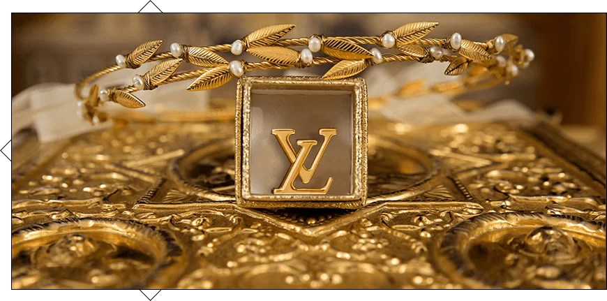
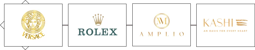
Jewelry
It's no surprise that a gold logo is best for gold items. Expensive jewelry should be emphasized by a luxurious logo. And the color of wealth and success fits here like no other.
Fashion industry - exclusive, trendy
Gold is a very stylish color. Therefore, it is no surprise that various brands love to use it in their logos. Luxury designers especially love it. So if you work in the fashion industry and don't know what color to choose for your logo, choose gold.

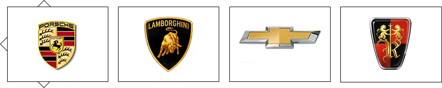
Cars are timeless classics
Car creators also prefer the color of luxury. After all, it emphasizes the high cost and uniqueness of the company. “Our cars are not for everyone!” - the gold color in the logo will speak for you.
Technology - quality, uniqueness
If you want to indicate that your equipment is high-quality and original, gold is perfect. In this way you can emphasize the high cost of the company.

Art is a talent, a source of energy
If you are from the field where you need to create. For example, you are engaged in the production of materials for artists and other creators. Gold is also suitable for those who create their own shaders. For example, photo or film studios.
Products - unsurpassed taste
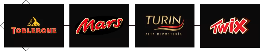
Edible logos can also be gold. It will look great in coffee and chocolate logos. But it is also suitable for other products. He will focus on the subtle, excellent taste and exclusivity of the product.
Status, image goods - high cost, status
By this definition we mean watches and other accessories by which a person’s financial status is judged. Usually such jewelry is expensive. And the companies that manufacture them try to emphasize this high cost and uniqueness. That's why many luxury accessories company logos choose gold.
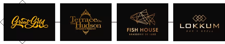
Restaurants - atmosphere, exclusivity
The excellent taste of each dish and the unsurpassed atmosphere in your establishment will help highlight the golden one. Just imagine how restaurant guests will admire the logo when looking at it. After all, aesthetic pleasure in a restaurant is no less important than gastronomic pleasure.
Oddly enough, there are areas of business for which it is better not to choose gold. Are you positioning yourself as a company with affordable services? Do you sell inexpensive goods? Is your business far from sophistication and luxury? Do you want to be easier in the eyes of potential buyers? Then gold is not for you. This color is an indicator of uniqueness and high cost. Gold is the color of winners. Who wouldn't suit logos in the colors of wealth? Read on.
Agriculture
Agricultural companies mean a good harvest and work with land and fertilizers. And since gold in ancient times was considered the color of kings and nobility, it would be strange if it was added to the logo of a company that deals with land. After all, this was previously done by peasants—ordinary people.

Social media
Social media is all about accessibility. Almost all social networks talk about themselves as platforms where it is easy to register. You can communicate anywhere in the world. And their use itself is free.

Entertainment
Joy, happiness and fun are things that do not require restraint and sophistication. Positive emotions can manifest themselves in different ways. There is no place for exclusivity here.

Goods for children
Children are not interested in the price and exclusivity of the product. It is important for them that the item is bright and beautiful. So in this area you can “splash” all the colors of the rainbow onto the logo.

Pharmacy
Gold is always associated with a high price. Which is not always true in the medical field. After all, every person gets sick at some point, regardless of income. So medicines should be affordable for everyone. And the logo should emphasize this.

Landscape design companies
The design of a garden or other green area cannot be associated with gold. Because this color usually reminds us of autumn, when everything fades and becomes warmer. Dried grass and fallen leaves are absolutely inappropriate for a green landscape.

It is very important to choose the right color “buddy” for your gold. After all, a monochromatic logo may seem boring in some cases. That is why it should be diluted with other shades. But the most important thing is to do it right. If you choose the wrong color to pair with gold, you can immediately “bury” the entire image of your business. The shades should fit perfectly and complement each other. Moreover, briefly presenting the concept of your business to potential clients. Below are the most winning combinations:
 |
Gold + sea green | |
| Warm and luxurious gold harmonizes perfectly with the cool color of the sea wave. Looking at this combination, you can’t help but imagine a sandy beach overlooking the distant sea. Only fish and jellyfish are missing. Using this combination, you seem to plunge into an atmosphere of calm and tranquility. | ||
 |
Gold + olive | |
| Both of these tones belong to warm colors. They complement each other perfectly and reveal themselves in a new way. Looking at these colors, you can imagine an olive tree, somewhere in Greece, being hit by the sun's rays. Moreover, the sun does not forget to bestow its attention on a single olive. | ||
 |
Gold + black | |
| This combination is like a timeless classic. Will always be relevant. Black color especially makes gold stand out against its background. Gives incredible brightness and shine. | ||
 |
Gold + red | |
| These colors are both bright and provocative. It would seem that they cannot look good together. Although, in fact, they not only look great and do not drown out each other, but also attract attention. | ||
 |
Gold + white | |
| The combination of gold and white is for those who prefer minimalism and laconicism. This combination symbolizes stability, aesthetics and tranquility. White color perfectly emphasizes the brightness of gold. It looks very impressive. | ||
 |
Gold + burgundy | |
| Both colors were previously considered the colors of the royal court. So this noble couple will clearly show whose logo is truly “royal”. Elegance and mystery, restraint and richness - all this is about the combination of burgundy and gold. | ||
 |
Golden + electric | |
| This dynamic and vibrant combination will clearly not leave anyone indifferent. It will definitely be remembered by your client and will fit perfectly into the logo concept. In general, audacity and sophistication in one bottle. |
||
 |
Gold + emerald | |
| Deep emerald color and bright gold seem to be made for each other. They combine perfectly with each other, creating a unique visual. It’s not for nothing that jewelers love to use this combination in their products. Gold necklaces and rings with emeralds look amazing! So why not transfer this “amazing” to your logo? | ||
 |
Gold + brown | |
| This tandem is very stylish and does not catch the eye. Gold next to brown acquires a special softness and warmth. An incredible combination that will not leave connoisseurs of true style indifferent. | ||
Gold has dozens, or even hundreds of variations. They can be very attractive, or they can be completely disgusting. You can create an incredible design with this luxurious color. True, use a decent color, and wisely. After all, anti-trend or simply unpleasant tones can repel a potential client.
Undoubtedly, logos in warm colors will delight customers. But only if you choose the right tones. Let's figure out which ones your client will like. Read on and learn more about the current shades of gold.
pink gold
A spectacular and stylish shade. Perfect for those logos in which gold or pink would look inorganic. After all, now a solution has emerged - to combine these two colors. And you will get unique rose gold.
golden straw
It’s not for nothing that this tone is called straw. It absorbed all the beauty of dried grass. The logo looks incredible.
golden honey
Imagine fresh liquid honey flowing smoothly from your spoon, shimmering in the light. This is exactly what this shade looks like.
golden haze
Wonderful rich color. He will not “eat out his eyes.” Calm and soft, but at the same time very memorable.
The Golden Fleece
One of the lightest shades of gold. It looks very gentle and sophisticated. A great option for your logo design.
gold alloy
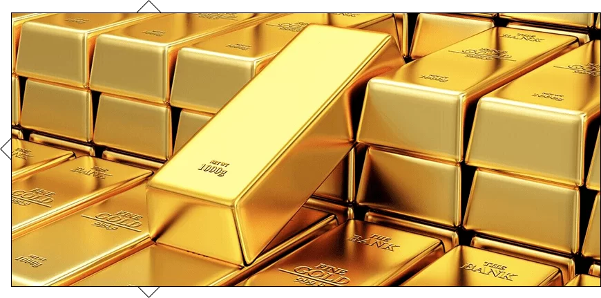
Luxurious and noble color. It was as if it was actually created based on the color of a gold bar.
sunset gold
Who doesn't love watching the sunset? After all, every shade that is involved in it is incredible. And all of them were absorbed by the color “sunset gold”.


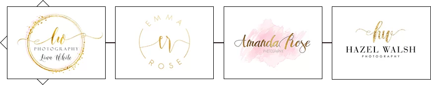
But it is very important to remember that the slightest mistake in choosing a shade can ruin the entire logo. Therefore, we advise you to trust the professionals. They will be able to choose the perfect shade for your logo. They will tell you what the target audience will like most. And they will create a logo that your competitors will only dream of. Moreover, it is necessary to find real specialists. Such as the designers of the WeLoveBrands studio. Just look at the magical golden logos they have already created for other companies:
Surely you thought now that this was some kind of miracle. Because such masterpieces are simply impossible to create without professional experience. This is what makes them different from the work of other companies. Luxury and high cost or nobility and sophistication - it’s up to you to decide! And we will present it in the best possible way. Remember that it is very important to entrust the implementation of your ideas to real professionals. Therefore, carefully select a designer, and start thinking about what colors will be on your logo :)


