Receive a presentation of services and expert advice
The best people in the industry oversee your brand development process
Best branding agency and graphic design studio – WeLoveBrands❤️
 WeLoveBrands.pptx

The best people in the industry oversee your brand development process
A logo plays a big role in creating a company's image. Correctly selected logo colors will highlight your strengths and attract the target audience. Therefore, it is very important to approach the choice of colors responsibly. Do you want to present yourself to the consumer by evoking certain emotions in him? Choose the right color.
Where should you start creating an emblem? Understand the psychological impact of shades on a person. And we will help you with this. Today we will tell you how an orange logo can influence a consumer.
Orange is the color of warmth and happiness. It has always been associated with inspiration and positive energy. It charges with vivacity and energy. It creates the impression of home comfort and coziness, fuels us with friendliness and optimism.
It is not for nothing that this color is between yellow and red. It combines the warmth of yellow and the grandeur of red. But orange, unlike these two colors, is not as aggressive. It’s good because it doesn’t evoke a lot of vivid emotions and doesn’t put pressure on a person.
Orange color has a wide palette of tones. Each of them has a different effect on a person. The semantic meaning of the “orange” color directly depends on the shade. If yellowness predominates in it, it will evoke positivity and joy. There will be a feeling of warmth in your soul and a desire to create. The superiority of red will awaken other emotions. Looking at orange and red will fill you with strength. It symbolizes assertiveness, determination and activity.
There are many shades, here are some of them:
 |
Pumpkin People usually associate pumpkin with autumn and spices. Gives a feeling of comfort. So the color will act accordingly. |
|
 |
Tangerine Imagine a ripe, juicy tangerine. It exudes freshness and the fruit lifts your spirits. The tangerine color also has an effect. Incredibly stylish and bright. |
|
 |
Signal orange Bright and rich. It is not for nothing that it is called signal, because this shade can be seen even from afar. |
|
|
|
Fiery This tone is as bright and memorable as fire itself. Closer to red. Therefore, it is perfect for expressing strength and activity. |
|
 |
Gray's last breath Interesting name, isn't it? Essentially, it is yellow-red. The history of the tone's name is tragic. The gray parrot's eyes turn yellow before death. That's why the color is also called. |
|
 |
Ocher Soft and calm shade. Close to brown. Very stylish and warm. |
and others...
In any case, I want to peer into any shade of orange. It brings warmth to the soul. It is not for nothing that it is considered the color of creativity and signifies the maturity of the individual. Charges with enthusiasm.
Orange is often used in business. It carries a special message.
Let's list the advantages of color:
symbolizes organization and assertiveness
helps to concentrate
redirects aggression into a creative direction, which is good when working with conflicting clients
attracts attention to itself. Therefore, it is well suited for emphasizing the necessary details. For example, a call to action button.
But still, you should not abuse this tone. Because it also has disadvantages :
oversaturation with the color orange can cause apathy or mental exhaustion
he gets tired quickly
too much of it can give your logo a cheap feel
Therefore, we do not recommend making orange the dominant color. Better to add it as a couple of finishing touches.
Orange has its own meaning in different cultures. We have collected the most common ones for you:
Western countries - symbolizes autumn, harvest, warmth and clarity
India - a pale orange color (called saffron) is considered sacred and brings good luck
Netherlands - orange is associated with the Dutch royal family
Colombia - a symbol of fertility
Eastern Cultures - Orange means happiness, good health, love and humility
By the way, Buddhist monks wear orange-colored clothes.
Orange is the color of energy, optimism and strength. It instills hope in a person and leaves a pleasant, warm aftertaste on the soul. But it should be remembered that excessive amounts can cause the opposite effect. If you do not want to make the consumer feel uncomfortable, do not overuse color. But overall, this tone will do a great job of drawing attention to your brand. Especially if the product you are promoting solves problems or gives positive emotions. Undoubtedly, orange suits almost all areas of business, but there are those where it will look especially organic.
Pharmacy - hope and peace of mind
Orange has never been better suited for advertising medicine. After all, it will not only evoke a positive attitude, but also provide a sense of peace of mind. This will help the consumer believe in the effectiveness of the drug. Also, don’t forget that orange is a symbol of health. Agree, this is an important nuance when promoting a medicine.
Children's products - happiness and joy
What other color to choose than orange when it comes to baby products? Orange radiates joy, which children will especially appreciate. They associate it with the sun and warmth and evokes only positive emotions. Moreover, the color attracts the attention of young buyers. Therefore, if you are racking your brains about what color to “paint” children’s products, orange will help.
Entertainment - fun and interest
Is your company engaged in brightening up leisure time? If you are a TV channel, cinema, etc., carrot is perfect for your logo. Also, an orange logo will fit perfectly into the concept of holiday agencies. You want the consumer to see what exciting events you hold? Colorful and interesting. Then choose orange.

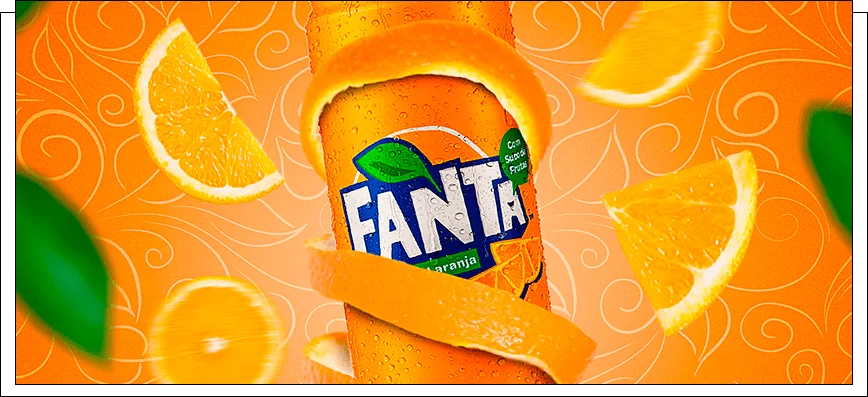
Food products – bright, excellent taste
Oranges, carrots, mangoes, persimmons - there are so many delicious things that are orange! People associate orange with tasty treats. So why not choose orange for your store logo, product or even drink?
IT goods and services, sale of gadgets - the latest technology
Such a bright tone will definitely suit your IT company. And in general, if your business is related to technology, orange is what you need. Do you want to be associated among consumers with the trends of the computer world? Now you know what color to paint the logo.

Energy industry - strength and development
For many people, the color orange is associated with the understanding of fire. And fire, as you know, is a symbol of energy and strength. Therefore, if your company is dedicated to the energy industry, this color scheme has never been better suited for you.
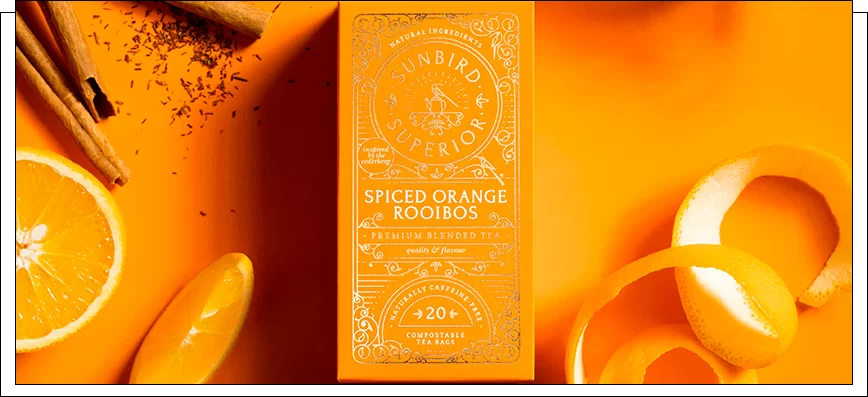
Agriculture - quality and naturalness
Orange is also great for agricultural products. It is also good for presenting agricultural machinery. This color in many countries symbolizes a good harvest. So why not turn this to your advantage? Warm bright shades will delight the eye of any buyer. Add a couple of carrot-colored details to your logo and profit growth is guaranteed.
Real estate - a cozy home
Many people associate the color of orange with warmth, homeliness, stability and comfort. This is why many real estate agencies prefer to use orange in their logos. And, you know, their choice most often becomes more than successful.

Oddly enough, there are areas of business in which it is better not to “shine” orange. Are you positioning yourself as a reliable and safe company that you can rely on? Are you involved in, in some senses, dangerous areas? If your goal is to reassure a person and assure him that everything will be fine, then you should not add orange to the logo. Maybe you want the consumer to associate it with relaxation and rest? Then this color is definitely not for you. By the way, what is your pricing policy? If you sell luxury products and services, we do not recommend using carrot shades. After all, they are the ones who show the availability and flexibility of prices.
And now we will show which business orange logos are not suitable for.
Airlines always try to convince consumers as much as possible of their reliability. Therefore, it would be unwise for them to use the color of fire for their logo. After all, safety comes first. The main task of the carrier is to reassure the person, to show that they need to be relied on. So orange would be completely out of place here. Of course, unless you want to scare the passenger.

Are you involved in banking operations (loans, deposits)? Then it would not be entirely advisable for you to use orange. After all, this color symbolizes cheapness and accessibility. And the client should feel respected and welcome. And also to see that he deserves all the best. As you know, many people believe that expensive = best. So the accessibility color won't work here.
By the way, do you want to be associated by the consumer with reliability and composure? Then it’s better not to “paint” yourself orange. Your logo should persuade and reassure, not the other way around.

Imagine a beautiful blooming garden...Trees with juicy fruits grow there, young bushes quietly whisper among themselves. Everything is green... Oh, I mean orange. Well, what did you think? This is exactly how clients will imagine you when looking at your carrot logo. Many people associate the color orange in the landscape with yellowed, dried grass. And this cannot go hand in hand with a beautiful green garden.

As you know, crystal clear water is associated with blue and cyan colors. What if the logo for a drinking water company turned orange? The consumer will immediately imagine orange and possibly dirty water. It is unlikely that she will be able to cause thirst.
It is very important to choose the right color “partner” for your bright carrot color scheme. After all, a monochromatic logo can sometimes seem boring. That is why it should be diluted with other shades. But the most important thing is to do it right. If you choose the wrong color, you can immediately “bury” the entire concept of your business. So the colors should fit perfectly and complement each other. Below are the most winning combinations:
 |
Orange and white | |
| A very stylish combination that is used by many companies. It attracts attention perfectly and leaves a positive impression. Bright orange is perfectly compatible with calm and basic white. It is thanks to him that orange looks more expressive and modern. | ||
 |
Light orange and olive | |
| Calm but trendy color combination. If you follow fashion trends, the combination of light orange and olive is especially for you! Despite the fact that both shades are relatively muted, they create an incredibly stylish tandem. Against the backdrop of an expressive olive, the orange tone looks more colorful and vibrant. | ||
 |
Dark orange and cherry | |
| Both colors of this combination are quite bright and catchy. In fact, they could do just fine without the merger. But just look how beautiful they look together. And most importantly, very stylish. If you're still looking for a color scheme for your logo, consider this option. | ||
 |
Orange and purple | |
| Perhaps the combination of these two shades will seem unusual and strange to you, but believe me, this is only at first glance. It looks very stylish and impressive. The colors complement each other perfectly. Lilac brings out the brightness of orange. Orange makes lilac a more delicate and calm color. This tandem will not leave anyone indifferent. | ||
 |
Light orange and gray | |
| If you are a lover of pastel colors, then you will definitely like this combination. These colors are quite muted, but they look so cool together. Their tandem will not leave anyone indifferent. In addition, it will greatly highlight all the positive qualities of your company. Isn't this a dream combination? | ||
Orange is divided into many tones. They can be very attractive, or they can be completely disgusting. With the help of orange you will create an attractive, unforgettable visual. True, use a decent color, and wisely. After all, anti-trend or simply unpleasant tones can play a cruel joke on you.
Undoubtedly, logos in warm colors will delight customers. But only if you choose the right tones. Let's figure out which ones your client will like. Or rather, we will show you the most current and stylish shades of orange.
peach
Similar to peach pulp. Light yellow-orange color with gray undertones.
tangerine orange
Imagine a juicy ripe tangerine. Very rich color. This shade is the same.
carrot orange
Rich red-orange color. Looks like carrot root.
pumpkin
Similar to pumpkin pulp. The color itself is bright yellow-orange, with a reddish undertone.
calendula
Hue of calendula flowers. Bright yellow-orange.
brick orange
Dense red-orange color.
golden yellow
Reminds me of the color of gold. Bright yellow with hints of orange.
apricot
Looks like a ripe apricot fruit. Very juicy, but at the same time soft orange color.


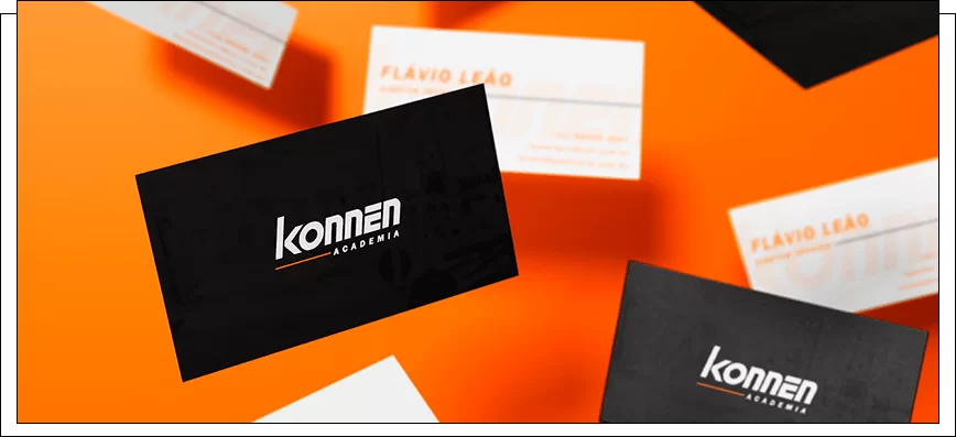
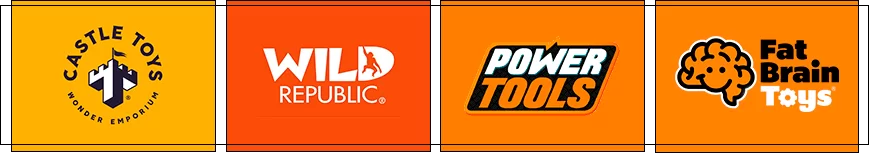
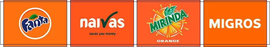
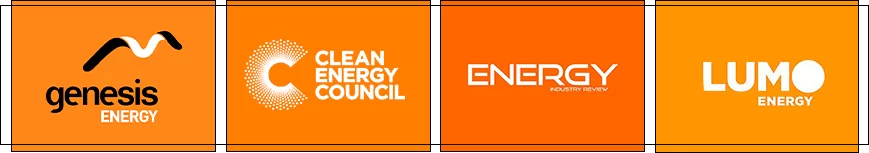
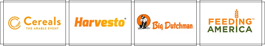
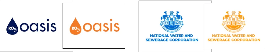
But it is very important to remember that the slightest mistake in choosing a shade can ruin the entire logo. Therefore, we advise you to trust the professionals. After all, they are the ones who will select the right shade of orange, focusing on the preferences of your target audience. Moreover, it is necessary to find real specialists. Such as the designers of the WeLoveBrands studio. Just look at the stunning orange logos they've already created for other companies:
We are sure that it is very difficult not to want such logos. After all, we, WeLoveBrands, literally put our souls into our work . And it is precisely because of this that they differ from the work of other companies. Energy and optimism or warmth and comfort - it’s up to you to decide! And we will try to present it in the best possible way. Remember that it is very important to entrust the implementation of your ideas to a pro. Therefore, carefully select the designer, and start thinking about what colors will be on your logo :)


