Receive a presentation of services and expert advice
The best people in the industry oversee your brand development process
Best branding agency and graphic design studio – WeLoveBrands❤️
A logo is an integral part of the image of every company. If you want to attract more customers and increase sales, you definitely need to develop a personal logo. After all, it will show that you are a brand. A reputable company that does its work conscientiously.
True, in order for the logo to be successful and to do its job as a PR person one hundred percent, choose the right color. The right shade will not only set you apart from your competitors, but will also highlight your individuality. You need to choose it based on the activities of your company. Because each color has a certain psychological effect on a person. So you need to choose the shade that will encourage the consumer to buy or order a service from you.
Today we will talk about the color purple and its role in the color palette. Who should use it? You will learn from this article.
Purple is an aristocratic and noble color. It expresses restrained strength and grandeur. And since the tone is a cold color, it does not excite the nervous system. So with its help you will not be able to provoke the client to a certain action. But, nevertheless, it will make the buyer respect your company.

Purple color is one of the most mysterious colors. It is deep and has many different meanings. It’s not for nothing that this color is located at the very end of the color spectrum. Because it includes the qualities of many other colors.
It is called the color of the union of two opposites. This is because it is obtained by mixing red and blue. So he combines cold calm and hot violence. The color of weakness and strength, naivety and cunning, wisdom and power. In general, this is a color paradox. A combination of incompatible things.
Purple means nobility, spirituality, inspiration, modesty, self-esteem. It is also the color of intuitive thinking.
Each shade of it has its own impact on a person. They have different meanings. For example, dark tones of purple with a predominance of blue signify power and brute strength. If red dominates, then it symbolizes naivety, infantility, impulsiveness and emotional immaturity. Lighter shades have calming properties. Associated with softness and tenderness. Psychologists consider “pure” purple to be slightly difficult to perceive.
Of course, there are a lot of tones. If we start listing everything now, it will drag on for a long time and in earnest. So we will focus on the most popular:
 |
Purple Very beautiful color. Bright and memorable. Many people associate it with extravagance, artistry and originality. |
|
 |
Lilac Gentle and pleasant. Causes positive emotions and calms anxiety. It also improves vision and has a gentle effect on humans. It is also a symbol of intuition. |
|
 |
Lilac It looks rich and noble. Although it is associated with emotional immaturity. It is also symbolized with vanity. Most often it is chosen by teenagers. |
|
 |
Lavender Delicate and soft shade. Very beautiful and stylish. Light, slightly muted, does not evoke bright emotions. But, nevertheless, incredibly pleasing to the eye. |
|
 |
Eggplant Deep bright shade. I want to look into it. It looks impressive and chic. Basically, it's purple with a hint of burgundy. |
|
 |
Dark purple Very stylish color. Beautiful, close to blue. Not particularly bright, but a serious shade. |

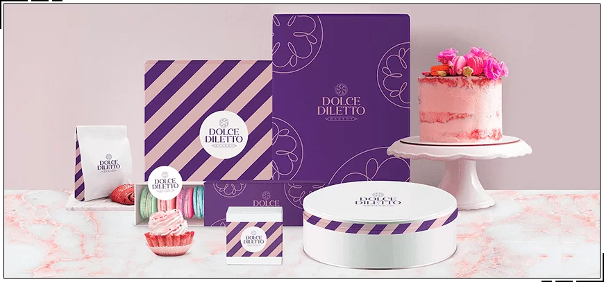
Purple is a color commonly used by spas and bakeries. This is because it is very calming. Therefore, if you and your employees often get stressed, then this color is perfect.
Purple is also great for memory. If you need to remember large amounts of information, then use it. Moreover, this tone evokes the earliest memories.
The color violet also enhances suggestibility and lulls vigilance. That is why it is often used by hypnotists. It helps relieve symptoms of chronic fatigue.
Don't go overboard with this tone though. Too much of it makes you sleepy. It can cause depression, dejection, and loss of strength. So bigger is not always better.

Purple is a very ambiguous color and has many interpretations. In different countries it is deciphered differently. Somewhere it is considered elegant and festive, and somewhere mournful. In each country the meaning is at least somewhat different. And we have collected the most interesting meanings for you:
Eastern countries - has positive meanings. Associated with wealth, prosperity and luck.
Western countries are a positive color. Means power, privilege and glory.
England - purple symbolizes mourning and negativity.
Italy - negative value. Means death and mourning.
Thailand - purple clothes are put on the deceased who was very loved.
Brazil - purple clothes are put on a deceased person who has been inglorious
USA - symbolizes courage and honor
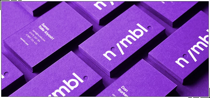
Since the color is considered expensive and looks rich, we recommend adding it to the logos of luxury companies. But it is also suitable for brands with an average pricing policy. Purple is exclusivity, luxury and chic. Prosperity and well-being. Therefore, if you want to show your client your positive attitude and emphasize the quality and responsibility of the company, purple is what you need.
It will also be good for those who want to earn respect from buyers. Undoubtedly, purple suits almost all industries. But there are those in which it will look especially organic. Let's look at those industries in which the color will fit like a native:
Financial companies
Purple color suits financial companies like no other. After all, they need to show that they can be relied upon. That the company can be trusted. And purple will help a lot with this. He will introduce you properly and reassure clients of your competence. Also, as we wrote earlier, purple symbolizes well-being. And this quality goes hand in hand with successful financial transactions.

Medicine
There is no room for error in this area. Even the color for the logo must be chosen responsibly. The company's symbols should not only attract the client, but also convey a certain message. Why do we so recommend using purple in medicine? Because it will calm the patient. And due to the fact that this color symbolizes health and prosperity, a person will not worry so much. The color will make him respect you on a subconscious level. So feel free to use it in your logo.

IT sphere
Modernity and quality... Rich experience and the latest technologies... Of course, you can describe your IT enterprise in different words. But it won't make sense if your logo doesn't convey the same message. The purple hue perfectly conveys the description of your positive qualities. Do you want to show that you are the best in the computer services market? Now you know how to make a new logo.

Food
Purple is a great color for food design. Especially sweets. Delicate, calm shades will look great on logos of food companies. Of course, they won’t really create an appetite, but they will relax your thinking. And when a person is relaxed, he will definitely want something tasty. And besides, purple will inspire respect and trust in you. Will assure that your products do not contain harmful impurities.

Clothes and shoes
Many shades of purple look more than stylish. Most people associate them with trendiness and high fashion. Especially lavender. And if you are the owner of a clothing store or brand, it would be a sin not to take advantage of this. By the way, lilac shades will fit perfectly into the designs of clothing companies not only for adults, but also for children.

Creative studios
Purple is the color of creativity. So if you make your studio logo in this tone, all creative types will appreciate it. Most artists, musicians and dancers love shades of lilac. Still wondering what color to make your studio logo? Now you know.

Beauty Salons
This color will perfectly fit into the design of a beauty salon logo . It will make your clients feel luxurious. It will also emphasize the professionalism of the employees. Plus, purple is stylish. Add a couple of purple details to the logo, visitors will appreciate it.

There are industries in which purple would look out of place. Sometimes it will push the client away from your company altogether. We do not recommend using it for enterprises with a low pricing policy. Also, you should not use it in industries related to love and infatuation. If you are in the business of plants and selling them, then don't choose purple for your logo. Read on and find out in more detail who should not use this color.
Energy companies
Most people associate energy with fire, strength and power. Therefore, purple will not be able to reflect this in the logo. And since it is also a cold color, it will not awaken the right emotions. You also need to take into account that this is a more feminine tone. So we don’t choose violet for such emblems.

Wedding salons
A wedding is a very sensitive process. This is an accumulation of tenderness and awkwardness. This is something light and soft. Therefore, purple color will not fit here. It will be too heavy for the symbolism of the salon. Of course you can try using lavender, but it will look too cold. We advise you to consider other colors.

Agricultural companies
Agricultural enterprises do not in any way fit with the luxurious royal tone. The color purple signifies wisdom, depth and strength. And agricultural companies need to show with their logo good performance and a large harvest. This color scheme will not be able to fully express the power of your enterprise.

Real estate
A logo for such an industry should be designed in warm colors. But not in purple. The color of mystery and spirituality is clearly not suitable as an element of the identity of a real estate company. You need to show the comfort of home. Where did you see the purple fire? For a real estate agency, it is better to use a different color.

Cars
It is better not to paint emblems for car companies purple. If only because the buyer needs to be assured of safety, and not of mystery. In such an area, everything should be strict and clear. Seriousness, confidence, quality - this is clearly not about violet. Of course, its noble and aristocratic meaning is attractive, but here it will not be useful.

Sometimes monochromatic logos look boring. Therefore, we recommend diluting purple with other colors. Use a variety of interesting combinations. It’s really important to choose the right mix of shades. After all, an unsuccessful combination will ruin the entire logo. They should look perfect so that there is nothing to complain about. And they must complement each other. Below are the most winning combinations:
 |
Purple and white One of the classic combinations. Against a white background, purple appears especially bright and unusual. This combination looks simply stunning. Stylish and impressive. |
|
 |
Purple and pink Quite unexpected. These tones seem to be similar to each other, but in tandem it looks incredibly cool! Cool purple and warm pink go well together. |
|
 |
Purple and green with warm undertones You won't believe it, but this is one of the most winning combinations. Even though both colors are bright, they look good. |
|
 |
Purple with cool green Two cool colors... They combine well with each other. This combination will bring any logo to life. |
|
 |
Violet and Prussian blue Purple harmonizes perfectly with Prussian blue. Azure resembles the surface of the sea, and violet emphasizes the beauty of azure. |
|
 |
Purple and silver This combination is simply gorgeous. Both colors symbolize aristocracy and nobility. And what do they look like in tandem! Perfect! |
|
 |
Purple and beige Delicate and calm beige looks great next to violet. Softness with mystery. So if you haven’t had time to choose a color scheme for your logo, choose this one. You can't go wrong |
The color purple has many variations. Each of them is unique. Moreover, they can look attractive, or they can be completely disgusting. If you choose the right shade, you can create a unique visual. Please note that colors that are unpleasant to the eye can play a cruel joke on your logo.
Undoubtedly, logos in purple shades will delight buyers. Will attract new clients. But only if you choose trendy tones. Let's figure out which ones your client will like. More precisely, we will show you the most current and stylish shades of purple.
lavender
A very stylish shade. Now it is especially popular. Moderately bright and calm.
fuchsia
Bright and catchy color. It looks original and attracts attention. It literally exudes freshness.
plum
A hint of ripe and juicy plum. Just imagine a freshly picked fruit and its extraordinary color. This is exactly what plum is like.
eggplant
It's essentially a purple with blue undertones. Cold, but very deep.
orchid
It’s as if the shade of this flower was transferred to the picture. Juicy and stylish.
purple
One of the brightest colors. Therefore, we do not recommend choosing him as a soloist. But nevertheless, the color is beautiful.


But it is very important to remember that the slightest mistake in choosing a shade can ruin the entire logo. Choose it based not only on personal preferences, but also on the tastes of your target audience. But we still recommend turning to professionals. After all, they are the ones who will choose the right color, focusing on the target audience. Moreover, it is necessary to find real specialists. Such as the designers of the WeLoveBrands studio. Just look at all the beautiful purple logos they have already created for other companies:
Please note that we work on every detail of the emblem. So we are 99% sure that your customers will love the logo from us, WeLoveBrands. After all, we put a piece of our soul into each of our works . This is why our creations look alive. They differ from the work of competitors. Mystery and wisdom or hidden power - it’s up to you to decide! And we will try to present it in the best possible way. We are sure you know that it is very important to entrust the implementation of your ideas to a pro. Therefore, carefully select a designer, and start thinking about what colors will be on your logo :)