Get a presentation of services and expert advice
Best people in the industry oversee your branding process
Best branding agency and graphic design studio – WeLoveBrands❤️
Instagram has over a billion unique users every month. 90% of them follow the profiles of bloggers, companies or brands. But businesses or opinion leaders transfer communication to a social network and often face the fact that sales and the number of new subscribers do not grow.
Visual marketing is one of the strengths of a personal or business brand if used correctly. Images and symbols, corporate colors and fonts - how to combine them with each other and what kind of visual to use on Instagram in 2024, said specialists from the WeLoveBrands agency.
The audience evaluates a brand, product or service from an aesthetic point of view. When the choice is between your company and a competitor's business, the visual component often becomes the deciding factor. Corporate identity and unique design of posts can distinguish you from competitors and improve the company’s position in the market.
Original visual on Instagram :
 Helps promote business .
One of the most important factors that negatively affects the results of advertising campaigns is a poorly packaged profile. You have 3 seconds to hook the user. If a person goes to the profile, the purpose of the advertisement is fulfilled. Next, the account registration will dot the “i”s. If the profile visual is not catchy, and the texts are uninteresting, do not provide any benefit or do not reach your target audience, the person will not subscribe and will not buy the product or service that you offer. It will close the page and go to your competitors' profile.
 Increases subscriber engagement .
An original design, as well as high-quality photos and videos motivate users to leave comments, like and “share” your content. Important: visuals go viral much more often than text. This means that it is easier to get likes and comments with an unusual design.
 Promotes increased user loyalty .
If content is created with the goal of “filling in” key meanings in your profile, presenting the mission and values of your brand, and also telling a high-quality story about a product or service, it increases the loyalty of subscribers. Through content you visualize the desires, values and “pains” of your target audience. Users for whom the demonstrated meanings are relevant will subscribe to the page and become fans of the brand.
People are greeted by their clothes—an account on social networks is no exception. The design of a commercial or personal brand page should look high-quality and aesthetically pleasing, comply with the latest trends and quickly respond to changes in design and SMM promotion.
If you want sales, task number 1 should be to attract attention and create the right impression with the help of visuals. After creating a corporate identity and high-quality profile design, you can begin to influence a warm audience. For a visual artist who hits the target and the heart of the target audience, it is important:

Creating a visual for Instagram begins with organizing professional photo and video shooting. If you feel like there is nothing to photograph - for example, you are a freelancer, your profession is not related to creativity, or the company’s finances are limited - contact:
photo stocks;
freely available illustrations;
design templates;
borrowing content from Pinterest, Behance and other online creative platforms.
Important : Instagram blocks you for copying branded content without indicating the author. But you can use graphic elements, stock photos or a ready-made template for a post when designing a visual on Instagram.

Overexposed, with a poorly chosen background, poor composition or too personal, we leave it for the archive on the phone or on Google Drive, but not for the Instagram profile. If you are new to social networks and have never worked on profile design before, train your “observation.”
Save visual photos on Instagram that you like in terms of color scheme, locations, poses and composition, and then repeat the ideas. It is important to regularly review the work of competitors and leaders in the niche, replenishing the library - this way you will understand how to take pictures, and also collect references that may be useful in your work in the future.

Seek the services of a photographer if you run an Instagram store with jewelry, cosmetics, perfumes, accessories, clothing, shoes, and handmade goods.
Important : if you use visual templates for categories, stick to the same style. Give preference to the same font, the same colors and repeating code elements.
Avatar is the main profile photo. The main requirements for it are that the photo is taken on a plain background, the face or logo is clearly visible, and the image itself is of the highest quality.
It’s best to put your own photo on your avatar: portrait, without filters and looking into the camera. If you want to put your product in the main photo, show it on a person. For a personal brand profile photo, you can use attributes based on the topic of the blog:
recipes - girl with dessert on a fork;
photographer - a guy or girl whose half of her face is covered by a camera;
gardener - photo against the background of Strelitzia or another exotic plant;
artist - photo with a brush and strokes of paint on the skin.
It’s good if the profile photo is made in corporate colors: brand recognition is closely related to color. Think Netflix, McDonald's or Facebook - you can immediately name the shades with which these brands are associated.
There are a lot of options for visual design of a profile on a social network. You can use standard photos, photos with design integration, or a feed completely designed in a graphic editor.
Which option to choose depends on the characteristics of the business and your positioning. The main thing is that the visual must correspond to the target audience, stand out and harmoniously combine with each other. To achieve this, plan your content ahead using special programs and tools - for example, Planoly, Unum, Smmplanner, Inpreview, Plann and others.
The cosmetics brand Nars mixes product shots with photographs of models in a checkerboard pattern, and Zara posts a series of photos and videos from one shoot, three posts in a line. A plain background and the absence of unnecessary details in the photographs help to focus attention on the brand’s products.
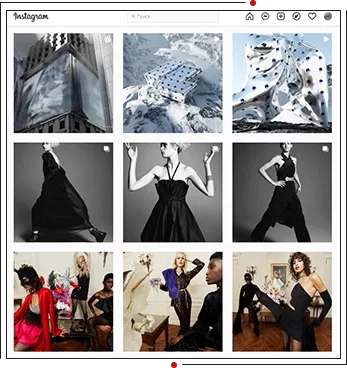
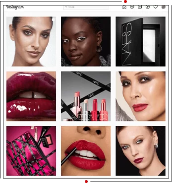
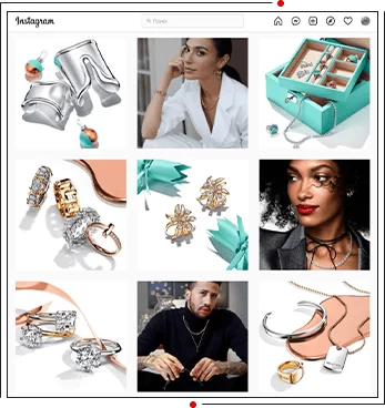
To design your profile in a corporate style, you can choose color accents and repeat them in the visual. An effective choice is to use the same color throughout all elements of your brand identity. Take a closer look at how the Tiffany brand Instagram page is designed. Their Tiffany Blue turquoise color has even become a registered trademark.
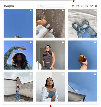
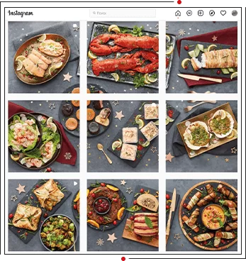
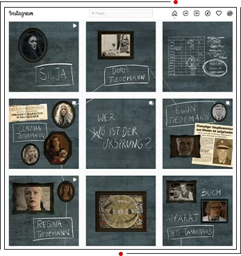
The German chain of stores with goods at prices below market prices Aldi UK publishes recipes for dishes in its profile and photographs them so that the picture is combined into an endless festive table. And on the page of the Netflix series “Dark” you can even get “stuck” for a couple of hours, looking at the feed like a puzzle.
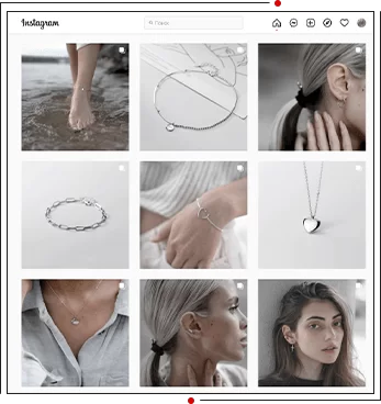
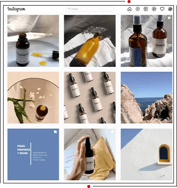
Today, more and more often you can find close-up photos of textures, decorative elements, clothing accessories, care products, tags, and so on. Such images add “air” to the profile and help create a minimalist feed.
Creating a visual on Instagram that attracts attention and meets business goals will not be possible without trend watching - tracking trends, as well as their timely implementation into your content strategy. We've shared the top trends that are worth paying attention to if you haven't already.
Videos lasting less than 15 seconds, as well as live photos of 2-3 seconds in style, are more reminiscent of GIF animations, which, thanks to Instagram’s functionality, last continuously until the user closes the post.
What can you “revive” in your profile if you are developing a personal brand :
candle burning;
flight of birds;
look of the day (“image of the day”);
movement of leaves;
seashore and waves.
The American developer of software, networking and telecommunications equipment Cisco Systems predicts that by the end of 2024, video will generate up to 82% of Internet traffic. In addition, about half of users prefer to watch videos about products or services before purchasing.

This is a new format of stories lasting 15 seconds. Users can record and edit videos using filters, effects and sounds. Reels almost completely copies the effects, overlay of text and music on the TikTok social network.

To create a beautiful visual on Instagram, it is not necessary to shoot unnatural poses, photos with elongated white colors and heavy retouching. “Lick” photos on social networks in 2024 were replaced by natural shades and a minimum of processing - up to complete #nofilters and #nomakeup.
Top bloggers' visual processing is limited to changing brightness and sharpness. Another common processing method to create maximum naturalness and aesthetics is muted colors and “pulling out” a dark shade.

How to beautifully design Instagram? Try black and white photos. You can use warm and cold b/w in your profile - build on the overall tone of the account so that black and white photos look harmonious next to color ones. And for a retro effect, add grain to your photo - this feature is available in Lightroom and Nebi.

The cyberpunk aesthetic and bold neon palette are futuristic and (again) fashionable. Neon is not a new trend; acid shades were first appreciated back in the 80s, and now they are back at the top. It’s worth trying to take a photo through a neon folder - and you’ll be on trend.
You can maintain a profile in one color scheme. This will help avoid chaos and add aesthetics to the page.
How to maintain a profile in one color :
![]() Add a profile to the Colorkuler website . It will show which color is currently dominant on your page. You will be guided by it in the future.
Add a profile to the Colorkuler website . It will show which color is currently dominant on your page. You will be guided by it in the future.
![]() Find shades of this color that go well together on @awsmcolor . This is your color palette, within which you will need to take all photos and videos.
Find shades of this color that go well together on @awsmcolor . This is your color palette, within which you will need to take all photos and videos.
![]() Look for backgrounds of this color (walls, floor), elements (clothing, furniture, decor), details (nails, cosmetics, food) and take photos on these backgrounds or with these things.
Look for backgrounds of this color (walls, floor), elements (clothing, furniture, decor), details (nails, cosmetics, food) and take photos on these backgrounds or with these things.
![]() Tighten the colors to match the selected tone in Lightroom . The program helps remove specific shades from photos. Too much yellow? Reduce its intensity and increase the intensity of, for example, peach or nude.
Tighten the colors to match the selected tone in Lightroom . The program helps remove specific shades from photos. Too much yellow? Reduce its intensity and increase the intensity of, for example, peach or nude.
Important : the profile can be in either warm or cold shades. Accordingly, the temperature in the pictures should always be reduced or increased.
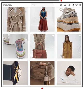
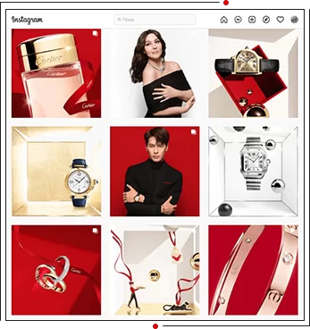
You can increasingly see close-up photos of logos, tags and textures on your profile. The most popular brands on Instagram right now are Cartier, Chanel, Dior, Zara, Prada, Chloe and Vogue. Their tags and products are removed up close, leaving little space around.
When choosing close-up photography, it is important to remember several rules :
Do not place such shots side by side, but combine them with a long and long shot.
Avoid posting them near bright frames. Close-up photos attract attention and look quite heavy in the feed; in combination with bright photos, their perception may deteriorate.
User Generated Content is the content created by users: their reviews, photos and videos of your products. They can be shared on your profile, increasing brand loyalty. A nice bonus is that UGC is often more effective than branded content. According to Gartner, UGC has a 4.5% higher conversion rate than that created by brands. About 79% of people say that user-generated content influences their final purchasing decision.
You can learn how to use UGC from large brands. For example, Adobe often posts photos of subscribers processed in the company's programs. And Airbnb publishes photos of users taken in housing rented using the platform. Apple went even further - it launched the hashtag #ShotOnAnIphone on Instagram, with which users share content shot on the iPhone.
Your task is to motivate your audience to share posts with company products on your page. You can organize a competition with reposting user content in stories or give discounts to those who share such content on social networks.
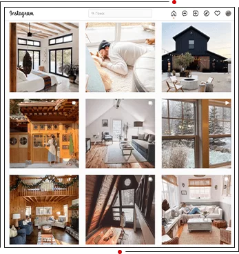
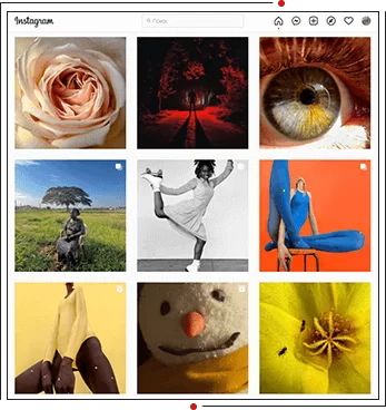
Introduce code elements into the visuals of Instagram posts that are read by brand lovers. Such elements can be branded objects, shapes, colors and font combinations that you have used previously. Thus, the Ukrainian cinema chain Planet Kino often uses a corgi dog in its visuals.
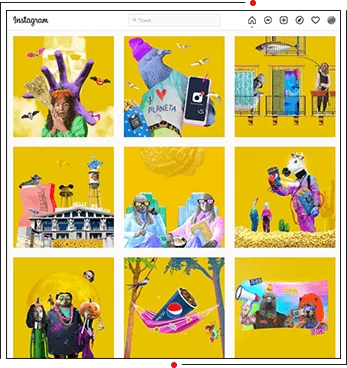
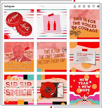
2024 has given emoji a new lease of life in design. They are actively used as objects for the design of advertising materials by popular brands, for example, McDonald's and Pepsi.
Using emojis is a simple and creative way to increase engagement. Good advertising is always associated with emotions. Accordingly, emoticons will help make the visual more vivid and add feelings to it. Bright and unusual ones will be a priority, but standard ones from the keyboard can also be creatively integrated into the content.
Experts from the WeLoveBrands branding agency share how NOT to maintain a profile in 2024:
 “ Checkerboard ” layout - alternating different post designs through one.
 The “ column ” (vertical) layout is an option in which posts of a similar design are lined up in one vertical line.
 Excessive filters or presets - excessive photo processing.
 “ Beige ” profiles - the turning point of 2024 became proof: users are tired of beige profiles and the total black style. According to analytics from the Tagwalk service, compared to 2023, in 2024 users became 91% more likely to share images in the color block style on social networks and 121% more likely to share images in neon shades.
 Hidden advertising - users have long learned to determine when a blogger shows a product they like on their own initiative, and when they are trying to pass off an advertisement as a sincere recommendation. By the way, such advertising undermines the influencer’s reputation and reduces the level of trust of subscribers.
This is only a part of the anti-trends; their list is updated every year. If you want to maintain your profile in accordance with what is relevant, not lose user loyalty and sell effectively, entrust the development of the visual of your Instagram page to employees of specialized companies.
Nowadays people more often view stories rather than feeds, so first of all they need to be made interesting. About 62% of Instagram users said they become interested in a brand or product after seeing it in their Stories. This is due to FOMO (Fear of Missing Out). Stories remain on the profile only for 24 hours, and therefore there is a fear of missing something important.
In their impact on the user, stories are similar to advertising banners with inscriptions like: “The discount ends in 24 hours!”, “This is a limited collection, only 15 units left!” “20% discount on EVERYTHING - offer valid for 12 hours!” Having missed out on what they wanted, the user most often regrets it, and his next action is to subscribe to the brand’s page on social networks, follow news in stories, add a product to “Favorites”, and so on.
We have collected 30 ideas for every day that will help you shoot engaging stories :
plans for the day - a list in the morning and in the evening the same list with marks of what was done;
any checklists;
personal storytelling - the history of career development, mistakes or failures in work;
expert storytelling - “tricks” from your field, behind the scenes of the work process;
quiz - a list of questions in quiz format;
workout of the day;
image of the day;
breakfast of the day - the process of preparation or a photo of a ready-made dish;
photo collage - can be done on Instagram itself;
blur or darken - to create a background for text;
intrigue - “This day has come” with continuation in the next story or “question” sticker: guess where I’m going today/what awaits me;
photo or video about the team;
stories with loved ones and friends - through relationships with other people, personality is revealed better;
selections - books, films, recipes, ideas for stories;
short atmospheric videos;
reviews - for example, of applications or cosmetics;
recommendations - tips on where to go in your city;
stories in the mirror are a good alternative to simple conversational stories;
change angles - combine portrait conversational stories with a video of yourself waist-high or full-length;
sketches - diagrams and small drawings will help convey information more easily than using solid text;
trust - a story about issues that you cannot solve, with a request for advice;
cases - screenshots of correspondence with clients, work results;
life hacks - for life and for Instagram;
games - finding differences in photos;
weather - a beautiful photo of the street, a sticker with an air temperature indicator and a survey “How is it with you?”;
true or false - publication of a fact with a survey;
unpacking - unpacking section;
before unpacking the game “Guess what’s inside”;
timelapse (a function in the phone camera that speeds up the process) - film any process: charging, cleaning, work;
branded section - come up with your own “trick” that you can share regularly. For example, a new habit every month. After 30 days, talk about the results and set a new goal.
Important : the first story is seen by the largest number of people per day, which means it always has the largest reach. You can maintain this coverage for as long as possible or lose the attention of subscribers already on the second story. The main task for the first story is to hold the user’s attention so that he wants to move on and find out the continuation.
Show, don't tell, —
one of the rules of marketing
in social networks
Duplicate content from your profile : fewer and fewer users will scroll the feed, which means your post may be missed. If you are filming a review or conversational stories, add text to the video - according to research, only 29% of users always watch stories with sound.
Secure important information in “ eternal stories ”. If this is a commercial profile, save the price list, customer reviews, discounts, products in stock and specific information (about materials, team, your values, etc.). If the blog is personal, you can pin information about yourself, customer reviews, life hacks and failures that happened at work.
And one more piece of advice: make corporate stories in the same style . This way, the company’s account will become recognizable faster.
Copyright infringement is a punishable practice, including on Instagram. Therefore, it is important to use copyrighted content or images and videos for which you have rights. A common practice is to use stock photos and audio as a safe alternative.
Photo stocks (paid and free) :
FreeStockImages;
Unsplash;
Foodies Feed;
Gratisography;
Pexels;
Albumarium;
StockSnap;
The Pattern Library;
Shutterstock;
Depositphotos;
Getty;
Freeimages;
Visualhunt;
Pixabay;
RawPixel.
Audiostocks :
Freemus;
AudioMicro;
Opsound;
Purple Planet Music;
Envatomarket;
SongFreedom;
Bensound;
AudioJungle. ⠀
When companies or bloggers don’t have time to invest in content, audio and photo stocks will be a good practice.
You have decided to start creating a visual for your Instagram profile. One of the main questions is what color the page will be in. Let's imagine that you like blue, but will your target audience like it? Will the profile convey the desired message?
We paint the bedroom walls in light shades and choose the color of the children's clothes depending on their gender. We are convinced that green calms and red excites. Colors affect people differently, so it's important to consider shades when launching a brand and designing communication channels. The purchase largely depends on the colors; they also form associations with the brand among consumers. For example, Harley Davidson, with the help of black, managed to convince the target audience that it was a cool and tough company. And Burger King's signature colors are red and orange because they stimulate appetite.
"When I haven't any blue, I use red" —
Pablo Picasso, Spanish painter,
according to a 2009 survey by The Times -
the most famous artist of the 20th century
How a certain color affects people's perception :
 All shades of white and beige . Associated with purity, simplicity and naturalness. If you plan to broadcast an image of modernity in your feed, feel free to choose them.
 Shades of blue . Induces feelings of calm and stability. Conveys reliability, success and trust. Blue and dark blue are the colors of the flags of the European Union, UNESCO and political structures, as well as IT and other technology companies, including Intel, Facebook, PayPal.
 Shades of green . Associated with nature, youth, money and environmental friendliness. Green is a symbol of medicine, pharmaceuticals and banks: most pharmacies are designed in its shades, and Privatbank, Oschadbank and OTP use it in logos and advertising. Most eco-friendly brands also actively use the color green. The ribbon, decorated in shades of green, evokes a feeling of harmony, freshness and development.
 Shades of orange . Positively position the audience, and turn customer indecisiveness into action. The combination of red and orange can stimulate appetite, which is why these shades are signature shades at Burger King. Previously, McDonald's also used their combination in its logo.
 Shades of red . Associated with fire, blood, power and passion, they have a stimulating effect. Major brands often use shades of red to create a festive mood. This is what Coca-Cola does, for example. The color red is often used to emphasize a discount in advertising.
Do you have any doubts about what color to choose when ordering a visual for your Instagram account? Perhaps you have many favorite colors, but you don’t know how to combine them correctly? Order a free consultation from WeLoveBrands specialists!
If you want to sell effectively on the Internet, but don’t have time to figure out how to make a visual for Instagram, order a turnkey content service from a specialized company.
For those who already have a profile on a social network, we have prepared a mini-test.
Look at your account and answer these questions :
Do you like the last 10-15 posts?
Do you want to scroll down the feed?
Are the stories you publish engaging? Do you want to continue watching them?
Are there photos on your profile that motivate you to read the post?
Would you follow this account?
If you answered no to at least one of the questions, send a link to your account to colleagues and regular clients asking them to answer the same questions. Get feedback. And then you have two options: try to fix what is currently ineffective on your own, or entrust the generation of content to the specialists of the WeLoveBrands agency.
A high-quality, selling visual sets a company apart from its competitors. Create a unique voice, signature style and visual concept on Instagram that is “unlike everyone else”. Contact us - uniqueness sells!
This is a general profile style that creates a certain impression on visitors. Consists of photographs, graphics, illustrations, videos and other elements.
Used to create a brand identity, reflect its values, and also for effective communication with the audience.
In various social networks such as Instagram, Facebook, Twitter, Pinterest, visual content is a key element that helps brands and users stand out from the crowd.
A visual is not just a beautifully designed feed, but a kind of business card that succinctly tells about who is behind it and how it can be useful.
How a visual on Instagram will work to develop your brand:
There are different types of visuals you can use on Instagram:
In addition, you can publish different photo formats: square, horizontal or vertical. You can also add filters and effects to process photos and videos.
If you come across a boring and uninteresting page on a social network, even if it is filled with important information, you don’t want to subscribe to it, much less buy from it.
Preferences in colors are a matter of taste. But it’s useful to know how colors are associated with certain moods.
For example:
Color is important for conveying information and emotions, which is why it really influences consumers. According to statistics, 80% of people believe that color contributes to better brand recognition.
To design your visual on Instagram, choose your brand colors. Calm and minimalistic color schemes are also popular in the trend.
The number of colors depends on your style, brand and goals. It is generally recommended to use no more than three to five primary colors to create a unified and consistent visual image. The use of many colors leads to overload, such content is difficult to perceive.
Primary colors usually include:
Focus on creating a cohesive and memorable style that is unique to your brand or social media profile.
Don’t know how to work with a color palette yourself? Try Coolors.co. He will analyze and offer a palette of 5 colors that suit your profile
Better yet , contact our graphic designers and SMM specialists.
Profile packaging works for brand identity, recognition and attracting new visitors. It is important to strive for a consistent style and overall harmony between all elements of the account.
Account design includes the development of a profile photo, design of posts, covers for stories and highlighted stories (Highlights). The cost of this service starts from 12 USD for one post and from 10 USD for a story, and creating an avatar will cost from 2,5 USD.
|
Service list |
Price |
|
Visual design (feed + actual) |
from 20 USD |
|
Instagram Eternal Feed Design |
from 20 USD |
|
Instagram account audit, consultations |
from 15 USD |
|
Drawing up a content plan for posts (with visuals) |
from 25 USD |
The price for visual content can be presented either for a single work or in the form of packages or monthly services.