Receive a presentation of services and expert advice
The best people in the industry oversee your brand development process
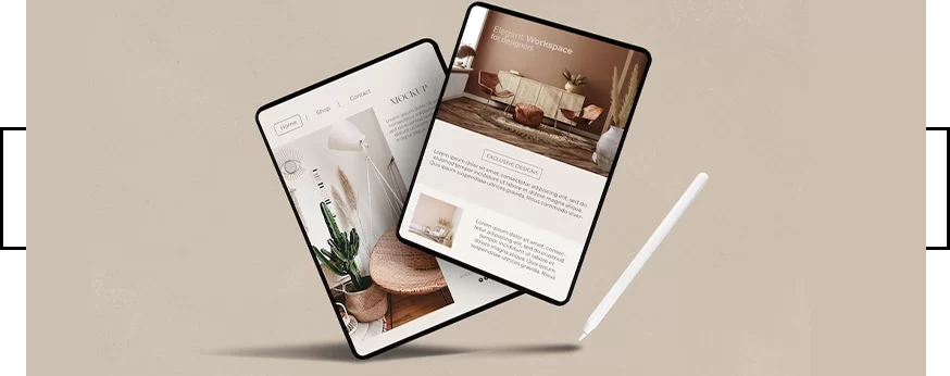
Best branding agency and graphic design studio – WeLoveBrands❤️
 WeLoveBrands.pptx

The best people in the industry oversee your brand development process
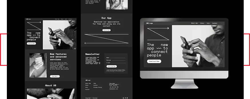
A presentation is visual information about your company, brand, products and services. And in order for it to reach your target audience and force them to take the action you need, the text must be presented competently and profitably. A modern and non-standard presentation design will help enhance the overall impression.
Why is this happening? It all depends on perception, which in turn is influenced by the ease of use of the resource and its appearance. That is, website web design is important. With its help, it is possible to create the desired image and encourage users to linger on the pages.
Professionally executed design allows you to convey a special mood and emphasize the uniqueness of the company. This is an effective tool for building communication with the audience, which helps improve your image, expand your customer base and increase income. In addition to aesthetics, website design affects usability - its functionality, accessibility and comfort for the user.
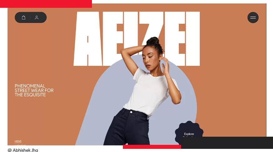
Appearance forms the first impression. This truth applies to both people and web resources. Whether it is the website of a large company or an entertainment portal, first of all you need to develop a corporate style that is needed for promotion and advertising. Its role is to reflect the business concept and increase awareness. When a person lands on the page, they should immediately understand what company they are talking about.
In addition, a competent structure, convenient menu, navigation, high-quality photos and content are important. All this will help create a modern and effective design that revitalizes user activity.
 Convenience . The time the user spends on the site and the depth of page viewing depends on how intuitive the navigation is and how logically the structure is built. It is necessary to place all important blocks in the visitor’s field of view, create clear transitions and noticeable buttons with a call to action.
 Aesthetics . The first thing the user pays attention to is the attractiveness and relevance of the site, that is, how well the design corresponds to modern trends and the specifics of the company’s activities. A beautiful and stylish website makes you want to stay and study the information in detail.
 Simplicity . This means that the resource must be understandable for users, so that they can easily find what they need and understand what and how they need to do. In addition, conciseness is important. The absence of excessive graphics makes it easier to understand, while the clutter of different details can be irritating.
 Functionality . Modern design requires adaptive layout and complex functionality, which consists of integrating the site with 1C, delivery services, payment systems, user services, etc.
 Uniqueness . The design should not copy other resources, and the content should be of high quality, that is, useful, relevant and your own, and not borrowed from competitors.
 Uninterrupted operation . An effective website is one that is always available to users and does not generate errors when performing any action.
 SEO . Internal and external optimization of a web resource will allow search engines to see, recognize it and bring it to the top of the results, which will increase traffic.
An Internet resource that meets the basic criteria will become effective. After all, then it will be convenient, accessible and interesting for the audience, as well as understandable for search engines and different from competitors’ sites.
Website design is a matter of taste. However, do not forget that the preferences of the target audience may differ from both your requirements and the designer’s vision. This applies to everything – the color scheme, images, the location of information blocks, and navigation in general. The statistics are merciless: only 5% of visitors will further study the information on a resource if they don’t like the design. The rest will not give him a chance and will close the page after a few seconds of scrolling. Therefore, it is important to make it not just beautiful, but attractive to the target audience.
Beautiful website designs 2024 are, first of all, comfortable and harmonious, without cluttering elements and eye-catching shades.
What then are ugly?
If your resource does not have elements that catch the guest’s attention, he will need additional time and effort to find the starting point for interaction. A similar effect is caused by a chaotic arrangement of elements, especially if the purpose of some of them is unclear. Such a site will be irritating and users will obviously not find it beautiful.
Pay attention to the GIF animations. An excess of them, on the one hand, looks tasteless, and on the other hand, it interferes with the user’s concentration. This will also be a disadvantage for you. But don’t go to the other extreme, abandoning the visual accompaniment of the text altogether, because this also harms the perception of information.
Users and search engines alike do not like sites that have been “frozen” in the last century and have not been updated since then. They certainly won't promote business or attract consumers, but they will make a great exhibit in a museum of web design history.
As for the color scheme, there are also nuances that affect beauty. Avoid shades that are depressing and irritating to the eyes. Depressive colors include purple, green, blue, as well as black and gray. And neon or bright colors in abundance on the page can cause rejection and a desire to leave the site as soon as possible. At the same time, neutral, dark and catchy shades can be used to create accents and play on contrast, effectively highlighting individual elements or blocks.
 missing or complex navigation, which consists of a problematic search for the return exit;
 unreadable content due to poorly chosen style and font size;
 an abundance of multi-colored blocks on a neutral background;
 excessive creativity that will confuse the visitor, for example, the absence of words on the main page;
 classified information about the owner of the site and his contacts, which can only be found after completing the quest;
 menu in the form of photographs;
 a logo that is misleading about the type of activity of the company, because a visitor is unlikely to appreciate your creative approach if, for example, he is looking for seeds and seedlings, but sees a sign in the form of a fiery drop with a car wheel inside.
Such mistakes can turn off users, so take this into account when developing your design. To get a truly attractive design, follow the trends, use those styles and ideas that suit your type of activity, adhere to the principle “less is better than too much” and, of course, build on the characteristics of the target audience, their needs and desires.
7 out of 10 websites need a redesign every three years. Large and successful companies update their web resources constantly. For what? To improve functionality, simplify navigation, improve appearance.
How can you determine when it’s time to redesign and not miss the first signs of “aging”? Take a careful look at your website and evaluate its capabilities based on the main criteria.
 The site is about or more than three years old . Even if its structure follows modern UX trends, most users start to catch on to the outdated design. This often manifests itself in pages overloaded with details, distracting backgrounds, unreadable fonts, etc. That is, it is important to notice and remove elements that distract and irritate.
 Replenishment of the assortment . If you have new products, services or business directions, you need a redesign to loudly announce them. Sections should be added and menus changed. This way you will help your visitors find what they are looking for, increase LTV, average check and loyalty to the business.
 Rebranding . If the positioning and corporate identity of the company changes, the website must be designed in accordance with the new rules.
 Declining sales and increasing the number of failures . If the conversion on the site has dropped, it means that people are less interested in your product. To attract consumers, a redesign and a new advertising campaign will be needed.
 Competitors are ahead . You conducted a competitor analysis and it turned out that your site is losing in terms of indicators or new effective features. Then, to strengthen positions and highlight advantages, you need to redesign using trends
 Adaptability . If your website still does not have a mobile version, you are losing customers, because many now surf the Internet from phones or tablets.
At the same time, updating the visual component of the site is not always the solution. There are such conditions of the site when more serious changes are needed. For example, the resource is more than 5 years old. It is already morally obsolete. Problems arose in interaction with customers - slow loading, complex navigation, inconsistencies with visitors' expectations. Here we need a new website prototype, built according to modern UX development requirements. Another case: when the site is initially devoid of usability, advertising and SEO do not work. What to do? Seek help from a UX specialist.
The best website designs 2024 combine aesthetics and usability.
Since some consumers pay attention first to usability and navigation, and then to design, it is important to make the web resource comfortable for them in every sense.
The designer, using visual means, presents information in such a way as to attract the visitor to the page and make him a regular user. If this task is completed successfully, the site becomes popular. At the same time, not every popular resource is fashionable.
 Firstly , the site design was created taking into account fashion trends. Today one of these trends is minimalism. Therefore, many government organizations, educational institutions, municipal services and other companies with outdated design order a redesign to make their web resource more modern and attractive.
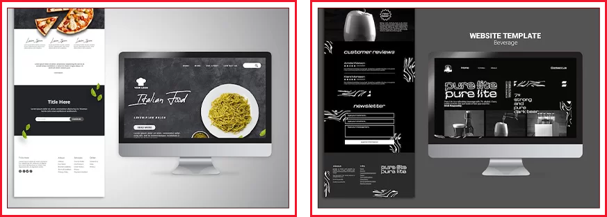
 Secondly , the fashion site contains only high-quality, professional, unique photos. Here, users will not see banal images or stock photos.
 Thirdly , fashion sites are convenient, have an intuitive interface, logical structure and simple navigation. After all, forcing a visitor to strain to find the right product is bad form.
 Fourthly , fashion resources contain useful information for the user, which is positively perceived by search engines. At the same time, content oversaturated with keywords and clumsy falls under filters and does not arouse interest among visitors.
 Fifthly , the fashionable website is designed in accordance with the corporate style. Here all the elements are thought out and carefully selected. Each of them performs its own function, and does not loom on the page just for beauty.
Fashionable website design 2024 meets certain requirements. It not only corresponds to trends and looks impressive, but also contains various current features (for example, background video, drawn elements, non-standard menu, sense of presence, 3D, interactive, etc.). All this attracts users, arouses interest in the product, increases loyalty and trust.
Website style is an important component of design. It can be traced in all elements and blocks of the resource, provides a holistic perception of the web page, forms an impression of the company, and creates a certain mood.
Minimalism . Its essence lies in the absence of unnecessary elements (animation, backgrounds and textures), a wide color palette, extensive information content and the presence of additional functions. White, gray, black interspersed with another more contrasting shade are acceptable. They can highlight a menu or navigation bar. In minimalism, free space is used as a tool to emphasize the significance of any design element. The menu should be concise - no more than 3-5 sections. The best example of a site in this style is the Google start page.
Expressive typography . Involves the use of non-standard and hand-drawn fonts in headlines and slogans. The emphasis is not on graphic design, but on text design. It is permissible to use a varied color palette, but animation should be kept to a minimum or, in extreme cases, it should be made as invisible as possible.
Responsive . This is an adaptive style that allows the site to be organically displayed both on the screen of a desktop computer and on the screens of other gadgets, because the development of the resource begins with the mobile version. Such a site is created in three ways: “fluid” - compressing blocks to the size of a particular screen, switching layouts, and “panel” with horizontal scrolling. Of the shades, both contrasting and monochrome options are acceptable, and the images used are flexible for different screen resolutions. A responsive website is suitable for companies that want to expand their target audience.
Classic style . Features of classic sites: they have a clear column structure, the menu is located at the top or on the left, the pages are designed in soft and restrained colors, the fonts are the most readable. The advantage of classics is its versatility. It is in this style that the websites of companies that want to show their seriousness, solidity and status are designed.
Art Deco . The opposite of minimalism, it is distinguished by its boldness and brightness in colors, fonts, and graphic patterns. On a page designed in this style, you can find smooth, rounded and sharp, straight lines, ethnic and geometric patterns, ornaments, and floral details. For text, 5 main fonts are used: ITC Anna, AZ Highway, Circus Didot, Kuenstker 165 and Metropol. The palette is based on a play of contrasts. Animation in all forms is welcome. Art Deco is suitable for people of creative professions, especially if their work is related to this style.
Retro . It is characterized by simple geometric shapes - ovals or circles, various ribbons with elements of aging and wear, as well as decorative and elongated fonts with the addition of shadows and various contours. Images – posters or in the form of engravings. This style is chosen by those companies that would like to add a slight touch of antiquity to their design, as well as cafes, restaurants, and hotels whose interiors are made in retro style.
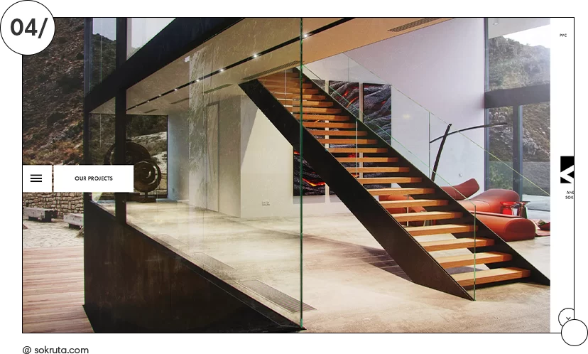
Apple style . The composition of the site page is presented in the form of a modular grid with a strict hierarchy. This uses one large image - a logo, main product or other element - and leaves white space between the blocks. Schematic drawings are used for buttons, and the menu can be anything. Popular colors are white, gray, black. Particular attention is paid to the quality of the photograph - as a central element on a plain background. Adobe Myriad is used for headings and Lucida Grande for other text. Apple style is the optimal solution for online stores.
Flat or flat style . Both a two- or three-column structure, as well as various modular grids with information blocks, are allowed. At the same time, voluminous and animated buttons are taboo. Flat style uses bright (red, orange, yellow, etc.) and retro colors (for example, beige, salmon or olive) without gradients. Although the graphics do not have depth or 3D effects, they allow you to harmoniously place accents.
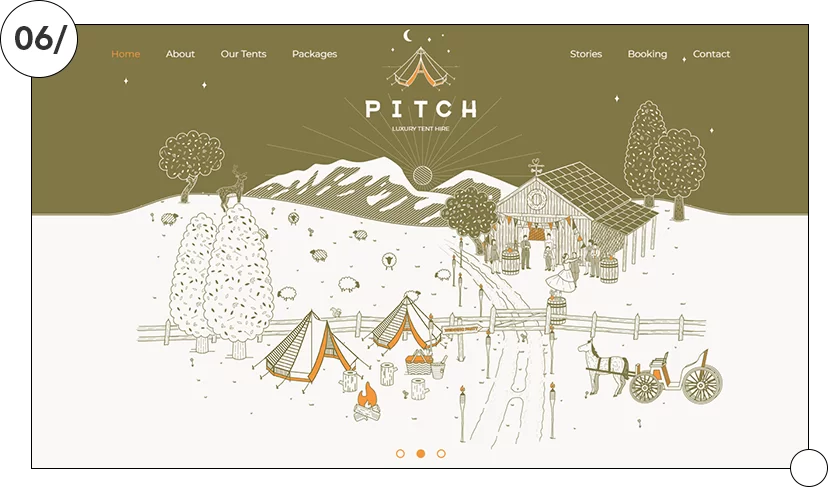
Hand drawn style . We are talking about design, which is based on sketches or drawings. This approach makes the design interesting, lively, and emotional. Hand-drawn elements allow you to highlight important things, increase brand awareness and audience trust, and make content more friendly. Suitable for online stores, blogs, landing pages, websites of creative individuals, children's development centers.
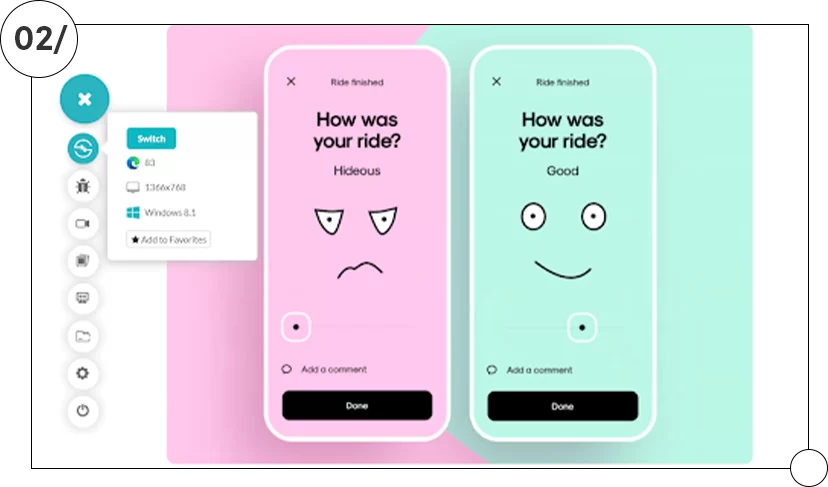
Organic & Natural . When choosing this style, natural textures (grass, earth, wood), plant patterns, landscape images, natural shades (brown, green, etc.) are used. Suitable for sites where the visual component is more important than the content, for example in the tourism or restaurant business, as well as for natural cosmetics stores, medical centers, social projects, residential complexes, including suburban ones.
When choosing a style, you should take into account the topic of the business and the characteristics of the target audience. Then you can create a harmonious web design that matches the type of activity and meets the needs of users. And to enhance the effect, you can combine elements of two styles that are compatible (for example, minimalism and typography, hand-drawn and Organic & Natural).
To create an effective, up-to-date website design, a specialist must understand digital technologies, have artistic taste, and follow design trends. Using various tools and fashionable features will help strengthen your web resource and make it more attractive to the audience, which in turn will contribute to business development.
New minimalism . Laconic design is always in fashion, but this year it is a little different. Soft, restrained shades are still popular, only instead of the usual black, white and gray, colored paints are now more often used. Various features are added to the site to arouse interest among consumers, but at the same time they do not distract from what is important.
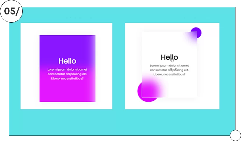
Symmetrical layout . Thanks to the balance between text and image, a harmonious design is obtained that allows you to control the visual movement of the visitor on the page.
Anti-design . Nowadays it is fashionable to break the rules, to go beyond aesthetic norms. For this purpose, asymmetry, large objects, and combinations of controversial colors are used. But so that the design does not seem primitive or “wild”, all elements must be selected carefully, and not overdo it with their quantity. You can soften the picture by diluting it with minimalistic details.
Natural shades + neon . The combination of calm basic shades, reflecting harmony, comfort and reliability, and bright neon details allows you to place accents, refresh the design, and attract attention.
Photos of ordinary people . Modern sites refuse photographs of models, images of ideal faces and figures. Now, more and more often, companies are using photographs that depict ordinary people with wrinkles and other “imperfections.” This brings the site to life and makes it more human because users can identify with these people.
3D images . They're back in a more subtle form to spice up otherwise understated website designs.
Kinetic typography . You can animate a logo, slogan or other text that you want to draw attention to. Just use this technique precisely, and select fonts that are readable and contrasting.
Blur effect . Such elements add dynamism and create a sense of surprise.
Unusual reader interactions with the interface . Hide and seek games, visual storytelling and other interactive activities keep users from getting bored, which has a positive effect on conversion.
You can also use video content, since people are more willing to watch videos than read long texts, decorative fonts with dancing letters for eye-catching headlines, and other trends. There are a lot of them, but not all of them are suitable for a particular business in terms of mood and character. Therefore, choose those trends that will help distinguish your company from competitors, strengthen your image and reveal your individuality. Or get inspired by popular trends and develop your own unique style.
How to create a website that will be remembered by users? Implement special features and effects in the interface.
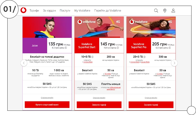
The mobile operator's website offers different tariffs. The visitor selects an option from those presented on the page. There is only a nuance: one of the tariffs stands out from the rest . When a person chooses it, he thinks that he has made an independent decision.
The “Comparison” technique clearly shows why the product on your website is better. Not with words, but with images.
Product visualization in real life is a great effect for online stores of clothing, cosmetics or furniture. A fitting room function with your photo or an application that shows how new furniture will look in your apartment will help the buyer make a decision.
Experiments with menu layout will be appreciated by young customers and fans of modern trends. The main thing is that it is displayed equally on all gadgets.
The Hover effect appears when you hover your mouse over the image. It can increase, become colored, or disappear. This game is addictive and improves behavioral indicators on your web resource.
A crafted illustration on the website will look better than “polished” photographs. Author's drawings that reflect the mission and main idea of the company arouse interest due to their unusual nature.
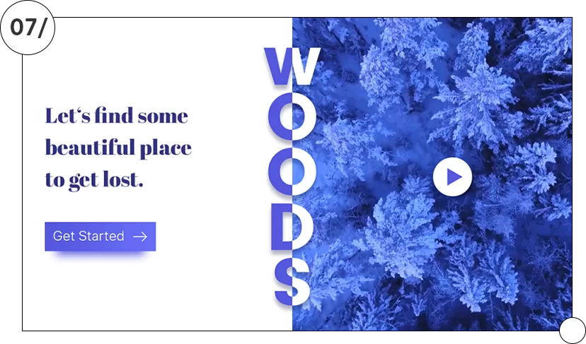
Split layouts are a popular feature when the screen is divided into two parts. Each of them, with the help of contrast, animation, 3D effect, typography, attracts the visitor’s attention, shows twice as much information, and encourages comparison.
Parallax effect - images in the background move slower than images in the foreground. This makes the composition more voluminous and deep, which attracts the visitor.
Virtual reality gives the consumer the opportunity to evaluate the car he is about to buy, or explore the rooms of the house he is planning to buy, or create the effect of presence in the resort cities of the world using virtual tours, maps, broadcasts, 3D travel, test drives, online panoramas
Optical illusions are a win-win option for a site that needs to attract attention. Basic tools: changing shape and space, clever contrasts, the ability to see what is hidden at first glance, giving elements a double meaning.
Cool website designs 2024 are sure to contain various features and catchy details. But design techniques cannot be copied thoughtlessly. You need to implement not all at once, but one at a time, and see how the audience reacts, and also choose those that suit your business. To bring your idea to life efficiently, you should hire a professional web designer.
Pay attention to website designs that are popular among users. Their main features are that they are laconic, attractively designed and comfortable. The emphasis is on the benefits that the resource can bring to visitors.
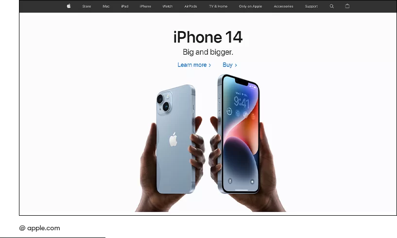
Apple
The site attracts attention with a minimal amount of text on the first page, empty white space and bright details. The menu for searching for the necessary gadget is laconic, so the buyer will need no more than 2 minutes to obtain all the information on the device he is interested in. After each description there is a call to action. High-quality product photographs especially attract attention. No unnecessary details - a feature of the stylish Apple website.

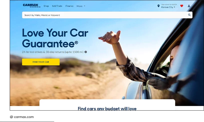
Carmax
On the homepage, the first thing that grabs your attention is the call to action, highlighted in yellow on a muted background. The second thing that comes into view is the company’s slogan, written in large white letters and explaining the essence of the site. The third emphasis is placed on the search bar for the required vehicle with the connection of filters. Nothing else is needed to work on such a resource. As a bonus, the first page contains research on the most popular car brands.
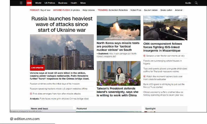
CNN
The news site gained popularity due to its visually convenient sorting of news that does not merge into one illegible canvas. White color is selected as the main background. It makes black text and bright event photos stand out clearly. Also, a white background is used as a delimiter. Not the least role in the popularity of CNN is played by the constant updating of news and the advantage in the number of servers on the globe.
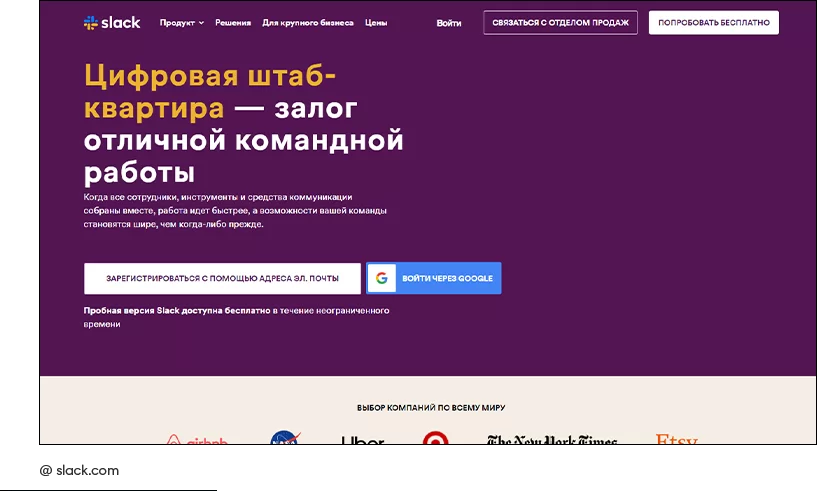
Slack
The collaboration messenger website clearly defines its essence with a slogan on the main page. Next is the registration field. The main task of the resource is to download the application. Its design copes with this task perfectly. On the pages you will not find unnecessary information or descriptions of how the application works, which will prevent you from staying on the site for a long time, but will encourage you to take action.
Booking.com
The housing search service has a convenient booking line with filters. You can specify all the conditions, including the availability of a hairdryer. Photos of houses, apartments, apartments, hotels, hostels and information about them are placed in tiles on a white background. Simple navigation on the site and strict rules for those who place advertisements for housing rentals make the resource a popular platform for travelers.
It is noteworthy that all of the listed sites have common design elements, but each resource uses them differently. Therefore, when creating your own web project, avoid mindlessly copying design features and borrowing ideas from others. This is the only way you can differentiate yourself from competitors, be remembered by your target audience, and your company will make a profit.
If you need a modern web design for a website, online store or portal, contact the specialists of our studio. WeLoveBrands designers are ready to share ideas on how to improve your website, or develop a cool design for a web resource from scratch. To get advice and clarify the details of cooperation, call us by phone or write in instant messengers.


