Receive a presentation of services and expert advice
The best people in the industry oversee your brand development process
Best branding agency and graphic design studio – WeLoveBrands❤️
 WeLoveBrands.pptx

The best people in the industry oversee your brand development process
Color is the first thing the human eye notices. And only after that he analyzes the shape of the object, its properties and qualities. Research shows that between 60% and 80% of people make purchasing decisions based on the color of a product or its packaging. Therefore, it is color that can either create a product or completely destroy it.
We decided to devote this article entirely to the color yellow. Here you will find out which business is suitable for a yellow logo, and which one is absolutely contraindicated. We also tell you all about the psychology of the color yellow, its energy and how people perceive it on a subconscious level.
 The color yellow creates a feeling of warmth, fun and joy. On a subconscious level, most people associate it with something pleasant and positive. Since yellow activates the right hemisphere of the brain, it can safely be called the color of creative people.
It has a strong stimulating effect on a person, prompting him to action. But, unlike red (which has a similar effect), yellow stimulates the psyche much more gently due to the feelings of carefree happiness and carefree joy that it carries. Unlike red, the yellow palette does not have sexual or aggressive connotations, which also softens its impact.
If you want to evoke a good mood and positive emotions while encouraging people to take action, yellow is the perfect color for your logo.
Yellow color can change human behavior. Moreover, both for the better and for the worse.
Positive effect on the psyche: increases concentration, improves memory, forces a person to collect his thoughts, organizes, and also helps to make decisions faster. Being an active and energetic color by nature, yellow encourages openness and sociability.
Important detail: yellow color changes the visual perception of an object. Surfaces or objects of this color are perceived as lighter and warmer. Therefore, even the largest objects in yellow will seem weightless to a person, and cold ones will seem much warmer.
Negative effects on the psyche: the abundance of yellow color is too tiring for the psyche. Prolonged exposure to a yellow-colored room can cause nausea and headaches in the most susceptible people. Oversaturation with it can provoke aggression, neurosis, anxiety and restlessness.
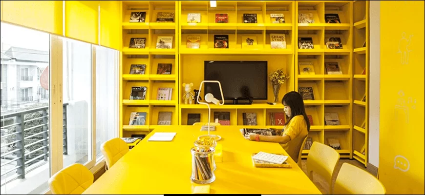
And if a small yellow logo cannot oversaturate a person’s psyche, then a yellow interior has every chance for this. Therefore, you need to consciously approach the design of the office interior in yellow tones. If this is your corporate color, then you don’t need to make it dominate the space. It will be enough to place bright accents. Let's take a closer look at the meaning of yellow in an office interior.
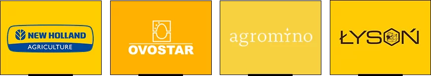
All shades of yellow belong to the element of Earth. And the main properties of the Earth are care, preservation, conservation and protection. Therefore, all types of activities related in one way or another to supporting people or other businesses belong to this element. This includes insurance companies, marketing firms, social services, hospitality, real estate, and companies that develop software-based intellectual products.
When choosing the energetically correct color for a business, it is important to start from the material that dominates the company’s activities. For example, if a company works on the earth or uses its products, then it belongs to the earth element and all shades of yellow and brown suit it.
This is agriculture, construction or warehouse business, sale of building materials, stone processing, mining, processing plants and enterprises, etc.
Why is it so important to consider the color belonging to certain areas of business? Because if you DO NOT take it into account, you can cause severe cognitive dissonance in people. They most likely will not find the cause of the discomfort. But they will definitely feel that “something is clearly wrong here.” Rest assured. And if a person feels there is a catch, then what kind of trust in the company can we talk about?
Now let's look at this from a different perspective. When you use the color of the element of your business - in the interior and identity - then a person immediately understands what he is dealing with. He doesn't even have to read the signs when entering the office. He already intuitively understands what the company does and what interaction with it can lead to. Given the fierce competition in the market, this fact is important to understand and take into account. Indeed, often, among similar companies/products/services, the client randomly chooses the one whose logo and corporate style he liked.
The perception of the color yellow varies across cultures. Therefore, when developing a yellow logo and identity design for a foreign company, you need to be extremely careful and pay attention to the traditions and culture of another country. See how different attitudes towards the color yellow are around the world:
As you can see, in some countries the perception of yellow logos is radically different. Therefore, when you are developing a logo for an Egyptian or Latin American company (or a product with your logo will be exported to these countries), it is better not to use yellow. Unless you're a funeral home, of course.
Although the color yellow is perceived by many as positive, cheerful and sunny, it can sometimes acquire a negative connotation. Let's look at its pros and cons for business.
Positive Perceptions in Business: Cheerful, happy, playful, upbeat, optimistic, inspiring, confident, creative, clear minded, helps in decision making, original, stimulating, academic, analytical, wise, smart, logical and consistent.
Negative Perceptions in Business: Critical, judgmental, overly analytical, impatient, impulsive, selfish, pessimistic, angry, cowardly, deceitful, unemotional, ruthless, unworthy, substandard.
Why list all these negative qualities? To clarify the situation: not every shade of yellow is perceived positively, and too much of it can cause psychological rejection among consumers.
Still doubt that shades of yellow can evoke a radically different emotional response in the audience? Then let's look at an example.
| Light yellow is a rather delicate and muted color. Therefore, it is better to use it as a background in a logo. Conveys a feeling of clarity, attracts attention and is well remembered. | ||
| Citrine yellow has an irritating effect on the psyche of the beholder, therefore it is often perceived negatively. Creates a feeling of frivolous and superficial attitude, as well as deceit, insincerity and instability. | ||
| Golden yellow is generally perceived positively. Associated with curiosity and sensitivity. But it can have a negative connotation with feelings of loneliness. | ||
| Cream is a neutral color that has the most ambiguous connotations. May be perceived as reassuring and needy at the same time. Often creates a feeling of insecurity. | ||
| Dark yellow – it is better not to use this color in a logo, as most people perceive it extremely negatively. Creates a feeling of cynicism, melancholy and depression. | ||
| Bright yellow is dynamic, flashy and lively. This is exactly how this shade of yellow is perceived. Creates a feeling of fun, energy and speed. | ||
| Lemon is a cheerful and positive shade. It does not put pressure on the psyche, so it is easily perceived. Conveys a feeling of self-confidence and also gives the emotion of hypersensitivity. |
And these are only seven shades of yellow. The rest are also perceived differently. In order not to be mistaken in choosing the ideal shade, entrust the design of the yellow logo to the professionals of the WeLoveBrands studio.
In terms of frequency of use in company logos, yellow takes an honorable fourth place after blue, black and red. If it is ideal for some areas of business, then in others it seems completely inappropriate. Let's take a closer look at who yellow logos are suitable for.
Yellow color has pronounced dynamism and powerful energy. Therefore, its use on the logos of energy companies seems to convey: “With our fuel, your car will go even faster.” In addition, yellow color attracts the attention of drivers from afar and attracts with its friendliness.

The global giants of fast food chains chose this particular logo color (or partially used it) in order to clearly reflect their main quality - the speed of cooking. An additional advantage of yellow logos for fast food and eating establishments is that it attracts attention, looks welcoming and increases the feeling of hunger. Moreover, in many countries (especially the Americas) the color yellow has particularly strong associations with food, as it is the color of corn, maize and other grains. If you want people to salivate just by looking at your logo, yellow is definitely your color.
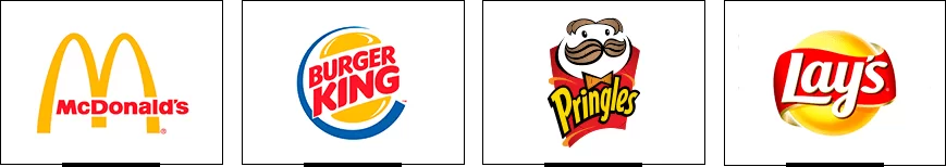
The color yellow is associated not only with vitality and positivity, but also with critical thinking and the ability to think logically. This is why it is so well suited for logistics companies. And the feeling of openness, friendliness and desire to communicate makes it a suitable color for the media and companies whose activities are related to communication.

The main characteristics of the color yellow are precisely all those qualities that we associate with children. These are entertainment, fun, joy, laughter, fun, cheerfulness, unstoppable energy and carefree happiness. That's why yellow is so often used in logos for children's products and in the entertainment industry. If you are doing business in this area and want the company to evoke cheerful, positive and “tasty” associations, choose yellow.
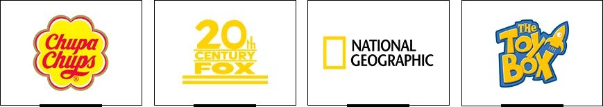
It is unlikely that any color can be more associated with the sun, summer and ripe harvest than yellow. That is why it is so often used in the design of logos for agricultural companies. Moreover, yellow gives a feeling of kindness, caring, warmth and generosity. And these are the main characteristics of agriculture, farming and everything related to agriculture and the people who work in this area.
Yellow color is rarely used in the automotive industry, so logos of this color are especially noticeable and stand out from the rest with their brightness. By the way, yellow attracts a person’s attention much faster than any other color. Just remember the logos of such giants as Ferrari, Chevrolet and Caterpillar. In addition, yellow is associated with speed and innovation, qualities that are welcomed in the automotive industry.

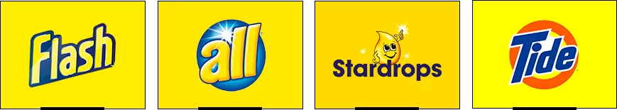
Many manufacturers of household goods choose yellow logos to attract the attention of customers and, on a subconscious level, motivate them to a certain action - buying a product. At the same time, such a logo hints that any household chores can be done easily and simply using the products of this brand. Even boring cleaning (for example) can be turned into a joyful, fun activity. Yellow logos for household goods promise to help turn boring everyday life into a holiday. And this message works.
As you have already seen, there are many areas of business for which a yellow logo is ideal. Now let's look at those areas where its use is undesirable.
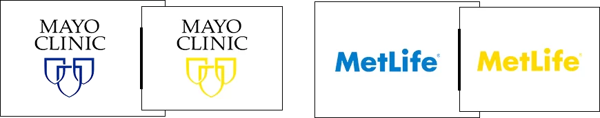
The appropriateness of using yellow in the logos of clinics, medical centers and pharmacies is questionable. After all, fun, happiness and joy are not at all the emotions that sick people feel. And they come to such establishments not for entertainment and a festive atmosphere, but for the professionalism of doctors. Of course, there is no need to thicken the paint either. But you must admit that in this context, shades of blue or even green seem much more appropriate than yellow. See how clinic logos would look in yellow:
Airline logos made in yellow monochrome will not convey the emotions and sensations that the target audience needs. When going on a flight, people want to feel the professionalism of the pilots, the reliability and safety of the aircraft itself. The blue palette is responsible for these emotions. And feelings of fun and carelessness are completely inappropriate here. If you can’t do without yellow, then use it as an additional color for accents. See how famous airline logos would look in yellow monochrome:

Yellow monochrome logos are not commonly used in the IT field. Obviously, the emotions of amusement, carelessness and impulsiveness seem inappropriate in this area. On the other hand, if used as punctuation, it can convey feelings of optimism, logical thinking and creativity. See what the yellow logos of famous IT companies would look like in monochrome yellow:
Of course, we do not insist on a complete rejection of the use of yellow in the logos of such companies. But we urge you to use it in doses, only emphasizing the details.
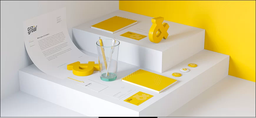
Do you want the perfect logo for your company in yellow? Order a logo design from professional designers from the WeLoveBrands studio.

Do you want yellow in your logo, but monochrome seems too boring? This means you need to dilute it with an additional color. We have selected three color combinations with yellow that seem ideal to us.
 |
Yellow and purple | |
| This is a classic combination that never loses its relevance. This combination evokes a feeling of warmth, creativity and ambition. By the way, it is this color combination that is present in the Hallmark logo. | ||
 |
Yellow and green | |
| Two natural shades that complement each other so wonderfully. Green balances the powerful energy and impulsiveness of yellow, and yellow in turn gives green warmth and optimism. An excellent example of such a combination is the logo of BP (British Petroleum), John Deer and SubWay. | ||
 |
Yellow and black | |
| Depending on the chosen shade of yellow, this combination can be perceived as dynamic and sophisticated or aggressive and depressive. Therefore, be careful in choosing your palette. But in any case, such a contrast attracts attention, because it is simply impossible not to notice it. The logos of Nikon, Ferrari and Raiffeisen Bank are excellent examples of the combination of yellow and black colors. | ||
Different shades of yellow periodically replace each other in fashion trends. Today, the most popular shades in yellow logo design are:
Canary is a soft, delicate and slightly muted shade of yellow that can be used as a background.
Laser Lemon is an energetic and dynamic shade that creates a fun and joyful atmosphere.
Supernova is a rich, complex shade that is perfect for both the background and the logo itself. It looks very juicy, bright and stylish.
Mikado Yellow is a shade with a calmer energy than the previous one, but no less rich, interesting, “tasty” and stylish.

In fact, a stylish logo can be made in any shade of yellow. It's all about creativity, courage and a unique vision. Our designers have more than enough such abilities - along with professionalism and a sense of style. Want a really cool logo? We think now you know where to order it.


