WHAT DID WE DO?
For a massage parlor, it was necessary to create a minimalist logo that would reflect the effect of the procedure.
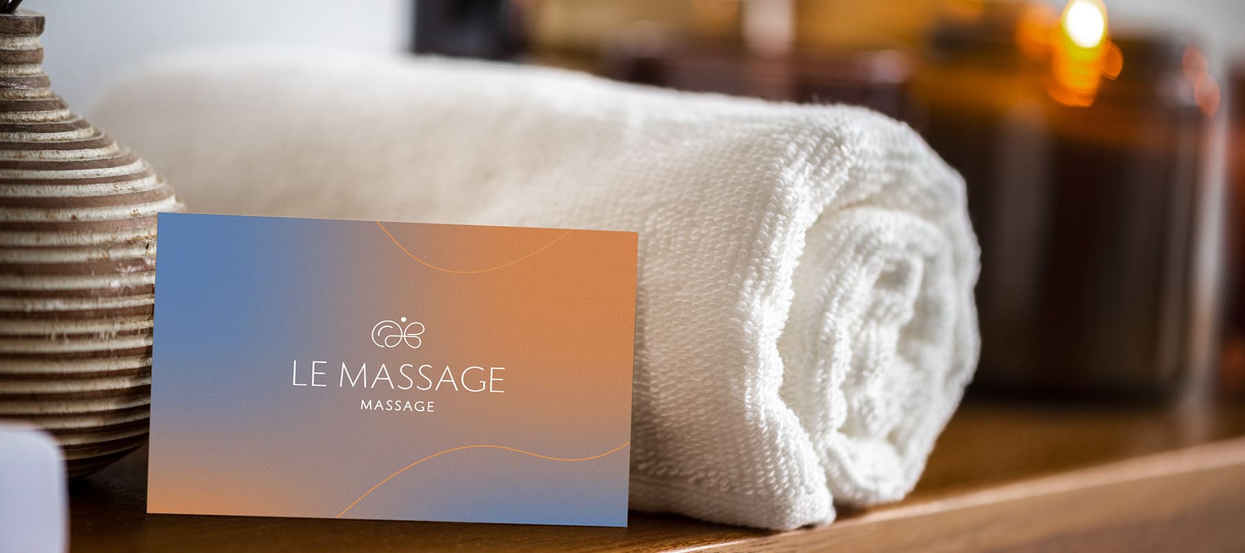
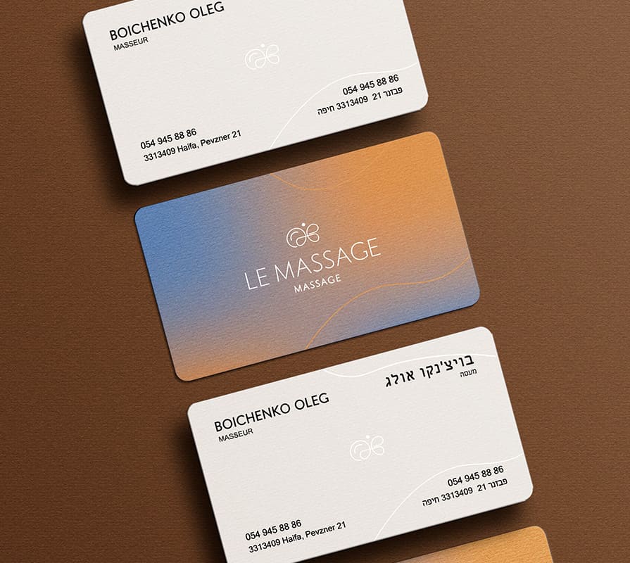
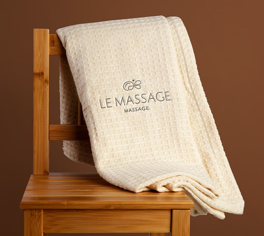
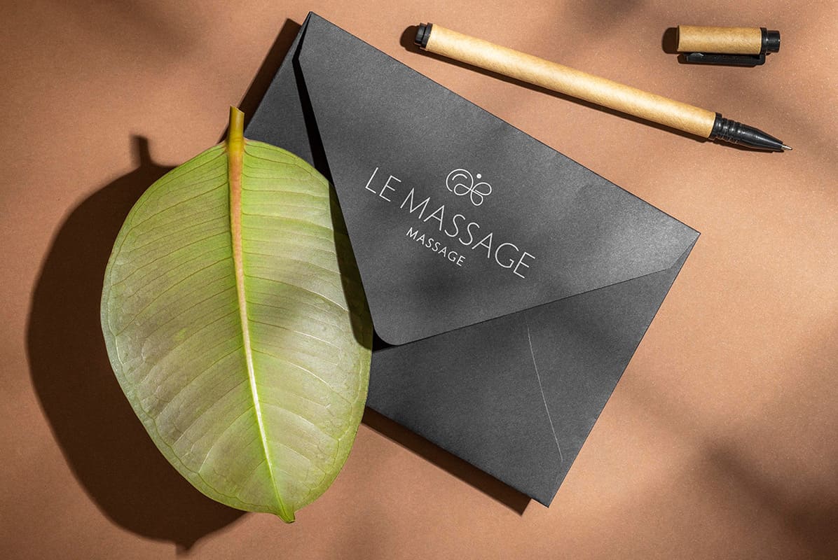
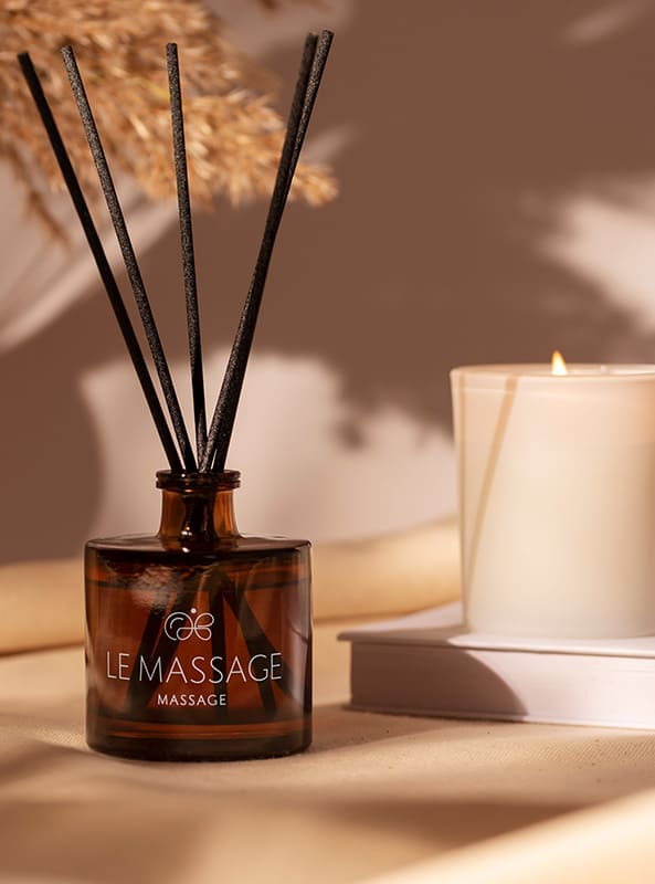
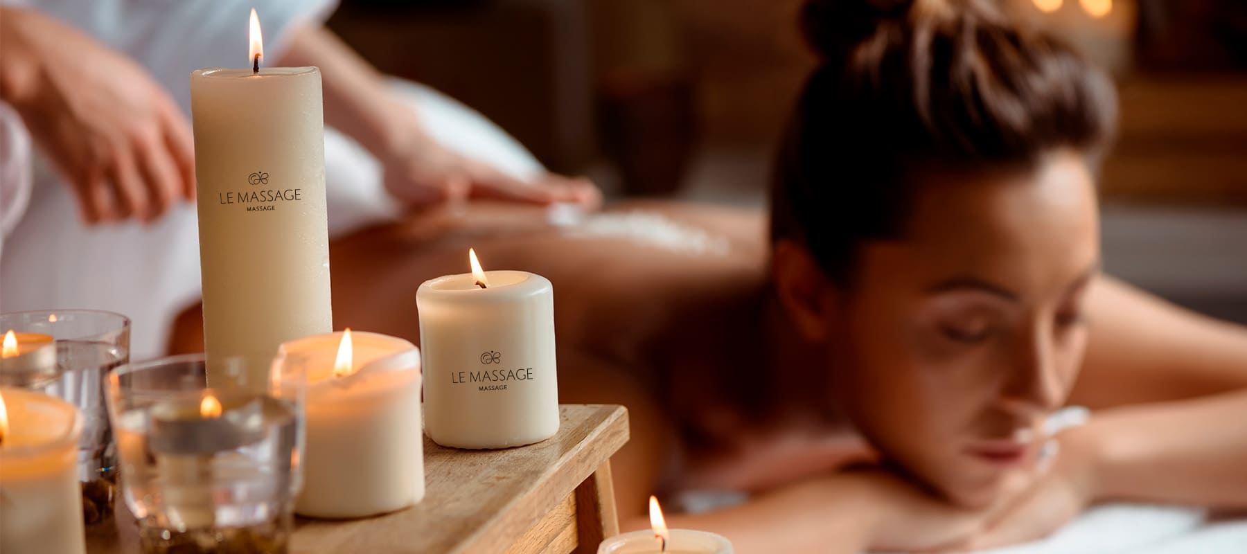
- We developed a concise combined logo containing the salon name and symbol. It is a monochrome sign in soft tones, made in black on a light surface and white on a dark one.
- The font chosen is a classic sans serif. The soft lines of the letters seem to repeat the movements of a masseur and set the mood for relaxation.
- A stylized image of a butterfly was used as a symbol. The curls that form the butterfly are associated with massage lines, reflecting softness and lightness.
Subject: massage services
Region: Israel
Task: design a logo with an emphasis on softness and lightness.
ACHIEVED RESULTS
The logo reflects the client’s request for softness. The brand name looks stylish and at the same time is associated with lightness, tenderness and relaxation.
