WHAT DID WE DO?
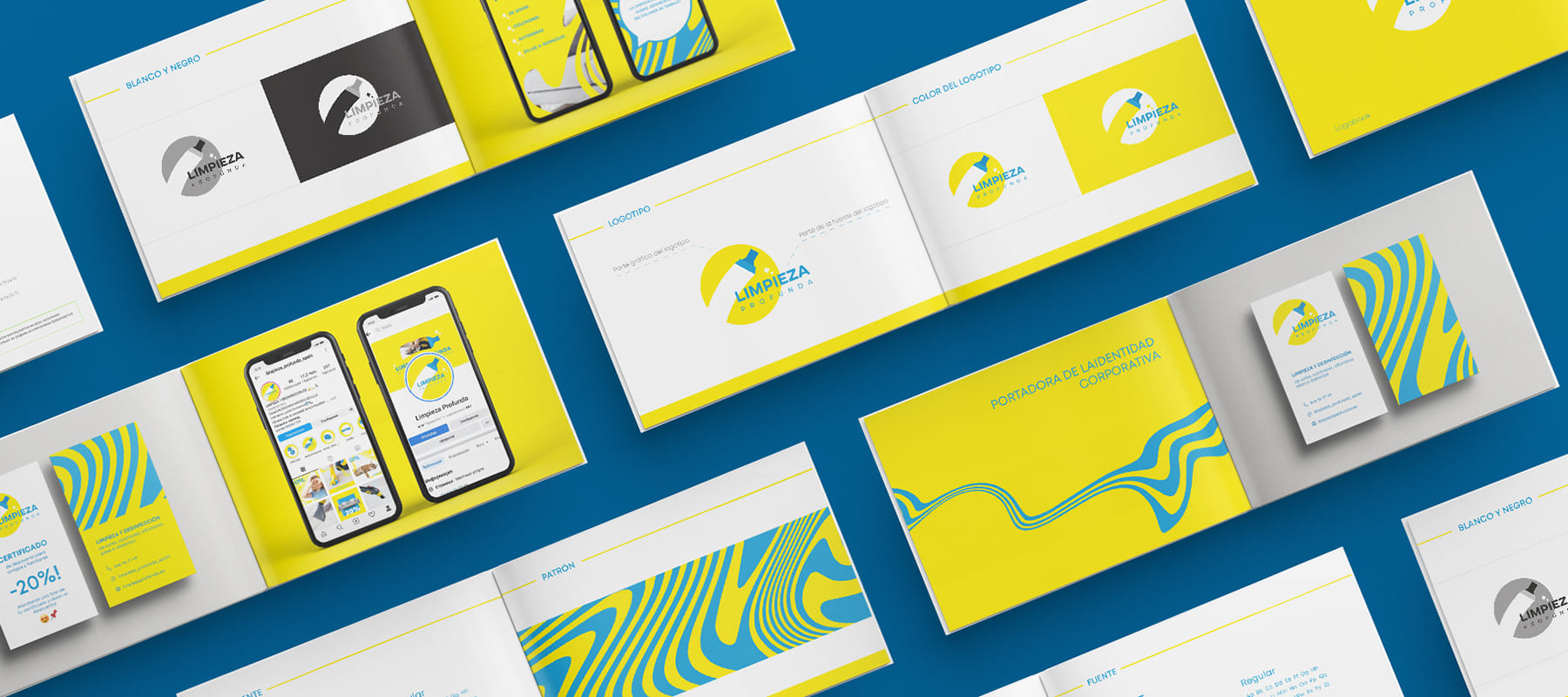
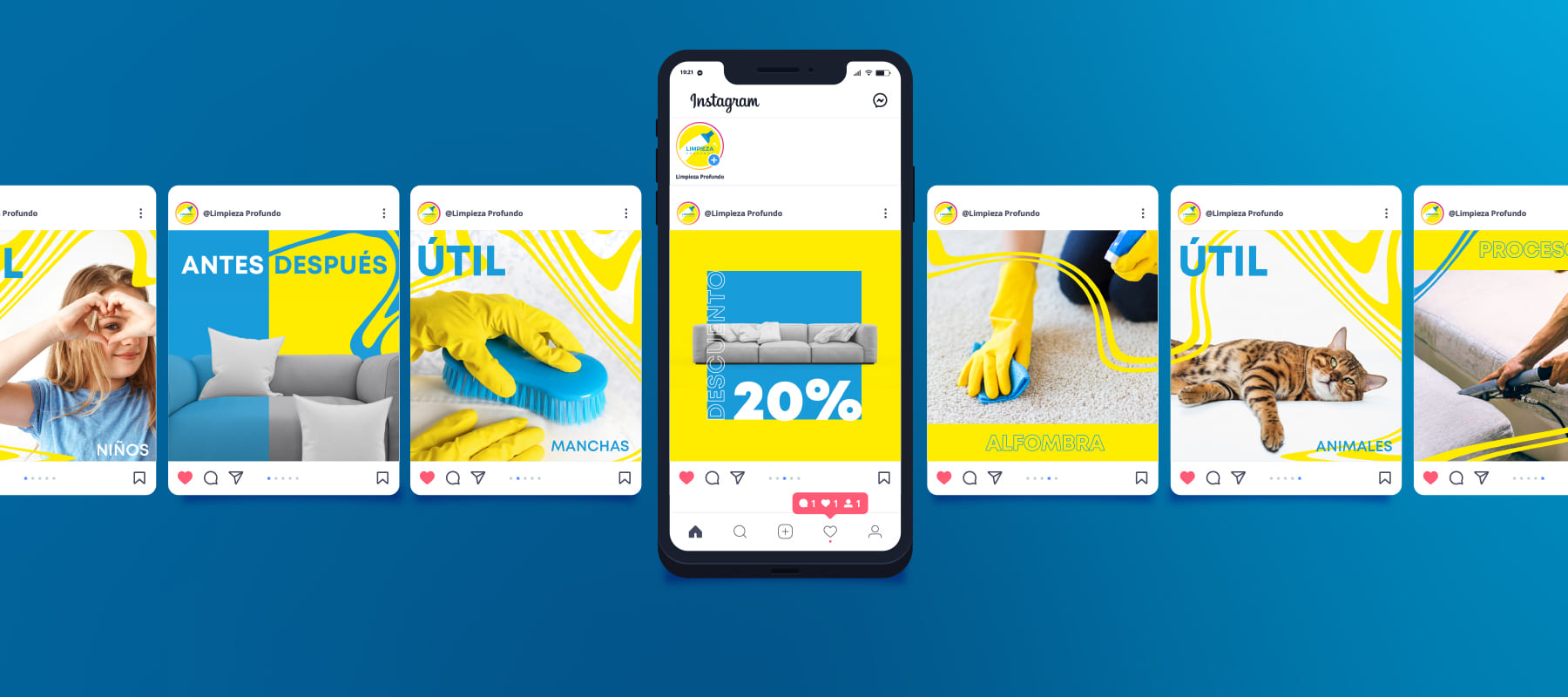
To present a cleaning company on social networks, it was necessary to develop a bright page design and corporate style that would reflect the activity.
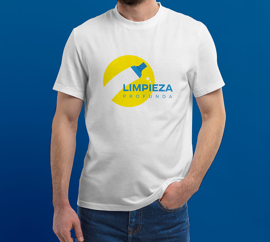
- In addition to the company name, the logo includes an image of a brush that leaves a clean mark. This solution allows us to show what the company does and what results the clients expect.
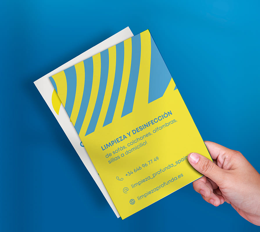
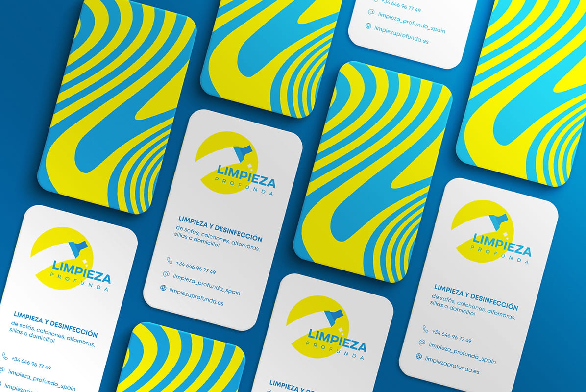
- The design uses bright colors – rich yellow and calming blue. This is an unusual combination for the cleaning industry, where blue, white and pink are most often chosen to reflect freshness and cleanliness. Yellow is associated with joy, warmth and care, and blue with relaxation and sublimity. They complement and balance each other.
- The design of the booklet, advertising materials, business cards and social media pages also used curls and soft lines reminiscent of water stains that may remain during cleaning.
Subject: cleaning services
Region: Spain
Task: develop a logo, corporate identity and design for social networks that are understandable to the target audience.
ACHIEVED RESULTS
The developed logo and corporate style are understandable to the audience, reflect the specifics of the activity, attract attention and stand out against the background of competitors. Such design reflects positivity and cheerfulness, is easy to remember.

