WHAT DID WE DO?
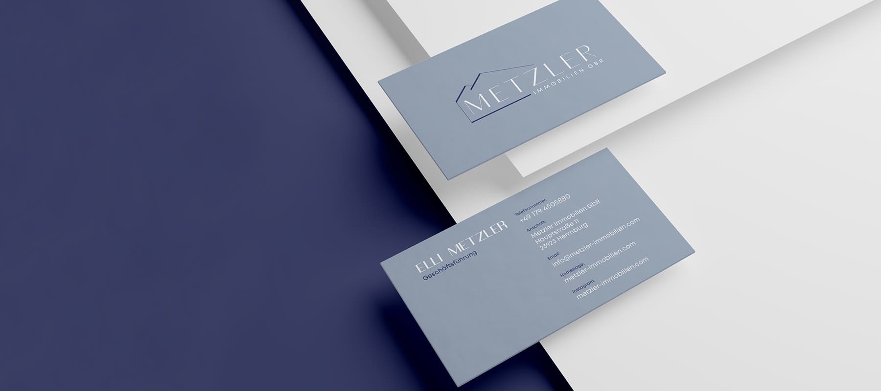
The company is engaged in the sale and rental of real estate. Traditionally, this area is more associated with men, so it was decided to develop a style in soft tones to evoke associations with a woman as well.
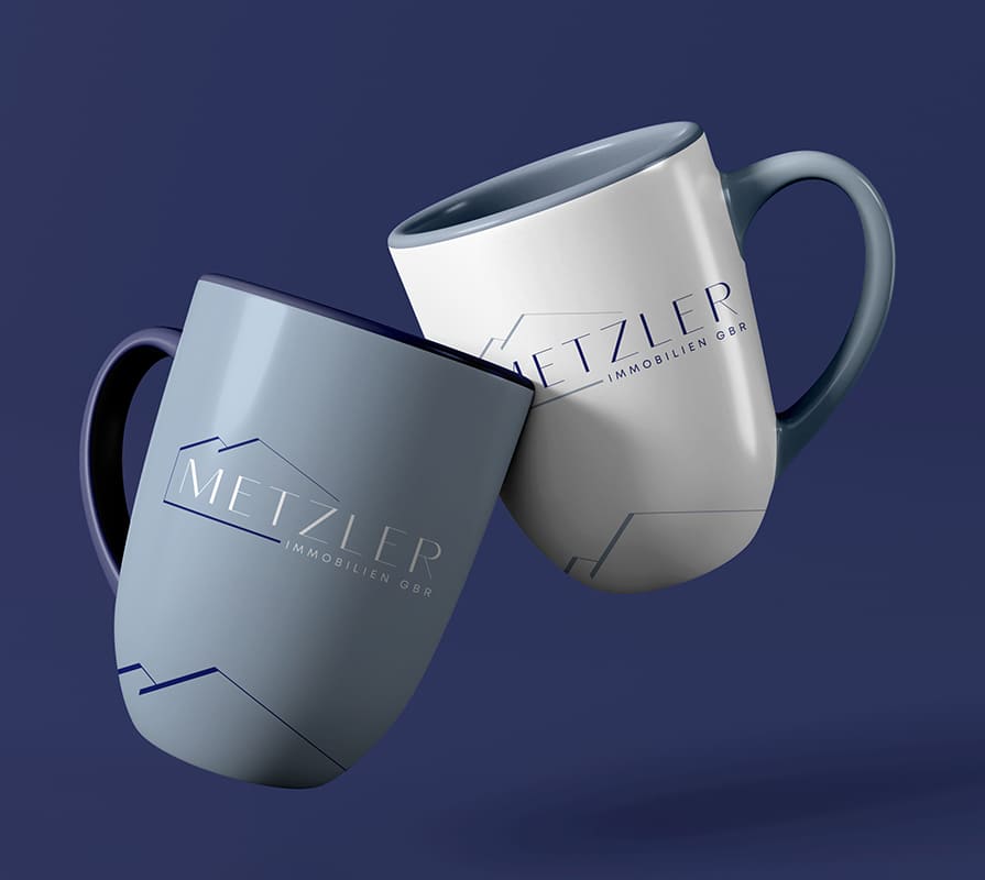
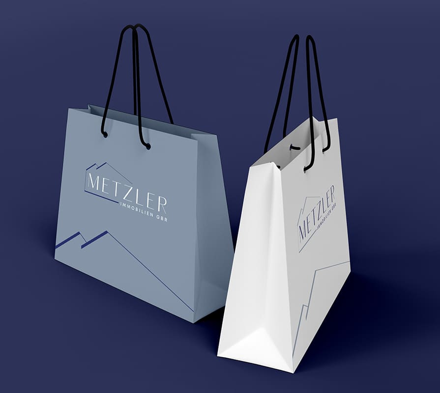
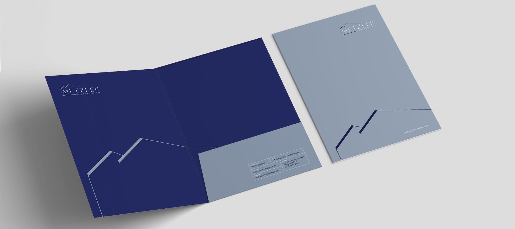
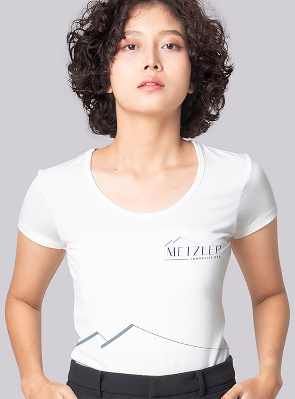
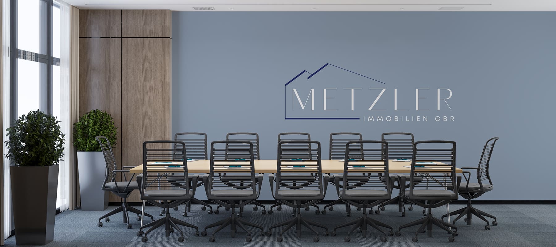
- We developed a minimalist stylish logo that reflects the specifics of the activity. For this, we used a stylized image of houses made with strict lines.
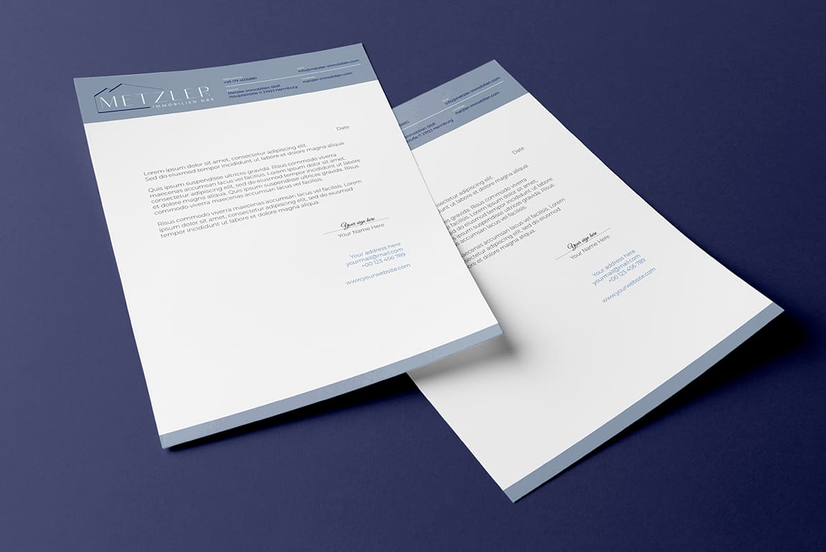
- To create a signature style that reflects elegance, a pastel blue shade and deep blue for accents were chosen.
Subject: real estate
Region: Germany
Task: to develop a logo and corporate identity that would be associated more with a woman than with a man.
ACHIEVED RESULTS
The logo and corporate identity elements look stylish and sophisticated on all media. On the one hand, such a minimalist design is suitable for the real estate industry, and on the other, it evokes associations with tenderness and elegance, which in turn is associated with a woman.
