WHAT DID WE DO?
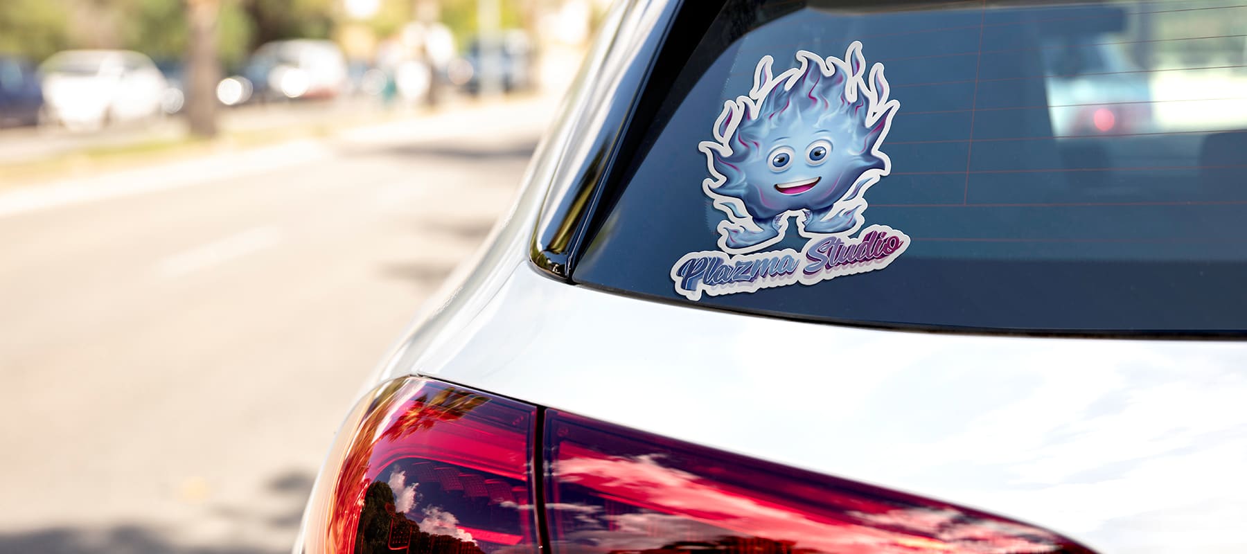
When developing the logo and corporate character, we took into account associations with a blue plasma panel and a blue screen.
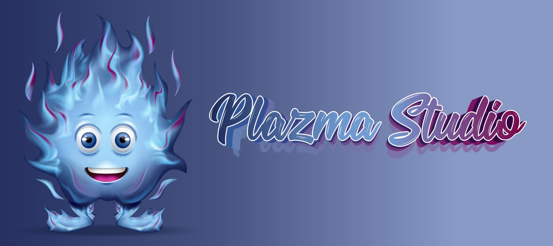
- For the font logo, we used a calligraphic font with legible letters and soft lines, which combines the company’s technological prowess and childish playfulness.
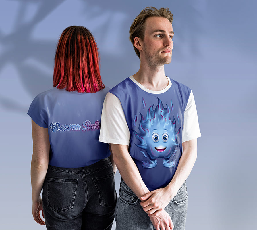
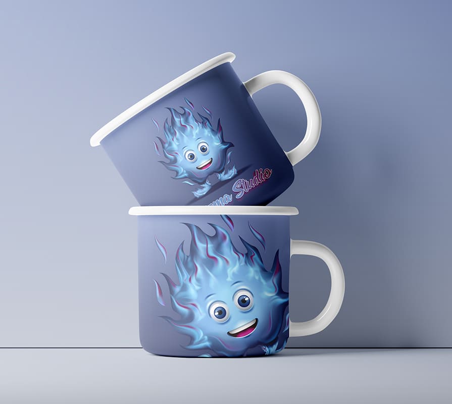
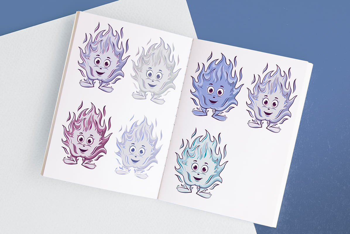
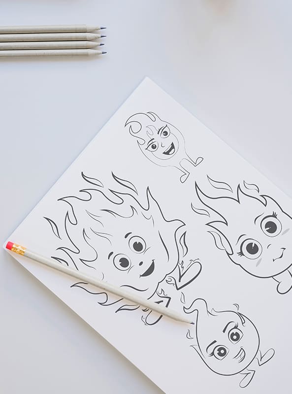
- The symbol of fire, a home hearth that does not burn, but gives comfort and warmth, was chosen as the corporate character. The stylized flame was made friendly and sweet – a friend of children.
- The design uses a blue palette to emphasize the connection with blue plasma. At the same time, blue and light blue shades reflect peace and safety, and purple – creativity.
Subject: development of mobile games for children
Region: Ukraine
Task: develop a logo that reflects the scope of activity and a corporate character that attracts children.
ACHIEVED RESULTS
A simple, dynamic logo and a cute character radiating joy and friendliness, developed in a single style and color scheme, evoke pleasant associations, attract children and adults, and hint at the company’s area of activity.

