WHAT DID WE DO?
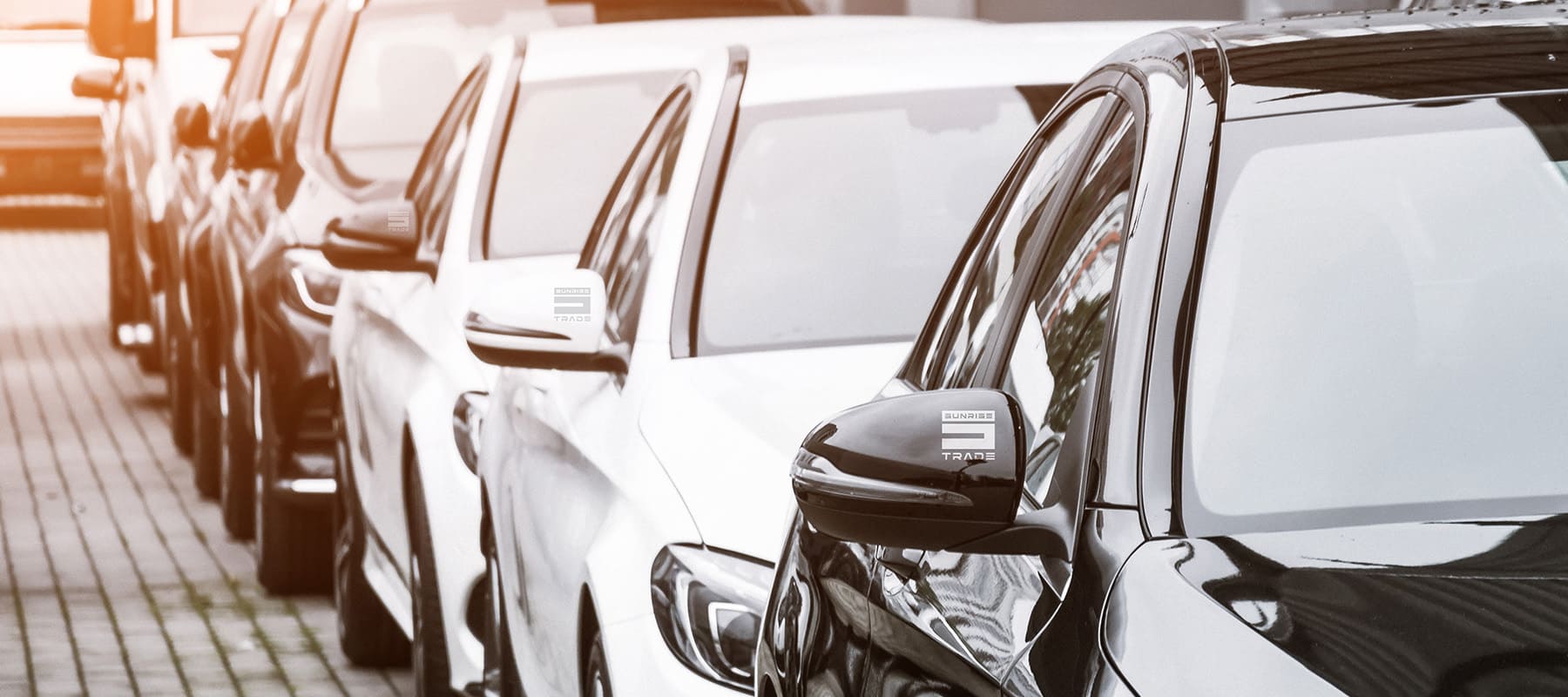
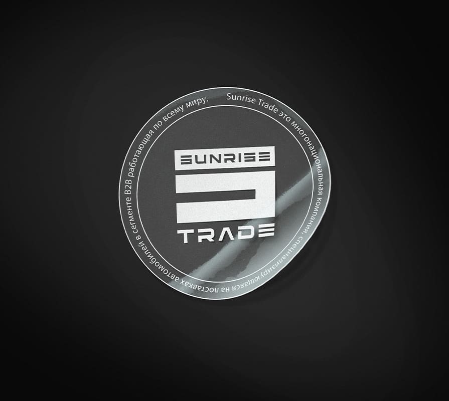
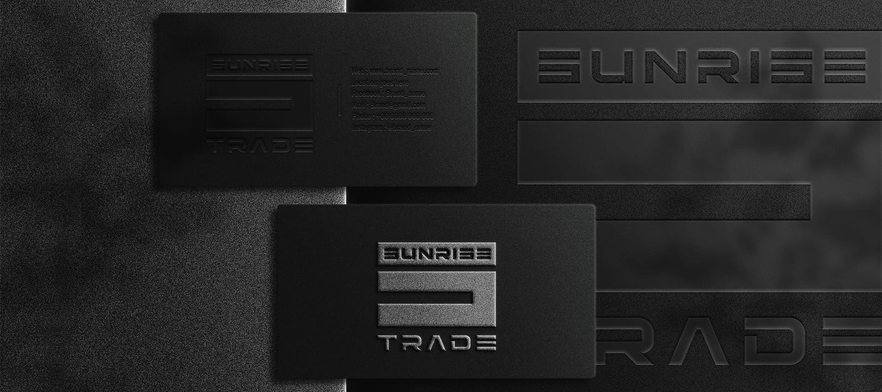
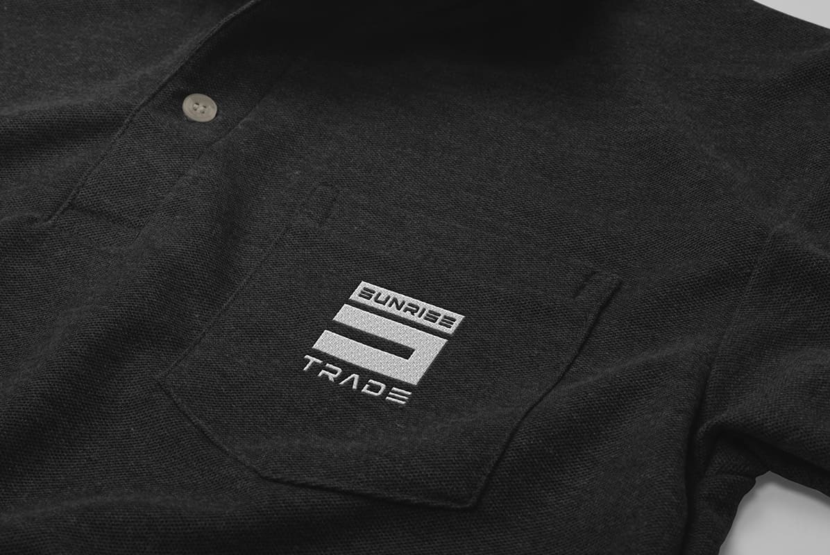
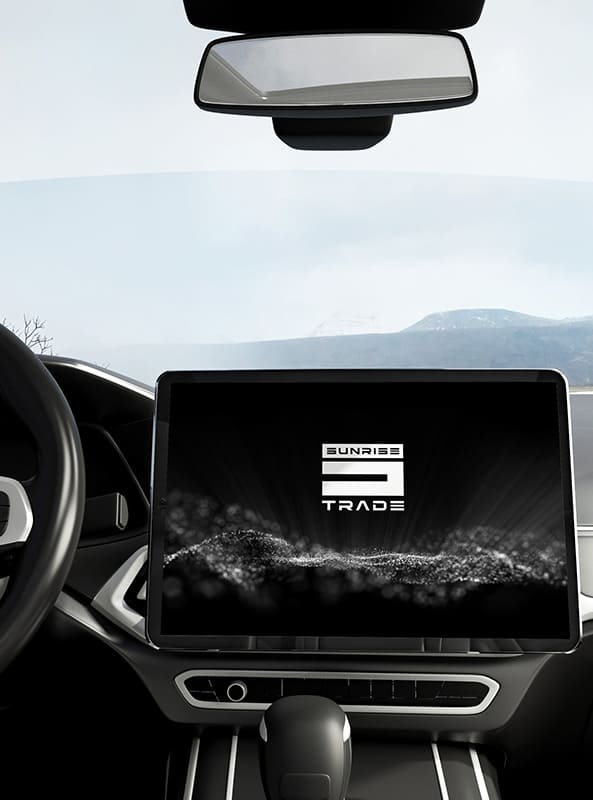
For a company that supplies cars from the USA and Europe, we developed a combined logo that combines the name and geometric shapes to give it austerity.
- For the brand name, symbols like a rectangle were used to create an association with the road.
- We developed a font with sharp lines that resemble the direction of a path.
- The colors chosen were black and white. Black symbolizes power, strength, and confidence, while white symbolizes lightness and perfection. The monochrome style adds severity and enhances the overall impression of the logo.
Subject: cars
Region: Ukraine
Task: develop a logo in a strict style.
ACHIEVED RESULTS
We developed a brutal, clear logo in black and white, reflecting the specifics of the business and designed for a male audience.
