Design of corporate style
WHY IT IS IMPORTANT TO DEVELOP A CORPORATE STYLE FOR YOUR COMPANY?
Recognition of the company and of its products
Recognition is a constant sign of successful brand development. It is important for the user to cling to something in a huge variety of offers in the trading market. And corporate style is a great opportunity to detach from competitors and to give the company the image that is necessary for attracting and retaining customers.
Less cost to market new products
Investing in the creation of the corporate identity of a company is investing in the promotion of each product that your company sells or is planning to sell. One recognizable style would attract more attention to a new product than many new style decisions in combination.
The combination of styles of all brand communications
All company documentation, advertising, printing, products, office decor, etc. that decorated in a single branded style, would make a bright impression on customers, partners, and even competitors. It means that your company is stable and booming. Also, it would show that you are taking care of your image.


Corporate style is a concept of a uniform design of all elements of the bran’s communication with the world. Such as packaging, documents, signage, advertising printing, business cards, advertising, etc.
Question - Answer
What the corporate identity is?
Corporate identity is a set of permanent elements (graphic, color, verbal) that used to represent goods (services) and other information coming from the company. Also, the internal and external design of the organization in a single style that helps shape the image of the company.
Features of corporate identity:


What is the corporate identity of a company, organization, enterprise, firm, site, product or service is and how to develop it?
If we would speak in a language understandable to marketers, corporate style is a visual and semantic unity of the goods/services offered, all the information coming from the enterprise, its internal and external design. This is a language characteristic of the enterprise, a kind of identity card of the enterprise, its identification mark, business card. Your style helps to remember the company, brand, and advertising.
If we would speak in a language that designers understand, corporate identity is a combination of color schemes, visual elements, designs, words, fonts, forms that the company uses for self-identification in the market. Thanks to the combination of these elements, a company, organization, or brand broadcasts its philosophy, features, idea. This the way how the company wants to be perceived by consumers, partners, competitors.
If explaining to an entrepreneur what the corporate identity is, try this way: in contrast to the corporate image, which is measured by the psycho-emotional attitude of the audience, the corporate identity is quite tangible. These are buildings, office decor, logo, staff uniforms, images, color schemes that distinguish it from competitors. In addition, the corporate identity of a company cannot be positive or negative. He is either strong or weak.
Why do companies need a corporate identity?
Many owners, entrepreneurs, and company executives continue to wonder why identity is so important. In fact, everything is easy. The main goal on the way of achieving a commercial company is maximizing profits. Corporate identity effectively solves 6 interrelated business tasks:
- Identification of company products. “Correct” corporate identity distinguishes your product from similar competitors’ products effectively. As a result, the consumer recognizes the product in the total mass quickly and choose it.
- Creation and consolidation of the desired image in the consumer’s mind. Attracting and retaining the attention of both existing and potential customers for a long time is becoming possible thanks to the corporate identity with a competent idea embedded in its design. The main thing is that the consumer should understand: using your products would help him in solving his problems and improving the quality of life, that everybody is striving for.
- Formation of a positive corporate image. The basis of a trusting long-term relationship with a client is positioning oneself as a company from the best side. The sooner you manage to convince the consumer of reliability and professionalism, the faster the product of your activity will conquer the market. That would reduce your costs for its “promotion”.
- Determining your market position. Corporate identity helps both to emphasize favorably the differences between your trademark and the numerous competitive offers in your industry, and correctly indicate its similarity with well-known world brands. And in fact, and in another case, this contributes to the activation of customer demand and sales growth.
- Reporting to the potential client the necessary information. You can inform the consumer about the release of a single novelty or series of new products through the design of products in a certain style, as well as focus on certain properties of the product (for example, naturalness, etc)
- Savings on the ordering of promotional items. Since corporate identity is a complex of ready-made solutions, its presence greatly simplifies the process of obtaining branded attributes. So, to create business cards or forms, you do not need to involve a designer and pay for his services each time, but simply print out the existing mock-ups of advertising materials.
Developing a corporate identity is a justified marketing step by which the company declares about the seriousness of its strategic plans and lays the foundation for its dynamic development.
What are the basic elements of corporate identity?
Corporate identity includes a logo, fonts, colors, and style-forming graphics. Let’s analyze the characteristics of the main elements of corporate identity in more detail.
The first element is the logo

The logo is original style, the image of the full or abbreviated name the company or company products. It could be a graphic brand design next to the logo. The element that we imagine while hearing Nike, Apple, Adidas. Presented a checkmark, a bitten apple, and a triangle with?
So the graphic sign worked one hundred percent. A good logo is half the success. Stories of famous brands are shining examples of that.
The founder of Ribbon Sports, Phil Knight hired Carolyn Davidson, a student at Portland University, to design a shoe logo in 1971. Davidson presented Knight with several options and he chose the checkmark. He paid $ 35 for that. Years later, after the Nike logo became recognizable worldwide, Knight sent the designer a diamond ring in the form of a checkmark and an envelope with Nike shares to express his gratitude.
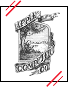
The first logo of Apple was created by Ron Wayne. However, a picture resembled resembled a tiny work of art and did not fit well with the concept of modern technology. So a year later Steve Jobs asked Rob Yanov about logo design. And he created a famous bitten apple that painted in a black colour in 1998.
The McDonalds logo owes its appearance to one of the founders Dick McDonald. During the construction of a restaurant in Phoenix, architect Stanley Metson introduced his brothers to the project: a rectangular building with a red roof. Dick did not like the project and decided to add two large golden arches on top of the building. An architect did not approved this idea. So Dick McDonald went to George Dexter and asked to make a sign from two golden arches. Here is the way how the prototype of the future McDonald’s logo appeared.
The second element is colors of corporate identity

Color is one of the basis elements of corporate identity. It affects how consumers perceive the brand emotionally. Karen Haller, a business color expert, is talking about the meaning of every shade.

Red: power and passion

Green: youth, love and nature

Blue: calmness, trust, reliability

Black: exclusivity and charm

Orange: friendship, fun, playfulness

White: simplicity, purity, naturalness

Yellow: optimism and positive

Violet: luxury and whim
Attention! Always choose the color that is opposite to the color of the main competitor.

Successful brands are usually using modest fonts that are easy to read and easy to combine. The size and type of font depends on how the brand is positioning itself relative to the consumer. Does he want to become his friend or, on the contrary, keep himself aloof.
If brands want to build close warm relations with a client, then they use simple or handwritten fonts in their corporate styles. Pay attention to the font Ray Ban and H&M, Coca-Cola. They are saying: “We are friends. So come on without formalities. ”
If the brand is neutral, then in most of cases it is using Helvetica font. Interaction with such a brand remind communication with an old friend you see once a month. He says: “I am your friend. But be restrained. We do not know each other so well. ” Look at VISA
If a brand produces niche products, it use complex fonts. Pay attention to VAIO. The font says: “This is a secret code for their own. If you understand him, you are in that. ”

Style-forming graphics is unique complex of visual elements that are using for creation and design of corporate products. It could be ornaments, company characters, geometrical figures, etc.
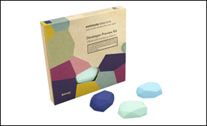
The style-forming graphics is repeating the shape of the bicones – bluetooth beacons, that is the main product of Estimote.
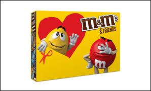
The style-forming graphics here is presented here in the form of two familiar characters – nuts in red and yellow glazes.
Let’s imagine the brand of clothes is launching new clothes collection and got an invitation to showroom opening. At the entrance to the store we are getting a multi-colored and flashy flyer, in lookbooks we are coming across a strict and concise design, and business cards giving out excessive officiality. The impression is torn. We can’t connect individual elements and the brand image crumbles.
If you want to avoid such situations, you need to think over the corporate identity and to develop each detail. Let’s see what are the ways of corporate identity existing.
Corporate identity carriers. What are they look like?
The main carriers of corporate identity:
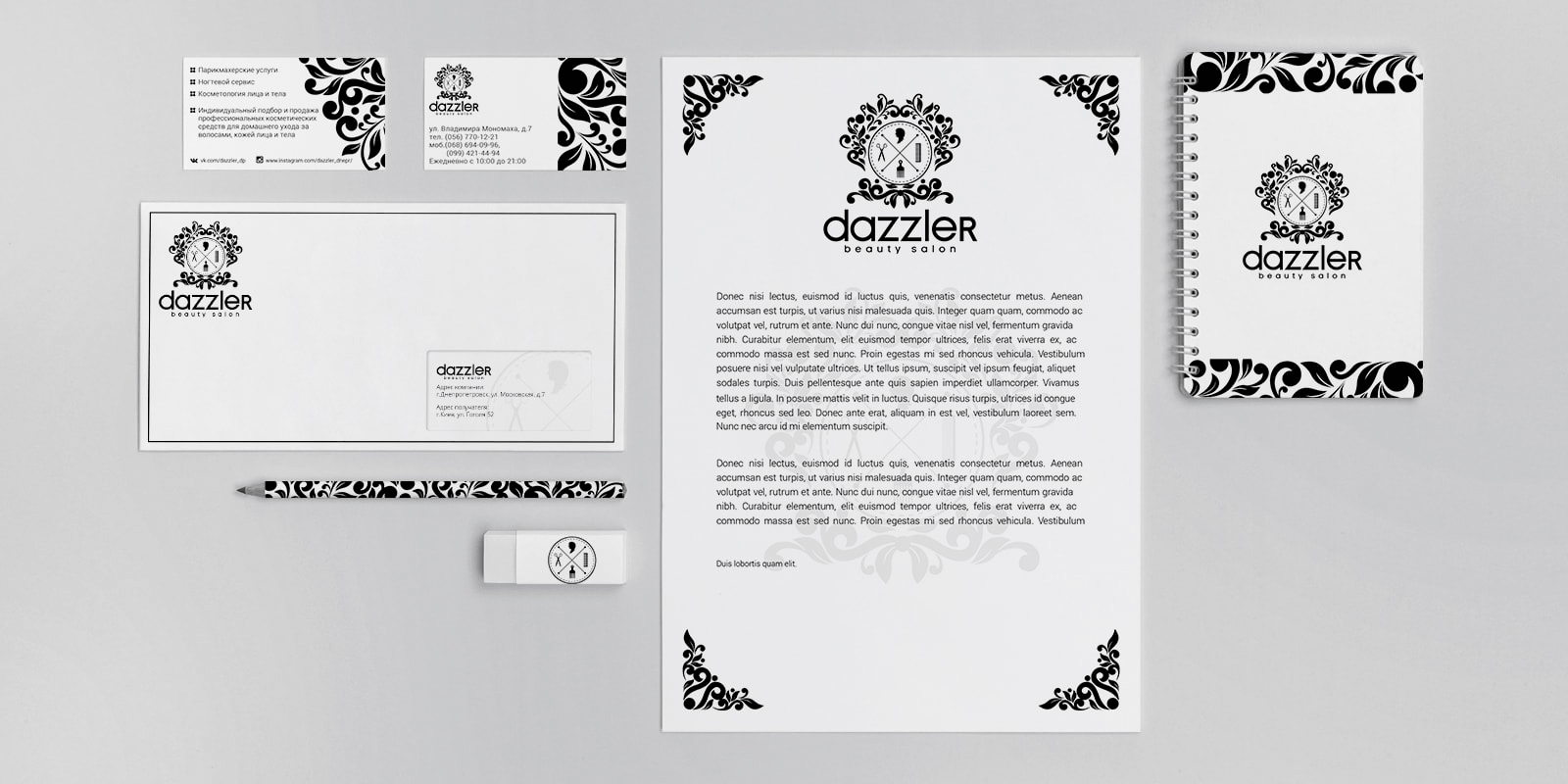
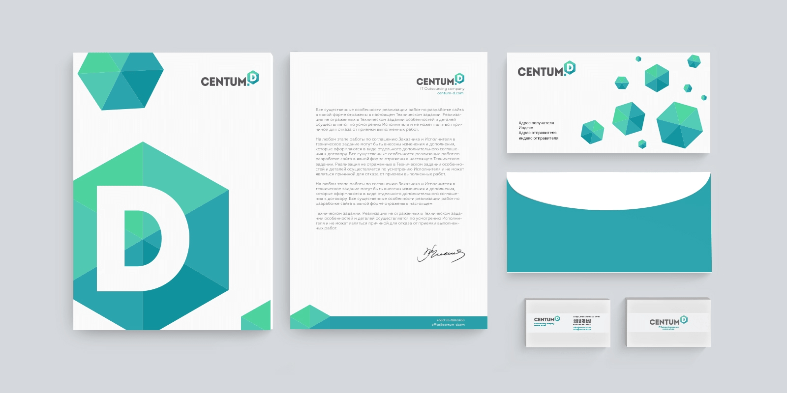
- business card (corporate, personal)
- letterhead (horizontal, vertical)
- envelopes of various formats
Additional corporate identity media:
- website
- folder
- booklets, posters and calendars
- stickers
- souvenir products
- POS-materials
- label packaging
- advertising modules
- interior elements, etc.
All of the listed corporate identity media are designed the same way. They must contain the corporate identity constants: logo, corporate fonts, primary and additional corporate colors.
The set of required media is determined in each case individually. Taking into account the needs of your company.
How to create a corporate identity?
There are a few ways of corporate identity development. You can develop it by yourself, order from freelancer or ask the design studio. Consider these ways in details.
Do it by yourself
You are painting a logo by yourself, choosing a corporate fonts and colors. This way you are setting the tone to your brand.

Pros: budget economy

Cons: there is no adaptation of logo to documents, advertising materials, business cards, etc.
Here are few shining example of logos of successful companies who created iconic logos and graphic signs by themselves, even without designers.
In 1998, Larry Page and Sergey Brin came up with a new search engine. They called it Google later. The first Google logo was invented by Sergey Brin, while working on the GIMP graphics package.

In 1893, pharmacist Caleb Bradham created the Brad’s drink, which became popular in his pharmacy. In 5 years, Caleb bought the name Pepsi-Cola for $ 100. At the same time, Bradham’s neighbor came up with the first logo for Pepsi.

Oddly enough, the Coca-Cola logo was drawn not by a designer or even an artist, but by an accountant Frank Robinson. He was coined the name of the drink in 1886, replacing the letter “K” in the word “Kola” with “C ++”. Robinson painted the logo by hand using the “Spencer” font and placed “Delicious and Refreshing” under the logo.
Order from a freelance designer
You are choosing a designer, drawing up a brief and getting a logo and graphic sign in corporate colors.

Pros: you are saving a time, and the order is carried out by a professional

Cons: the designer is not responsible for creating a corporate identity. He only develops its individual elements.
Here are a few examples of how companies choose responsible designers and got a stunning memorable logos in final.

Famous Nike tick was created by student of Portland University Caroline Davidson in 1971. She got for that only 35 dollars. It hasn’t changed for 37 years.

In 1953, Arthur Paul, a freelancer and future designer, drew a rabbit logo for Playboy magazine and created a layout for the first issue. Paul later said that if he knew how famous this logo would become, he would spend more time and effort on it. Because the process of logo creating took about half an hour.
Order from a design studio
You turn to our design studio, make a brief and get a corporate identity for your brand.

Pros:
- the working process of studio is organized well;
- designers would take your wishes and changes into account;
- designers would develop style-forming graphics;
- studio would perform all technical work: adapt the style for the attributes, make a brand book or guide for your employees;

Cons:
- expensive
Remember that logo and graphic sign are not a corporate identity yet. All those well-known examples when legendary companies developed the logo without any help are just a small part of a big process. After that the finished logo is handing over to professionals who adapting it for advertising materials, documents, business cards, t-shirts, posters, etc.
Therefore, whatever option you would choose, corporate identity is not only the logo, but also all the visual elements that are making the brand, company or product recognizable and distinguishing it from others.
Which document describes the elements of corporate identity?
Guide line is passport of standards that contains a guide to corporate identity. It is a set of instructions for the proper placement of visual brand identifiers on various media obtained as a result of the development of a corporate identity of a company.
Guidelines for corporate identity allow you to respond to incorrect use of elements of corporate identity quickly. Also it would help to find a mistakes in the work of manufacturers of printing products for your company. Due to the corporate identity guide, corporate colors would always have the right hue while printing, the logo and other elements of the brand’s visual identity would retain the right proportions. The flight of imagination of the designer would be limited to those frames that would be spelled out in the corporate identity guide.
What does the company get as a result? All commercial printing would be designed in the same style from business cards to outdoor advertising and souvenir products. Creating a corporate identity guide is the cheapest way to avoid the higher cost of restoring a company’s image. Our studio offers guideline development services both for the company and for an individual brand.
Corporate identity guide contains:
- constants of corporate identity (sign, logo, logo character, logo scaling, colors, fonts)
- invalid use cases for basic visual and verbal brand identifiers
- internal and external business documents
- paperwork for consumers
- marketing materials
- outdoor advertising
- Posm
- souvenir products
- a uniform
- transport
Guideline structure, volume and cost may vary depending on the scope of activities and tasks that the company sets itself. There are situations where regulating the form, badges, additional documentations and other materials is necessary in addition to the main package of documentation.
COST OF CORPORATE IDENTITY:
Development of 1 unique concept
- The client already has a logo
- Up to 5 media to choose from
- Business card / letterhead / folder / tag / sticker, etc.
- Projection on mockup (3D)
- Source files: .ai .pdf .docx
- Development period 5 … 7 days
Development of 3 unique concepts
- The client has a logo
- Up to 5 media to choose from
- Business card / letterhead / folder / tag / sticker, etc.
- Projection on mockup (3D)
- Source files: .ai .pdf .docx
- Development period 5 … 9 days
Development of 5 unique concepts
- The client has a logo
- Up to 5 media to choose from
- Business card / letterhead / folder / tag / sticker, etc.
- Projection on mockup (3D)
- Source files: .ai .pdf .docx
- Development period 7 … 10 days

