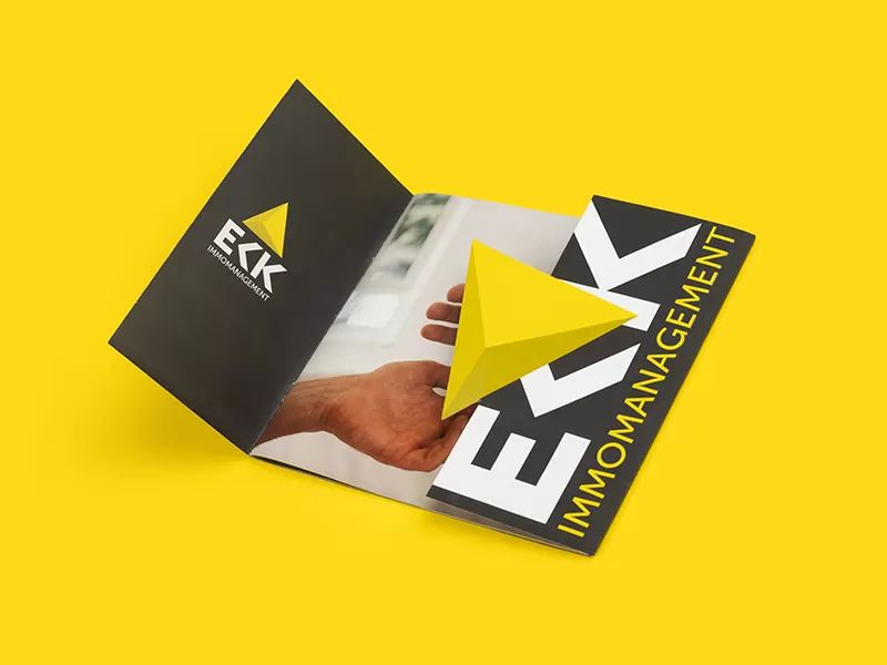
Catalog Robert Eck
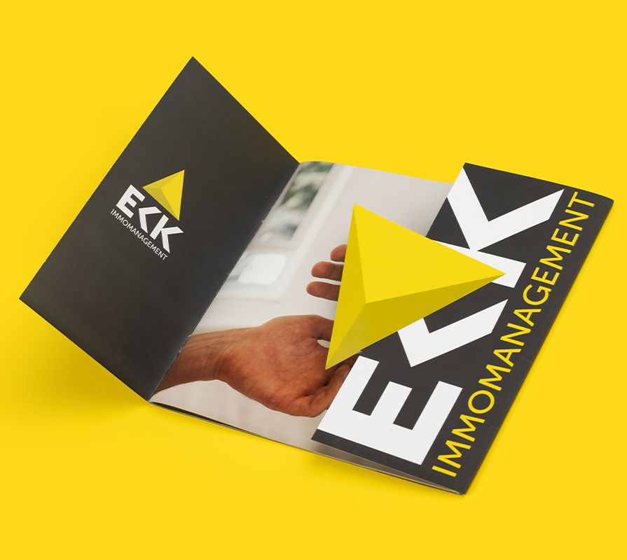
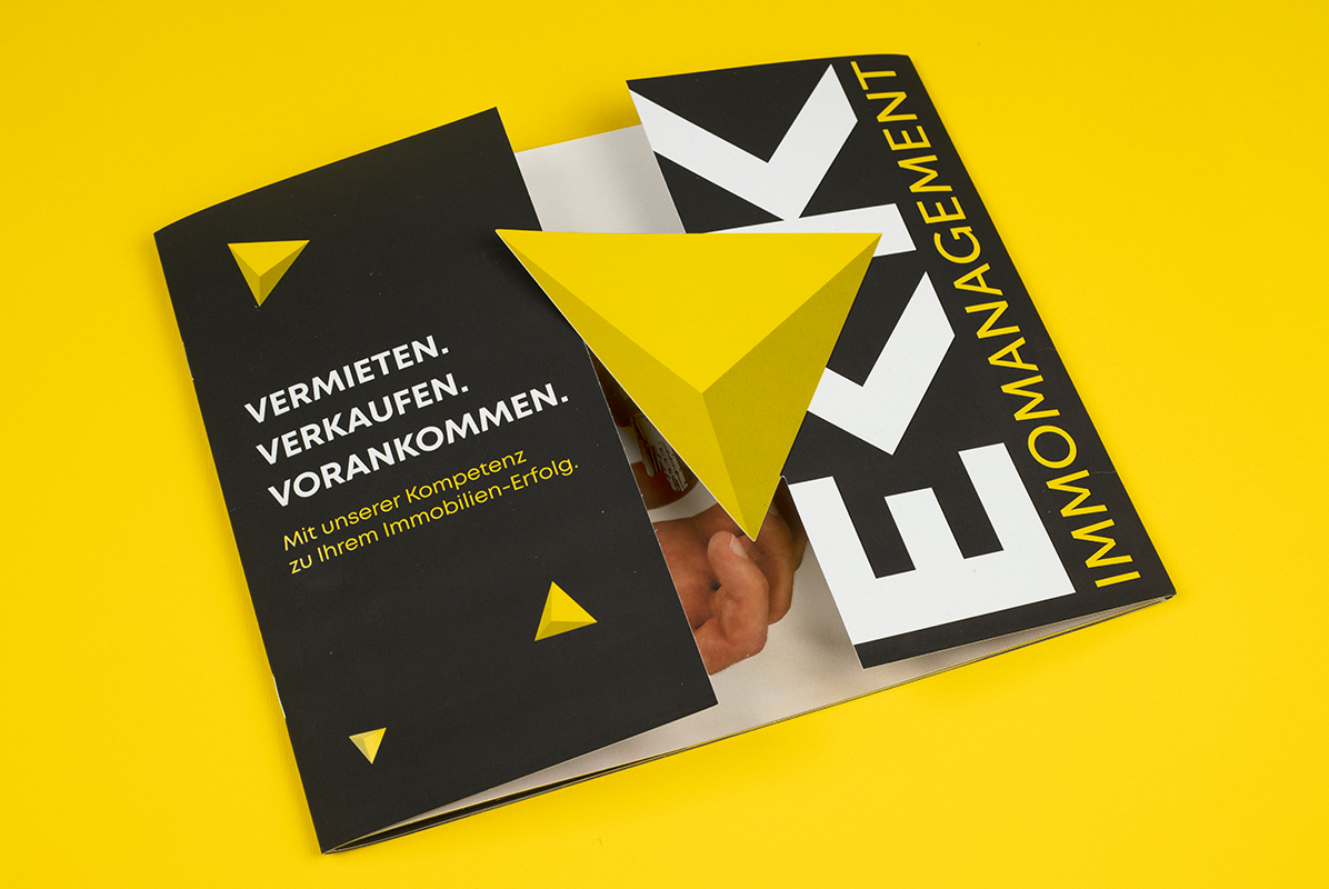
For the German agency Eck-Immomanagement, we developed a premium presentation catalog that reflects reliability, high status, and impeccable quality in residential properties. Clean geometry, minimalist elegance, and a structured presentation of information transform the catalog into an effective sales tool in the luxury real estate market.
What have we done?
The catalog’s color palette is based on a sophisticated combination of a deep, dark shade and contrasting yellow accents that highlight key elements of the layout. The dark tones lend the publication a premium look, depth, and a sense of stability, while the contrasting spaces ensure ease of perception and bring the architectural aesthetics of the properties to the forefront.
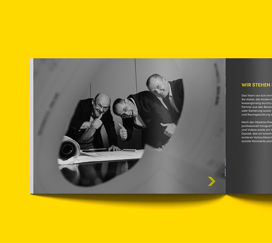
The visual style combines the rigor of German design standards with contemporary trends in the layout of high-end publications. Each page is designed to strike the perfect balance between large, high-quality images, detailed views of real estate properties, and informative blocks of text, allowing potential clients to instantly appreciate the benefits of the offering.
Subject: Real Estate
Region: Germany
Task: Catalog design and preparation for printing