
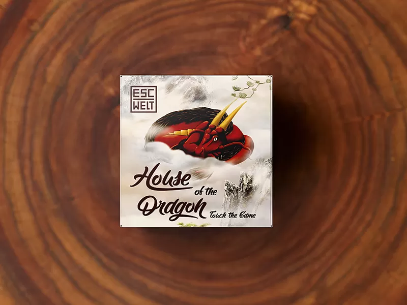
Package Escape Welt
For the limited edition series of Escape Welt wooden escape boxes, inspired by Eastern mythology, we developed an exclusive packaging design and a Japanese-themed brand identity. The visual concept was based on the image of a majestic dragon, symbolizing wisdom, mystery, and power. We succeeded in creating a rich graphic concept that immerses the player in the atmosphere of ancient Japanese legends and transforms the wooden puzzle into a collectible artifact.
What have we done?
The visual concept for the packaging is fully aligned with traditional Japanese aesthetics. The central element is a highly detailed depiction of a dragon, whose curves intertwine with the complex geometry of the puzzle box itself, hinting at the ingenuity of its hidden mechanisms. The illustrations are rendered in the style of traditional graphic art, featuring textured patterns that symbolize the elements of fire and earth.
The color palette, built around rich reddish-brown tones, was chosen to evoke a sense of premium quality, authenticity, and historical value. Terracotta, deep wine, and woody shades, combined with gold accents, beautifully highlight the natural wood texture of the product itself and ensure excellent visibility of the packaging on store shelves.
Subject: Board Games, Gifts, and Entertainment
Region: Europe
Task: Packaging Design and Corporate Identity Development


