SHOR booklet
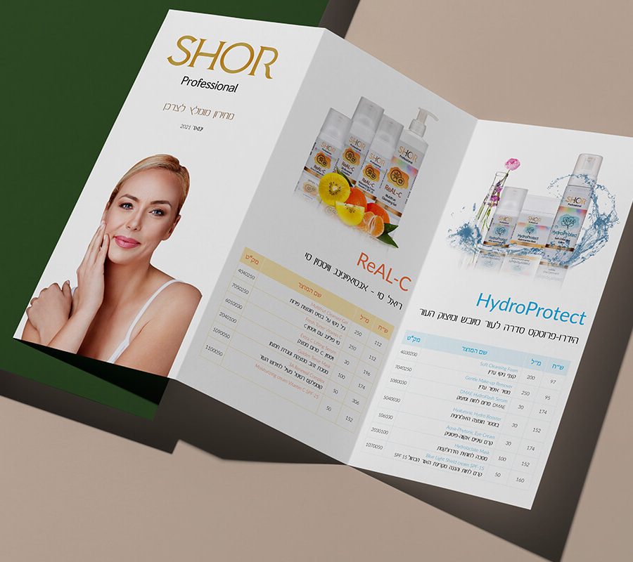
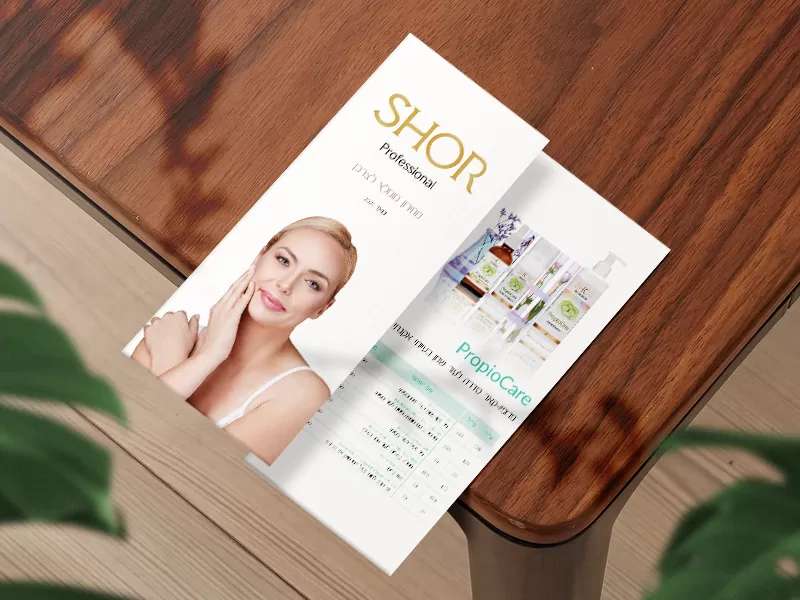
For the natural cosmetics brand SHOR, we developed an elegant and aesthetically pleasing multi-page booklet that conveys a philosophy of premium skincare, natural harmony, and self-care. We created an inspiring visual story that highlights the high quality of the products and evokes an immediate emotional response from the target audience. The brochure’s thoughtful design harmoniously combines aesthetics and informative content, making it an effective tool for communicating with customers.
What have we done?
The visual concept for the SHOR brochure is inspired by the purity of nature and the idea of gentle skin care. The design’s central theme features watercolor illustrations of a delicate lotus—a symbol of renewal and perfection—as well as juicy fruits, which highlight the natural ingredients and abundance of vitamins in the cosmetics line. This combination lends the printed materials a sense of lightness, freshness, and natural vitality.
The color palette is based on subtle pastel tones that evoke a sense of softness, coziness, and harmony. An exquisite gold hue serves as a refined accent. The gold design elements (branded embossing, outlines, and the fine lines of the graphics) underscore the premium status of SHOR cosmetics, adding a refined sheen, prestige, and a sense of luxury to the visual design.
During the layout process for the brochure, special attention was paid to the balance between text blocks and “white space” on the pages. Carefully selected typography and smooth compositional transitions ensure easy reading, helping consumers intuitively familiarize themselves with the properties of each cosmetic product and the brand’s aesthetic.
Subject: Cosmetics and Skincare
Region: Israel
Task: Design and layout of a product brochure