
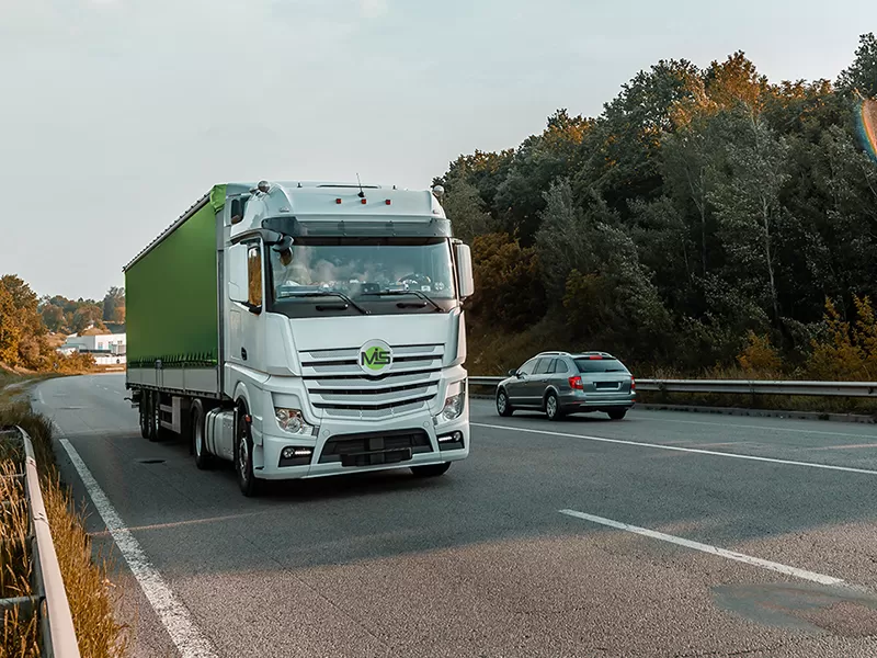
MIS style
For MIS, a logistics and transportation company, we developed a dynamic, modern, and functional visual identity that conveys speed, reliability, and impeccable precision in the transportation industry. We created a strong and memorable graphic symbol that effectively reflects the brand’s core values. The logo is highly versatile, laying a solid foundation for the subsequent rollout of the company’s comprehensive corporate identity.
What have we done?
MIS’s visual concept is rooted in the idea of continuous motion, precise logistics, and technological sophistication. The logo’s geometry is built on clean, confident lines that symbolize well-planned routes, fast delivery, and reliable supply chains. The result is a stable yet forward-looking visual identity that instantly inspires trust among both end customers and the brand’s key business partners.
The color palette, combining a vibrant light green and a deep graphite gray, was not chosen by chance. The fresh green hue symbolizes safety, the environmental sustainability of modern logistics solutions, and a “green light” for any direction. The understated graphite gray conveys stability, premium quality, and industrial precision. This combination ensures maximum visibility and excellent legibility of the logo on any medium—from corporate printed materials to the sides of freight vehicles and containers.
During the design process, special attention was paid to the logo’s adaptability: it scales flawlessly and remains recognizable on both digital platforms and physical surfaces (stationery, driver uniforms, and branded vehicles).
Subject: Logistics, Transportation, and Shipping
Region: Europe
Task: Logo and Corporate Identity Design


