CarGo Ways
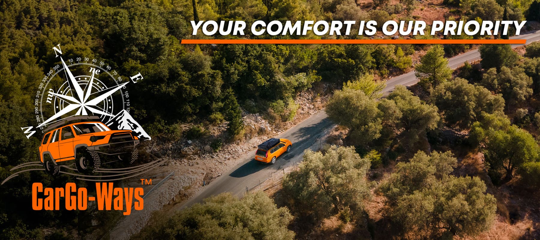
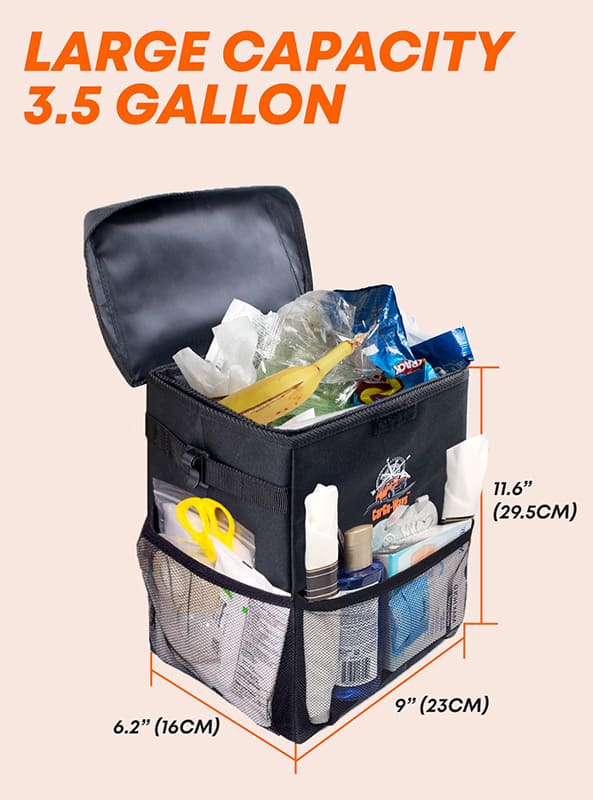
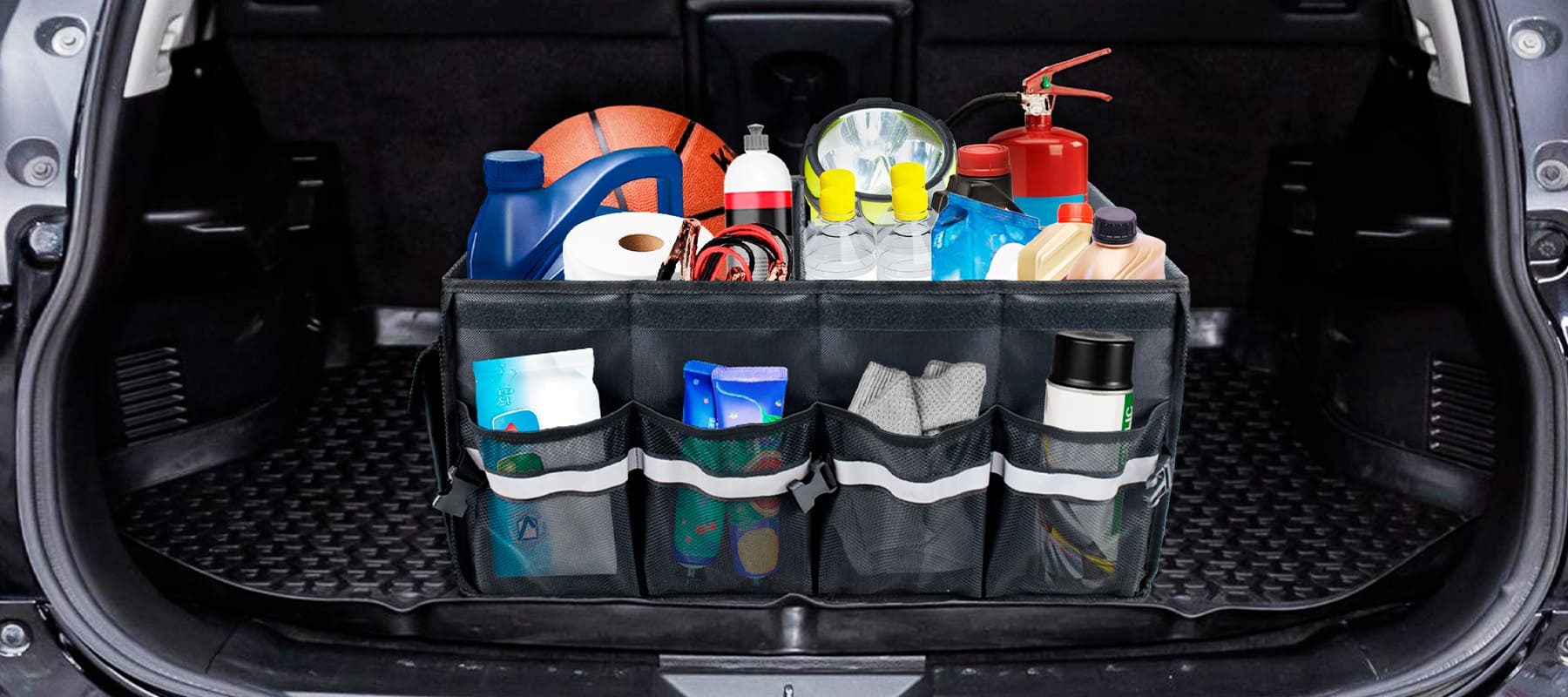
For CarGo Ways, a company specializing in automotive accessories, we developed a minimalist yet dynamic visual identity that conveys practicality, organization, and comfort on the road. We created a stylish and memorable logo that highlights the ergonomics and high quality of the company’s products for organizing space inside the car. The logo is highly versatile, which laid a solid foundation for the subsequent rollout of the brand’s visual style on marketplaces and social media.
What have we done?
The visual concept of CarGo Ways is inspired by the idea of continuous motion, speed, and impeccable order while traveling. The logo’s geometry is built on clean yet dynamic lines that symbolize roads, reliable freight transport, and ergonomic solutions for the car’s interior. The result is a balanced and modern logo that instantly inspires trust among car owners.
The color palette, combining vibrant orange, deep coffee-gray, and pure white, was not chosen by chance. The orange color adds dynamic accents and draws attention, while the darker shades emphasize the sleek automotive style, the premium quality of the products, and their practicality. This combination ensures excellent readability of the logo on any medium—from product listings on Amazon to branded packaging and labels.
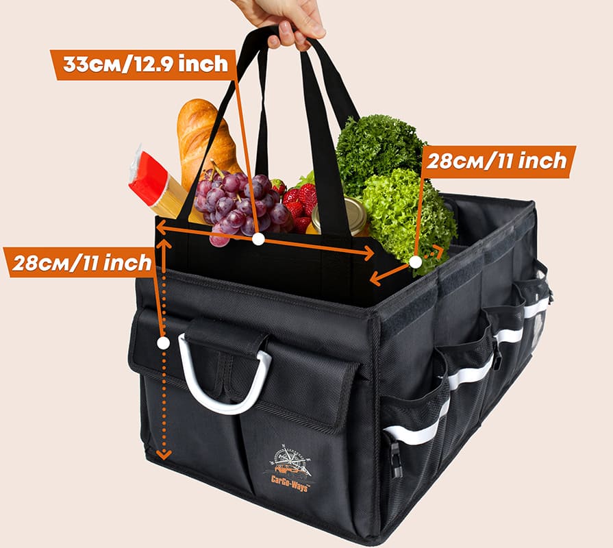
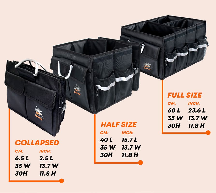
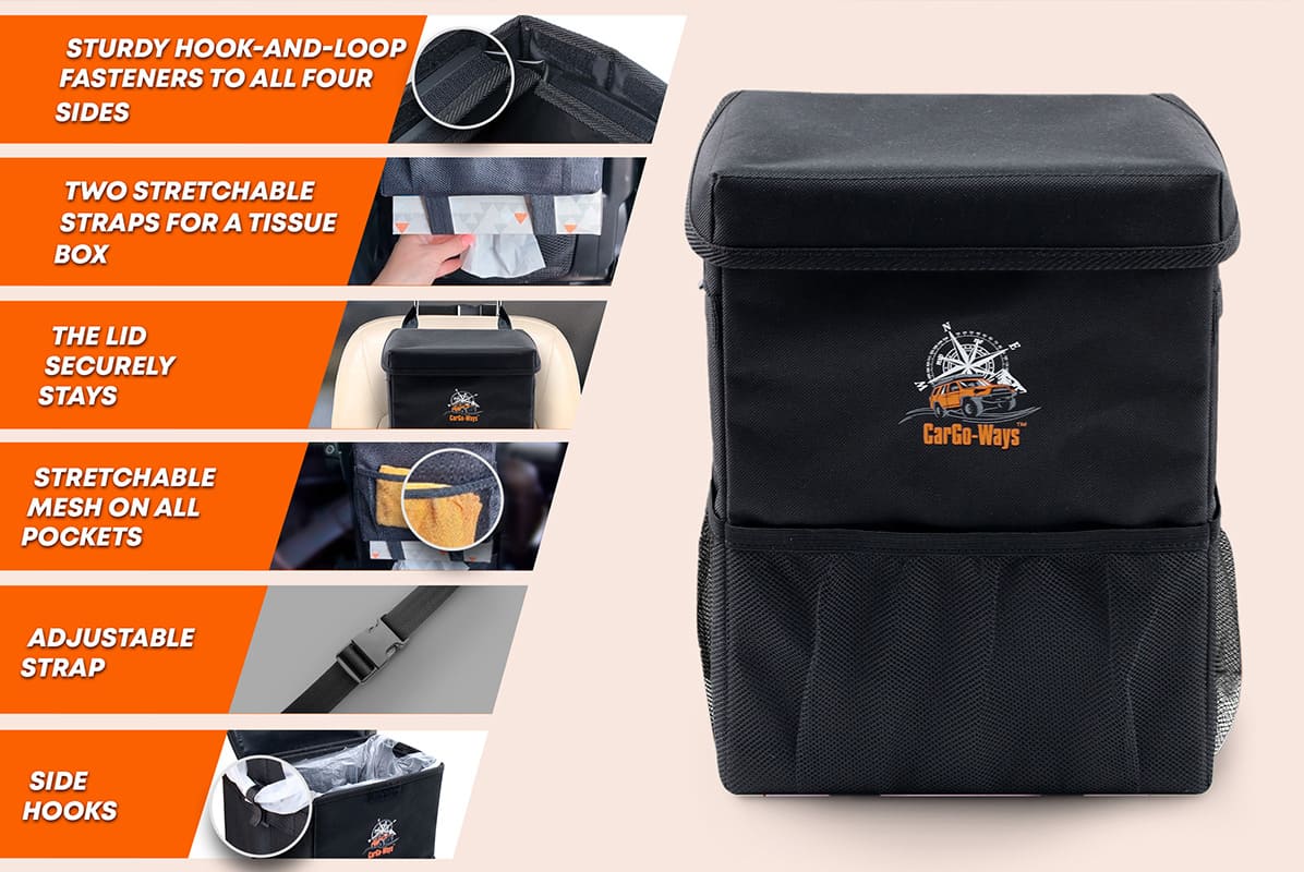
During the design process, special attention was paid to the logo’s adaptability: it scales flawlessly and remains recognizable both on digital platforms (in marketplace page designs, app icons, and the Instagram feed) and on physical surfaces (when applied to automotive products, boxes, and business cards).
Subject: Automotive Accessories
Region: Spain
Task: Logo and brand identity development