Deep Wet Cleaning
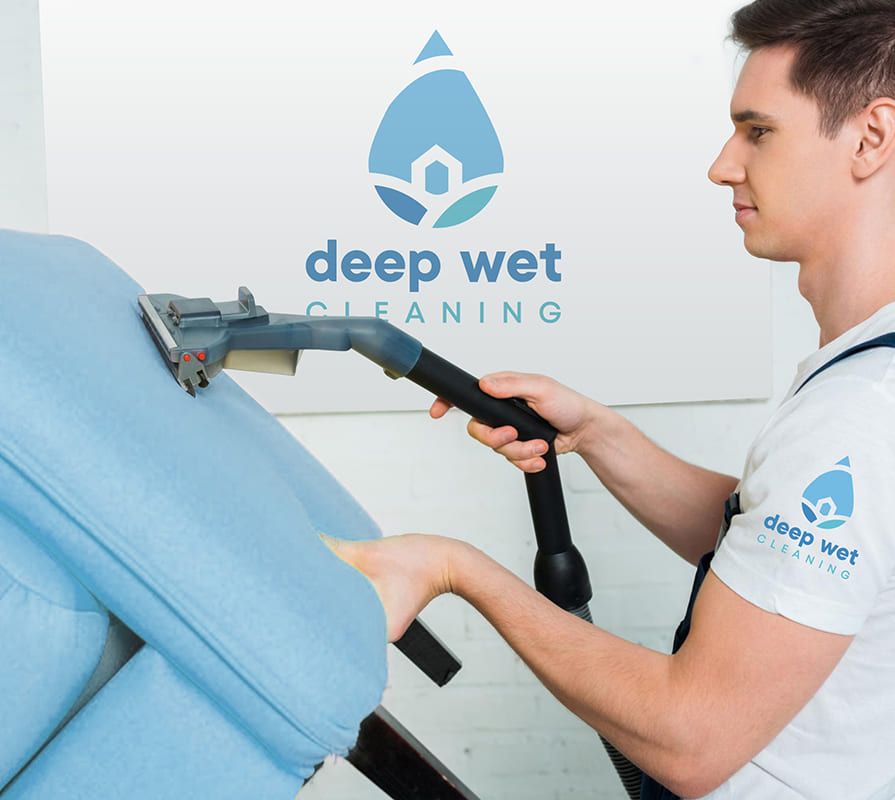
For Deep Wet Cleaning, a company specializing in professional cleaning and disinfection of upholstered furniture, we developed a minimalist yet impactful visual identity that conveys impeccable cleanliness, freshness, and safety. We created a strong and memorable visual brand marker that effectively conveys the company’s values. The logo is highly flexible in its application, laying a solid foundation for the subsequent rollout of a comprehensive brand identity.
What have we done?
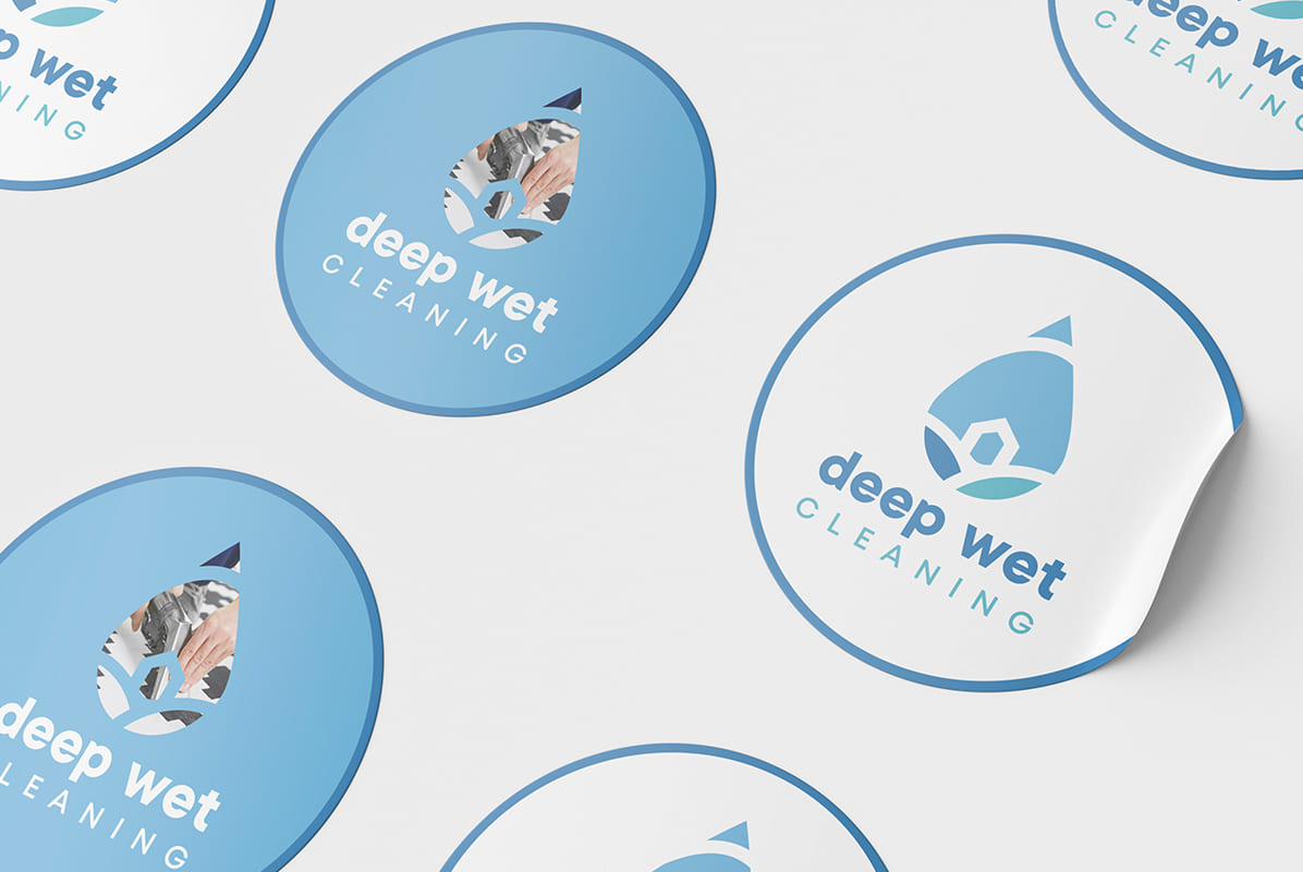
The visual concept of Deep Wet Cleaning is rooted in the idea of impeccable order and care for the home. The logo’s geometry is based on a droplet—a symbol of deep cleansing—inside which a silhouette of a house is schematically depicted. This symbol directly reflects the company’s core business, evoking strong associations in consumers with harmony, coziness, and a healthy indoor atmosphere.
The color palette, combining three harmonious shades of blue and light blue, was not chosen by chance. Airy and watery tones symbolize lightness, professional disinfection, and psychological comfort, creating a sense of reliability and relaxation for customers.
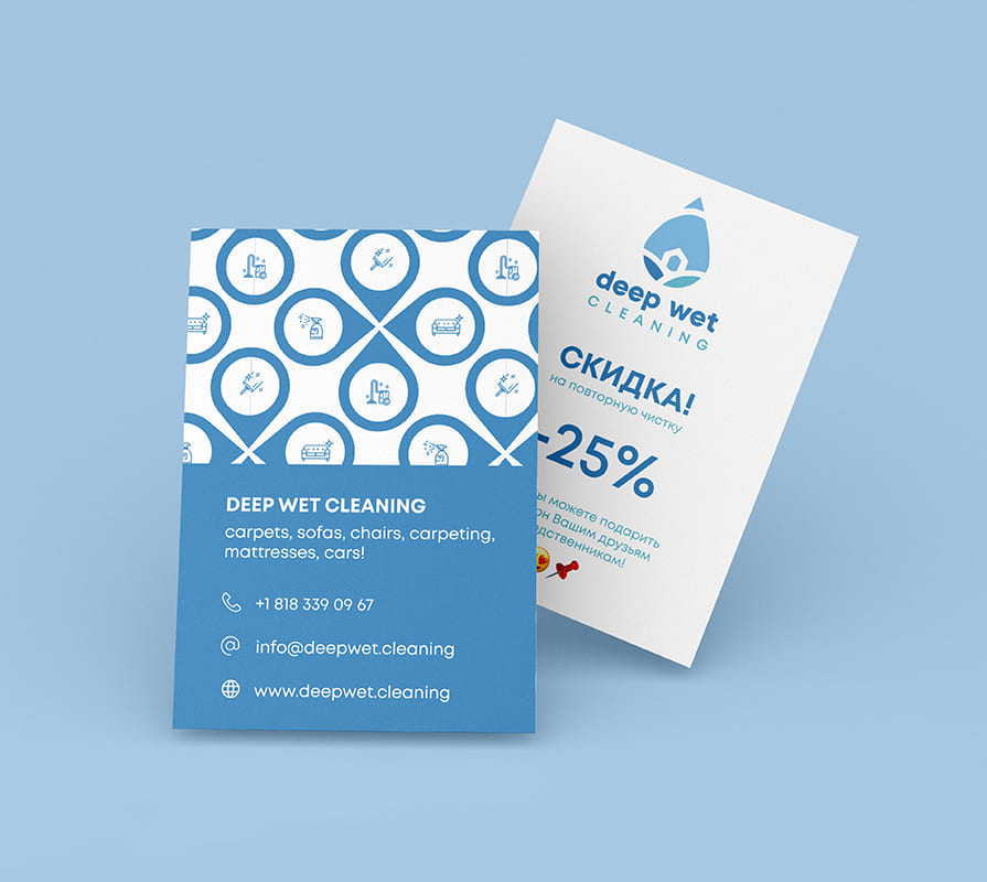
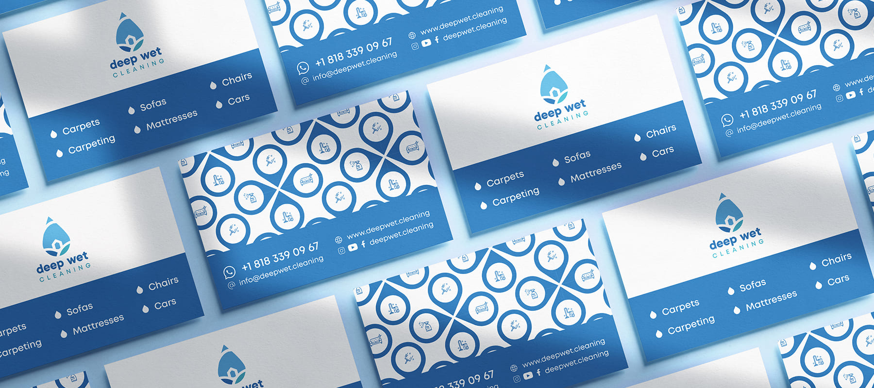
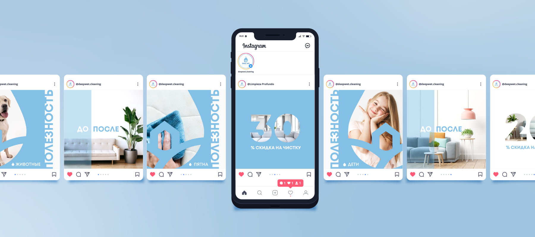
During the design process, special attention was paid to the adaptability of the style: unique droplet-shaped icons featuring images of cleaning products were created for business cards, brochures, and promotional materials. The brand elements scale flawlessly and remain recognizable both on digital platforms (in the design of Instagram and Facebook pages) and on physical media, enhancing the brand’s professional image and overall recognition.
Subject: Cleaning services
Region: USA
Task: To develop a logo, corporate identity, and social media design with a focus on the company’s activities.