LE MASSAGE
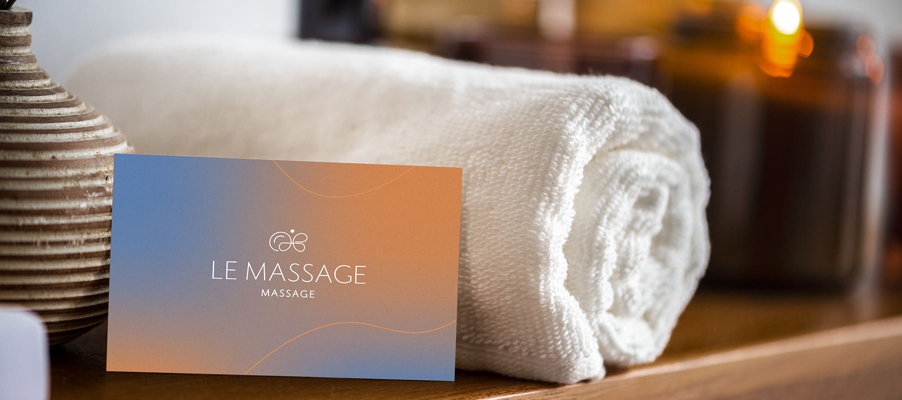
For the LE MASSAGE spa, we developed a refined and minimalist visual identity that conveys a sense of lightness, gentleness, and deep relaxation. We succeeded in creating an elegant and memorable visual brand marker that accurately conveys the gentleness and therapeutic effect of the treatments. The logo is highly flexible in its application, laying a solid foundation for the subsequent rollout of the studio’s comprehensive brand identity.
What have we done?
The visual concept of LE MASSAGE is rooted in the idea of fluidity and harmony. The logo’s geometry is built on thin, graceful lines stylized to resemble the silhouette of a butterfly. The soft curves and distinctive swirls evoke a direct association with massage strokes and the precise movements of a therapist, instantly putting the client in a state of relaxation and tranquility. The chosen classic sans serif typeface harmoniously complements the logo, emphasizing the brand’s modern elegance and premium status.
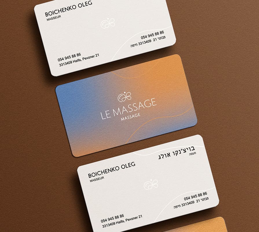
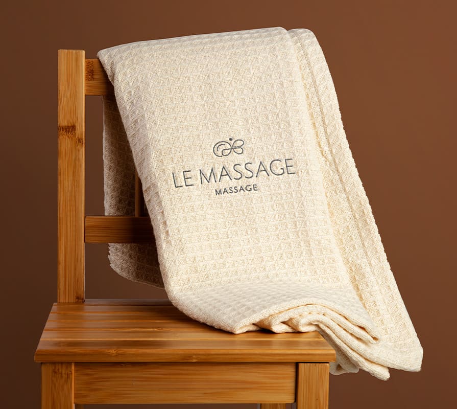
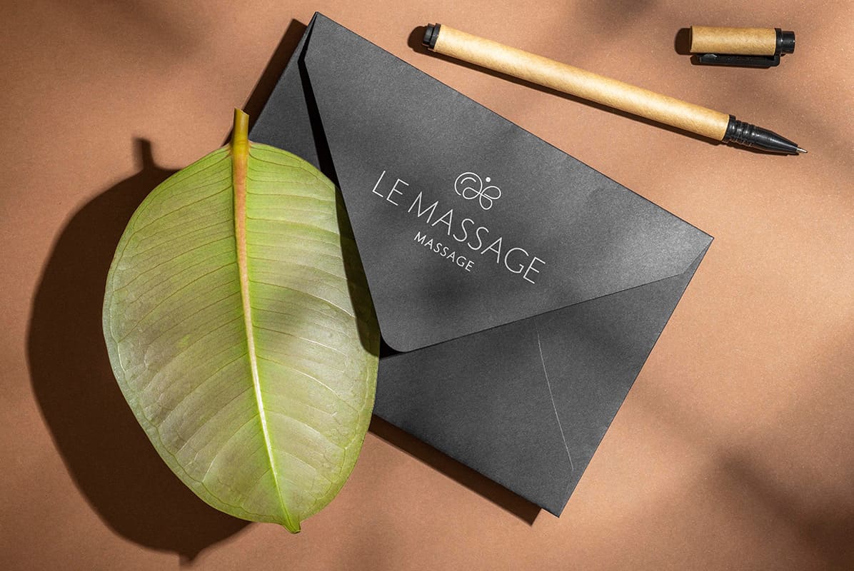
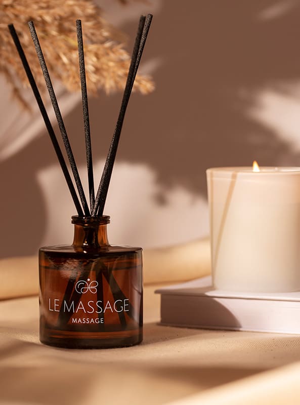
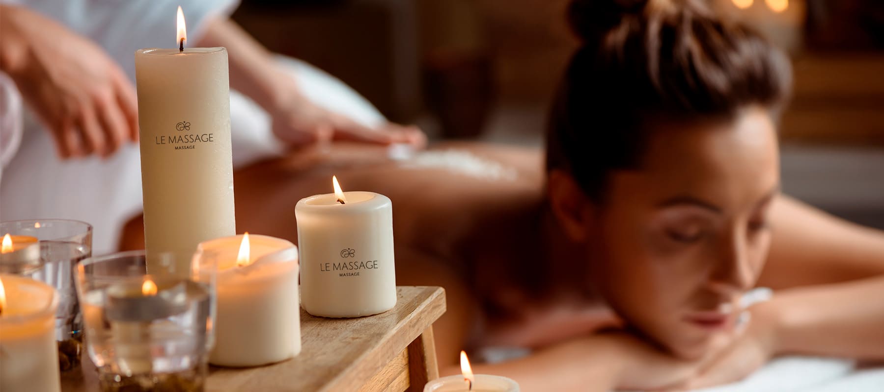
The color palette, featuring a monochromatic scheme and soft tones, was not chosen by chance. The minimalist design—a black logo on light surfaces and a white one on dark ones—ensures flawless contrast, premium minimalism, and excellent readability across all media: from printed materials and signage to branded accessories, textiles, and staff uniforms.
During the design process, special attention was paid to the logo’s adaptability: thanks to its carefully calibrated proportions and refined graphics, it scales flawlessly and remains recognizable both on digital platforms (in mobile apps, social media, and on the website) and on physical surfaces within the salon’s interior.
Subject: Massage Services and Wellness
Region: Israel
Task: To design a logo with an emphasis on lightness