Metzler Immobilien GbR
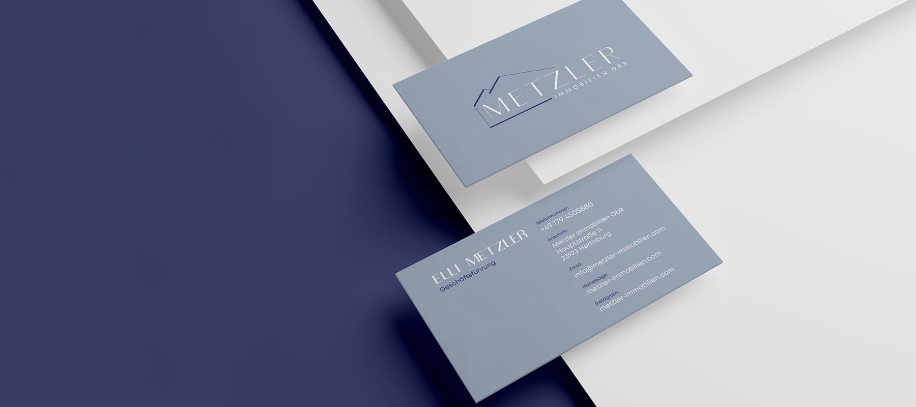
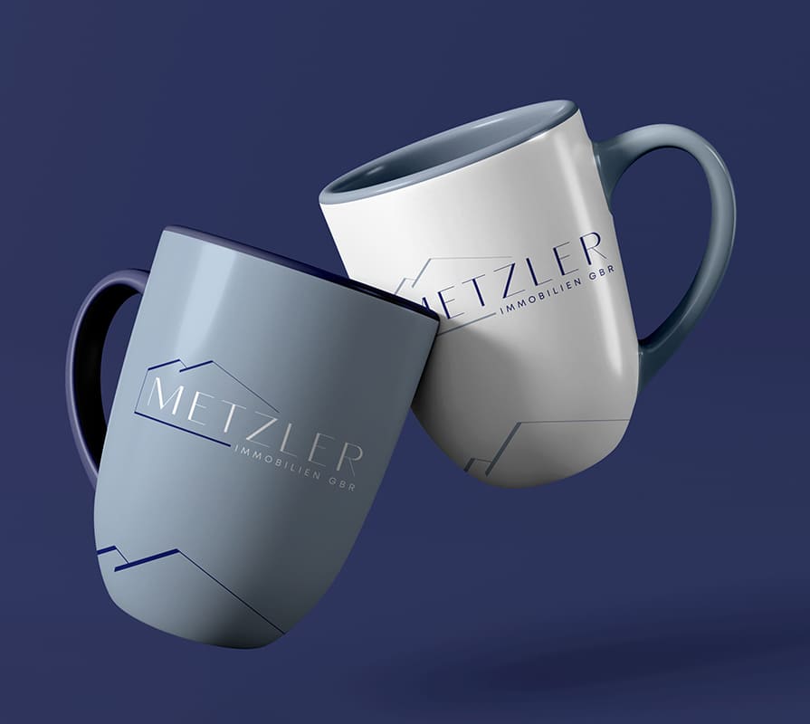
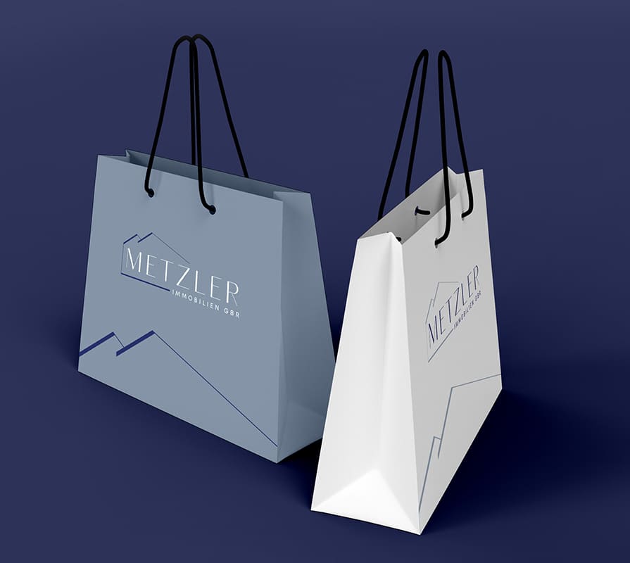
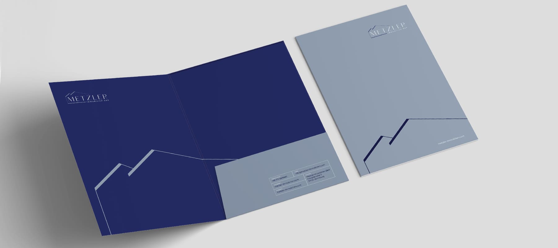
For Metzler Immobilien GbR, a company specializing in real estate sales and rentals, we developed a refined and elegant visual identity that combines the professionalism of the industry with a soft, aesthetic presentation. Traditionally, the real estate sector is associated with a masculine approach, rigid forms, and strict geometry. Our task was to move away from this stereotype and create a harmonious, stylish brand identity that evokes associations with tenderness, grace, and femininity, while maintaining a fundamental sense of reliability. The logo is highly versatile in its application, laying a solid foundation for the subsequent rollout of a comprehensive corporate identity.
What have we done?
The visual concept for Metzler Immobilien GbR is based on the ideas of minimalism, lightness, and architectural elegance. The logo’s geometry is built on clean, precise, and delicate lines that form a stylized image of houses. This approach highlights the company’s specific line of business while doing so subtly, conveying the values of premium service, comfort, and harmony.
The brand’s color palette is selected to highlight the brand’s nobility and sophistication:
- Deep blue serves as a confident foundation and creates strong accents, symbolizing the company’s stability, trustworthiness, and status in the real estate market.
- Pastel gray-blue dominates the brand identity and sets a soft, elegant tone, guiding the visual perception toward lightness, care, and femininity.
- Light gray serves as a harmonious neutral background and a unifying element, lending the entire graphic system a sense of sophistication and purity.
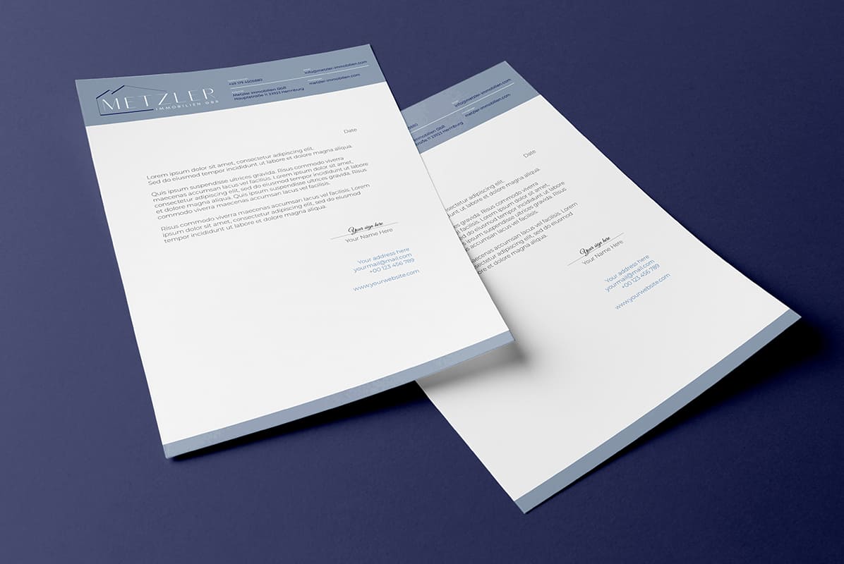
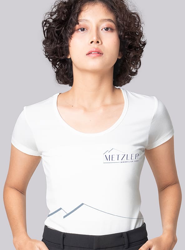
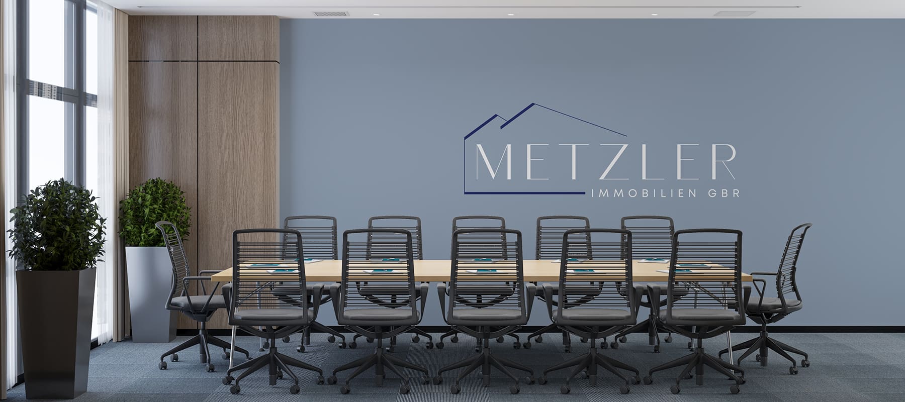
During the design process, special attention was paid to the adaptability of the brand identity. The minimalist design scales flawlessly and maintains 100% brand recognition both on digital platforms (websites, social media, favicons) and on any physical media—from business stationery, document folders, and letterheads to outdoor advertising, signage, and office interior design. The result is a sophisticated and memorable brand image that sets the company apart from its competitors and inspires genuine trust among customers.
Subject: Real Estate (Sales and Rentals)
Region: Germany
Task: To develop a logo and corporate identity with an emphasis on elegance and softness.