Plazma Studio
For Plazma Studio, a mobile game development studio, we created a vibrant, dynamic, and approachable visual identity that conveys an atmosphere of creativity, technological innovation, and engaging gameplay. The logo we designed easily adapts to any digital platform or medium, laying a solid foundation for building a strong brand in the game development industry.
What have we done?
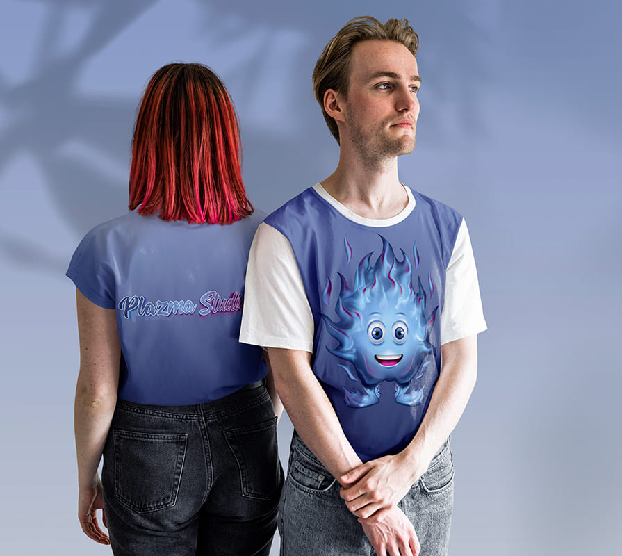
Plazma Studio’s visual concept is built on the synergy between modern technology and an emotional connection with the audience. The brand’s main symbol is a blue flame (plasma)—pure energy that, in our interpretation, has transformed into a warm, charming, and friendly character that instantly resonates with children and adults alike.
- The logo is based on a calligraphic typeface with soft, flowing lines. This allowed us to harmoniously combine the studio’s IT expertise with the lighthearted, childlike playfulness characteristic of mobile games.
- The primary color scheme features neon blue and blue tones, directly evoking the glow of plasma, a sense of security, and technological balance. Purple accents harmoniously complement the palette, symbolizing boundless creativity, magic, and innovation.
- Special attention was paid to the scalability of the style during the design process. The logo and brand identity elements are perfectly legible on the screens of any mobile device, in app icons, game interfaces, and favicons, and they also look great on the studio’s merchandise.
Subject: Development of mobile games for children
Region: Ukraine
Task: To develop a logo, brand identity, and corporate mascot that reflect the company’s field of activity and appeal to the target audience.