Sunrise Trade
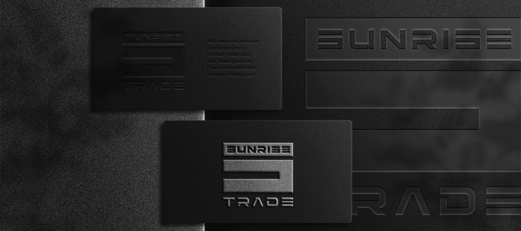
For Sunrise Trade, a company specializing in the import of vehicles from the USA and Europe, we developed a rigorous, bold, and substantial visual identity that conveys strength, confidence, and an impeccable standard of service. We succeeded in creating a powerful, masculine, and memorable visual signature that effectively communicates the brand’s core values to its target audience. The logo offers great versatility, establishing a solid foundation for the further rollout of the company’s overall brand identity.
What have we done?
The visual concept of Sunrise Trade is rooted in the idea of power, rigor and road aesthetics. The geometry of the combined logo is based on concise forms: the use of the rectangle symbol creates a direct association with the automobile highway. A unique font block with sharp, clear lines conceptually reproduces the direction of the path and the dynamics of movement. The result was a monolithic and authoritative sign that instantly inspires trust among clients and brand partners.
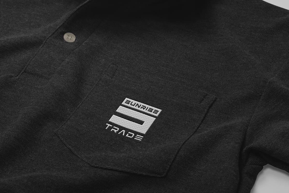
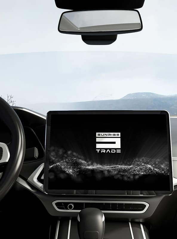
The color palette is made in an uncompromising monochrome style. The contrasting combination of deep black and pure white colors was not chosen by chance: black symbolizes power, strength and confidence, while white is responsible for lightness, transparency of processes and perfection. Such a classic solution provides maximum visibility, restrained severity and excellent readability of the logo on any media — from digital screens to branded vehicles.
During the design process, special attention was paid to the adaptability of the sign. The logo scales flawlessly and maintains 100% recognizability both on small digital surfaces (application icons, favicons, profiles in social networks) and on physical surfaces (documentation, interior elements, outdoor advertising).
Subject: Automobiles
Region: Ukraine
Task: Development of a logo with a formal/minimalist style.