Receive a presentation of services and expert advice
The best experts in the industry will oversee your brand development process.
→ Need branding, design, or creative solutions? Call us at +48 505 648 022 or message us on WhatsApp.
 WeLoveBrands.pptx

The best experts in the industry will oversee your brand development process.
Health is a highly sensitive topic. Therefore, companies operating in the medical field and looking to attract new clients must not only differentiate themselves from competitors but also inspire trust and convince of their reliability and safety at first glance. A medical company logo plays a crucial role in creating the desired image.
Well-chosen design elements and a well-thought-out logo concept will help capture and hold people's attention, increasing recognition and trust in the company.
The right logo will emphasize professionalism and reflect a commitment to customer service while remaining effortless and natural. We'll discuss how to create such a logo in this article.
The medical services market is quite vast, and to differentiate your company from competitors, you need to highlight its advantages and create a striking and memorable visual image. Consumers should feel reliable and safe from the very first encounter with the company. Therefore, the logo and the impression it creates are so important.
A medical logo allows you to:
 strengthen the company's image;
 differentiate your business from competitors;
 highlight your strengths and type of activity;
 to create a sense of security among consumers;
 increase recognition and trust in the company;
 attract the attention of new clients.
A good medical organization logo inspires trust and reassures clients of its professionalism and modern approach. And if they feel secure, their interest in the company will grow.
Logo design in the medical field is determined by several factors. Firstly, the company's specific business and focus, and secondly, the message you want to convey to consumers through various elements and techniques.
A corporate logo can reflect the specifics of a business so people understand the company at a glance, or it can be based on a specific message. For example, use a silhouette of a pregnant woman or parents with a child for a family clinic, an image of teeth for dental offices, or images resembling blood cells for laboratories and research centers.
A medical company logo should be clear and memorable. Choosing a suitable symbol or icon should be based on the company's profile.
In the field of medicine, the following areas are distinguished:





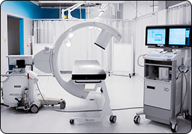
Common and easily recognizable images for medical institutions include the red cross, a bowl with a snake, a heart, palms, and other symbols associated with health and a happy family.
But to stand out and attract attention, it's recommended to move away from traditional imagery and create a creative logo. You can play with familiar images or use abstract elements, but be careful not to go overboard.
The medical industry is making its own adjustments and demands seriousness. This doesn't mean a logo should be boring. Quite the opposite—it should be lively and emotional, but without the risk of being misunderstood by the audience.
Original logos are rare in the medical field, so you have a chance to stand out and outshine your competitors. If you want a unique and stylish medical logo, order one from WeLoveBrands. You can do this by phone or via online chat.
A medical company's logo should be clear and evoke positive associations. It's best if it inspires confidence and reflects a commitment to customer service.
When choosing design elements, consider the needs of your target audience and how accurately they convey your message. For example, colorful logos aren't typical for the healthcare market, but if your business is aimed at children, why not break away from stereotypes and add a little pop of color?
An image is one of the key elements of a logo. It can reflect the company's focus, highlight its benefits, or create a unique atmosphere.
The most commonly used in the medical field are:





Such images are found in many company logos, so they often go unnoticed. To stand out from the crowd, it's better to stylistically play with traditional images or use abstract elements.
Color conveys a certain mood, so its choice should be taken carefully. The medical logo predominantly features blue, red, green, and yellow shades.
Red symbolizes strength and energy, stimulates the nervous system, and is associated with medical themes; blue calms and evokes a feeling of stability and security; green is associated with health; and yellow brings hope, warmth, and joy.

When choosing a color, consider your audience and the impression you want to make. If your business is aimed at an older audience, opt for neutral colors, while if it's aimed at children or young people, add a little life to the logo with vibrant shades.
Most often, two colors are used in design, but if your idea calls for a different number of shades, don't get hung up on this trend and choose as many as you need. The main thing is that they look harmonious.
The font should be consistent with the overall concept and complement the image. It's best to choose legible and understated font styles.
Fonts with flourishes and a lot of detail are not suitable for the medical field, but this does not mean that only strict and heavy options should be used.



If you want to soften your logo, you can choose a less cluttered font with smooth lines and easily distinguishable letters. This will give your brand a more appealing and stylish look.
 Traditional symbols played in an unconventional way
If you want to create a clear logo that will inform consumers about the company's activities, you can use familiar and common images, but not in a classic version, but with the addition of a certain twist.
 Abstract elements
To differentiate yourself from competitors and attract attention, you can choose images or abstract elements that are not relevant to the topic but evoke certain emotions.
 Playing with text
When choosing a font logo, remember that without an image, customers' attention will be focused on the text. To ensure a visually appealing and stylish logo, experiment with words and fonts. For example, highlighting portions of the text, using scaling, blurred letters, or broken lines.
If you're looking for a fresh idea and a modern logo for your medical institution or company, then you've come to the right place. WeLoveBrands' designers will study your business, develop a strategy, and create a brand identity that will enhance your company's image.
Many companies in Ukraine use familiar medical symbols in their logos. Laboratories and modern medical centers most often choose font-based logos or combinations, but with a minimal number of elements and a simple image.
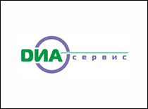
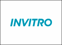
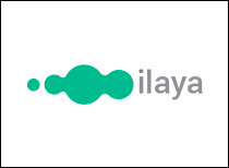

Ukrainian companies use a wide variety of shades and shapes, not sticking to the popular medical colors of red and blue. Gray, pink, green, yellow, and brown are also common.
American medical centers typically feature simple logos with abstract symbols. Font logos using simple font styles are most common.



One of the most common colors is blue. Gray, black, yellow, and green are also popular.
When it comes to European logos, minimalism is trending. Each medical company uses its own imagery and design techniques, depending on the specifics of its business and the services it provides. However, simple, two-color font logos or three-color combination logos with a limited number of elements are common.
Traditional medical symbols are not often used in logos, and gray, blue, and red tones occupy a special place among colors.
In Asia, you can see both simple logos in one or two colors and complex emblems. Each country and company has its own design characteristics, but one common theme is the active use of geometric shapes and abstract elements. Familiar medical symbols are typically used for hospitals.


Popular colors are those that are typical for the medical industry as a whole (blue, green and red).
There are two main ways to create a unique logo: hiring a freelance designer or hiring a professional studio or agency. Each has its pros and cons.
The advantage of freelancing is getting a high-quality logo for a relatively low price (prices vary across Ukraine, starting at 30 $ on average). However, there's a catch: you must find a responsible and talented specialist. Otherwise, ordering blindly can backfire – you might miss the deadline, or the logo will be primitive.
If you choose a studio, you can be sure you'll get what you want. These companies employ experienced and creative designers who value their reputation. Therefore, the work will be delivered within the agreed-upon deadline, and you'll receive several logo options. This service will cost more than freelancing (starting at $150), but you're risk-free.
Designers study the specifics of your business, your competitors, and your target audience, develop a core idea, and create original logos. This means there will be no cookie-cutter solutions or generic symbols.
This is exactly how the specialists at WeLoveBrands work. Order our design service and receive a modern, recognizable, and trustworthy logo for your medical organization, company, or center. For more details and any questions, please call us or send us a message in the chat.