Receive a presentation of services and expert advice
The best experts in the industry will oversee your brand development process.
→ Need branding, design, or creative solutions? Call us at +48 505 648 022 or message us on WhatsApp.
 WeLoveBrands.pptx

The best experts in the industry will oversee your brand development process.
Energy companies need to create a reliable and credible image that will attract and inspire trust. A logo can help achieve this. A good brand identity will allow companies operating in the energy industry to immediately communicate their credibility and professionalism. A logo will inform consumers about the company's activities and highlight its strengths.
A well-thought-out visual identity strengthens reputation, inspires trust, and evokes positive associations. But to achieve this, you need to abandon formulaic solutions and create an original logo.
A brand name creates a specific image in the minds of consumers. It can not only attract attention and interest in a product, but also repel it.
A modern and stylish logo will inspire confidence in the company and convey its reliability and security, while a banal and boring one can create a feeling of incompetence.
An effective energy logo helps:
 stand out from the competition;
 inform about the specifics of the business;
 highlight the benefits;
 increase recognition;
 improve the company's reputation;
 inspire confidence;
 attract new clients.
A logo must be interesting to attract and hold attention, understandable so that people can quickly identify the company in front of them, and emotional to influence consumer behavior through their feelings and sensations.
Energy company logos that convey energy and warmth to their audiences create a positive outlook and evoke pleasant associations. To create such a logo, it's important to use an original concept and select appropriate images, shapes, and colors.
When choosing design elements, it is necessary to take into account the company's line of business and target audience.
Thus, oil and gas companies can place a drop of oil or fire on their logos, power plants – light bulbs, lightning bolts or power transmission towers, hydroelectric power plants – dams, nuclear power plants – symbols of radiation hazard, and companies associated with renewable energy sources – images of living nature.
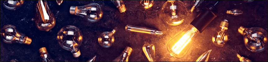
Green energy has become increasingly popular recently. New companies, large and small, are emerging that generate energy from inexhaustible natural resources (sunlight, wind, and rain). These characteristics can be incorporated into a logo, thereby creating a clean and eco-friendly image for the company.
The design can use both thematic imagery and abstract elements. The main thing is that the logo is recognizable and evokes a sense of stability.
To order a logo, call WeLoveBrands. Our designers will bring any idea to life to present your business at its best.
Every design element influences the overall image and perception of the logo. Using various symbols, fonts, and color schemes, it's possible to create a specific image of the company and reach consumers.
A logo that emphasizes reliability and strengthens the energy company's image consists of clean lines, simple fonts, bright colors, and images directly or symbolically related to energy. Let's take a closer look at these elements.
How to choose color, imagery, and font for an energy logo?
 Image
Most often, a logo is based on a symbol related to the energy industry. It is selected based on the specifics of the company's activities. For example, for solar power plants, it's the sun and solar panels; for wind power plants, it's turbines; for hydroelectric power plants, it's dams and drops of water; for thermal power plants, it's power lines, light bulbs, and lightning bolts.

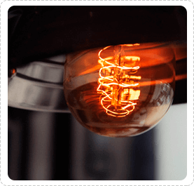
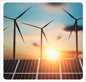
If you're going for a neutral look, choose geometric shapes that evoke the desired associations. This will create an attractive and modern logo.
 Color
Energy company logo designs favor bright, sunny colors. Popular shades include yellow, red, orange, green, and blue. They are associated with energy, sun, and nature.
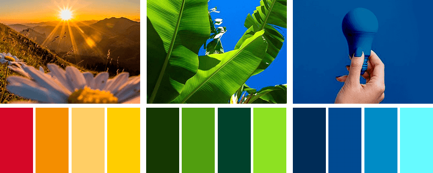
Green and yellow shades are ideal for companies working with alternative energy sources, blue for hydroelectric power plants, and orange and black for thermal power plants.
A great solution is to combine a bright color with a neutral one, such as gray or black. This logo will look stylish and respectable.
 Font
Since energy companies are characterized by power and stability, this should be reflected in their logo design. Strong fonts with straight, bold lines are most often used.
To stand out and be remembered, you can develop your own font style or adapt an existing one.

Creating a unique logo requires an unconventional idea. Conventional symbols convey the essence of a company, but they don't differentiate it from competitors or enhance its recognition. For this reason, it's better to explore unexpected imagery and use interesting color schemes.

If you're stuck for ideas but want to create a trustworthy logo, contact WLB Studio. For a consultation and to learn more about design, call us or chat online.
The logos of Ukrainian energy companies vary depending on their line of business. Electricity companies use thematic images (such as lightning bolts) and geometric shapes, while solar power plants often opt for natural symbols and symbol-free logos.
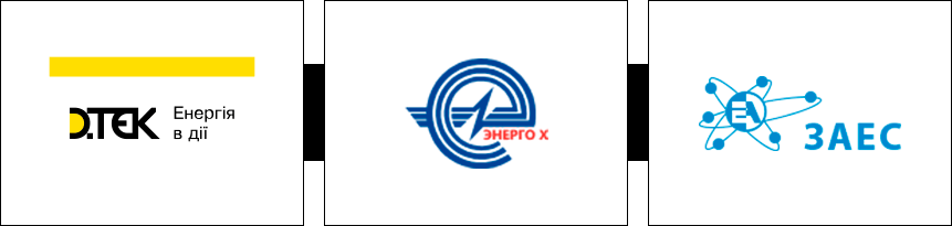
The main colors present in the design are blue, yellow, orange, green and black.
Companies often use interesting fonts and unusual styles, which gives logos a sense of solidity and elegance.
A distinctive feature of American energy company logos is the use of various geometric shapes and lines. Font-based logos and minimalist corporate symbols are also common.
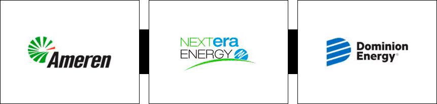
American company logos are predominantly blue, green, red, and black. Two- and three-color logos are more common.
European logos are characterized by unconventional fonts, unexpected images, and brightness.
Popular shades include yellow, red, blue, and green. Often, more than three bright colors are used in designs.
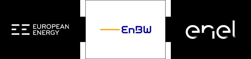
Many logos feature interesting fonts and play with text—both in font and combined characters. Images include animals, natural symbols, and abstract elements.
Logos of Asian energy companies mostly use traditional images and geometric shapes in this industry.
Common shades include red, yellow, green, blue, and gray. Two-tone logos often use contrast or a combination of two vibrant hues.
There are many ways to create a logo, but there are three main ones: by yourself using online resources, or by ordering one from a designer or a design studio.
If you choose to create a logo using a logo maker, you shouldn't expect a unique and original design. Online resources allow you to select an image that matches the theme and choose any color and font. This means you'll be stuck with a template and a simple logo.
To achieve a recognizable, modern, and stylish logo, you need to carefully consider the idea and entrust its development to a professional. Designers can be found freelance or in a studio or agency.
In the first case, you can get a high-quality logo for a relatively low price (starting from 30 $, depending on the region, qualifications, and availability of the designer). However, there's a risk of dealing with an unscrupulous designer who will miss deadlines or produce a basic logo.
When you order services from a design studio, you risk nothing, as companies value their reputation. The studios employ specialists who are not only passionate about their work but also know how to ensure your logo captures the attention of your audience.
Logo creation at a studio starts at $150, but you'll get the results you expect. Companies offer several options, varying in price, timeframe, number of logo variations, and the amount of edits allowed.
Before starting work, WeLoveBrands studio designers study your business, competitors, and target audience. They then develop a strategy and create effective energy company logos that are memorable and highlight their strengths. If you need just such a logo, contact us by phone or via the chat on the website.