Receive a presentation of services and expert advice.
The best experts in the industry will oversee your brand development process.
→ Need branding, design, or creative solutions? Call us at +48 505 648 022 or message us on WhatsApp.
 WeLoveBrands.pptx

The best experts in the industry will oversee your brand development process.
Are you familiar with the saying, "They greet you by your clothes, but see you off by your mind"? It turns out, it applies not only to people but also to a company's image. Many clients choose a contractor based on their brand identity. So pay due attention to your logo. After all, it would be a shame if a client switched to a competitor simply because their logo looked better.
The key to a stylish and attractive logo is a good color. It's important to choose the right color, depending on your business's line of business. Today, we'll discuss the role of brown in logos. Who benefits from brown? What tone pairs it with? And how do you use it effectively? Read on to find out the answers to these questions.
Brown is associated with tree bark, earth, and fertility. Many people associate it with stability, loyalty, and reliability. It radiates calm and health.
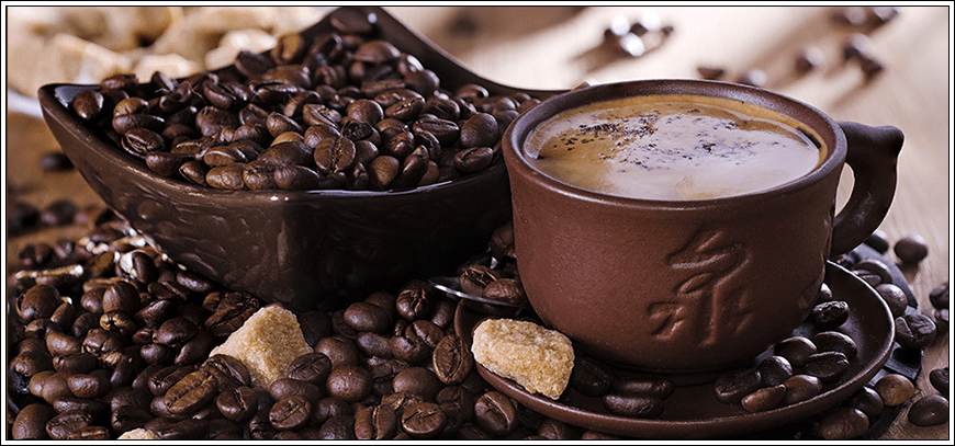
Brown is the color of safety, comfort, and coziness. It symbolizes a warm home and relaxation. Even in ancient times, this color was considered rich and noble. It was once worn only by the upper classes.
Brown combines many colors: yellow, red, green, orange, purple, and gray. The result is a luxurious hue that combines all the positive qualities of other shades.
This color relaxes and relieves stress. It evokes a sense of security and calms. It helps one cope with physical and psychological stress. It also boosts self-confidence.
Each shade of brown has its own effect on a person. Lighter shades evoke a desire to relax. They can calm and suppress aggression. Bright browns, on the other hand, stimulate a desire to take action. In any case, all shades attract attention.
Brown has a wide range of shades and can be warmer or cooler. For example, a brown with a hint of orange is called tawny, while a brown with a hint of red is called brick brown. There are also many unusual names. For example, "giraffe belly" is a brown with yellow undertones. Chamois is a brown with a hint of beige. A very beautiful name, "burnt coffee color," is a dark brown with a black undertone.
In short, each shade has its own unique charm. If we started listing all the shades of brown right now, it would take forever. So, we'll stick with the most basic ones.
 |
Crème brulee It's essentially light brown mixed with white, very similar to the color of coffee with milk. |
|
 |
Dark chocolate Simply stunning shade! Sophisticated and elegant. |
|
 |
Brown We all know the brown bear from children's fairy tales. Imagine its fur. Dark brown. That's the color. |
|
 |
Ocher This color is reminiscent of hot desert sand. A mixture of light brown and yellow. |
|
 |
Brick As we wrote earlier, this shade of brown is close to red. |
|
 |
Chestnut Light brown with a cool undertone. The color resembles chestnuts. |
|
|
|
||
 |
Coffee This color is a perfect match for the shade of coffee beans. Incredibly deep and stylish. |
|
|
|
||
 |
Bronze Bronze is more close to light orange. A gorgeous color. |
|
|
|
||
 |
Copper This color is a unique mix of beige, yellow, and brown. It looks cool. |
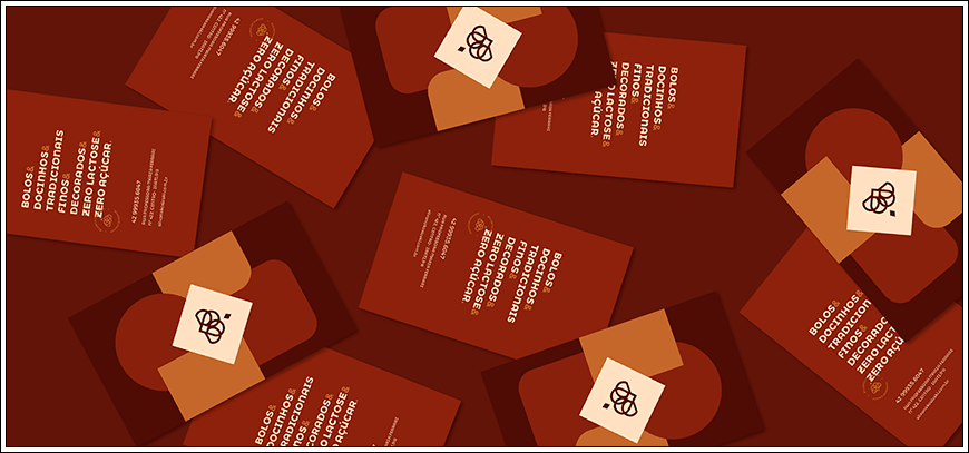
This color is perfect for business. It not only has a calming effect, but also helps to set the tone for productive collaboration. It also helps smooth over awkward moments in teams and inspires employees to reach new heights. Furthermore, it promotes concentration, helps overcome challenges, and aids decision-making.
But brown also has its drawbacks. Excessive amounts can trigger depression and stress, inhibition and boredom, and the development of self-doubt. The color can also signal a reluctance to make new acquaintances.
Brown has its own meaning in every country. Some associate it with mourning, others with happiness. Regardless, all interpretations are interesting and unusual. We've compiled the most common ones:
North America – stability and reliability
Europe - health and fertility
Latin America is considered a negative color.
Egypt - comfort and coziness
Turkey is the color of the earth
Asian countries - brown symbolizes mourning. Although in the Chinese zodiac it is used to represent the earth.
Eastern countries - has a negative meaning. Mourning color
Be careful with logos using brown. Despite the hidden power and luxury inherent in this color, not everyone will understand this. Some people even associate it with dirt. Also, remember that too much brown can cause stress or even trigger depression. Overall, brown is a great color for your company logo because it suits many industries. However, there are certain industries where it looks particularly trendy and stylish. We've compiled a list of businesses for which this color is particularly suitable.
cloth
Brown is a very stylish color. That's why it's so beloved by brand creators. Many well-known clothing brands choose brown for their logos. This is because it combines impact and simplicity. It also emphasizes the luxury and exclusivity of your clothing. In short, it's a perfect choice for designers.

automobile companies
Strength and power, speed and confidence—these are the qualities that automotive companies need to convey. And brown is a great color for this. You can try it as a single-color logo or combine it with another interesting shade.

agricultural companies
We've written before that brown is associated with fertility and the earth for many people. This makes it a perfect choice for emblems and other symbols of agricultural companies. Whether you're growing corn or making agricultural equipment, brown is a perfect fit for any industry.

cafes, restaurants
The color scheme will look simply stunning on logos of any establishment. We especially want to emphasize lighter shades, like crème brûlée. It will evoke a sense of calm and tranquility in potential customers, making them eager to visit your restaurant or café.

electrical industry
Since brown is a rather warm and calming tone, it would look great in logos for electrical companies. Alternatively, it can be paired with warmer colors to evoke maximum emotion in the customer.

real estate
Brown is especially suitable for real estate companies. It's one of the most comfortable colors. It's also slightly muted, so it doesn't overwhelm the viewer. It promotes relaxation and calm, evoking the feeling of a warm home, the kind you typically experience at home under a blanket with a mug of hot tea.

products
This color would be very appropriate in the food industry, especially if you're choosing a logo for chocolate or coffee. Since these products are naturally brown, it would be especially appealing to create logos in their color.

construction companies
Stability, reliability, and confidence are typically associated with the color brown. And these attributes are often adopted by construction companies. So if you own such a company and are considering a logo color, consider using brown. You'll not only market yourself as a reputable company but also earn the respect of your clients.

There are industries where brown would be inappropriate. Sometimes, it can even turn customers off your company. We don't recommend this color for businesses associated with romance and emotion, modern technology, or children's entertainment. We also don't recommend it for companies with low price points. After all, brown is a tone of luxury and aristocratic chic. Read on to learn more about who should avoid this color.
electronics stores
Typically, brighter colors are best for tech stores to attract attention. Use different colors when creating a logo for such a company—colors that symbolize modernity and technology, rather than sophistication and luxury. This will accurately describe the tech store.

flower delivery
Almost everyone associates flowers with romance, love, or even respect. They're simple, light, and delicate. The color of fertility and earth doesn't describe these characteristics. Therefore, we don't recommend choosing brown in this case.

financial companies
Although brown symbolizes stability and reliability, it's still not suitable for financial industry logos. It's too soft and muted, not serious enough. While you can certainly try using it in this field, it's better to choose a more flattering color.

beauty salons
Beauty salons are always trendy, modern, and stylish. Your logo should convey that you're a "girl's paradise." And according to statistics, many women dislike the color brown. So, think about your logo some more.

goods for children
It's no secret that children are drawn to bright colors. You can convince them all you want that brown is the season's trend and a style icon, but it still won't capture their attention. It's one of the most "grown-up" colors, quite serious. Therefore, it won't evoke joy and excitement in them.

medicine
Like it or not, most dark colors are subconsciously associated with negativity. Medical company logos are supposed to instill absolute optimism and faith in the good. Dark shades, including brown, are too serious for that.

companies that care about cleanliness
Cleaning companies and dry cleaners would be a good example. People typically associate white and blue with cleanliness, but not brown. This is because, if used incorrectly in a logo, it can evoke dirt. Therefore, it's better to choose a different color to convey cleanliness.

In some cases, monochromatic logos can look boring. In such cases, color combinations come to the rescue. We recommend diluting brown with other bright shades and mixing it with interesting tones. Use a variety of attractive combinations. However, it's crucial to choose a combination that's pleasing to the eye. This is essential to attract new customers. An unsuccessful combination will ruin the entire logo and turn off potential buyers. Colors should look perfect together, leaving no room for criticism. They should also complement each other. Below are the most winning combinations:
 |
Brown and white | |
| The combination of brown and white is a timeless classic. Brown stands out perfectly. This combination will always be in style. | ||
 |
Brown and bright blue | |
| Against a brown backdrop, bright blue really shines. It's the perfect combination to grab your customers' attention. It's simply stunning, needless to say. | ||
 |
Brown and beige | |
| You could say these colors are "birds of a feather." They're warm shades, both soft and slightly muted. A successful combination. It looks simple yet tasteful. | ||
 |
Light brown and blue | |
| Dark and light tones look stunning together, needless to say. Light brown, a warm shade, and cool blue complement each other perfectly. By coloring your logo in these colors, you'll definitely make your company stand out. | ||
 |
Light brown and purple | |
| It looks unique. Thanks to the light shade, purple plays in a new way in this combination. It looks stylish and modern. | ||
 |
Dark brown and lemon yellow | |
| This combination plays more on contrasts. The combination of light lemon and dark brown is like a lemon cake with chocolate icing. Just as successful and beautiful. | ||
 |
Reddish-brown and pink | |
| A rather unusual combination. A shade of brown, close to orange, and a bright pink create a unique duo. Very cool. | ||
 |
Light brown and creamy white | |
| A very delicate and light combination. It's pleasant to look at. Of course, it doesn't look bright. But thanks to the subtle overlap, they look simply stunning together. | ||
 |
Reddish brown and dark brown | |
| These two shades of brown look great together. Thanks to the muted tones, this combination doesn't look overbearing. It's understated and tasteful. | ||
Brown has a relatively wide palette. It has numerous variations, each unique and distinct from the next. Each shade can evoke a specific emotion, be it joy or hope. It can also evoke disgust. So, choosing the right shade is crucial. Because only with the right tone can you create a unique visual. Unattractive colors can backfire on your logo and ultimately damage your company's image.
Brown emblems will undoubtedly delight customers and attract new clients. But only if you choose trendy tones. Let's figure out which ones are sure to please your clients. More specifically, we'll show you the most current and stylish variations of brown.
coffee
This color makes you want to drink a cup of coffee. It immediately brings to mind the light aroma of coffee. The shade is very deep and beautiful.
brick
This shade of brown has a red undertone. It's considered cool and looks great in any combination.
creme brulee
A very delicate and airy color. Just like the dessert for which this color is named.
chocolate
It looks expensive and sophisticated. A rich and noble shade. It immediately evokes a feeling of warmth and home.
terracotta
Are you familiar with the concept of "cool beauty"? Well, this shade perfectly describes it. Terracotta is a very beautiful color, and belongs to the cool class.
bistre
A rather unusual name for a shade. It's one of the darkest in the brown palette, which is what makes it stand out from the other tones.
sepia
A very warm and beautiful shade of brown. It has hints of orange and yellow. A striking and stylish color.


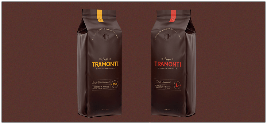
But it's crucial to remember that the slightest mistake in choosing a color can ruin the entire logo. Choose it based not only on personal preferences but also on the tastes of your target audience. So, if you're unsure of your color skills and knowledge, we recommend consulting with professionals. They'll be the ones to choose the right color, keeping your target audience in mind. And it's crucial to find true experts, like the designers at WeLoveBrands. Just look at the wonderful brown logos they've already created for other companies:
Order your logo from us at WeLoveBrands and be 99% sure your clients will love it. We put our heart and soul into every piece of our work . That's why our creations feel alive. This is what sets them apart from our competitors. Confidence and stability or peace and tranquility—the choice is yours! We'll do our best to present it in the best possible light.
We're sure you know how important it is to trust the implementation of your ideas to professionals. So, choose your designer carefully, and start thinking about the colors for your logo. :)