Receive a presentation of services and expert advice
The best experts in the industry will oversee your brand development process.
→ Need branding, design, or creative solutions? Call us at +48 505 648 022 or message us on WhatsApp.
 WeLoveBrands.pptx

The best experts in the industry will oversee your brand development process.
Creating a successful restaurant logo requires skill. After all, everything must be taken into account: the location, the cuisine, the atmosphere, and, of course, the customers. At the same time, when looking at the logo, visitors should clearly understand what to expect. This is a crucial prerequisite for a successful corporate identity. While a cool style and high-quality logo may not affect the establishment's reputation, a poor logo can seriously damage it. After all, charm and appeal are always in the details. And believe me, people notice them.
In this article, we've decided to showcase the most inspiring restaurant logos from around the world. We've grouped them by the most popular global cuisines: European, Asian, Mexican, and American. We hope this collection will inspire you when designing your own logo.
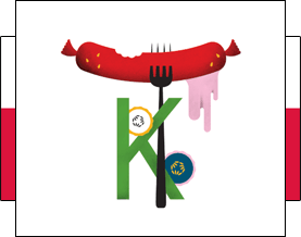
Contemporary trends in logo design and overall corporate identity can be seen in the example of the Polish brand Kimski. The bold and colorful illustrations are subtly balanced by minimalist typography. This design conveys the idea that modern Polish cuisine is expanding its boundaries, incorporating influences from other cultures, particularly Korean.
 |
 |
 |
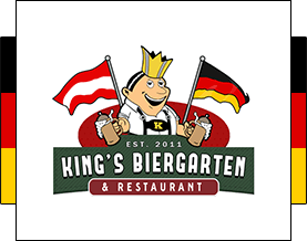
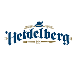
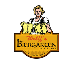
In Germany, the vast majority of restaurants remain faithful to the traditional meal—slow, measured, hearty, and filling. Therefore, logo designs often feature characters in traditional national dress, medieval family crests, Gothic-style fonts, and other national symbols. All these elements lend authenticity to the logos, honoring past traditions and serving as a reminder of the roots of the family and the nation as a whole.
 |
 |
 |
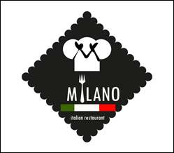
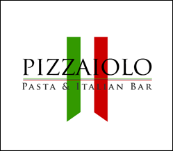
Italians still place a strong national identity first. Therefore, most restaurant logos are designed in the colors of the national flag or with elements associated with Italy. For example, images of pasta, tomatoes, a chef in a traditional toque, pizza, olive oil, and so on are often used. However, the design style itself has changed somewhat—it has become lighter, airier, and more modern. Fonts are often bold, handwritten, and feature smooth, soft lines. All this lends the logos a warmth and simplicity with a touch of romance, so characteristic of Italians. Here are examples of the best Italian restaurant logos:
 |
 |
 |
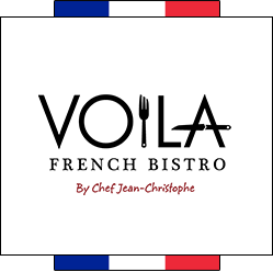
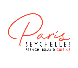
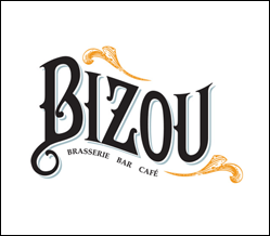
French restaurant logo designs don't follow any particular trend. However, they can be broadly divided into two camps. Some follow the stylistic traditions of the past—the most popular being the Art Deco style of the 1930s and the styles of the 1950s and 1960s. Others follow progressive design trends, embracing sophisticated minimalism and contemporary chic. Fonts and images are chosen to suit the chosen mood—retro or contemporary. However, both logo design trends imbue their images with warmth, sophistication, and legendary French charm.
 |
 |
 |
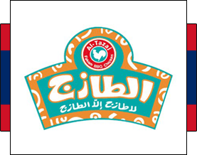
This style emphasizes the use of vibrant, bold colors in design—blue, red, yellow, white, etc. Logos in this style often feature a background in the national colors of Asian countries, and the logo is emphasized in a bold, condensed font for improved readability. Pan-Asian design is a blend of tradition and modernity, color and pattern, as well as an abundance of detail and the obligatory presence of hieroglyphs or Arabic script.
 |
 |
 |
Japanese-style restaurant logos typically use predominantly red and black colors, along with images of traditional chopsticks. Logos can range in style from classic to progressive. Minimalistic designs and a near-total absence of background ornamentation are encouraged. The most common images used are a red circle symbolizing the sun, sushi, fish, a pagoda, a sakura branch, and hieroglyphics.
 |
 |
 |
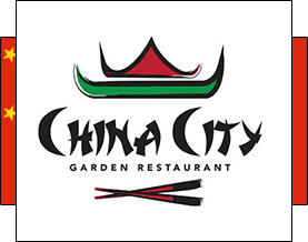
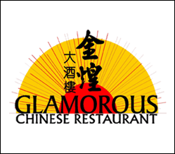
Logos for Chinese restaurants are generally similar to their Japanese counterparts in style and color scheme. The most common colors are red, black, and white, and the most common design element is the dragon. Other popular elements include noodle bowls, chopsticks, pagodas, fans, red circles, and Chinese characters. Chinese-style logos are more dynamic and intricate than Japanese ones, and employ more detail.
 |
 |
 |
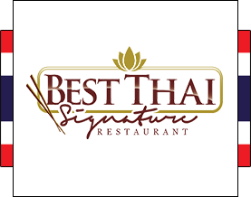
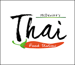
Thai restaurant logos often feature national symbols such as the elephant, the Thai pagoda, the Buddha, and, of course, the lotus. Fonts are designed in the style of Thai script, with flowing lines and intricate scripts. Traditional Thai ornaments are also often used in logo design. Color schemes can vary, but black, red, burgundy, brown, and gold, characteristic of Eastern cultures, are prevalent.
 |
 |
 |
Mexican-style design is incredibly recognizable, and restaurant logos are no exception. They often have a vibrant and dynamic appearance, making them unmistakable. Typically, the primary colors used in corporate identity design are orange, red, green, yellow, and turquoise. These hues lend warmth, vibrancy, and a cheerful feel to the images.
Proponents of traditional style often use symbols characteristic of Mexico, making them highly recognizable worldwide. This allows them to clearly communicate the restaurant's style to their audience through visual imagery alone. Such symbols include sombreros, cacti, skulls, chili peppers, maracas, and bushy mustaches. While such images are no longer surprising, they remain relevant and, when reinterpreted in a modern way, can look very stylish:
 |
 |
 |
However, increasingly, Mexican restaurant logos are emerging that push the boundaries of traditional imagery. These logos are much more in line with global design trends, appearing fresh and unique. The fact that a restaurant is Mexican is clear from the name alone. And that's a good thing, as design should evolve, be diverse, and constantly surprise its audience. Here are the best examples of Mexican restaurant logos with a modern twist:
 |
 |
 |
The diversity and diversity of American cities are reflected in design, including restaurant logos. While rural and mid-sized cities favor traditional design, in major metropolises like New York, Washington, D.C., and Los Angeles, designers follow the latest fashion trends, essentially setting them.
Traditional American signage design pays homage to a classic, timeless style. They are characterized by bright, cheerful, even happy colors, bold fonts, illustrations, and cartoon characters. Recently, logos resembling the retro styles of the 1930s and 1950s-1960s, as well as pin-up-inspired images, have become popular. All this creates a special charm, imparting warmth and warmth with a subtle hint of nostalgia for a bygone era. Here are the best retro logos for American restaurants:
 |
 |
 |
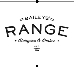
In progressive cities, restaurant logos with a retro feel are also common, but most establishments still embrace modern fashion. This translates to total minimalism. One of the most popular trends in restaurant logo design is the complete elimination of background images and color schemes. Most restaurateurs prioritize the name, so they avoid any details that could distract from it. As a result, we're seeing a trend toward black-and-white or gray restaurant logos, complemented by modern geometry, negative space, broken letters, and contemporary industrial influences.
Designers play with fonts in every way possible, making shapes and lettering flow into one another. The result is an interesting and intricate visual play with an emphasis on minimalism. However, logos often include some kind of signature mark—a small image that captures the soul of the establishment. Here are some of the best such works:
 |
 |
 |
These are the general trends and global tendencies in logo design that you can follow. Or you can choose not to follow them and become a trendsetter yourself. WeLoveBrands Studio loves creating vibrant, unique, vibrant, and dynamic designs. Design with character. Contact WeLoveBrands Studio if you need a logo styled for any country or culture, or, conversely, a stylish and ultra-fashionable minimalist logo that transcends time and nationality.