Receive a presentation of services and expert advice
The best experts in the industry will oversee your brand development process.
→ Need branding, design, or creative solutions? Call us at +48 505 648 022 or message us on WhatsApp.
 WeLoveBrands.pptx

The best experts in the industry will oversee your brand development process.
A successful logo ignites a spark of recognition that makes consumers feel familiar with the brand. It helps identify the company, establishes a strong emotional connection with the audience, and highlights its benefits.
In IT, it's important to show a company's development direction, convey its philosophy, and emphasize innovation. A great logo accomplishes this perfectly. A great logo is reputable, recognizable, and trustworthy. To achieve such a logo, you need to ditch the clichés and embrace your imagination.
An original and expressive logo can attract consumer attention and enhance a company's reputation. And that's not all it does.
The information technology industry is rapidly evolving. Until recently, we didn't even know what a smartphone, the internet, or social media were, but today we're dealing with global giants like Microsoft, Apple, Google, Amazon, Facebook, and so on. The logos of these companies are so familiar that wherever we see them, we always know who they are.
A corporate logo is a company's calling card. It helps differentiate it visually from other companies in its sector and establishes a special connection with consumers. Every business needs a logo, and IT is no exception. Here's why.
Expressive logo:
 It attracts and intrigues. It tells a story about the company and helps create a specific image in the minds of consumers. If this image resonates with them, they will become your customer.
 It distinguishes a company from its competitors. A good logo emotionally engages consumers. It's easily remembered and associated with a specific company, meaning it stands out from the crowd.
 Strengthens a company's image. When consumers see a logo, they form a certain impression. And this impression influences their decision—whether to stay with the company or look for another. To engage your audience, you need a unique and engaging logo.
 Increases trust. People are more trusting of companies that have a logo. Having a brand name reassures them of the company's credibility and reliability.
 Guarantees the quality of a product/service. A logo itself, of course, doesn't promise anything, but it does influence people's subconscious. A stylish and respectable logo reflects the high quality of a product, while a dull and banal one suggests low qualifications and a frivolous approach to work.
 Advertises the product. A logo, placed on various media (website, signage, documents, souvenirs, and promotional items), helps promote the product. The more often it appears before consumers' eyes, the more likely it will be remembered. However, common sense should be exercised and avoid placing it on absolutely everything.
If you're looking for an attractive and trustworthy IT logo, welcome to WeLoveBrands. Our designers are ready to bring impressive ideas to life to transform your business. If you have any questions, please contact us via chat.
An IT company's logo should convey seriousness, reliability, responsibility, and dynamism. Therefore, when designing it, it's best to avoid soft lines and standard images (computers, monitors, etc.), as popular ideas aren't always the best. Such options merely inform the audience about the specifics of the business, but don't reflect its character and, therefore, don't distinguish it from the crowd of similar companies.
IT companies vary in their specialization and range of services. These characteristics must be taken into account when developing a logo.
For example, if we're talking about a design studio or advertising agency, a logo can be colorful and vibrant, while digital agencies and outsourcing companies are better off opting for a stylish, laconic logo.
Logo design also differs depending on the technology being used. If a company operates in the entertainment (movie portals, music sites, games, online libraries) or communication (social networks, chats, etc.) industries, it's best to use bright colors and imagery. However, if you develop and implement business software, a logo can be more subdued, restrained, and authoritative.
A startup allows you to realize a fundamentally new idea and make money from it. The success of the venture largely depends on the impression it makes and whether it inspires trust.
Therefore, it is important that the logo is relevant, that is, it reflects the offer and symbolizes progress and forward movement.
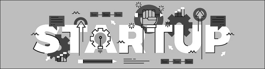
Abstract symbols that emphasize innovation, development, and dynamism (arrows, lines, geometric shapes) are most often used in design, along with vibrant, eye-catching color combinations. Green, blue, red, and black shades are preferred, but if the specifics allow, cheerful tones such as yellow or orange can be incorporated.
A good startup logo conveys the brand's philosophy and mission. It's best to create combination logos, combining the name and symbol. This increases recognition and makes the project easier to find online.
Online resources offer a variety of services to simplify work and save time. These sites can be used for everything from searching for information and communicating to creating logos and editing photos.



An online service's logo should be concise and clear, so users clearly understand the capabilities available to them. To achieve this, you can use themed icons, geometric shapes, simple lines, and a minimal number of colors.
IT companies are associated with innovation, progress and responsibility, so the logo should reflect these characteristics.
To achieve this goal, geometric shapes and clean lines, without curls or ornate patterns, are most often chosen. But to create a successful logo, it's essential to add emotion and a touch of creativity.
Uniform and standard logos no longer attract anyone. They can ruin the impression of any company, regardless of its activities. Therefore, if you want a unique and expressive logo, avoid using popular designs.
Common images such as computers, monitors, mice, and keyboards can be used in unusual ways or even discarded altogether, opting instead for abstract images symbolizing technology and development.
By choosing a particular shape for your logo, you imbue it with a special meaning. Consumers will evoke certain associations when looking at the sign, so you need to use a symbol that conveys the desired image.
For example, a circle symbolizes unity and friendship, a square – stability and constancy, a curve – flexibility and adaptability, vertical lines – strength and endurance, and horizontal lines – calmness and stability.
To stand out from the competition and attract consumers, you have two options: develop your own font or adapt an existing one.
The focus isn't on the beauty of the letters, but on the appropriateness of the typeface for the specific needs of the business. Creative companies working in the entertainment industry will benefit from playful and playful fonts, while software developers should choose a more serious font that emphasizes stability and reliability.
The most common typeface in the IT industry is high-tech style letters.
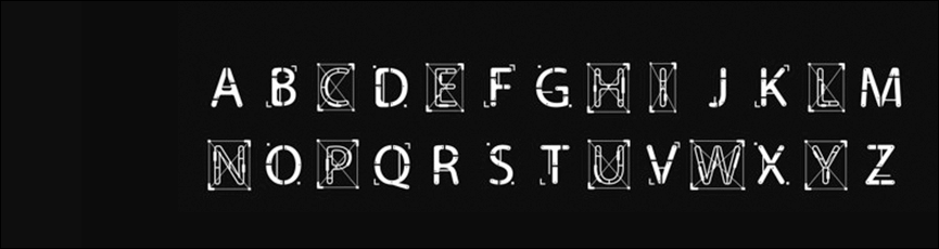
When developing a unique font, don't chase fashion trends, as such a symbol may become irrelevant in a couple of years.
Color works wonders and says more about your business than you think. The right shade can create trust with consumers and evoke specific emotions.
To understand what kind of company it is, the name is often unnecessary. Simply seeing the signature color and silhouette is enough to recognize the brand. This is the power of color, and it's precisely this secret that well-known companies use to enhance their recognition.
The right shade will evoke the right associations in customers and connect them with your business.
In the IT industry, the most popular colors are blue, red, green, and gray. Let's take a look:
 blue – promotes relaxation, evokes associations with confidence and security;
 red is the color of passion, intuition and energy, it awakens desire and delight;
 green – associated with safety, health and freshness;
 Gray – symbolizes restraint, justice and spirituality.
When choosing a color, it's important that it highlights the company's features and advantages. Therefore, if you need a different shade, go for it. Don't be afraid of bold decisions and unusual and colorful combinations – such logos can work better than traditional solutions.
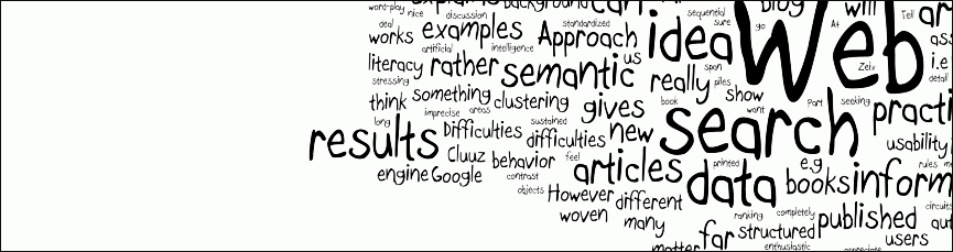

To stand out from the crowd of competitors and attract and intrigue users, don't be afraid to try bold solutions. A logo with traditional symbols can look dull and boring, but an original brand mark can surprise and quickly become memorable.
WeLoveBrands designers love to break stereotypes and think outside the box, so you'll find exciting solutions. Call or email us for a free consultation.
Logos of Ukrainian IT companies can be roughly divided into two groups: laconic font-based ones and bright, combined ones.
Colors and shapes come in a wide variety, and there are also combinations of several shades. Large companies don't use traditional symbols, but instead use color accents.
American logos for online services and other IT companies range widely. They range from simple, minimalist font logos to colorful symbolic symbols, from traditional designs (smartphone, code elements, etc.) to unexpected images.
Diversity extends to all logo elements—fonts, colors, and images. But blue remains perhaps the most common shade. Gray and green are also frequently used.
Most large European IT companies are located in Germany, France, the UK, Spain, and Belgium. They often use font-based and combination logos with an emphasis on font.
European companies are choosing unique and interesting fonts and vibrant colors. The most popular shades are red , blue, green, and black .
Font logos are usually simple and two-color, while combination logos are brighter.
Asian company logos are characterized by simplicity, two-color designs, and geometric shapes. Most consist of a lettering and an abstract symbol.
Compared to American and European logos, Asian ones are more subdued and subdued. They lack bright colors and contrasts. Common shades include blue , black, and red.
There are several ways to design a logo. Three main ones are considered:
Hiring a studio will cost you more than freelancing, but you can be sure you'll get the results you're looking for.
If you want a modern logo with a story behind it that evokes interest and trust, contact WeLoveBrands. To learn more and order your logo design , please chat or call us.