Receive a presentation of services and expert advice
The best experts in the industry will oversee your brand development process.
→ Need branding, design, or creative solutions? Call us at +48 505 648 022 or message us on WhatsApp.
 WeLoveBrands.pptx

The best experts in the industry will oversee your brand development process.
Today, massage parlors have become a great way for people to relax, unwind, and indulge. Thanks to rapidly growing demand, entrepreneurs are increasingly considering them as an ideal business option.
But along with the pressing issues (bank loans, staffing, salon design, etc.), you need to think about creating a massage parlor logo to attract clients and make a lasting impression.
Allied Market Research has published data showing that global massage demand will reach $154.6 billion by 2022. People seek this treatment for more than just medical purposes. With rising stress levels among women and the growing popularity of this service among men and even teenagers, the search for ways to relax and restore emotional health continues. Due to the high demand for relaxation services, you can find many touching logos online featuring fluid typography, carefully chosen colors, and icons.
So, a unique logo is essential for a massage business that wants to stand out from the competition and build a deep emotional connection with clients. Of course, you can strengthen your argument with statistics from the University of Massachusetts research, but in case that's still not enough for you, below are five reasons why a massage therapist needs a logo.
# 1 You'll never have a chance to make a first impression again . It sets the tone for your future relationship. Your logo should spark interest and a desire to learn more about your salon, services, and products. Think of the first impression your logo makes on the viewer as the first meeting with your client. It's unlikely you'd show up in front of them in rumpled pajamas and with a messy hairdo. After all, the success of your business depends on it. Rather, you'd choose an attractive and unique look to convey your professionalism.
# 2 A logo is a way to stand out in the highly competitive field of relaxation services. It says, "Look at this!" and at that moment, you can tell them what sets you apart from other massage parlors. Without a logo, you'll become just another faceless parlor, lost among your more successful competitors.
# 3 Effective design helps retain existing clients . How does this work? When existing clients look at your logo, it should instill confidence. If a client doesn't see your logo and think, "This massage parlor has exactly the reputation and image I'm looking for," you risk losing them.
# 4 It clearly distinguishes between amateurs and professionals . People seek services, including massage, from the best specialists. If a client wants to know whether you're an amateur or a professional, the first thing they'll do is look for your brand's presence online: on social media pages, check for a website, and evaluate your salon sign. What do all these have in common? They'll see your logo everywhere. In the eyes of the consumer, it works like this: an amateur logo is for amateurs. A professional logo is for a reputable company with skilled specialists.
# 5 Uniqueness of your brand . Now that you've captured the client's attention and explained that your massage parlor employs only highly qualified specialists, communicate your brand's strengths – use your logo to explain what makes you unique. After all, this strength is the special sauce that will help you build a loyal fan base.
First of all, it's important to understand that a massage parlor logo is an outward expression of your brand's inner beauty. Above all, you're selling style. Therefore, it's crucial that your logo be stylish, unique, and feminine. Therefore, choose soft, calming colors for your design. Avoid choosing a font that's difficult to read. Natural symbols such as water, leaves, and the like will work perfectly with a massage brand logo.
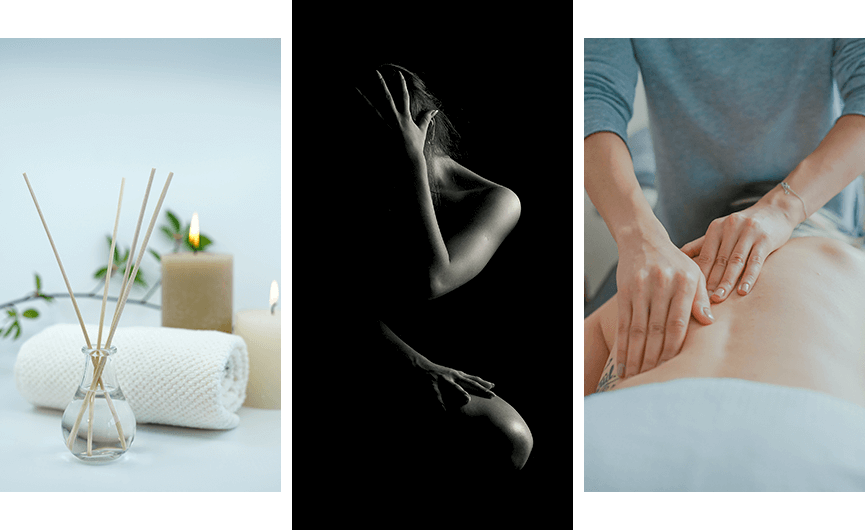
Some massage parlors offer their own products alongside their services: massage oils, bath foam and salts, skin care, and so on. If classic femininity is what distinguishes a massage parlor, your logo should reflect this. Use pink, lavender, and other traditionally feminine colors. Use objects or well-groomed parts of the human body: hands, face, or the female silhouette. A branding agency's graphic designer should find the right balance and skillfully incorporate feminine themes into the logo without making it look cloying. If a massage parlor uses organic, natural products, consider using green.
For most entrepreneurs, their business is their baby. So they want their logo to include their name. You can experiment with this idea by incorporating massage items into the initials of your name. For example, if you offer hot stone massages, reflect this in your logo by including your initials, a tree, a pond, and stones. This will create a relaxing atmosphere and represent one of your treatments.
Whatever massage parlor logo idea you choose, it should be a work of art that reflects your brand and its uniqueness. Avoid all shades of cinnamon, gray, and black. They create a dirty, earthy effect, which is completely unnecessary. But this is more of a recommendation than a rule.
A logo should be adaptable. Before creating it, consider where it will be used. Will it be displayed outside your business? Inside a massage parlor, on a wall? Therefore, it's important to ensure it will look great in any size and on any medium, from an employee's T-shirt to a social media page. How will it look in black and white? After all, a logo may be used on brochures and other printed materials, which don't always feature color.
The human eye appreciates proportion, balance, and equilibrium. A good massage parlor logo should be proportional. Therefore, spacing and symmetry are important. Combine individual elements into a cohesive whole.
It's easy to create a logo inspired by fashion trends, but then redesigning it every few years becomes a must. It's better for your brand to have a trademark that will be relevant today and ten years from now.
Before you contact a branding agency, take the time to ask yourself 3 questions:
 What will be your target group?
What do you want to tell her?
What elements and structures can you use to do this?
SUPER! Now we can confidently move on to the next section.
To begin, we will break down the logo into its components: color, font, and symbol.
A logo is a symbol that helps promote and identify a brand's services or products. Typically, a logo takes the form of an abstract or illustrative symbol.
Some massage parlors use the name (font) as a logo, but most tend to combine a symbol and a font in the logo, which makes the brand easier to identify and remember.
Color is an important component of a logo. It influences our emotions and plays a crucial role in developing an effective logo.
Today, a well-designed color scheme in a logo is more important than ever. It's your brand mission statement. Therefore, the tone and wording of the visual message are crucial, as a logo is more effective than words today. You simply must wisely utilize the powerful tool of color psychology. Below are the most common feelings associated with the color scheme described.
Red is one of the most popular colors in logos. It is associated with strong emotions: hunger, anger, passion, enthusiasm, and energy.
Orange is a very cozy and warm color. It's typically used by bold and creative brands.
Yellow – associated with joy and summer, but too much of it can cause anxiety.
Green is a favorite among brands that want to communicate a connection to nature, environmental friendliness, or a desire for growth and development.
Blue is also one of the most popular colors that brands choose to use in their logos because it represents calm, trust, and stability.
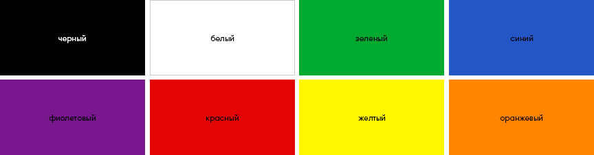
Purple has long been a favorite color of aristocrats, and is therefore strongly associated with luxury and quality. It's ideal for high-end brands.
Pink – youth, energy, romance and femininity (depending on the concentration of color).
Brown – often used by men's brands to emphasize reliability, simplicity, naturalness and masculinity.
Black – when used correctly in design, the color can give it chic, sophistication and classicism.
White is a fresh and clean neutral.
Gray – when paired correctly with another color, it evokes maturity and mystery. But it can also be boring.



This design tool includes the 12 primary colors we learned about in kindergarten. Using the color wheel, a designer selects contrasting and complementary colors. When designing a logo, they typically choose colors that are closest to each other on the wheel.
The average designer will answer, "An effective logo generally has two or three colors. Using more can create a chaotic effect." To which eBay, Google, and NBC will only laugh. Indeed, there are many myths about the number of colors in a logo. One of them is, "Using more than three colors in a logo will create a sense of disorder and chaos." But before you infuse your logo with a rainbow, consider the advantages of logos with a minimal number of colors:
The logo can be easily applied to any surface;
Easier to scale;
It is better remembered and subsequently identified.
Therefore, for ease of use in practice, multicolor is discouraged. And this unspoken rule has its logic. It's very difficult to achieve harmony with too many colors. Furthermore, a colorful logo can be irritating to viewers who see over 1,000 advertising offers a day.
Let's move on to choosing colors for the massage parlor logo.
Here are 6 questions to help you define your brand's personality and, therefore, choose colors that appeal to a specific audience. Your audience.
 Gender : Is the brand male or female?
 Tone : Is he serious or humorous?
 Value : Affordable or Luxury?
 Time : classic or modern?
 Age : young or mature?
 Energy : Calm or Loud?
Your answers will give you complete information about how you want to present your brand to your potential audience, and designers will use this information to help you decide which colors best suit your brand.
Although fonts are less noticeable than the image and color in your logo at first glance, they are the unifying element that helps create a harmonious logo. A well-chosen font will tell your brand's story, serving as its voice and personality. Whether in print or on your website, the targeted use of a good font can attract or repel your audience.
When you get to the stage of choosing fonts, there is a wide variety of fonts available these days The fonts can be overwhelming. Below are some tips for choosing the fonts that best suit your business.
With serifs
Even before the viewer reads and processes the information, the font already communicates something. This font group is classic. Every Microsoft Word user is familiar with Times New Roman, which belongs to this group. These are standard, high-quality, classic fonts that are easy to read. They are legible, and our eyes are accustomed to their shapes.
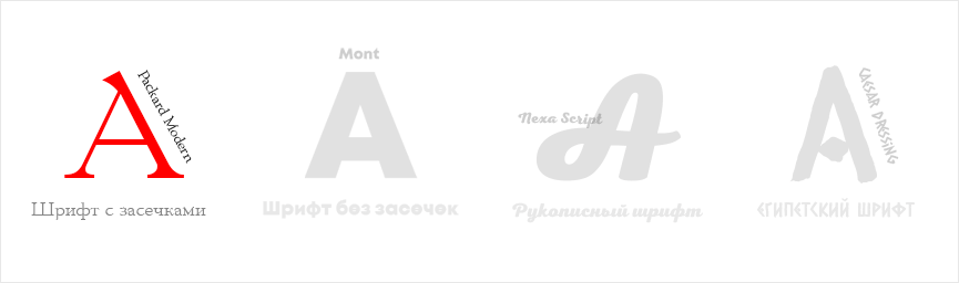
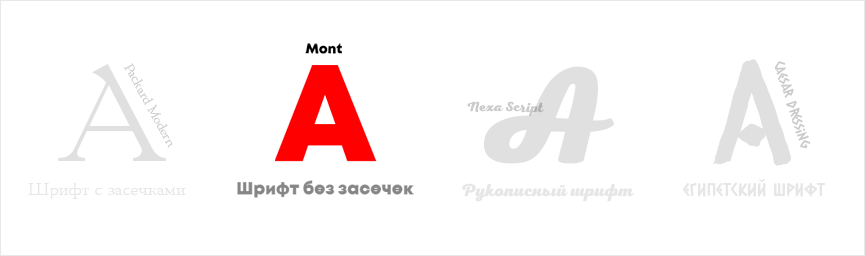
Sans serif
You might have already guessed the difference from the name. It's all about the serifs. This font is easy to read and widely used online. It has the added benefit of working just as well at low resolutions. In designs where it's used, a sans-serif font brings a modern, clean look, strength, and clarity. That's why it's so popular online today.
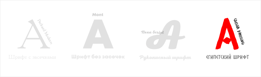
Block serif or Egyptian
If you're over 30 and have some experience using a typewriter, you're familiar with this font. Using it in a logo can add a touch of retro charm to a brand or project. However, it should be used with caution, as it's more suited to logos and headlines. Longer text can cause eye strain.
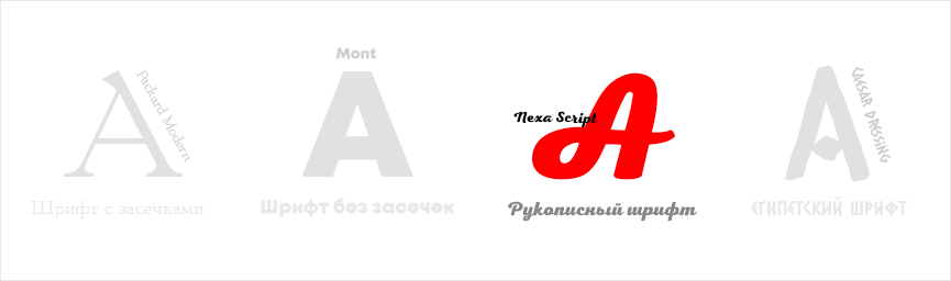
Handwritten
The name itself makes this font intuitive and requires no demonstration. Today, brands looking to use these fonts in their logos (and elsewhere) have a huge selection to choose from. These include calligraphic fonts (typically used in wedding invitations) and simple styles used by bloggers to imitate handwriting. While they aren't typically chosen for long text blocks, their presence in a logo lends a feminine, graceful, and elegant feel to the brand.
Need a simple font
A simple font is easier to adapt for use on different surfaces. Keep in mind that the logo may need to be scaled up or down for printing on employee T-shirts, pens, and other promotional materials.
Conduct a comparative analysis of competitors' fonts
No, we're not talking about imitation here. Marketers insist this procedure is necessary to analyze the wisdom of your competitors' font combination decisions and ideas. The idea is to learn from successful experiences.
Reflect your brand's personality
The right font selection successfully makes your brand recognizable and memorable. Should it be serious, clear, and pure? Or playful, airy, and evoking vivid emotions? What should it convey to the viewer? Innovation, tradition, or more conservative ideas?
You don't need a lot of fonts in one logo.
The best choice is a maximum of two fonts. Any more will create a sense of clutter and chaos. As we know, a sloppy logo is harmful and arouses suspicion in the client. Most well-known companies use only one font in their logo. If the brand is still young, it usually combines two fonts: the name and the slogan.
Do you need a trendy font?
It's important to make a decision right away. If you want to be on trend, you need to budget for a logo redesign right away. You don't want it to look outdated. If you want to use a timeless classic that will be relevant even decades from now, consider a minimalist font for your massage brand: clean, clear, and practical.
Video and animation
Some designers claim that static logos are gradually becoming a thing of the past. Video and animation have firmly established themselves in branding this year. Massage parlors are highly competitive, and the abundance of advertising leads to so-called "ad blindness" in viewers, who simply stop paying attention to the same type of ads. New ideas are needed, or clients will simply scroll past their feeds and find more successful competitors. Advertising campaigns now use far more GIFs than before. And this trend has successfully migrated to logo design.
Mustard color instead of gold
Luxury brands often use gold to convey their premium appeal. Mustard yellow is popular in the fashion world, and it has now captured the hearts of designers and trend-conscious consumers. It has become a worthy alternative to gold, which has become rather tired over the past 20 years. This shade is often combined with another trend: minimalism. You can already find some impressive designer work using this color and style online. One such example is the logo of the renowned tire manufacturer Continental.
Space
Although brands have been cautious about adopting new logo trends in recent years, preferring classic designs, nebula, re-telling, and watercolor backgrounds have nonetheless managed to capture the hearts of viewers. American marketers are confident that massage parlors and spas shouldn't always choose icons based on their first associations. However, this trend is likely to catch on with entrepreneurs considering a unique interior design for their massage parlors—one that fits the theme, so to speak.
Refreshing mint
Oh, this trend is going to be a success. Some designers even predict it will take the lead this year. The unusual, soft hue will give the brand a bright and fresh voice among the competitors' similar and expected logos. As a reminder, this trend was popular in 2017 in both fashion and logo design. And now it's expected to make a triumphant comeback this year.
Contrast and gradient? Why not?
The 1990s were marked by a design world where gradients were considered tasteless. This was primarily due to poorly designed logos. This year saw a resurgence of gradients using contrasting colors. Designers are creating successful gradient logos using contrasting pastel shades.
Icons and symbols
If a massage parlor is looking for a way to add authenticity to its brand, it's worth considering using symbols in its logo. This trend isn't exactly groundbreaking, as many well-known brands have been following this path for decades. Above all, the use of icons and symbols aims to convey not just what the company does, but why it does it.
School of Integrative Body Therapy "Inkorte"
At first glance, the logo's symbol reflects an ancient Indian technique. Indeed, it was a design idea: to combine the representation of the connection between the vertebrae with the symbol of one of the most ancient civilizations. A solar color scheme against a white background was also used to achieve this. White symbolizes purity and clarity of thought. Yellow represents the energy of the sun and joy. Red signifies passion, love, and life. Overall, the Inkorte logo can be characterized as a clear message to the viewer, with a hint of mysticism.
Kinesthetic therapy
It's rare to find a logo in a soft, bleached shade of brown (terracotta) for a massage therapist (Moscow). Massage parlors, like spas, often try to avoid these shades. But a successful logo always pushes boundaries and defies accepted standards, doesn't it? In the logo, the designer used a dandelion symbol to convey the feeling of lightness after treatments. This way, the brand communicates not just what it does, but its purpose (as mentioned above).
Rojal Thaj
A massage salon offering a range of treatments, skin care products, and a wide selection of massage oils. The designer clearly wanted to demonstrate a complete connection with nature, hence the green color and the flower icon at the center of a green labyrinth (apparently a reference to Thai techniques).
Miracles of touch
The logo's purpose was to showcase the expertise of the massage parlor's professionals. Contrasting colors were chosen: orange and blue. Clearly, the designer's goal was to convey a sense of positive energy and relaxation in a single symbol. The silhouette of a person with an outstretched palm and a client. Overall, the logo is clear and legible.
RestoreMove
Presented here is one of the best (in my opinion) massage therapy logos I've ever seen. The designer did a superb job, creating a design that evokes a sense of hope for relief from chronic pain and the restoration of the freedom of movement previously felt by clients. The R symbol is represented by a running figure, indicated by an arrow (which represents movement). The combination of blue and green in the logo evokes associations of naturalness, professionalism, trust, and health.
Mountain massage
How can this logo be described in just a few words? Unique, modern, memorable, and attractive. The "M" symbol is represented here as a mountain with a cascading effect. The gentle, pleasant tremors one feels after a massage are also conveyed here using a ripple effect. The color scheme is stunning: the combination of blue, indigo, and white looks stunning against a black background. Stunning.
Pura Vie Spa
The salon's name combines French and Spanish. Pura Vie Spa translates as "Pure Life." The design features an image of hands holding a clear drop of water. At first glance, the logo immediately evokes thoughts of cleansing, care, healing, and renewal. The color blue is associated with trust, power, and professionalism. Thanks to the catchy name and design, the logo can rightfully be considered one of the best ideas for a massage parlor.
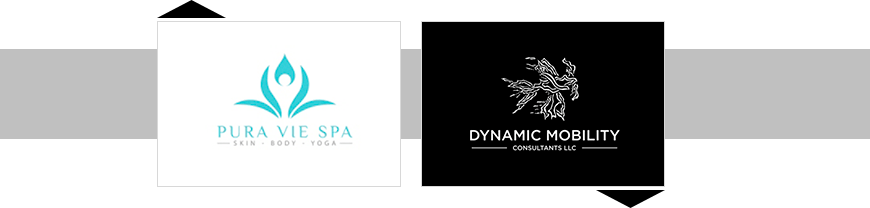
Dynamic Mobility LLC
The brand has chosen a challenging specialization: mobility training and massage therapy. Its specialists offer clients restoration of range of motion, as well as development of endurance, stability, and strength. The designer handled the task brilliantly, capturing the brand's personality in the logo design. Incidentally, despite analyzing thousands of logos before writing this article, this is the first time we've seen a black-and-white logo in this field.

Off the Essence
Off The Essence is another American brand offering massage therapy. It has a simple yet striking logo. The design includes an image of a lotus and the brand name (slightly below the icon). But the best part, according to viewers, is the eye-pleasing combination of blue and light gray.
How do you achieve the perfect logo for a massage brand? How much does it cost to create one? So, maybe Google has the answers? So, Alexa, how much does a logo cost? Hmm, no answer? First and foremost, entrepreneurs creating a logo for the first time search for "Create a logo cheap." But will they really get the end product they envision? Definitely not. After all, a good logo is often expensive, and a cheap one is often bad. Of course, there are exceptions, but they're rare. So, a logo can be free or cost tens of thousands of dollars. If you have a small business, a budget of $10 to $40 is recommended for a massage parlor logo.
In this case, you have a chance to find a promising designer with a small portfolio who can create a versatile logo. And even affordably. This collaboration could be a great experience for you; whether it's good or bad depends on your choice of specialist. But the fact remains that this deal will be risky. There's a high chance the logo design could be stolen, which risks lawsuits and, again, a lack of individuality and association with another brand.
You'll get a logo virtually free and instantly. However, the final logo will be mediocre (due to the use of standard fonts and icons). What's the point of creating a logo at all if it doesn't convey the brand's personality and message to the viewer?
When you order a logo design, you'll receive... a logo! Ordering a logo from the WeLoweBrands branding agency means you'll receive a worry-free package, including comprehensive market research, competitor analysis, and the services of illustrators, marketers, designers, and managers. Our agency's creative team guarantees a comprehensive approach to completing your tasks. This means you'll receive:
Logo in several formats;
Full right of use (documents that confirm the brand's ownership of this logo).
High quality work.
To get an initial consultation with a brand manager, use any convenient means of communication: our chatbot or the phone number listed in the contacts .