Receive a presentation of services and expert advice
The best experts in the industry will oversee your brand development process.
→ Need branding, design, or creative solutions? Call us at +48 505 648 022 or message us on WhatsApp.
 WeLoveBrands.pptx

The best experts in the industry will oversee your brand development process.
Connecting your company and its corporate identity doesn't require signatures, a logo, accompanying text, or borders. A design that utilizes transparent elements will help, creating a visual connection that your target audience will associate with your business.
The transparency effect is based on diluting the color (of a block, text, or image) to such an extent that the underlying layer reveals itself. In other words, it creates the sensation of a "thinning" or "wetting" of a color area, illustration, etc.
Transparency can add interest to your print or website design. However, experimenting with this effect should be done with caution to avoid compromising the readability of the material.
Benefits of using transparent elements in design :
 fits perfectly into any design;
 bring an image to life by adding depth and color;
 allow you to create an interesting place for text.
Translucent colors evoke associations with creativity, art, innovation, naturalness, and versatility. If these traits resonate with your company or brand, transparency is ideal for creating a distinctive identity for your product or service.
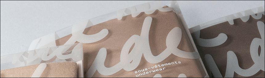
@Marianne Isabelle
Transparency in design is suitable for the corporate identity of businesses that want to emphasize their openness and accessibility to customers, as well as the transparency of their financial relationships with them. These include banks, insurance companies, car repair shops, and so on.
One way to use transparency in design is to overlay colored translucent blocks or gradients. In this case , black and white images are best, as they emphasize the color highlighting effect. Otherwise, the colors are likely to blend and disappear in the photo.
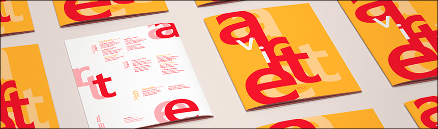
@ Cam. Castelao
To avoid shades that clash with brand colors, consider color mixing principles when using translucent elements. When designing printed materials, it's recommended to pay attention to the color, texture, and material of the surface on which the image will be printed. This is because objects composed of a thin fill are easily lost against a brightly colored background.
How to use transparency correctly in design?
To create contrast.
Do not overlap important parts of the design.
Choose the level of transparency that is appropriate for a specific project.
For small website blocks.
Maintain the readability of the text.
Do not leave transparent elements on images.
Translucent fills are used in photographs when developing magazines, catalogues , posters and other printed materials.
There are different ways to use transparency in graphic design:
Overlaying translucent elements in contrasting colorsis an interesting approach for logo design, posters, and advertising.
Using translucent gradients . Designers use this technique when creating magazines, posters , and catalogs.
Highlighting individual parts of an image . This method is often chosen for creating catalogs, magazines, and advertisements.


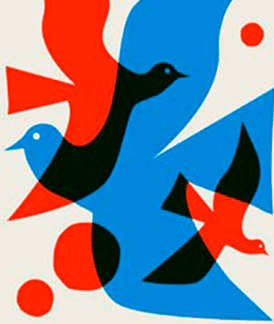
Using overlapping shapes to create a new imageis a useful technique for logo design.
Overlaying a translucent fill over an image . This technique improves text readability and is common in magazines, posters, advertisements, and web pages.
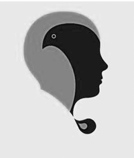

Logos with transparent backgrounds are often seen on websites or social media (on company/brand pages or groups). This is because such logos without a background are easy and quick to load on any website.
Transparent logos are also used as watermarks for images (products in online store catalogs, etc.). This doesn't affect the image's appearance while protecting the graphic content from theft.
Logos with a transparent effect are also suitable for creating printed products, especially for printing small-sized materials ( business cards , calendars, souvenirs).
It should be noted that not all existing formats are suitable for creating logos with a transparent background, but only some of them:
PNG format . Developed in 1996, it remains in widespread use today due to its ease of use and extensive website editing capabilities. Transparent logos in the free raster PNG format are used 90% of the time in website design, photography, and print.
GIF format . Invented in 1987, this oldest raster format partially supports transparency. However, it cannot control the degree of transparency, making GIF less popular than other formats.
SVG format . It allows for smoothly changing the opacity of an image's background using numerical values. The advantages of the vector SVG format include ease of processing and good scalability, which is why designers often use it for complex projects.
Transparent elements are often used in packaging designs for products such as cereals, nuts, vegetables, fruits, and snacks. These packaging designs draw consumer attention to the product itself, with texture and color acting as active elements in the composition and helping to demonstrate the condition and quality of the product.
For the same purpose, transparent or translucent labels are being developed for drinks (mineral and sweet carbonated water, energy drinks, etc.).
In the development of individual web pages for websites, you might encounter a transparency technique where a translucent fill is applied over an image, improving the readability of the text. This technique is typical for web pages where the image occupies the majority of the space and serves a communicative function, while the text complements the image, conveying important information about the website or social media page's content.

@ Mario De Meyer
This style can be found in outline button design, which in this case is a hollow, clickable element with no fill. Transparent (sometimes translucent) buttons are also called ghost buttons. These ghost buttons seamlessly integrate into various interfaces, regardless of their background, graphic objects, color palette, etc.
In recent years, Ukrainian designers have been proposing the use of transparent furniture and decor elements in interiors as a stylish and original solution. This approach allows for the creation of a "weightless" interior, adding lightness and airiness to the space, thereby visually expanding it.
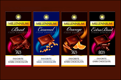
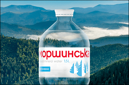
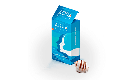
The trend toward transparency is also evident in the packaging design of various Ukrainian-made products. These include food and beverages (Millenium chocolate, Morshynska mineral water), and perfumes. Transparent designs can also be seen on Ukrainian medical product packaging (for example, Aqua Sinus Plus nasal and oral spray).
To emphasize openness and transparency in financial cooperation with their clients, some Ukrainian financial institutions commission designs featuring transparent or translucent objects. Many of you may have seen Alfa-Bank's advertising posters, which reflect this concept.
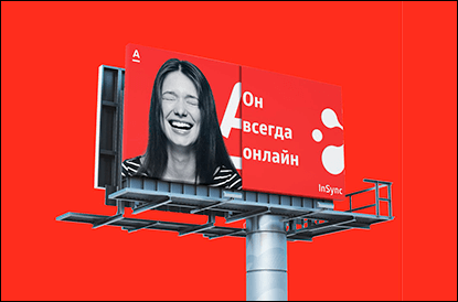
Transparent or translucent elements fit well into the design of websites dedicated to children's topics (online stores selling children's clothing, food, toys, etc.). This can be seen in the example of the online children's clothing store Baby Paradise.
Many products on the global market (beverages, skincare) have their own distinctive color, which each brand uses as a design element. This contributes to the growing popularity of transparent packaging and increased interest in experimenting with it. A good example is the label design for Avivo sparkling drinks from the Spanish company Torre Oria.
You can order a design using transparent elements from a freelance designer or a design studio. Prices depend on the scope and complexity of the work, the deadline, the number of completed design options, and the specialist's qualifications and studio rating.
A freelance design will cost you at least 10 $, while the same service from a web studio will costatleast $20. The undeniable advantages of the latter option include a formal contract, a guaranteed deadline, and a higher quality of the final product.
If you need an attractive and unique design with a transparent effect that will reflect your brand's uniqueness and help you stand out from the competition, contact WeLoveBrands. Orders are accepted by phone and via online chat on the page.