Receive a presentation of services and expert advice
The best experts in the industry will oversee your brand development process.
→ Need branding, design, or creative solutions? Call us at +48 505 648 022 or message us on WhatsApp.
 WeLoveBrands.pptx

The best experts in the industry will oversee your brand development process.
Design isn't just about vector shapes, images, fonts, and colors; it also includes the white space around text and images. These areas play a significant role because they define the boundaries of objects, create connections between them, and influence how information is perceived. This space is called negative space. Negative space, the empty space around images and text, helps convey the desired message to the audience, makes text and images easier to understand, and sometimes creates a distinct, interesting symbol, thereby attracting consumer attention.
This area “supports” the main image, making it more expressive, highlighting important details, or giving elements additional meaning.
The technique is used in various areas (web design, printing, advertising, logos and packaging) and is trendy in graphic design.
Negative space is the empty space that is located around, near, and between various objects and design elements.
These areas are used by designers to reinforce meaning and highlight important details. They contrast with the positive space occupied by the main elements.
Working with empty spaces also creates new images that aren't always immediately obvious and require closer examination. They form part of the design composition and, through optical illusion, attract attention and intrigue.
What does playing with negative space give you?
Small gaps between elements create a certain pressure and add weight to the image. To improve text readability and visual perception, negative space is used and the dimensions of empty spaces are carefully chosen.
To separate different objects, highlight a detail, or, conversely, unite all elements, different distances are set between blocks and the optimal color scheme is selected.
This technique allows for the creation of expressive and original designs, adding hidden meanings and duality, and is suitable for any type of business and field of activity.
One of the first to actively utilize this style was American graphic designer Charles Goslin. In the 1950s, he began creating interesting works that played with negative space. He primarily designed logos, corporate identities, and advertising posters.
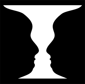
But the most famous image, distinguished by its duality, is the "Rubin Vase," created by the Danish psychologist Edgar Rubin about 100 years ago. This drawing, on the one hand, demonstrates the duality of how an image can be perceived, and on the other, it demonstrates the relationship between image and background.

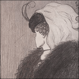
Another popular dual image was presented by the American psychologist Edwin Boring in 1930. This is the "Wife or Mother-in-Law".
The most popular logo created in this style is the FedEx logo. Designed by Lyndon Leeder, it combined two fonts in such a way that the space between the letters "E" and "x" became an arrow—a symbol associated with the company's growth and forward movement.
Negative space is used in photography, art, marketing, and design. This technique is most often used in logos, packaging, posters, and illustrations, but can also be applied in web and social media design.
How to play with negative space in an interesting way:
Two-in-one images are used less frequently in brand identities to avoid overwhelming consumers with puzzles and riddles. However, recently, there has been a trend toward more active use of this technique in logo design. Companies use it to stand out from the competition, engage their audience, and convey their core idea.
To effectively utilize all elements and highlight the company's unique features, you need to carefully consider the idea, identify key points, and choose the right color scheme.
# 1 Literality . Negative space complements the main object and facilitates the perception of information.
# 2 Cutting out details . If you need to show two objects, you can play with negative space by cutting out some parts.
# 3 Merging Elements . In this type of drawing, one object flows smoothly into another. The image creates interest and helps draw the audience in.
# 4 Contrast . This approach can be used for any business. It involves combining opposing concepts and showing harmony.
# 5 Minimalism . The use of negative space doesn't have to be overly noticeable or obvious. It's enough to use a small area to create an interesting design or logo.
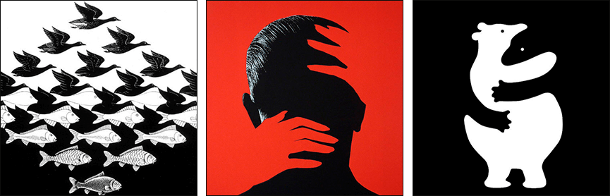
# 6 Character . If you're talking about a specific product, you can include an image in the design that will be associated with it. And if a company has its own character, it should be shown in the drawing.
# 7 Reversals . This technique is actively used in posters and illustrations, as it allows one to demonstrate the duality of an image.
# 8 Metaphors . To enhance the effect, you can use a metaphor, for example, making it a piece of a puzzle. Such a drawing will not only attract attention but also convey a specific message to the audience.
# 9 Two Sides . Combining two objects that cannot exist separately allows you to create interesting pictures and vivid images.
# 10 Story . Negative space can be used to tell a story about a company or product. This image will attract and hold the audience's attention.
If you're looking for a unique and striking design that utilizes negative space, contact WeLoveBrands. Our designers research your business, competitors, and target audience, brainstorm ideas, and create the perfect solution to best represent your company. For more information and a consultation, please contact us by phone or via online chat.
When creating posters, advertising materials, and illustrations, designers often use negative space. This technique not only helps attract attention and intrigue the audience but also conveys the desired message and idea.
White spaces of varying sizes make text readable, highlight important details, and aid in the perception of information.
Works that utilize negative space are visually striking and generate interest in the product.
Despite the fact that this method often creates ambiguous and hidden meanings that aren't immediately apparent, it remains popular among designers. Logo design is no exception.
Negative space helps create unusual effects and interesting shapes when developing logos and corporate identities . This attracts consumer attention, differentiates the company from competitors, and promotes brand recognition.
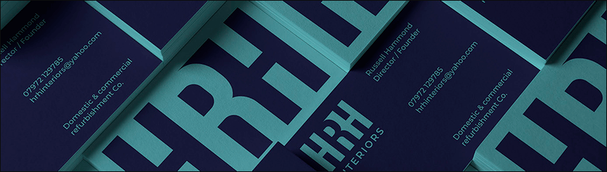
@ Alan Cheetham
Often, not only the space around the symbols is played with, but also the areas between the letters in the company name.
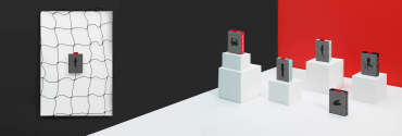
Product packaging and labeling play a significant role in increasing sales. A product's appearance largely influences consumer behavior. Good design arouses interest and encourages consumers to pick it up.
Designers use negative space to create expressive and intriguing packaging designs that stand out from other similar products, increasing brand recognition and increasing sales.
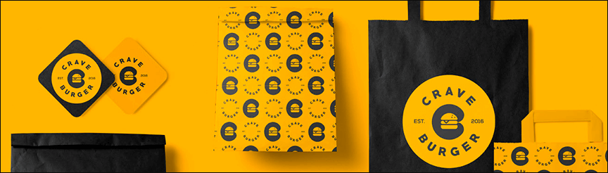
@ Vadim Carazan
This technique is often chosen by manufacturers of food products, alcoholic beverages and cosmetics.
In web design, the arrangement of elements is important. The user's gaze focuses on different objects, and negative space can be used to create balance, emphasize, and align all design elements. This is essential for attracting attention and controlling user behavior, thereby conveniently guiding them through the website.
This technique can be used in various ways, depending on the content, business specifics, and goals. To achieve the desired effect, consider contrasts, asymmetry, large empty spaces, alternating elements, and so on.
For landing pages, the emphasis can be on the call-to-action button. For online stores, it's important to showcase the product in a favorable light. Creative studios can even use a random arrangement of elements to create a creative atmosphere, a light, and relaxed feel.

When designing and decorating pages, remember that aesthetics, while important, take a backseat to space as a design tool. Negative space creates relationships, reinforces content, and defines structure and hierarchy.
Using negative space in web and social media design allows you to create practical, attractive, and stylish websites and accounts.
Design in Ukraine only began to develop rapidly in the early 1990s (after the collapse of the USSR). Then, designers began to monitor European and global trends to apply new techniques in their work. This included the use of negative space.
The first attempts to use white space in Ukrainian graphic design date back to the 1930s, with the development of the Art Deco style, which replaced Art Nouveau. Back then, designers first began to play with space when creating packaging and labels. But things didn't go further than that.
Negative space has experienced a second wind with the rapid development of graphic design in Ukraine. Negative space has begun to be used not only in printing and packaging, but also in identity and web design.
This trend became popular after 2015 and has remained popular ever since. Negative space is a popular technique for creating websites, logos, and packaging.
The movement emerged and began to actively develop in Europe and the United States around the same time. In the 1930s, American psychologist Edwin Boring presented an ambiguous drawing in which both a young woman and an old woman can be discerned. And Danish psychologist and educator Edgar Rubin presented his "Rubin Vase" image, which became one of the most famous examples of negative space in the world.
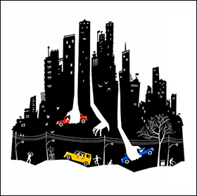
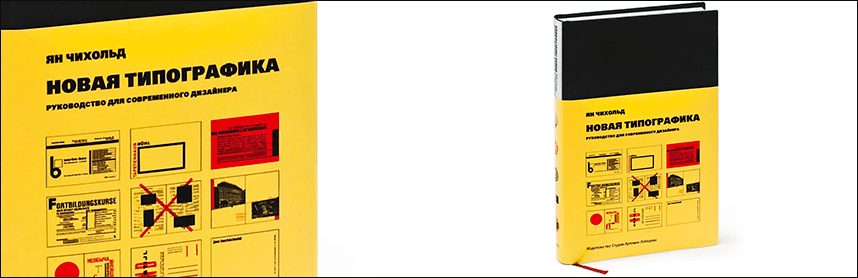
As for the use of negative space in design, one of the first to do so was the German typographer and designer Jan Tschichold. In 1928, he published the book "New Typography," which included the use of negative space among its core design principles.
In the United States, designer Charles Goslin actively exploited empty spaces. His first interesting and unusual works in advertising and brand identity appeared in the 1950s.
This trend also found its way into Japan (called "Ma," which translates from Japanese as "space, pause"). The technique of using space between different elements was actively used in art and culture.
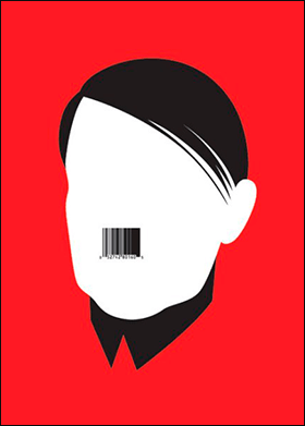
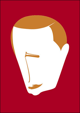
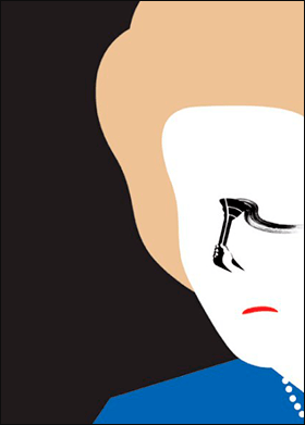
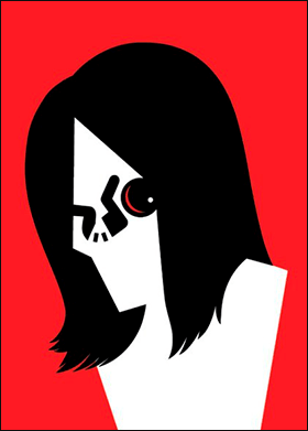
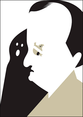
Today, some of the most famous designers who create masterpieces by playing with negative space are Tan Yau Hung from Malaysia and Noma Bar from Israel.

Tan Yau Hung is known for his space-themed drawings and work with some of the world's largest brands (Nike, Land Rover, Gap, Ogilvy, and others). He actively uses watercolors, markers, and calligraphy pens.
Noma Bar's illustrations grace the covers of hundreds of magazines and publications worldwide, including The Economist, BBC, and The Observer. The designer has received numerous awards and accolades and has published three books ("Guess Who - The Many Faces of Noma Bar" in 2008, "Negative Space" in 2009, and "Bittersweet" in 2017).
Negative space has been a design trend for several years now and remains popular. This technique is most popular in logos, websites, packaging design, printing, and advertising.
Negative space design requires imagination, knowledge, and skill, so it's best left to experienced designers. You can find specialists as freelancers or in design studios.
Freelancers typically charge less than companies, but their skills and workloads vary greatly. If you want a good result, you need to find a responsible and competent specialist who won't let you down on deadlines or produce a boring or uninspiring design.
Freelance design prices start at 10 $, while studios charge an average of $20 (depending on the type, volume, and complexity of the work).
By ordering a service from our company, you risk nothing, as we employ experienced, imaginative designers who value their reputation. They monitor trends, thoroughly research the market and business specifics, and employ a variety of techniques to ensure you receive a striking design that enhances your company's image.
To order a negative space design from WeLoveBrands, clarify details and the full cost, call us or leave a message in the chat.