Receive a presentation of services and expert advice
The best experts in the industry will oversee your brand development process.
→ Need branding, design, or creative solutions? Call us at +48 505 648 022 or message us on WhatsApp.
 WeLoveBrands.pptx

The best experts in the industry will oversee your brand development process.
Most people perceive images better than text. For this reason, label and packaging design play a special role in retail, as they are the first things a customer sees when looking at a product.
Most people perceive images better than text. For this reason, label and packaging design play a special role in retail, as they are the first things a customer sees when looking at a product.
Manufacturers have only 10 seconds to attract consumers and spark their interest in their product. That's how long it takes a visitor to evaluate a product's appearance and make a purchasing decision.
Your product may be of high quality and useful, but it will still go unnoticed if it has a dull and bland appearance. However, a striking and unusual label attracts attention and encourages purchases, including spontaneous ones.
The abundance of products, brands, and labels on the global market keeps manufacturers on their toes, forcing them to move. Companies can't stand still and use techniques that were relevant just a few years ago, as doing so will risk losing their position.
Rapid market development encourages businesses to employ new techniques and strategies to win customers. This includes label design. Why? Because a distinctive label makes a product stand out from the crowd and drives sales.
A label is both information about a product and its advertising. It reflects the brand's positioning, influences its perception, and shapes its value in the minds of consumers.
If a label matches the company's corporate style, emphasizes the uniqueness of the product, and meets the needs of the audience, it will be effective.
What is the purpose of a label? It's to inform the buyer about the product's properties and value, expiration dates, and the manufacturer. Typically, it includes the brand name and logo, slogan, competitive advantage, product ingredients, and company address.
Why is label design important? Because it serves a number of functions, namely:
 |
makes the product stand out from the competition |  |
builds trust and loyalty | |||
 |
increases recognition |  |
protects goods from counterfeiting | |||
 |
attracts the attention of buyers |  |
stimulates sales growth | |||
 |
presents the product favorably on the market |
Labels may vary in size, shape, materials, and type of information application (printing, embossing, holographic, 3D), but they always have two zones: the front (with advertising information) and the back (back label with product information).
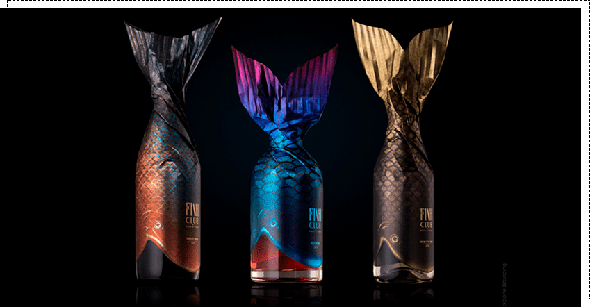
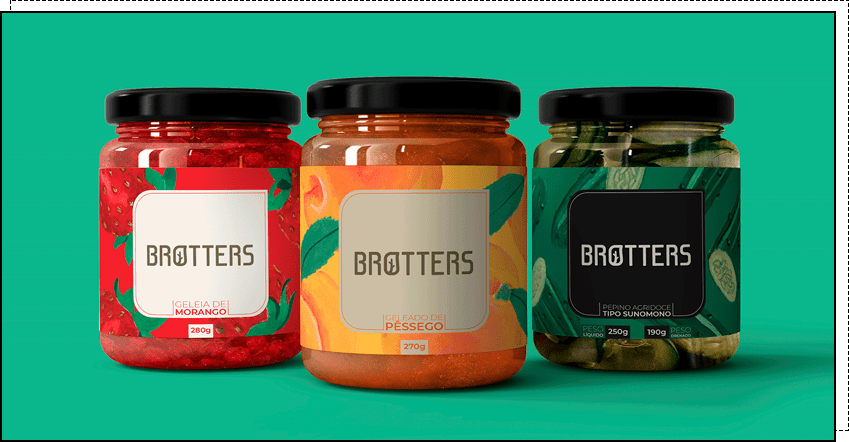
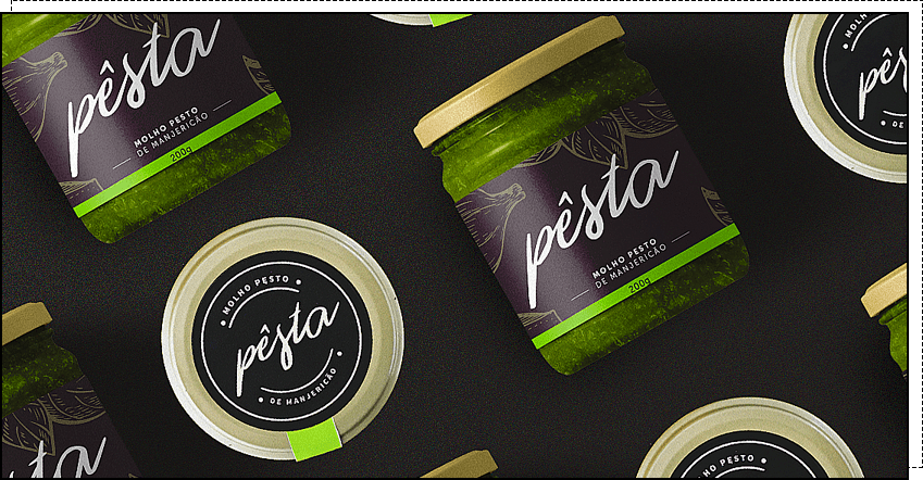
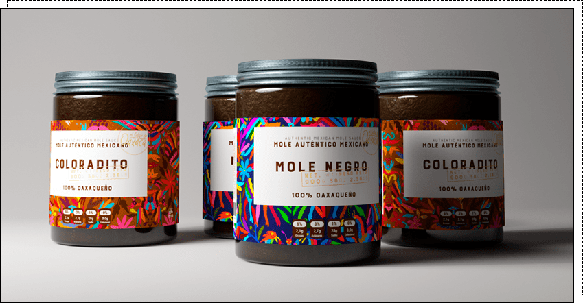

Designing a label isn't as simple as it might initially seem. To create an effective and engaging design, a number of factors must be considered, including audience needs, market characteristics, competitors' distinctive features, product categories, the psychological properties of different shades, and the company's corporate identity.
If you're looking for a stylish and original design that will help promote and sell your product, contact WLB Studio. Our designers have a wealth of ideas to capture your customers' attention.
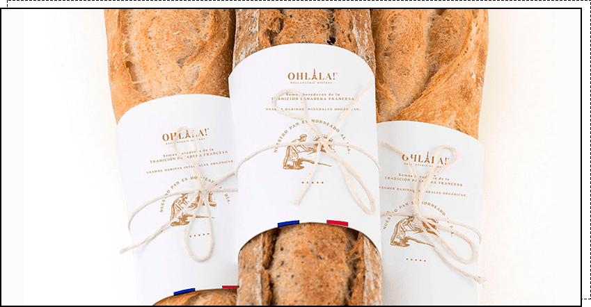
1. Minimalism. This label conveys the essence without distracting details. Its main features are simple lines and shapes, a sense of cleanliness and order, and an emphasis on color. Using a bright color in a minimalist style helps highlight the product and increase its recognition.
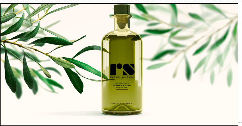
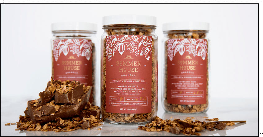
2. Eco-style. Characterized by soft neutral colors and rustic and natural motifs, the emphasis is on the naturalness and organic origin of the product. This label looks fresh and original. It is most often used in the food industry.
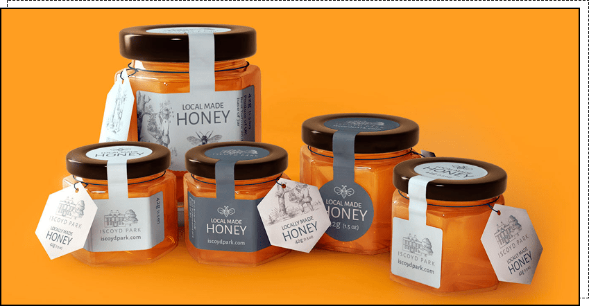
3. Vintage. This style is popular because it combines modern features with classic solutions. The label is characterized by lightness, positivity, and simplicity. It evokes pleasant associations and emotions, and brings back memories. The design uses subtle colors, distressed textures, illustrations, handwritten fonts, and colorful patterns.
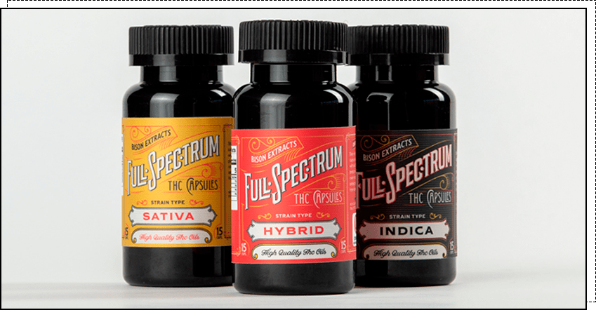
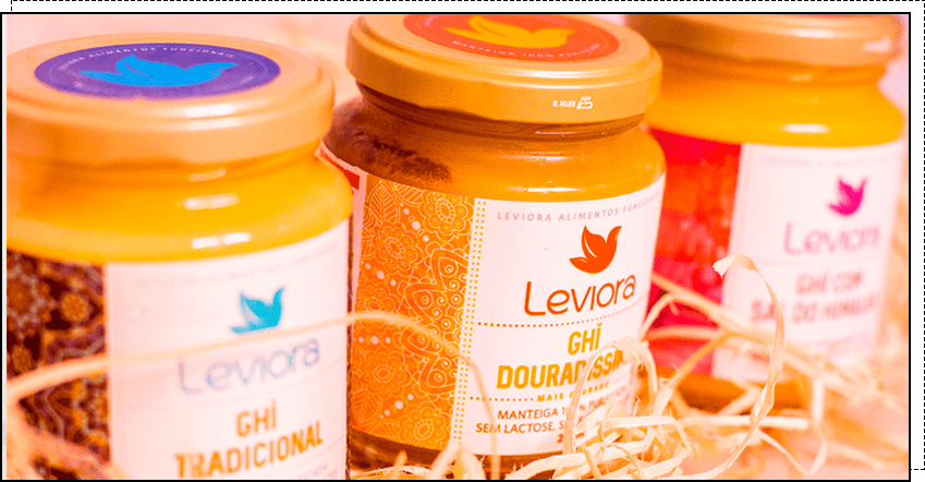
4. Ethnic style. This is popular for a number of food products to highlight their national identity. The design uses thematic illustrations, traditional patterns, and motifs.
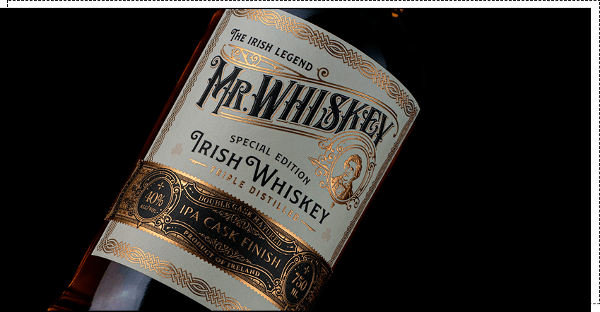
5. Empire. This style features military symbols (shields, armor, swords), family crests, and other elements that convey majesty, masculinity, and pomp. This style is very popular among alcoholic beverage producers, as it emphasizes a brand's status.
6. Classic. This style is characterized by simplicity, versatility, austerity, and elegance. The design features simple geometric shapes, a polished look, rich hues, and contrasting color combinations.
Style, like graphic techniques, is selected based on the product type to accurately convey the desired information to consumers and encourage them to purchase. This means there's no one-size-fits-all solution for all product categories, and each label is unique.
Next, we will consider the design features depending on the type of product.
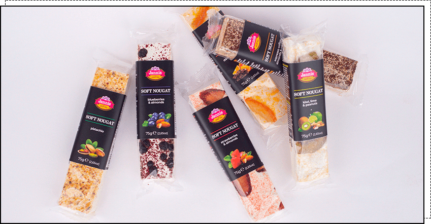
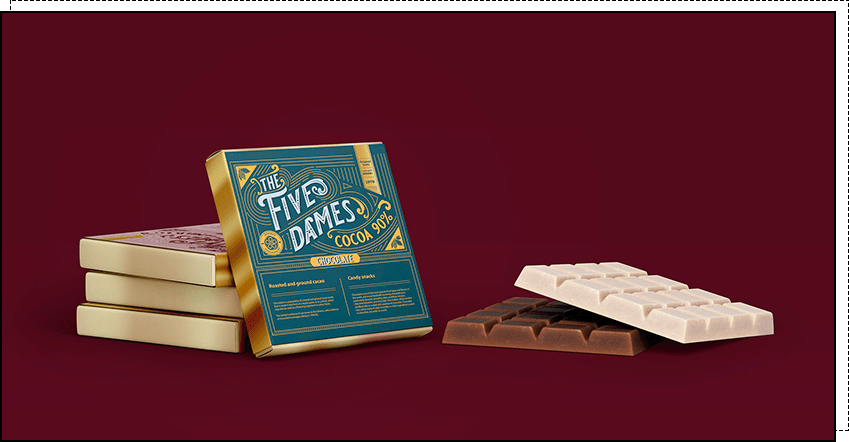
Wine label designs often rely on neutral colors (black, white, and gray) and their combinations with subtle shades (cream, blue, pink). However, sometimes you'll see bright colors, contrasting combinations (black and red, blue and orange, etc.), and creative solutions. These designs are eye-catching and intriguing.
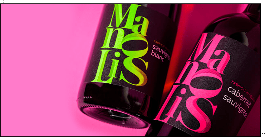
The champagne label design uses traditional fonts and large headlines to convey sophistication and luxury.
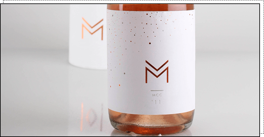
When designing beer labels, they strive to convey a casual and relaxing atmosphere and highlight the drink's unique features. Warm and vibrant colors are used.
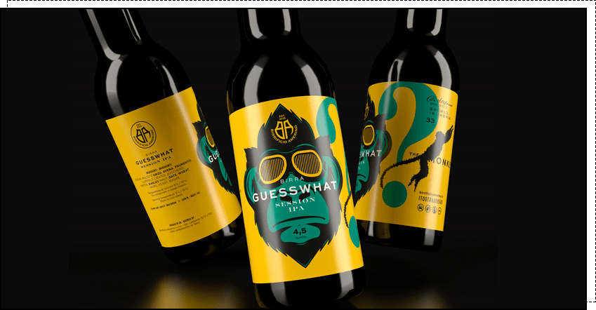
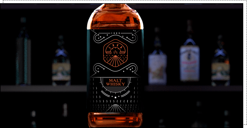
Labels for expensive spirits (vodka, whiskey, rum, cognac, etc.) always emphasize status and nobility. However, simple and sophisticated designs are also common.
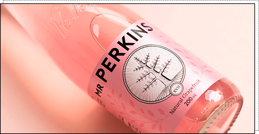
If you want to stand out among all those dewdrops, nature and juicy fruits, you need a non-standard label that breaks the mold.
To stand out from hundreds of similar products, you need to experiment and think outside the box. What do you think of these milk and dairy product labeling ideas?
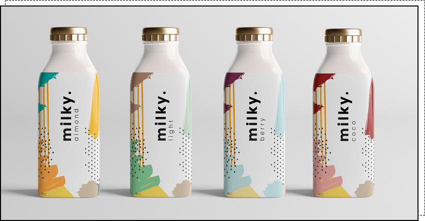
But recently, more and more often you can see unusual and interesting labels on the shelves.
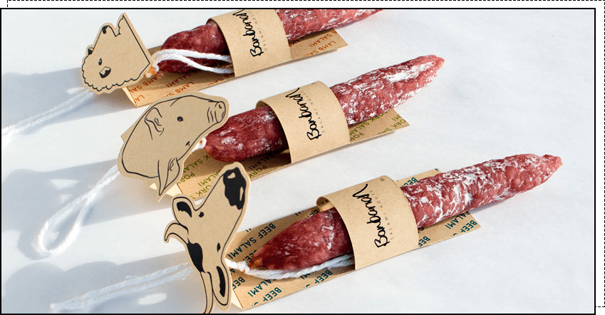
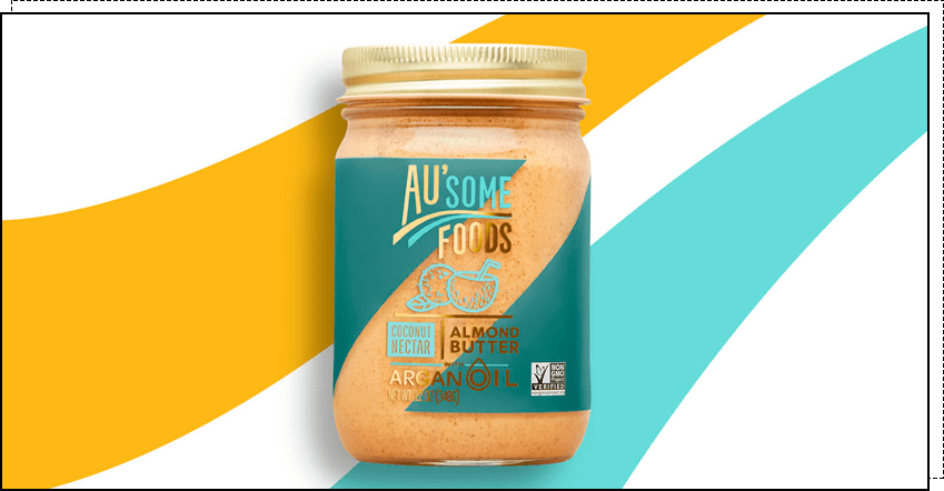
As for the color scheme, a wide variety of shades are used. They are selected based on the desired associations in the buyer. For example, blue conveys reliability, red symbolizes energy and strength, green is associated with well-being, freshness, and naturalness, and white emphasizes purity.
Mass-market products are typically characterized by bright colors and large fonts. However, recently, manufacturers have begun creating more subdued and concise labels.
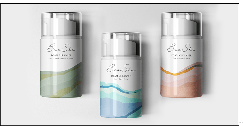
Products in the mid-price segment are often designed in neutral tones.
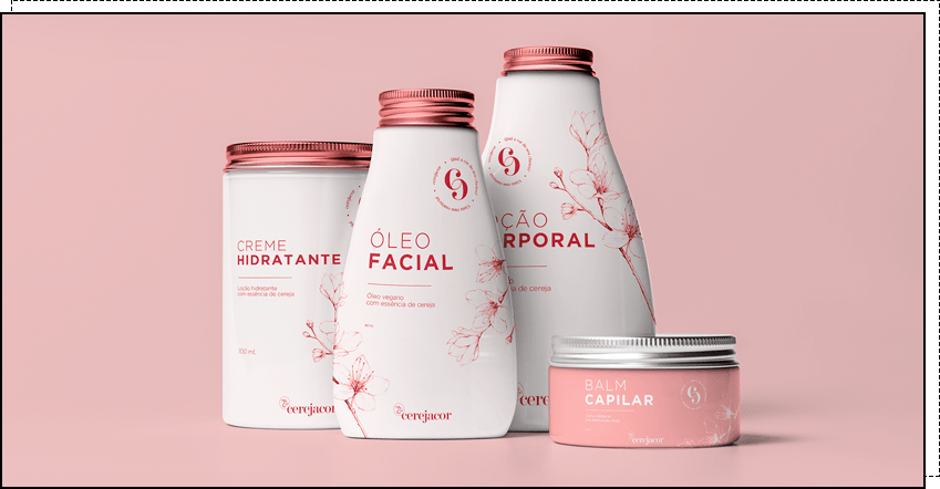
The label designs for luxury goods use neutral shades, silver and gold tones, simple shapes, and a laconic design.
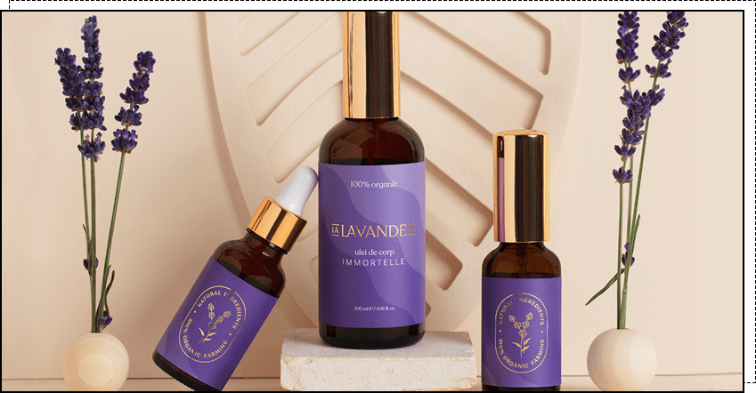
If you're unsure how to best design your label, contact our studio. We'll help you choose the perfect option to showcase your product.
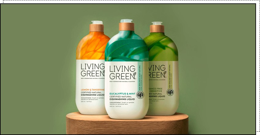
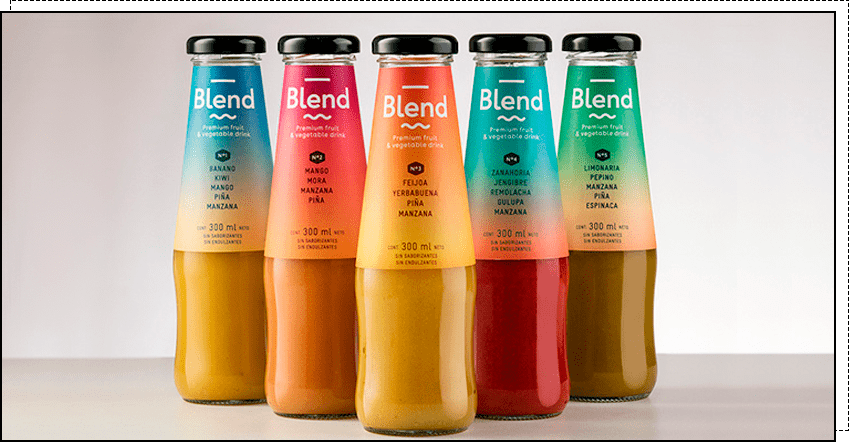
1. Gradients. Both bright and neon colors and soft, muted tones are popular. The combination of unusual colors with natural tones reflects the harmony of nature and modern technology. Gradients can be used across an entire product line or for a specific product to attract consumer attention.
2. Laconic boldness. Short text, large font, aesthetics, and brutal design are the hallmarks of this technique. It heightens perception and evokes emotions, improves product recognition, and invigorates the market.
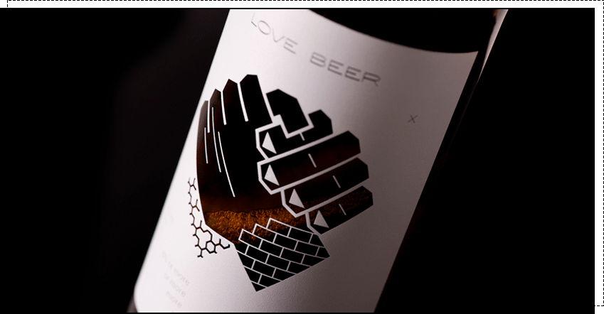
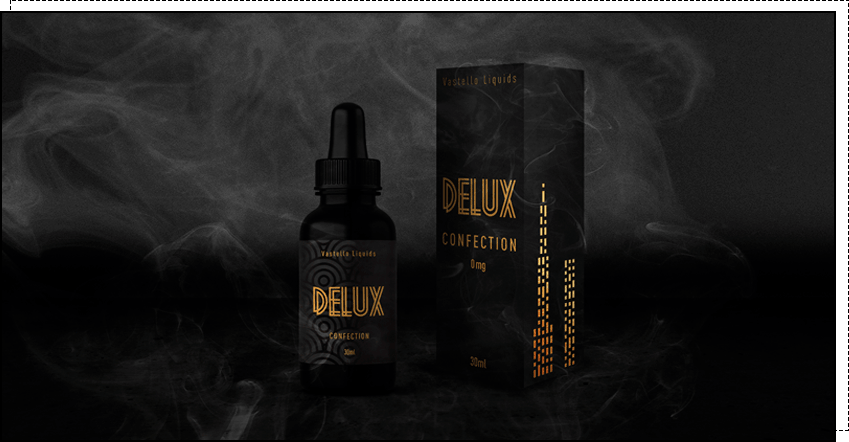
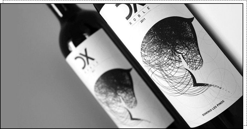
3. Black and white design. Black is associated with style and luxury, while white symbolizes purity and perfection, so this design is chosen to emphasize the product's premium status. This technique adds a touch of mystery, and the label looks striking and unique.
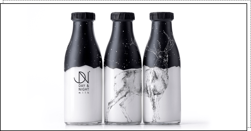
4. Transparent label. Used to show the true color and appearance of the product. Most often seen on beverages and cosmetics.
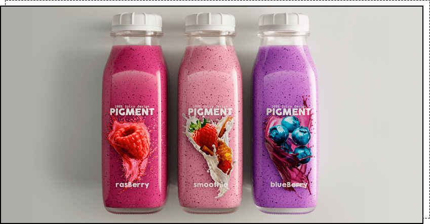
5. Numbers. Designers love to play with abstract elements and often use numbers to create emphasis. The design looks cool and unusual. A product with such a label will stand out on the shelf and attract attention.
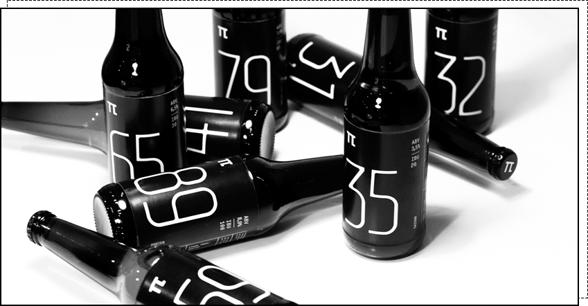
6. Bright colors. Bold colors always attract attention. But to ensure this technique works in your favor and doesn't turn off customers, the label shouldn't be too colorful or garish. Colors should be carefully selected, combined, and played with, and then you'll create a true masterpiece.
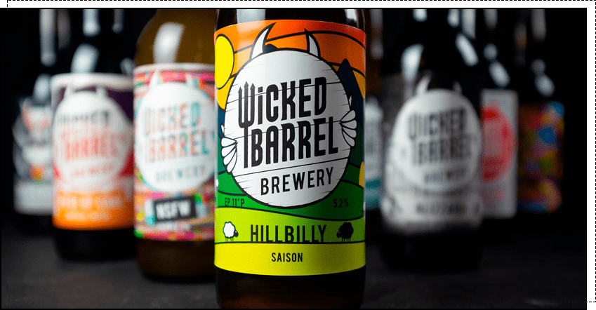
7. Maximalism. While minimalism is a popular design style, its complete opposite – maximalism – will also be trending this year. Numerous small details are used to attract consumers' attention and create a sense of luxury.
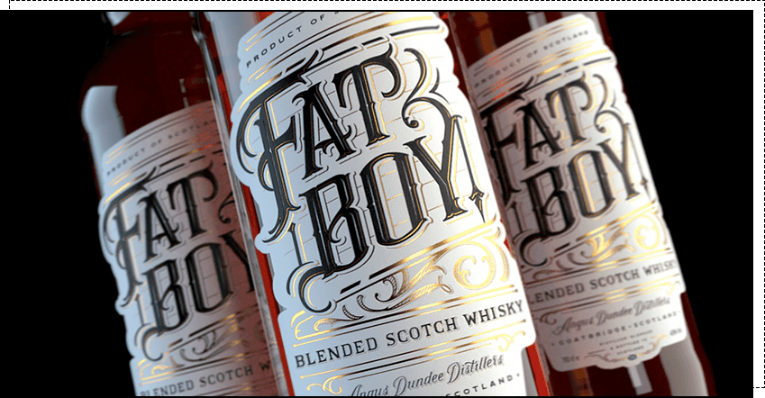
8. Images, illustrations, and stories. This year's trend is labels that tell a story or create an image. These can be hand-drawn illustrations or simply a drawing with an idea. Such labels are intriguing and look original.
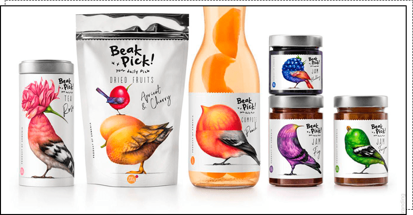
9. Metamorphosis. To differentiate themselves from competitors, brands need new, innovative solutions. One such approach is the use of metamorphosis—the transformation of one element into another. For example, birds transform into fruit, landscapes into animals, and so on.
Every detail on the label matters. Elements help convey a message to the consumer, shape the overall impression, and evoke specific emotions and associations. Take stripes, for example: diagonal lines symbolize movement and life, horizontal ones create a sense of stability and firmness, thin lines emphasize elegance, and thick ones suggest solidity.
To attract people's attention and encourage them to pick up a product, every design detail must be carefully considered – from text placement and font selection to color combinations and selection of techniques.
If you're looking for a unique and on-trend label, contact WeLoveBrands. For a consultation, please contact us in any way convenient for you.
Overall, global trends are almost identical to those in Ukraine. Designers from various countries use gradients, eco-styles, plays with color and fonts, and simple geometric shapes.
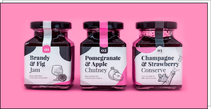
Bright and vibrant colors are trending because they attract attention and evoke positive emotions. Moreover, colors are chosen according to the product category to help customers associate the brand with the product and remember it more quickly.
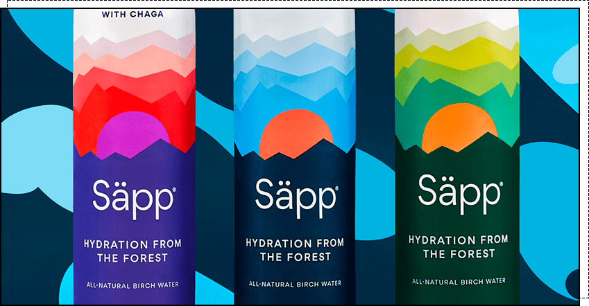
There's often a story behind a label. People love brands that resonate with them. And it's not so much about the product itself and its properties, but rather the values it reflects.

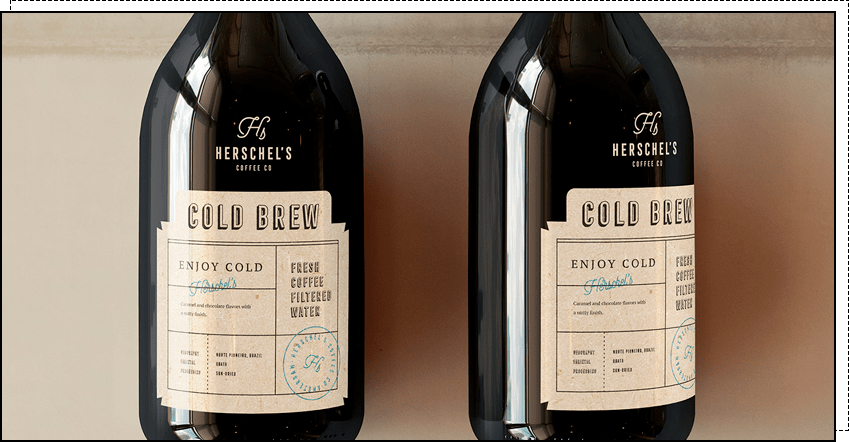
Another trend is the "postal" style. In the days before the internet, people received news from loved ones by mail and were delighted with every letter. Now, many companies are using the postal style to evoke a sense of nostalgia and relive fond memories in customers.
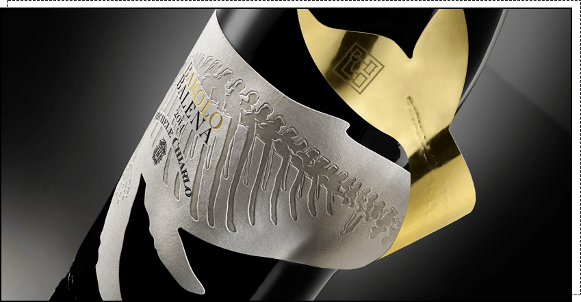
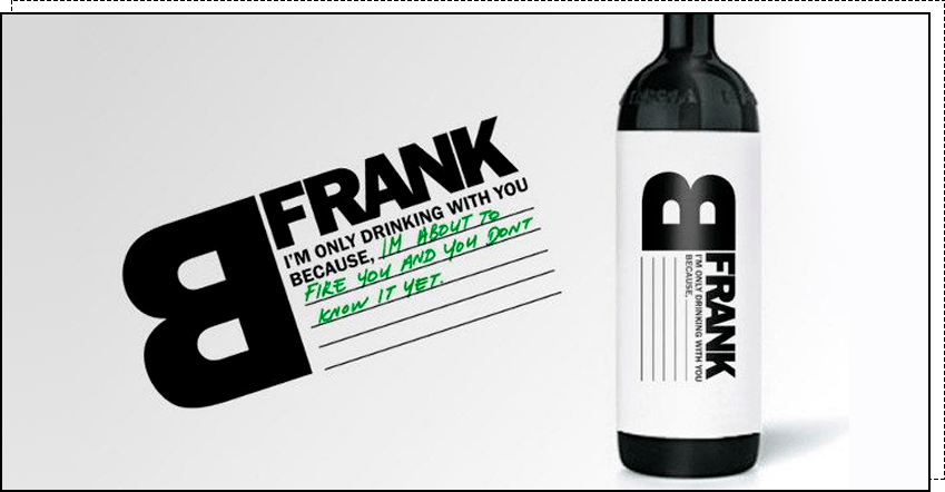
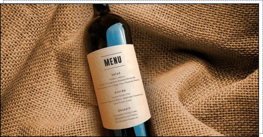
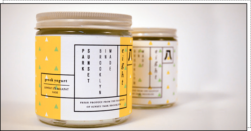
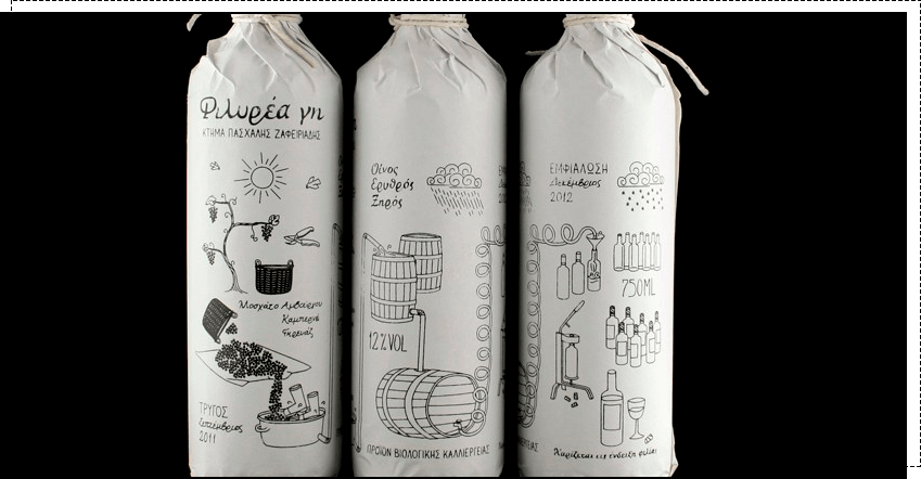
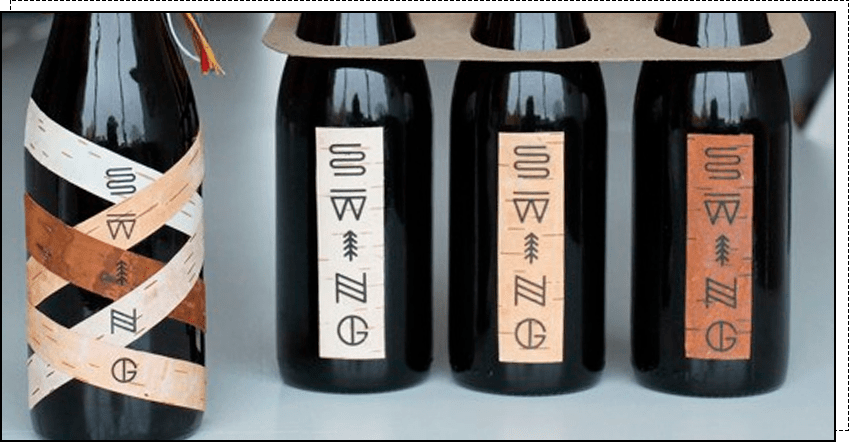
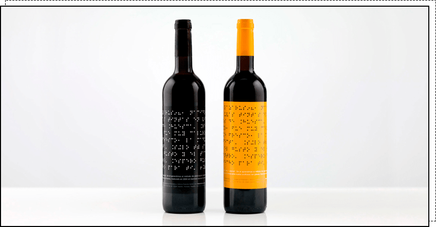
Labels play a significant role in product promotion. Statistics show that approximately 65% of consumers decide whether to buy a product simply by looking at it. And it only takes a few seconds to make a decision. This means that labels, or more specifically, their attractive and intriguing design, influence consumer behavior.
If you want your product to be eye-catching, intriguing, and evoke emotion, order a label design from WeLoveBrands. Our ideas and experience will help you promote your brand. For a consultation, call us or chat online.