Receive a presentation of services and expert advice
The best experts in the industry will oversee your brand development process.
→ Need branding, design, or creative solutions? Call us at +48 505 648 022 or message us on WhatsApp.
 WeLoveBrands.pptx

The best experts in the industry will oversee your brand development process.
Television is the most widespread mass media. Almost everyone can find a channel to suit their interests. They are divided into public and private, international, national, and regional. There are information, entertainment, news, sports, and educational channels for different demographics and ages.
There are over 37,000 satellite TV channels worldwide, and their number is growing every year. This means attracting audiences is becoming increasingly difficult.
A channel's profitability depends on its ratings and the number of regular viewers. Advertisers decide on advertising placement based on two factors: popularity and target audience. A channel's logo is one of the key tools for attracting and retaining viewers. We'll discuss design trends worth considering and what elements to use to create a striking brand identity.
The first thing a viewer sees when switching channels is the logos. Looking at them, they know which channel they've landed on and decide whether to watch it or not.
What kind of logo will attract attention and enhance the company's image? Simple, clear, and evoking pleasant associations.
That is, the TV channel logo should be :
 Informative . The viewer should be able to easily identify the channel's focus based on its logo. Logos for information, news, and science channels are typically distinguished by austerity and restraint. Emblems for children's and entertainment venues attract attention with bright colors and original fonts, while channels aimed at women feature a delicate color scheme and soft lines.
 Memorable . A good logo ensures quick recognition of a TV channel.
 Minimalist . The best logo is a simple logo.
"A logo cannot survive unless it is designed with extreme simplicity and restraint," said Paul Rand, designer of the logos for IBM, UPS, Enron, Morning Star, Westinghouse, ABC, and Steve Jobs's NeXT.
 Readable . The image on the screen is constantly changing. The logo must be clearly visible on any background.
 Long-term . The pursuit of trendy fonts and color combinations leads to the need for constant logo redesigns. This ultimately reduces the logo's memorability and recognition, and, consequently, reduces the channel's credibility.
A TV channel's logo should be checked for compliance with the above requirements. A high-quality branding will make the channel recognizable, differentiate it from competitors, attract new viewers, and retain existing ones.
Logo design is a complex and challenging task. What do you need to know to avoid mistakes? We've compiled the most important tips from leading designers and marketers. Follow them and you'll avoid common mistakes.
Recommendations for creating a logo :
Don't overcomplicate things .Too many details and colors will simply be impossible to see.
Make your logo easy to understand .Well-known TV channels' logos are designed with a minimum number of elements and clear, understandable symbols without any hidden meaning.
Choose your colors carefully .Color is the most effective way to make a logo stand out. The color scheme should not duplicate your competitors' logos.

Be consistent with your niche .TV channels target a specific audience. A science channel can't display a frivolous logo, and an entertainment channel can't display one that's too serious.
Think strategically .A logo will be used for many years to come. Most symbols can be modernized over time, but the core of a good logo will remain intact even after a redesign.
Study your competitors .Creating a unique logo is a long and labor-intensive process. Research your competitors: do their channel logos work, is their color scheme, font, and image effective? Analyzing the strengths and weaknesses of your competitors' logos will help you create a high-quality, original product.
Focus on your target audience . It's impossible to please everyone. But a good logo will attract your target audience. It's with them that you need to create a strong connection through your emblem.
And finally: trust logo design to professionals.Everyone makes mistakes, but a mistake in creating a TV channel logo is extremely costly. During a TV channel's early days, branding is one of the most important factors in its development. The designers atWeLoveBrands studio will help you developa unique logo that will create a strong connection between the channel and its viewers.
Psychologists say colors have a significant impact on consumers. Yellow evokes joy and warmth, green is calming, and black evokes feelings of luxury and prestige.
To choose the right shade or combination of shades for your company, you need to start from the main idea, the line of business, and the target audience.
 Red is the color of energy and passion. It's suitable for logos of youth, sports, and music channels. Since red is believed to stimulate appetite, it can be used in logos for cooking channels. However, it's not recommended for family and children's channels. This shade works well as an accent, so it's often used in combination with other tones.
 Orange is a playful and invigorating color. Unlike red, it doesn't carry a hint of aggression. It's one of the best options for logos of children's, gaming, music, and entertainment channels. It's not suitable for analytical, news, or financial channels, and it's not recommended for women's channels.
 Yellow radiates friendliness, joy, and youthful energy. Like orange, it's ideal for children's channels. It's not recommended for economic, political, or business-related platforms.
 Green is the most versatile color. Depending on its saturation and brightness, it can be used in logos for any channel, from serious to entertaining or children's. It's also one of the best colors for channels about the environment and ecology.
 Blue symbolizes maturity and reliability. It's used in logos for news, financial, and analytical channels. Overuse dulls the impact of blue, so it's important to stand out with a unique font or symbol.
 Purple is associated with wisdom, luxury, mystery, rich imagination, and creativity. It's effective in logos for channels specializing in fashion, history, development, religion, and mysticism. Light tones are very feminine and sophisticated, promoting relaxation and euphoria, while dark tones connect with the unknown, making them suitable for logos of esoteric television channels.
 Pink isn't just a feminine color. Its versatility, from classic to neon purple, allows the shade to be used in cutting-edge, modern channels.
 A brown logo will look unique, as it's rarely used. Dark shades look stern and masculine. Like blue, it's recommended for use in logos for masculine-oriented channels.
 White is the most versatile color. Its advantage is that it highlights other elements of the logo.
Understanding the psychology of color perception helps create TV channel logos that are fully aligned with their direction and target audience.
The logo's font indicates the channel's line of business and the age of its viewers. For example, "serious" channels use fonts closer to classic ones. These can include upright and slanted letters, with or without serifs. Entertainment, children's, and youth-oriented platforms use logos that range from minimalist, sans-serif, to decorative.
The main rule is to keep things simple and focus on how the logo will look on screen. Sometimes, simply changing the slant of traditional letters and numbers is enough to create a unique font for a TV channel.
As the number of channels grew and competition increased, logos became more complex. This trend toward greater complexity was limited by technical limitations—large screens were unavailable, making it impossible to discern a small logo with a multitude of elements.
Over time, a standard for creating TV channel logos emerged—simple, unique, and with a distinctive color scheme. Simultaneously with simplification and the elimination of many details, logos became more creative, unique, and recognizable.
There are over 100 television channels available in Ukraine. The most recognizable logos are those of ICTV, Pyatyi, STB, Novyi, and 1+1.




The first ICTV logo was unveiled back in 1992. Back then, it consisted of four orange Latin capital letters. The emblem has undergone numerous transformations, and in 2021, it is a simple, stylish, and recognizable logo consisting of the name and a star.
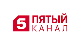
The "Fifth" logo is a red circle with a white "five" in the center. It's perfectly legible and recognizable. Since the first broadcast of the "1+1" channel, the logo has undergone several transformations, although the overall style has remained unchanged. Since 2020, the logo consists of clear, square-angled "1" signs and a plus sign in rich red on a white background.
The Discovery Channel broadcasts informational and educational programs from around the world, so the logo itself features an image of the globe. The logo's clear, smoky gray lettering is easy to read and recognizable.
CNN is an American television news network. The channel's logo is one of the most recognizable in the world. The design features rounded letters "CNN" with no spaces. The color red stimulates viewers' emotions.

The NBC logo design conveys a hidden message. Looking closely, you can see a peacock with six differently colored elements. These form a tail and also represent the six divisions of the television company.
National Geographic is an American television channel known for its wildlife programs and videos. Its main goal is to provide engaging content, raise awareness, and encourage people to care about the environment. A rectangular yellow frame gives the logo its distinctive character.
MTV was the world's first 24-hour music and entertainment channel. Its original logo consisted of a large, cubic "M" and a smaller "TV" logo. The deliberately casual design positioned the channel as youthful and rebellious. The logo remained unchanged for almost thirty years, changing only its color and texture. In 2010, a black-and-white logo was introduced to help it stand out from the colorful logos of its competitors.

You can design a logo yourself using specialized online services. However, it's best to entrust its development to professionals. Designing a logo in a design studio will cost $150 or more.
Most aspiring entrepreneurs don't plan to become a multinational company. This leads to the perception that logo development is an unnecessary, unjustified expense. However, it's important to understand that even small businesses need to attract customers, create a positive first impression, and stand out from the competition.
If you're planning to launch a TV or YouTube channel, entrust your logo design to the specialists at WeLoveBrands design studio. You can view case studies and a portfolio of work on the company's official website. To discuss your future unique TV channel logo, contact us by phone or via chat.