Receive a presentation of services and expert advice
The best experts in the industry will oversee your brand development process.
→ Need branding, design, or creative solutions? Call us at +48 505 648 022 or message us on WhatsApp.
 WeLoveBrands.pptx

The best experts in the industry will oversee your brand development process.
You've decided to open your own pharmaceutical business because you believe it can help your clients find resources that will help them feel healthy and happy. Whether it's Western medicine or natural healing methods, you know how to solve health problems and need the right tools to share them with the public.
So, how do you make a lasting first impression on a client? That's right, you need a logo. It's your chance to communicate who you are and what you do. Anything related to human health is important and serious. Therefore, today there are many reasons to create a pharmacy (or pharmacy chain) logo. In fact, finding a logo on your products is already a trend among customers. For a pharmacy, it's a distinctive sign and an opportunity to establish your brand in the healthcare industry.
The purpose of a logo is to promote a business worldwide. An attractive and memorable trademark is the first step toward establishing a web presence. However, blind adherence to outdated traditions and ideas is not necessary. Think of creating a pharmacy logo as designing its future. Logo design tells more than just how something will look; it tells a complete story about how it will work. A pharmacy adds value to patients' lives, and therefore its logo must be able to communicate this value both collectively and individually.
 1. Increases the chances of pharmacy brand recognition.
Simply put, they create consumer awareness of the identity of the pharmacy provider. A unique and attractive pharmacy logo reflects your personality and style. It clearly explains who you are, what you offer, and establishes your professional image.
 2. Strengthens trust.
Are you surprised? People will be more willing to buy medications from your pharmacy if you have a well-designed logo. This branding element will demonstrate the longevity of your practice. The color scheme you use in your design will convey this information to the viewer. How does this work? For example, female healthcare workers often choose pink uniforms to convey warmth, care, and a sense of trust.
 3. Your services and products are something outstanding.
A well-designed and thoughtful logo helps you stand out from the competition. Think of your logo as the visual representation of your pharmacy brand. It will show customers how you differ from the competition and what they can expect from the quality of your services.
 4. Reflection of professional image.
If your logo was designed by a talented cousin or a neighbor who owes you money, don't expect people to take it seriously. Nowadays, it's easy to find a branding agency that offers professional logo design. The cost will depend on your requirements.
 5. Increase sales.
Yes, you heard it right! A logo is an effective marketing tool. It's the first thing customers see when they visit your pharmacy or website for the first time.
People may not remember the name of a pharmacy, but they'll definitely remember its logo. You can analyze your competitors' logos, but don't copy them. Consider how your pharmacy differs from your competitors. Do you cater to a specific audience, such as women and children? Or does your business have an interesting founding story?
Based on this information, marketers, illustrators, and designers will help you choose the color, fonts, and shape of your logo. This will be discussed in more detail below.
Today, pharmaceutical companies form the backbone of healthcare. All types of medications are researched and sold by pharmacists. Therefore, competition between companies is fierce, as they compete for customers on whom their well-being depends. Because of this intense competition, pharmaceutical branding is expensive.
They must clearly convey messages related to well-being and health and completely avoid complex and confusing formulas. Crosses, human figures, and various symbols of energy and vitality have long been used as their trademarks. All this is done to ensure a unique competitive advantage when competing with competitors, patents, and over-the-counter drugs. Therefore, the logo design must appeal to consumers and demonstrate that using your medications is a benefit. In other words, trust and reliability must be promoted through promotional methods.
Unique design
High-quality icons in a minimalist style
Harmoniously selected color scheme
An effective, readable font
Here are some famous pharmacy icons.
The doctor's seal as a symbol of a prescription
Pestle and mortar (symbol of natural remedies from Mother Nature)
Cross (can be of different colors)
The Serpent of Epidaurus






Icons can certainly serve as a defining factor in a company's operations. But they don't have to be. This was proven by the company that sells the well-known Apple products. When commissioning the logo, the late co-founder Steve Jobs said, "It should be fun, energetic, and not intimidating." The bite of the apple served as its defining feature, and the company proved that it was possible to create an icon with deep meaning and a relevant purpose without relying on information about its operations. And it works!
Regardless of the medical field, whether a logo represents a clinic, a medical professional, a dentist, a pharmacy, or a doctor, the design elements will determine the difference, as each has its own unique characteristics. What do your consumers want? An original, authentic, and updated logo. After all, your customers want to feel like they're buying from the best pharmacy. Your goal is to give them a sense of individuality. On the contrary, a generic, ununique logo will harm your business.
Note: a logo with a simple message is easier to understand and remember! People can recognize the logo on banners from a distance and on your promoters' T-shirts. If you're looking to promote your pharmaceutical business, you've come to the right place. By learning about fonts, colors, and icons, you'll be able to understand what you want your logo to look like.
Think about the companies whose logos you see every day: from a car window on a billboard, on flyers handed out by smiling promoters, or in YouTube ads. Which ones do you think catch your eye? Chances are, as a viewer, the most memorable logo for you is one that uses key elements designed to convincingly represent a specific brand or service, such as color, emotion, and information.
When we buy medications at the pharmacy, we entrust our lives and health to pharmacists. This is a very important choice and encourages people to seek out professionals who embody calm, professionalism, authority, and stability. Therefore, many pharmaceutical companies today try to convey these characteristics through the color scheme of their logos. And inevitably, they become overly similar. Therefore, it is important to use your color scheme to communicate to consumers what makes you unique.
 Color
How can you choose a logo color that makes your brand trustworthy while also standing out from the crowd? It's not just the pharmaceutical industry—the entire healthcare industry uses blue as a primary color in logos. And according to statistics, approximately 85% of logos are blue. Yes, it's a good choice, as blue has long been associated with safety, knowledge, peace of mind, and stability. And at first glance, this color seems like a good way to demonstrate your expertise.
Green ranks second, while white is third. Let's look at colors that aren't as popular for pharmacy logos. For example, brown, pink, purple, and yellow. The fact that brown isn't popular in pharmacy logos makes sense. After all, we want customers to associate a pharmacy with sterility, not dirt. Yellow and pink, on the other hand, are considered friendly and welcoming colors. They're perfectly suitable for personal care.
To help branding agency specialists select the right color scheme, they need to answer the following questions:
Is the pharmacy brand male or female?
Affordable or luxurious?
Is his choice modern or classic?

When choosing a healthcare company, people want a restrained, serious, and mature logo. We analyzed over a thousand pharmacy logos; most preferred blue, purple, and black. Few companies chose orange, yellow, and red. Pharmaceutical companies also rely on the reputation of white due to its associations with cleanliness and hygiene.
If your pharmacy sells retail, consider red. Entrepreneurs whose business focuses on medications made with natural ingredients prefer green. It signals to customers that they can buy medications made with Mother Nature's prescriptions. If you specialize in women's health, pink will convey this to consumers. As for pharmacies that sell children's medications, almost any color of the rainbow is appropriate.
After reading this, have we confirmed your decision to go with blue? Or will a unique green logo represent your pharmacy? Of course, choosing a color is a personal decision for every entrepreneur. But understanding color in marketing will help you make an informed decision for your business.
 Font
You've probably heard the phrase, "Shoes make a person look good." Fonts are a crucial element of a massage brand's image. Your outfit may be meticulously designed down to the last detail, but if your shoes are old, dirty, and scuffed, you won't make a good impression. The same rule applies to typography.
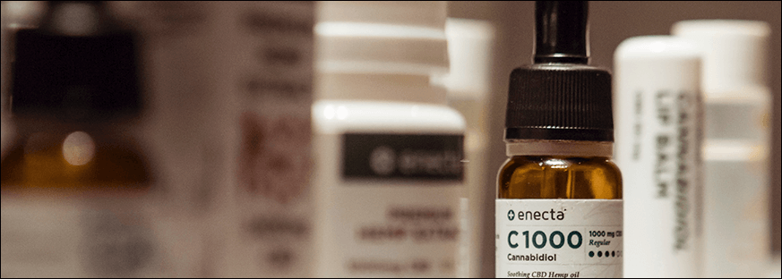
Even though typography accounts for only a tenth of your brand's image, it still has a colossal impact on its identity. Trends can significantly influence logo design. But fonts must remain legible and unique. Because if a customer can't read your message within three seconds, they'll simply leave.
Serif fonts are often used for headings and subheadings. If you're looking for a traditional solution, consider pairing serif and sans-serif fonts. This classic pairing complements each other well, creating visual interest and pleasing contrast. However, it's important to remember that using too many fonts in a pharmaceutical logo design can significantly hinder the understanding of your brand message.
Avoid using fonts that are too similar. This is more of a recommendation than a rule. Few users are aware that each font has its own family, each with its own personality and meaning. The idea behind this recommendation is to create a logo with visual variety. However, similar fonts can clash with each other and therefore make the logo appear awkward and ugly. In the pharmaceutical industry, there's no need to use additional elements to enhance the logo's aesthetic. This is because it's a serious business. Your logo design should be friendly and understandable, but without a hint of frivolity or playfulness. It's inappropriate.

The vast selection of fonts can be overwhelming. Therefore, it's best to stick to a few fonts and choose from them. This will give you a clear idea of the direction you should take. If everything is too complex and unclear, consider hiring a branding agency to design your logo. Professionals know how to give your business a unique identity. They understand all aspects of typography, and before applying a solution to your business, it will undergo comparative analysis and testing.
Old pharmacy logos look heavy and even awkward. In the last century, pharmaceutical company logos were typically black, brown, beige, and white. But today, thanks to new design trends and ideas, a brand can look simply stunning.
Design flexibility
Yes, you heard it right: design can be flexible. Until now, pharmacy logos have remained unchanged for decades. But today, you can find logos online that owners can make minor changes to for different occasions. When creating such logos, branding agency designers consider new business requirements. Therefore, a trademark can be used in several versions for different audiences, because a one-size-fits-all approach no longer always works. Today, businesses need a design that can personalize their relationships with different audiences: seniors, children, women, and men.
A variety of visual experiments and techniques
For a long time, designers have been experimenting with ideas for creating illusions in logo design as three-dimensional objects. They are constantly searching for ways to enhance the sense of depth. A striking example is the Edge Board logo, where the designer managed to combine the letters E and B in a way that creates a visual effect that makes one believe the logo has curved sections. These techniques help achieve a distinctive brand identity.
Emphasis on color scheme
The brand used color to tell its story. As discussed in the section on choosing logo colors, a well-chosen color scheme in a logo can evoke passion, desire, and other desired emotions. Thanks to this trend, colors are now being used intentionally and decisively in logo design.
Cartoon logos
They're used by pharmacies targeting children. Children associate cartoon logos with safety, fun, and a good mood. This year, cartoon brands will also be animated. Thanks to the animated effect of the fairytale staff, the ice between the pharmacy brand and young consumers melts before their eyes. Why? Simply because it looks interesting, casual, and fun.
Hand-drawn cartoon style sketches
This trend is also being embraced by pharmacies targeting children. This year, cartoon-style designs with thick outlines have won the hearts of designers and viewers alike with their immediacy and effectiveness. The hand-drawn, marker-like design has a playful and simple appearance, making it ideal for a logo for a pharmacy catering to children. Logos created in this style are not overly detailed, making them ideal for both small and large sizes.
Animated black and white logo
Oh, this classic combo will probably always be trendy! A logo created in this style is unobtrusive, cool, simple, and suits absolutely any design. Incidentally, pharmaceutical companies often request two versions of their logo: color and black and white. Sometimes, though, the black and white version looks so sophisticated and impressive that there's no need for a color version. However, using a black and white palette in a pharmacy logo isn't always appropriate. Only a professional designer can present it in a way that doesn't look threatening or hopeless.

Creative letter and symbol logo
Your logo speaks. It conveys, narrates, and communicates the brand message conveyed by marketers and designers. It's an effective marketing tool. Therefore, designers and illustrators use a variety of techniques to ensure the logo remains both engaging and simple. Negative space and symbols replacing parts of letters are particularly popular today.
Minimalist logos in geometric style
These logos were greatly simplified, consisting primarily of geometric shapes. Even today, geometric logos remain at the pinnacle of success. They can be easily and subtly incorporated into all types of branding materials without distracting the viewer with unnecessary details. To make them more memorable, designers use a unique color code.
“I wish you good health”
According to SMD research, the logo of the "We Want Health" pharmacy ranks second among the most successful pharmaceutical companies. This is despite the fact that the designer used two of the most difficult colors to combine when creating the logo, as red increases blood pressure, while blue helps normalize it. Incidentally, this color combination is also used by emergency services in Ukraine.

Vitus
When creating its logo, the Vitus pharmacy chain emphasized the color green, which is known to have a calming effect and is associated with nature. This subconsciously creates a feeling of safety and confidence in the pharmacy chain's products. Research shows that green is a safe bet for pharmaceutical products.

"Be healthy"
The Be Healthy pharmacy chain used an effective approach. Typically, a kind attitude and a wish evoke a reciprocal response – goodwill and the formation of a strong relationship between the brand and the consumer. The logo's color scheme is red and green. Red is the color of passion and blood, and green is the color of nature and ecology. An unusual color combination, but it works.

Some of the most common design elements found in pharmacy logos are the Rod of Asclepius, the mortar and pestle, the cross, and the Chalice of Hygieia. A common color scheme is blue, green, white, and red. Blue, green, and white are associated with calm, cleanliness, and hygiene. However, the pharmacy industry is very diverse, so limiting it to these colors and shapes would be a mistake. You can see this in the examples of American pharmacy logos.
Neofarm
Pure Heritage
Pharm House Logo

There's no better indicator of a brand's personality than its logo. After all, it's the public face of your brand. Therefore, unless you're a designer or marketer, developing one yourself isn't recommended. Therefore, you should allocate sufficient resources to have your logo developed by a branding agency. Where can you find a professional logo design? Search online for "custom logo design," and you'll encounter hundreds of thousands of options from self-proclaimed logo design companies and freelancers around the world. Some may be worth your time, but most aren't. Such a choice will lead to a rigorous selection process and a sifting process, which will ultimately waste time and money. So, agency or freelancer?
Freelance
Two hands and one head for a diverse project means very limited options for creating a logo that will become the face of your pharmacy. Before collaborating, it's worth asking yourself: will hiring a single designer bring the diversity and creativity you so desperately need? Will an unfamiliar specialist tap into all your creative potential or offer a limited option? What if there's another, more reliable and secure way to create a pharmacy logo? For example, hiring a branding agency.
Branding agency
Working with a branding agency guarantees high-quality work and timely project delivery. Designers are vetted before hiring, ensuring a high level of qualifications. A branding agency offers a professional approach to projects of any complexity, which is why logo design costs will be significantly higher than those of a freelancer.
So, a freelancer or a branding agency? The reality is, the best decision depends on your business needs and plans. If you're planning to open a pharmacy chain, it's worth ensuring the best logo quality and, therefore, choosing the branding agency WeLoweBrands.