Receive a presentation of services and expert advice
The best experts in the industry will oversee your brand development process.
→ Need branding, design, or creative solutions? Call us at +48 505 648 022 or message us on WhatsApp.
 WeLoveBrands.pptx

The best experts in the industry will oversee your brand development process.
The last 20 years have seen a boom in payment systems. The popularity of contactless payments, mobile payments, and digital wallets are fueling the emergence of new payment systems. However, few of them will survive in the face of fierce competition. For example, of the more than 200 payment systems introduced between 1993 and 2000, only PayPal achieved significant success.
A good logo will help you gain a foothold in the market and attract new customers. It will help create a positive company image, increase trust, and distinguish the organization, its products, services, and employees.
Why does a payment system need a logo? To create a reliable company image, highlight the core idea and strengths of the business, attract audience attention, and generate interest in the product.
A successful brand allows you to :
 Increase recognition and differentiate yourself from competitors. VISA, MasterCard, American Express, Apple Pay, Google Pay—these are all payment systems, but each is unique in its own way.
 Develop a company image . For example, the smiley arrow in the Amazon logo communicates the sale of products in categories A to Z and also demonstrates customer satisfaction.
 Increase trust . Statistically, consumers trust brands with a logo more.
 Increase customer base . The ultimate goal of a logo is to increase the number of payment system customers and the company's revenue by enhancing recognition, loyalty, and building a positive reputation in the market.
A logo is an important component of branding. It helps reflect a company's personality and improve its recognition.
It is important to remember that the logo is not :
 A full-fledged brand
Brands are built on thousands of customer touchpoints, not a single logo. Train your staff, implement automation, optimize your website for search engines, and improve customer support—this will help you build a strong brand that people trust and recommend to their friends.
Visual identity
A logo is part of a company's corporate identity. It also includes the company's colors and fonts, typography, photography, visuals, and other elements. These are developed comprehensively by a branding agency.
An indicator or guarantor of success
Even the most successful logo can't compensate for poor customer service, poor payment system security, and constant outages. Use a logo to highlight your company's strengths while improving other aspects of the payment system.
Before creating a brand name, first answer these questions :
Why do you need a logo?
What company story do you want to tell with it?
Who is your target audience?
Who are your key competitors?
Can you identify 3-5 key role models whose ideas can be used when developing a logo?
What company values do you want to express with your logo?
Does your brand have an established archetype, does it have any distinctive features, such as: sophisticated, luxurious, nostalgic, vibrant, and so on?
What are the main planned uses for the logo? Banner advertising? Website? Branded merchandise? A combination of these?
Once these questions are answered, you can begin creating your logo . To ensure it's effective, eye-catching, trustworthy, and calls to action, specific colors, fonts, shapes, and symbols are used.
Business owners and top managers often choose colors based on personal preference. This is a grave mistake. According to research, color accounts for 60% of impressions from advertising and products. Shades selected with a focus on the psychology of perception provide clear differentiation from competitors and strengthen communication with consumers.
 Red attracts attention, energizes, and motivates action. It's suitable for companies that need to convey strength, determination, energy, or leadership.
 Blue is used to convey reliability, wisdom, loyalty, experience, and success. It evokes feelings of security and trust. Light blue also conveys a sense of reliability and is recommended for technology and payments. Dark shades of green emphasize connections to money, stability, and growth.
 Brown is the color of tradition and conservatism, experience and longevity. Black symbolizes power, elegance, and luxury. It conveys classic values, practicality, and intelligence. Gray is used to create an atmosphere of confidence and security. White helps create a laconic image. It is widely used as a background for other colors, allowing logo elements to stand out.
Incidentally,the Pantone Color Institute, which annually selects the key color of the year, announced not one but two shades for 2021: Ultimate Gray and Illuminating Yellow. They replace the classic blue that was the symbol of 2020. Pantone's research can also be used as a guide when choosing a logo color for your business niche.

One of the key elements of a logo is the font. When choosing it, it's important to ensure it's consistent with the business's purpose. A payment system with a decorative, Disney-esque font is unlikely to inspire trust in potential clients. Therefore, choose this element of the logo carefully.
Furthermore, the font must be legible. Keep in mind that a logo can be used on a variety of media, including outdoor advertising, a website, a bank card, and branded products (pens, business cards, notepads). Therefore, it's important that the font looks equally good in all formats.
The most common options in the payment system sphere are :
Serif fonts are believed to retain the consumer's attention longer.
Sans serif fonts will emphasize the payment system's business style, the seriousness of its intentions, and the clarity of its processes.
ScreenSmart fonts are suitable for small characters. They are clear and legible—the perfect choice for small print.
Bold fonts attract and hold attention, and are easy to read. They are used for progressive payment systems with minimalist visual design.
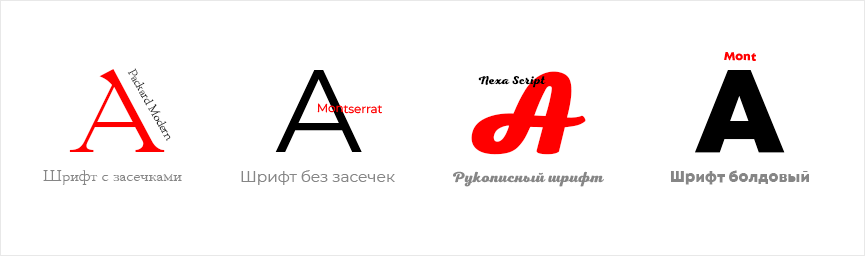
Incidentally, bold fonts are a trend for 2021. They're versatile and scalable. They'll look equally harmonious on backlit screens, outdoor advertising, and branded merchandise.
Scientists have found that simply depicting geometric shapes in a logo can influence brand perception. For example,the circle, used in approximately 20% of popular logos, evokes friendliness, unity, and stability.
The triangleis considered the most "stable" and "safe" shape. It's used by innovative companies that aren't afraid of transformation and adaptation to new realities. You can choose a triangle with its corners pointing upward or to the right. This symbolizes forward movement, while downward or leftward directions signify passivity.
Squares and rectanglesare used to emphasize professionalism, order, confidence, and stability.Vertical and horizontal linesconvey reliability, development, and dynamism.
The current trends of 2021 are a continuation and development of what users already saw last year. These include minimalism, geometry, multidimensional logos, and bold fonts.
Here are some more interesting ideas:
 Shadow Breaks
The intersection of two elements in a logo with a shadow effect requires the introduction of an additional tone. They are usually created without smooth color transitions. They look fresh and unique.
Color fading (Fades)This trend is implemented through a gradient that gradually fades until it disappears completely. This technique works best with a white background. Several shades can be combined.
Simple OverlaysA striking example of this logo technique is the MasterCard payment system. The trend involves using two elements with different intersections, as well as varying degrees of transparency.
Yin YangThe concept combines diametrically opposed elements and allows you to showcase several different missions or concepts of your company.
MicrolinesThis striking trend should be used with caution: it doesn't scale well and can appear unreadable at small sizes. Modern technologies make it possible to avoid degrading the appearance of emblems with microlines, but it's important to entrust the development to a professional design studio.
DoublesThe trend involves combining two intertwined elements. This technique can be effectively used when designing initials and acronyms in payment system logos. It also adds volume to the logo.
In 2019,MasterCarddropped its name from its logo. According to its Director of Marketing and Communications, over 80% of people recognize the logo without the name. The company retained two intersecting translucent circles, styled in a simple overlay style.
MasterCard uses red and orange in its logo. The intersecting circles have been a distinctive feature of Mastercard for over 50 years. They symbolize the brand's promise to connect people and help the payment system stand out, attract attention, and encourage action.
The Russian payment systemMiruses microlines, symbolizing people and the social relationships between them. The logo also features circles, rectangles, and a wing. The latter symbol represents a global view of the world—from a bird's eye view.
The logo utilizes multiple symbols: the circles and rectangles convey a connection to the financial world and also explore the idea of the world. The circle represents the outline of the planet, and the rectangles represent terrain visible from above. The logo's signature colors are green and blue, reflecting the hues of the earth and sky.
The name of the young payment systemCabbagetranslates as "cabbage," a reference to money. The logo is based on a circle, symbolizing security and endless movement. The Latin "e" encircles the figure, symbolizing the unimpeded flow of money around the world. The corporate color green represents help, protection, support, and care.
The Upaypayment system's logoin Uzbekistan features a stylized "wave" symbol, symbolizing the flow of money. The minimalist emblem is crafted using black and rich yellow. It looks great on outdoor advertising, backlit screens, and the company's signature backpacks.
The international payment systemPayPaldesigned its logo using a blue and light blue overlapping letter effect (Doubles). They evoke calm and a sense of security.
Developing a logo is a lengthy, complex, and comprehensive process that relies on researching a company's competitive advantages, target audience, and key competitors. Therefore, creating a logo yourself in an online image editor or specialized service without professional skills will be ineffective.
To achieve a high-quality result, the creation of a logo should be entrusted to :
Freelancer . The average cost of freelance development is 1,500–2,000 hryvnias. This method is reliable if you entrust the project to an experienced designer with a portfolio and positive reviews. Be sure to check whether other clients have had negative experiences with the freelancer. Reviews can be found on Google, the potential contractor's social media, and their profile on freelance platforms.
A design studio . This is the most proven and effective option. By entrusting your logo to a design studio, you'll receive work based on multi-stage research. Specialists at such companies typically possess the necessary technical skills, development experience, and knowledge of fonts, the psychology of color perception, and so on. Logo creation at a design studio costs $200 and up. The price depends on the complexity of the work, the urgency of the logo's implementation, the number of sketches, and the ability to make revisions.
WeLoveBrands studio specialists devote approximately 60% of their development time to collecting and analyzing data. This ensures you receive an effective payment system logo that aligns with trends, your requirements, and consumer expectations. We don't rely on hype, but rather leverage trends that will be relevant for years to come. Contact us to discuss your project, receive recommendations, and receive examples of our work.