Receive a presentation of services and expert advice
The best experts in the industry will oversee your brand development process.
→ Need branding, design, or creative solutions? Call us at +48 505 648 022 or message us on WhatsApp.
 WeLoveBrands.pptx

The best experts in the industry will oversee your brand development process.
Today, the variety of soap brands on the shelves of Ukrainian supermarkets is truly impressive. Gone are the days when the choice was limited to bare bars of laundry soap and a few bars with tired scents. Now, in addition to solid soap, liquid soap is also available, with transparent or creamy textures, smelling of all sorts of delicious things, and even having a healing effect on the skin.
Given the above, it's important to create a design for soap packaging that will convey the right message to consumers about the product's features and make it stand out from the crowd of competitors. And since we buy soap regularly, the manufacturer has no time to waste.
|
|
Protective. As a means of hygiene and protection against microbes, soap also needs protection from external factors. |
|
|
|
Aesthetic. You'll agree that the attractive appearance of soap packaging on a bathroom shelf is pleasing to the eye and lifts the spirits. |
|
|
|
Dispenser. This feature is exclusive to liquid soap, allowing you to dispense the required amount of soap for a single hand wash with a simple press of the dispenser cap. |
5 Trends in Soap Packaging Design
When it comes to soap packaging design, there are 5 key trends that are being observed in this industry:
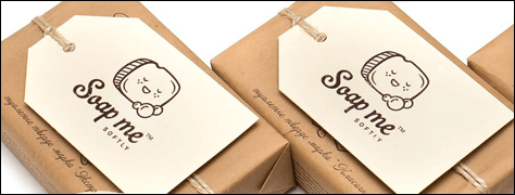
Handmade soap, so popular recently, can be considered a niche product. While initially appearing on our market, it was often produced in a "home-made" manner and lacked proper packaging, it is now the result of a specialized business line. Significant resources are invested in packaging design that conveys the handmade nature of the soap (for example, through the use of handwritten fonts, etc.).
 |
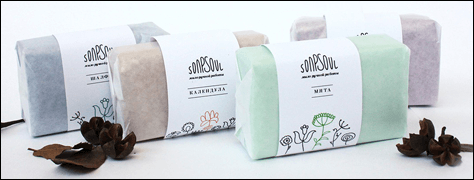
Many consumers believe that products sold in pharmacies are more trustworthy than those found in regular stores. Based on this belief, some brands choose a so-called "pharmacy" style for their soap packaging design. This style is especially common for products that boast medicinal properties due to special ingredients.
 |
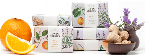
In this case, fruits, flowers, spices, and other ingredients that create the aroma and color of the soap, and whose name refers to a specific product line, may be depicted around the entire perimeter of the packaging.
 |
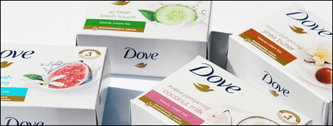
The absence of a bright palette of colors on the packaging and minimal design elements highlight the soap's cleansing properties and its lack of artificial additives. White, symbolizing purity and naturalness, is often the primary color of such packaging.
 |
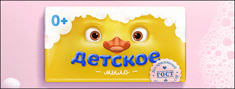
Typically, these are funny animals or fairy-tale characters featured on baby soap packaging. This delights children and encourages parents to buy the product in their child's preferred packaging.
 |
As you've seen, there's a close connection between packaging design and brand popularity. So, if your soap sales aren't yet at their peak, maybe it's time to consider rebranding and a new packaging design ? WeLoveBrands Studio is ready to help!