Receive a presentation of services and expert advice
The best experts in the industry will oversee your brand development process.
→ Need branding, design, or creative solutions? Call us at +48 505 648 022 or message us on WhatsApp.
 WeLoveBrands.pptx

The best experts in the industry will oversee your brand development process.
A logo has long ceased to be a simple image used to convey a company's message to its target audience. It is now used to attract new clients, build a certain reputation, and protect against plagiarism. A logo can also be safely called the "face" of a company.
In short, you won't get far without this treasured little image. Especially if your industry is highly competitive. After all, a logo is what will set you apart from similar businesses.
In this article, we'd like to touch on the beauty industry and the importance of logos within it. Specifically , the field of cosmetology.
In the beauty industry, a stylish logo serves a special purpose. It increases your recognition and memorability. The result: more clients and increased profits.
The beauty industry is quite competitive. Cosmetologists literally bend over backwards to win clients. If you want to stand out from the crowd, you need to create a unique image. A stylish logo does this perfectly. An aesthetic logo can highlight your strengths, highlight your advantages, and highlight your range of services. It can also impart a special charm and elegance. This will help you create the desired image.
In the cosmetology industry, a logo can perform several functions:
 Distinctive
A logo makes you stand out from the competition. It's easier for clients to find you and they can always recognize you among the crowd of other cosmetologists. This is especially helpful if you promote your business on social media.
 Advertising
This is the reason most companies commission a logo. A logo creates a specific image for your company. It also helps your target audience associate the company with the right things. It builds a certain reputation and communicates the company's values and philosophy.
 Protective
This feature is useful for cosmetologists who promote their services on Instagram or Facebook. They often post photos of their work on their profiles. Some competitors may act dishonestly and "steal" your photos. To avoid this, simply add your logo to the image.
As you can see, there are many reasons to develop a logo for the beauty industry. So, if you're a cosmetologist and haven't yet commissioned a logo, hurry up and fix that.
A cosmetologist bears a special responsibility. After all, they are essentially entrusted with one of the most important components of human beauty —the face. Various masks, peels, and injections can either improve or ruin a person's appearance. That's why it's crucial to use your logo to instill trust in your clients. It should demonstrate that you are a truly responsible specialist and that they can turn to you without any concerns.
Moreover, cosmetology services aren't cheap. It's important to demonstrate that clients won't regret handing over their hard-earned money. It's also crucial to highlight your pricing policy through your logo, so clients know exactly what to expect. Logos for beauty professionals should also highlight your level of expertise: quality, skill, high qualifications, and so on. In short, do everything you can to demonstrate and prove that you're the best!
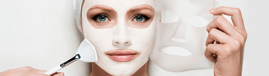
It's also important for your logo to be memorable and stand out from the crowd. This will help you stick in clients' minds. This is especially important for cosmetologists who post their work on social media, as many professionals' accounts are virtually identical, making it easy to confuse you with your competitors.
So, what points should be taken into account when developing a logo for a cosmetologist?
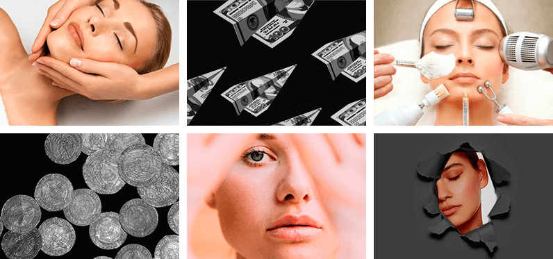
Stylish, trendy colors and modern fonts are a great way to create a cool logo for a beauty professional. Read on to find out how to choose them.
To ensure your logo is as stunning as possible, it's important to carefully select the appropriate font, style, and color. First, let's look at the different types of logos:

Before designing a logo, it's important to choose the perfect shape and dominant colors. Although consumers remember bright colors best, a cosmetologist's logo with such a color scheme will be difficult for clients to perceive. Also, after choosing the logo colors, be sure to test their effectiveness on different devices, as the same color can look different on a computer and a smartphone.
Cosmetologists prefer soft and non-aggressive tones. For example, soft pink, peach, light blue, lavender, lilac, etc. Royal colors, such as gold and purple, also look good. Classic tones, such as black or white, can also be added.

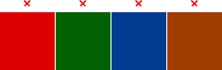
We don't recommend choosing red, green, blue, or other bright shades, as they can have a particularly strong psychological impact. And in the cosmetology industry, we don't need that. In general, before choosing a logo color, study its psychological impact. Then you'll be sure to hit the mark with the right shade.
The shape of a logo can also influence the human psyche. Let's explore how each shape affects the brain.
Circle/oval/ellipse
These figures evoke positive emotions. They are perceived as symbols of friendship, love, and unity. They are associated with stability and sometimes symbolize femininity.
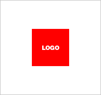
Rectangle and square
Clear lines and right angles signify stability and balance. They evoke feelings of strength, efficiency, and professionalism. Incidentally, it's best to avoid blue shades with these shapes, as they can create a feeling of coldness and unwelcomingness.

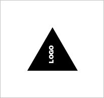
Triangle
This shape is closely associated with science, religion, and law. It also symbolizes masculinity. Therefore, it is definitely not suitable for cosmetologists.
As you can see, the ideal shape for a cosmetologist's logo is a circle. However, rectangular logos are also acceptable in this field.
Angular, pointy fonts aren't particularly suitable for cosmetologists, as they connote dynamism and a certain aggression. However, rounded and soft fonts will look right at home in beauty logos. They evoke a sense of freshness and even youth. You might also consider italics. They're quite feminine and look cool.
Now let's talk about fonts in more detail. There are two types of fonts: Sans (serif) and Serif Sans (sans serif). We don't recommend choosing fonts that are used frequently, such as Times New Roman and Arial. You can also create your own font, but there's no need, as there are tons of fonts online to suit every taste.
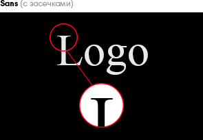
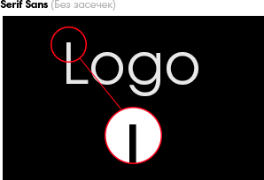
For cosmetologists, either rounded, soft fonts or stylish, sophisticated ones are best. It's a matter of personal preference. The key is to avoid "sharp" fonts, as they can create mistrust in potential clients in the beauty industry, or even be off-putting.
What are the current trends in beauty logo design ? We've compiled the most trendy and stylish options.
Simplified logo
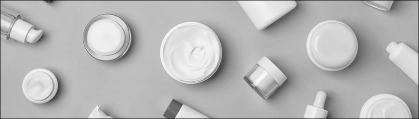
This trend is one of the most long-lasting. It's gradually becoming a classic. Simplified logos are distinguished by their conciseness. If you're a fan of minimalism, you'll definitely like this option. It can be described as "simple, yet tasteful." We also recommend considering this option if you plan to use it at different scales. Simplified logos will be legible at any size.
The Lost Fragment
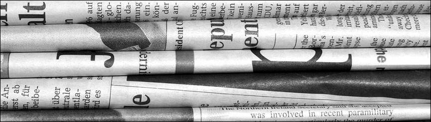
In this version, designers intentionally cut out individual parts of letters or designs. This gives even simple lettering a unique look. However, don't forget about logo readability. If you remove too many elements, the logo will look unfinished. Potential clients simply won't be able to decipher it.
Emphasis on certain details
Want to draw attention to your logo? Simply distort a detail. This trend looks very stylish. Change the color of one letter in a word or create a unique design. After all, graceful asymmetry and a touch of imbalance have never ruined a logo. Such accents add a unique charm. Just be careful not to overdo it. Otherwise, you risk ending up with a logo that looks simply crooked rather than trendy.
Vertical arrangement
If you plan to place your logo on a square surface or simply don't want a horizontal logo, arrange all its elements one under the other. These icons are usually more convenient to use than classic horizontal ones.
Geometric logos
Geometry is always stylish. This option will especially appeal to fans of minimalism. Folds, lines, and sharp angles evoke feelings of stability and confidence. Incidentally, combining angles and folds with other shapes is an interesting design solution. Experiment and combine.
Rounding
Smooth curves and rounded corners will look great in a logo. They will lend a certain softness and reliability to your company's image. They evoke feelings of comfort and flexibility—just what cosmetologists need. But the key here is to avoid overdoing the softening. After all, if you turn the logo into a solid sphere, it won't look impressive.
Hand-drawn
Subtle watercolor paintings and stylized illustrations can add a great touch of variety to a logo. If you want to make your company stand out from the crowd and highlight your creativity, consider this design option. The artistic renderings look stylish and elegant.
Thin lines
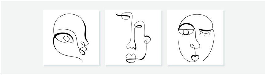
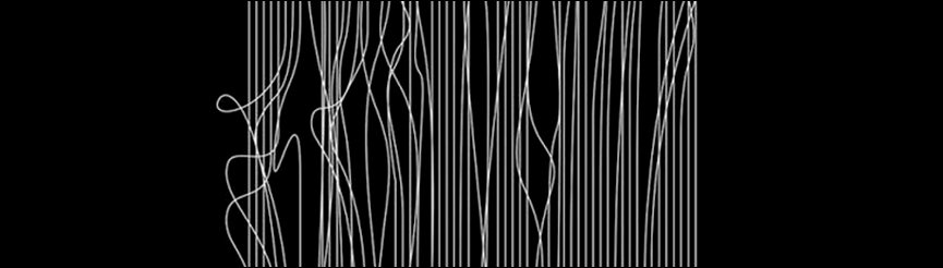
If you want your logo to evoke a sense of lightness and airiness, use thin lines in its design. They can also be used to create complex logos. However, such logos have one drawback: they can appear illegible when scaled down. Therefore, choose thin lines. lines only if you do not plan to distribute it in a small size.
Coats of arms and emblems
This option is more suitable for cosmetology clinics and companies than for individual cosmetologists. Coats of arms and emblems convey a certain grandeur and seriousness, perhaps even a touch of pathos. Such logos demonstrate your commitment to tradition and respect for the history of your roots. Therefore, if your company has been in business for a long time and has experienced many events, you can confidently choose a coat of arms as your logo.
However, we advise you not to chase trends. This can lead to you losing your unique identity. Study all the trends and incorporate them into your logo design. But don't stick to them exclusively. Develop your own signature style, and you'll be able to create the best logo.
We invite you to take a look at some successful logo examples from Ukrainian cosmetologists. Perhaps you'll find inspiration among them or decide what you want to see in your logo.
Let's take a look at cosmetic logos from the Asian, American, and European markets. Maybe one of them catches your eye?
Asia

USA
Europe

In reality, creating a logo is much more difficult than it seems. The process is labor-intensive and time-consuming. A high-quality logo is usually developed in four stages:

Stage 1. Research
At this stage, the designer collects and analyzes information, meticulously preparing to create a masterpiece for you.

Stage 2. Concept definition
The logo idea is developed based on the customer’s company philosophy.

Stage 3. Making amendments to the concept
The logo is approved by the client, and adjustments are made based on their wishes, but not in a way that conflicts with the core concept.

Stage 4. Launch
Logos are beginning to be used in advertising, printed on business cards, etc., and distributed online.
It's crucial that each of these stages be carefully considered. Then the result will delight you and your clients. That's why you shouldn't entrust logo design to just anyone. It's essential to choose true professionals who can bring all your ideas to life.
Don't know where to find such a logo? Then contact WeLoveBrands! They're true professionals. They'll design a logo for you that will make all your competitors envious. Just look at the beauty they've already created:
And the prices there are calculated for individuals. Designing a single logo will cost you $50.
If you're unsure which logo concept to choose for your cosmetologist, you can order several unique options. For example, three logo variants for $100, or five logo variations for $150.
A logo is an art form in itself. So create a logo worthy of display in the Louvre. The specialists at WeLoveBrands will help you develop it and bring all your ideas to life!
We wish you good luck, a beautiful logo, and lots of clients!