Receive a presentation of services and expert advice
The best experts in the industry will oversee your brand development process.
→ Need branding, design, or creative solutions? Call us at +48 505 648 022 or message us on WhatsApp.
 WeLoveBrands.pptx

The best experts in the industry will oversee your brand development process.
How does the morning usually begin, if not with tea? With coffee, of course. Many people simply cannot imagine a new day without an aromatic cup of their favorite beverage. That is why coffee can safely be considered an "indispensable" item in one's shopping basket.
When choosing coffee of a particular brand, consumers are generally guided by criteria such as:
|
|
The taste of the drink. |
|
|
|
Release form (granulated, ground, in beans, for coffee machines, etc.). |
|
|
|
Price. |
|
|
|
Convenient packaging. |
|
|
|
Brand "promotion". |
|
|
|
Packaging volume. |
|
|
|
Attractiveness of design. |
Naturally, every coffee producer strives to earn customer trust by meeting their needs and wishes as best they can across all aspects. Particular attention is paid to aspects related to coffee packaging design. It's no wonder, after all, that according to surveys of Western consumers, packaging is an indicator of the product's quality.
Coffee packaging, like any other product, is a unique channel through which the product communicates with the consumer. So, what needs to be done to ensure that the "language" of coffee packaging is understandable to the target audience without even looking inside? And, most importantly, that it sells the product? Let's explore this in more detail.
Given that the predominant share of coffee on the Ukrainian market is an export product, the following characteristic features reflect foreign trends in packaging design for this type of product.
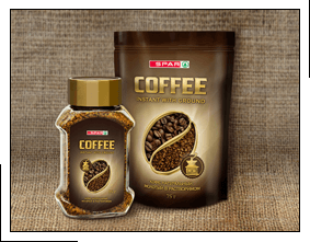
Perhaps the most popular option for traditional product packaging is to use images of coffee beans as decorative elements. Seeing them makes everything crystal clear to potential buyers.
 |
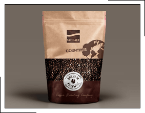
It's recommended to choose colors that are most closely related to the coffee theme for packaging design: brown and black, yellow and red. The first two are similar to the color of the drink, while the second two are warm colors and allow for an additional, bright accent on the packaging. A contrasting combination of black and white is also appropriate.
 |
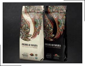
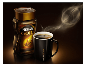
The use of simple, smooth lines is encouraged, as they evoke in coffee lovers a visual analogy with steam emanating from a cup of hot drink.
 |
A good example is the packaging of Nescafe coffee with a large logo of the same name printed on it.
 |
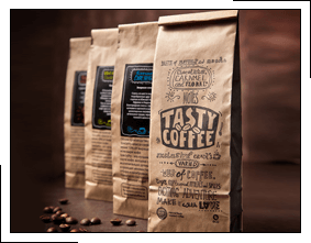
According to statistics, the largest percentage of coffee purchases are made for home consumption. This packaging design evokes associations with family comfort and a relaxed atmosphere.
 |
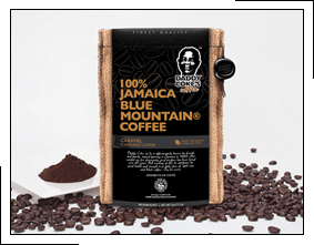
This trend is typically characteristic of premium coffees, whose producers emphasize the essence of the product without overloading the packaging with unnecessary details. Incidentally, it's precisely for consumers in this segment that the outer packaging matters most.
 |
If you're interested in successfully launching or rebranding your coffee brand, enlist the help of WeLoveBrands' design experts. With professional packaging design , we'll highlight your product's benefits and make it stand out on store shelves.