Receive a presentation of services and expert advice
The best experts in the industry will oversee your brand development process.
→ Need branding, design, or creative solutions? Call us at +48 505 648 022 or message us on WhatsApp.
 WeLoveBrands.pptx

The best experts in the industry will oversee your brand development process.
Starting your own consulting business can be an exciting, yet stressful time. Loans, choosing an office and furniture, hiring staff, and even adding logo design to the mix. Do you really need one?
Let's consider the example of Alexander, the owner of a bicycle repair service, perhaps not a consulting agency. What is the purpose of the logo? To connect consumers with Alexander's services. The logo evokes emotions and memories that remind them of his business. In his book "Love in Logo Design," David Irey argues that consumers choose services or products based on their perceived value, not their actual value.
A consulting company without a logo is like a person without a face. Sagi Haviv, a renowned New York graphic designer, once said, "A logo isn't just a brand's way of communicating with the public; it's also, first and foremost, an identity." Haviv has created some of today's most iconic logos—National Geographic, National Broadcasting Company (NBC), and Armani Exchange, to name a few. He also argues that a good logo shouldn't just be appealing to the public. It should work. The primary reason for creating a logo for a consulting company is individuality.
A logo isn't just art, but a strategic business tool. It can help you evoke emotions in your audience: deep blue evokes trust, while too much yellow in a logo creates anxiety. The emotions evoked by colors are a science in themselves. Using this information, you can create a logo design that will inspire positive feelings about your business even before meeting you. A whole section below will be devoted to color combinations and font selection.
A consultant at a consulting company can be compared to a superhero. Who can a company call on to help them escape their problems? That's why a consulting logo should resemble the emblem a superhero wears on their chest, revealing their true colors to the world. A logo design that builds your reputation exudes confidence, experience, and effectiveness—the three most important qualities of a consultant. It will be remembered by your audience if it demonstrates what the consultant can do for them. Instead of loudly shouting that you're the best among the competition, think about how to convey the message that you're the best choice for solving your client's problems. Consulting has many niches, and in most cases, you won't be directly competing with other consultants. Before creating a logo, let's define the two stages of a consultant's work:
Identify the problem
Suggest a solution
And how can experience, confidence, and effectiveness be combined with problem-solving in a logo? Simply use symbolism in your design choices.

It's not always effective to choose offers with favorable price points. For example, in your industry: some consulting services charge higher prices than their competitors. This means clients hire them because they need someone who can make their company better. And they're willing to pay a premium for that. The same principle applies when creating a logo for a consulting company. The word "expensive" is a bold, bold word. However, it's important to remember the difference between price and inflated pricing. An expensive logo developed by a team of highly specialized specialists based on preliminary market research is ideal for consultants working with clients who spare no expense in business development.
What is a logo? It's a part of graphic design that requires mastering the following skills:
Creative thinking
Color theories
Branding and Marketing
Aesthetics
Printing houses
Artistic mastery
We'll only touch on the key points here. Your choice of design, color, shape, or font will directly depend on your brand identity.
So, you need to decide what message your brand will convey, so it's time to choose the logo color scheme and font.
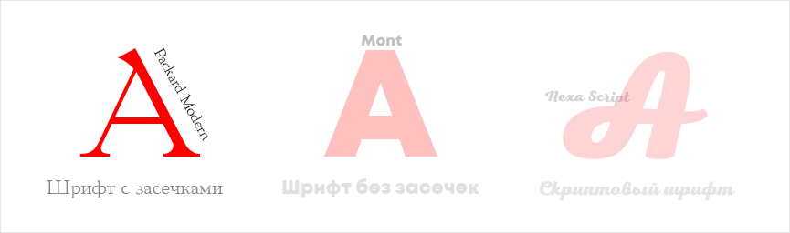
One of the most important design elements is typography. It can convey not only the name of a consulting firm but also its character. That's why most companies directly link their business profitability to their font. How does this work? White Mountain Footwear reported that its sales increased by approximately 20% after redesigning its logo font. There are three main font types, each with its own strengths and weaknesses. There are hundreds of variations, so choosing one can be challenging.
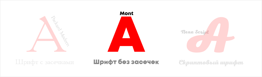
Serif fonts
This group evokes associations with scientific papers and printed publications. A study conducted by marketers showed that font influences trust. A quote written in the Baskerville font had a significant impact on reader trust. If you prefer a traditional, professional style, serif fonts are the way to go. However, on a website, for example, a serif font can look dated.
Here is an example of what the font looks like in Gaplogo.
Sans serif
A font that's simply adored online. It's used everywhere: in healthy lifestyle blogs, tech startups, and more. It looks clean and modern. Even when printed small, it's easy to read. The only thing to keep in mind is that the logo will be identical to everyone else's. Due to the popularity of sans-serif fonts, there's a risk that this choice won't be the best way to differentiate your business. This is how it looks in the logo.
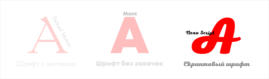
Script fonts
This is a complex family. Yes, I agree, they have a lot of personality; they can be imaginative, casual, energetic, and creative. If a consulting company's logo is youthful and full of boundless energy, this font would be an ideal choice. Here's an example of a logo that used a script font.
Each color has its own personality. According to a 2020 survey of California marketers, 80% of consumers say color increases brand recognition. The Logo Company studied the impact of several colors on people's feelings and emotions.
 Red is exciting, energetic, youthful and bold.
 Orange is friendly and cheerful. It conveys self-confidence.
 Yellow is optimistic, clear, warm.
 Green symbolizes youth, development, growth and freshness.
 Purple is creative, wise and inventive.

 Black and white – balance, neutrality, calm.
 Blue – strength, trust and reliability.
Meanings can vary depending on the shade of color used in the logo. It's also been proven that most women prefer more subtle shades (mixed with white), while men prefer bright colors (possibly mixed with black). If the logo will incorporate multiple colors, it's best to use a combination of similar shades. An accent color implies a strong contrast with the main palette. Pinterest can be a great source of inspiration for unusual color combinations. It's also worth conducting a comparative analysis of competitors to identify effective design techniques. However, this is the responsibility of the brand manager, marketer, and designers at the branding agency.
With trends rapidly evolving, every consulting firm faces a choice: stick with a familiar, old logo or embrace the latest trends. Despite the rapid changes in the design world, minimalism has held a firm position as a leader for several years now. However, this doesn't mean all logos created in this style are the same; marketers are finding ways to give their brands a distinctive look.
# 1 Simplification
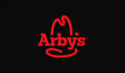
Walt Whitman once said that simplicity is the glory of self-expression. A well-known quote in the world of graphic design today, this trend is not only practical but also purposeful. The simplification genre has many subtrends: flat design, line art, simplified forms, and so on. But they are united by similar ideas and a desire to simplify design to get straight to the point. And it's not just new companies that are changing their logos in favor of minimalism. Spotify and Arby's have also embraced flat design and updated their logos.

# 2 Geometric style
Geometry has also had a significant influence on logo design. Symmetrical lines and shapes combine to create an attractive and unique image. And when done correctly and tastefully, geometric style becomes an excellent way for brand expression.
# 3 Hand drawing
In our age of rapidly evolving technology, a handwritten note or a pencil sketch has become something unusual. It's no surprise, then, that consulting firms strive to recreate this feeling when using handwritten logos. It's impossible to achieve a certain charm and authenticity with strict, printed fonts.
# 4 Responsive Logos
In modern design, visual appeal isn't the only thing highly valued. Efficiency and accessibility are also crucial. When developing a project, a user-friendly interface and a positive user experience are key goals. So, what does a logo's adaptability mean? It remains recognizable and retains its uniqueness at any scale.
# 5 Fine Lines
This is the latest trend in graphic design. This style manages to combine minimalism and complexity. Logos created using fine lines are composed of numerous simple details, creating complex optical effects and illusions. And despite the style's complexity at first glance, it remains classic and elegant, creating the desired impression of lightness, transparency, and weightlessness.

# 6 Symbols and Icons
This style isn't exactly a new trend in graphic design. It's been used for a long time by well-known, even legendary, companies (Apple, Twitter, Starbucks). But this decade, the trend has been revisited and given a fresh new approach. Modern designers prefer to create simple, discreet symbols that interact seamlessly with other design elements, such as lettering, backgrounds, and interfaces, to create a sophisticated and harmonious impression.
# 7 Imperfection
Thanks to the availability of a variety of graphic tools, designers have the opportunity to create images that stun clients with their perfection. The essence of this trend is the opposite. The raw design trend was born out of modern users' fatigue with perfection and technical perfection. Today's audiences crave naturalness: simple pencil lines, ink, watercolor textures, and imperfect coloring are becoming tools for creating authentic logo designs. This helps build a strong connection between the brand and the consumer.
# 8 Vintage
When considering this year's chart of future logo trends, vintage is a must-mention. It has literally exploded into modern graphic design trends, evoking the atmosphere of a carefree childhood. Thick lines, simple shapes, and a straightforward color palette help create old-school logos that combine authenticity, nostalgia, and uniqueness. Therefore, this year and next, cheerful, childlike logo designs will be incredibly popular. They manage to evoke memories of happy childhoods. Companies that embrace a cheerful, cartoonish style secure a broad audience reach and capitalize on people's nostalgic mood.
# 9 Multilayered
Modern logo trends have opened up new design possibilities through layering and fine lines. In search of bold, unique solutions, designers are experimenting with colors and achieving surprising results. By using deep backlighting and shadow adjustments, they achieve a three-dimensional effect and a truly tactile perception. This makes the logo appear cohesive, rather than simply a collection of disparate objects. These layered ideas have attracted many followers in 2021.
# 10 Bold Typography
It can rightfully be considered one of the most quirky trends this year. A bold take on typography has elevated the presentation of letters beyond the textual level and introduced conceptual changes. Using techniques from this style, lettering can become the image itself. To emphasize a brand's uniqueness and distinctive character, designers are using unusual and unusual fonts. This trend can easily be considered a unique way to visualize success.
Just five years ago, it was impossible to find an inspiring logo in the CIS. This was all due to the barrier of traditional perceptions. But today, I'll present several consulting company logos that can help you find your way among new trends and tendencies.
Strategic partner
When creating the logo, the designers used only two colors: a pleasant gray and a dark green. They achieved a good contrast without distracting the viewer from the text. And the geometric shapes with sharp angles keep the audience focused. The text is strictly informative, with a geometric style. Not bad and perfectly in keeping with their style.
The Lion and the Whale
This company has placed a premium on reliability. This is reflected primarily in the color scheme of its logo: white lettering (remember, white is associated with purity) on a pleasant blue background. Blue symbolizes stability, reliability, and consistency. The logo is depicted as a shield with claw marks and the abbreviation of the company's name. Overall, the work of the designer and marketer deserves plaudits. The logo is clean and conveys a message of reliability, protection, and purity in partnerships.
N/Z consulting
The consulting company's name includes the first letters of its partners' names. Therefore, according to the designers who developed the logo, they needed to be incorporated equally into the design. The black-and-white color scheme and thin lines created a sense of sophisticated, businesslike classicism. A sans-serif font was used.
Cascade
Kaskad is a construction consulting and management company. The logo utilizes two shades of green, clearly intended to convey a sense of youth, freshness, lightness, and energy. The icon, shaped like a high-rise building and composed of individual components, easily informs the viewer about the company's activities. Overall, the logo is informative and evokes a sense of trust.
In America, designers with toothy smiles insist that there are two golden rules for creating the perfect logo for a consulting company:
 The logo should not misrepresent your business;
 Color, spacing, font – everything should work with emotions.
So, here are 6 logos of American consulting companies that deserve attention.
Accenture
A management consulting firm. According to 2018 reports, their revenue was $40 billion, which speaks volumes about their successful branding, including their logo. What do they offer? Strategic, digital, and operational services. In their logo, the company wanted to convey the client's future after working with them. They achieved this with a simple idea: placing the greater-than sign (>) above the letter "t." This created a logo that is simple and understandable to millions of viewers, yet actually contains a deep, easy-to-read message.
Capgemini
This company's example illustrates how to build branding for a business empire even if your logo doesn't reflect the services you want to sell. From the very beginning, Capgemini's logo featured the ace of spades. The reason for this came from bridge, a card game enjoyed by the company's founder. Simple, sweet, and yes, in this case, it works.
DLA Piper
When you approach a lawyer, what's the first thing you want to see? Most law firm clients will say they value out-of-the-box thinking. If you look closely at their logo, you'll see that the somewhat circular design conveys openness, friendliness, and a desire to communicate. Can you see how a logo makes sense? Even in the example of DLA Piper.
Deloitte
When creating the logo, the company opted for timeless shapes that would look perfect in virtually any marketing message. The logo doesn't distract from the message it conveys with a stunning design and abundance of colors. This is ideal for a consulting company. The period at the end signifies that the consultants are used to seeing things through to completion and achieving success.
To choose a professional, let's first test them and compare logo design services. If you're an internet user, you'll know there are hundreds of logo design services out there. They want your money. But before you use them, consider whether your business needs a generic logo that looks like it was designed by a child. Pre-formatted online templates certainly make the task easier, allowing you to create a quick and dirty logo.
The pre-built templates used by the online builder are limited in creative freedom, meaning as a business owner you will always be limited by what the platform allows you to do.
No font selection. Fonts are important not only in a logo but in any other branding asset. Original fonts also communicate with the audience and add a unique touch to your logo. An online service uses standard, accepted fonts, depriving your logo of its individuality, which is the whole point of its existence.
Stock images. Stock images are visuals that are readily available on online platforms and have already been seen by thousands of people. Therefore, they don't immediately respond to the logo and don't easily establish an emotional connection with the brand.
Another option is to commission a logo design from a remote specialist. This has its pros and cons. First of all, when you first hire a freelancer, you can't assess their level of professionalism. Their prices are lower than those of a branding agency, but there's a reason for this. Creating a logo requires a comprehensive preliminary market research process involving a brand manager, a marketer, and a team of designers. A brainstorming session is held beforehand. The goal is to find a solution that will convey information about the brand's character and its activities. This logo will be unique and will work. As for a freelancer, they will be developing the logo themselves, in their free time from other projects. The prospects are not encouraging.
A logo is one of the key components of a company's image. This important task is best entrusted to the professionals at WeLoweBrands. Your consulting company's logo will be developed by specialists in various fields: illustrators, marketers, brand managers, and designers. To schedule a consultation , use the chatbot or call the number listed in the contact section.