Receive a presentation of services and expert advice
The best experts in the industry will oversee your brand development process.
→ Need branding, design, or creative solutions? Call us at +48 505 648 022 or message us on WhatsApp.
 WeLoveBrands.pptx

The best experts in the industry will oversee your brand development process.
To compete effectively in their niche markets, factories must have marketing strategies that help them overcome the obstacles created by competitors. A memorable business logo design can significantly facilitate customer acquisition, as it is one of the most visible branding elements.
Numerous studies conducted by marketers in different countries provide the same data: if an entrepreneur wants his business to be successful, it is important to use the first impression technique.
So, what is a logo ? It's a combination of visual imagery, text, and color scheme. It serves two purposes: it introduces your business name to potential audiences and creates a visual image associated with your products. A symbolic association. To understand how this works, consider the famous McDonald's arches. People recognize them without the need for a wordmark; they just need to see their logo. A well-thought-out and well-designed logo inspires trust. If your factory logo looks like it was designed by a talented tenth-grader, people will doubt the quality of your products. And rightfully so.
Its text must be clear and legible. Some companies, hoping to emulate Coca-Cola's history, choose a beautiful, illegible font. In fact, when creating a factory logo, one of the most important characteristics is that the text of your company name is clear and easily readable, even from a distance. The design should be:
Distinctive
Appropriate
Graphic
Practical
Simple in form
Convey a message to the company.

To ensure your company logo will work for your business, check its design for compliance with 5 principles:
 Simple
Memorable
Out of time
Universal
Corresponding
 1. Simple .
The simplicity of the design makes it instantly recognizable to users, making it universal and memorable. Good minimalist logos incorporate something unique without being overdone. And if you incorporate a refined, even polished, identity, you can capture the attention of viewers who are skimming logos on signs at 60 mph. Consider that the iconic international athletic shoe brand is based on a simple swoosh.
 2. Memorable .
Following the principle of simplicity comes the principle of memorability. You might be surprised, but the theme of a logo can play a relatively minor role in branding. But that doesn't mean it shouldn't be carefully considered. It simply means that it should not only be appropriate but also memorable and clear.
 3. Eternal .
Yes, effective design should be timeless and trend-defying. Before deciding on a style, ask yourself whether it will be effective in 10, 20, or 50 years. If you're buying new jeans to stay on trend, that's fine. But when it comes to your brand's identity, longevity is key.
 4. Universal .
A logo can be considered effective if it works across a wide range of environments and applications. That's why it's best to design it in vector format to ensure it can be scaled to any size. It's worth asking yourself whether the logo will be effective if:
Print it in black and white
Reproduce the logo at postage stamp size
Use it on a billboard
One popular technique among designers for creating a versatile logo is to create an initial version in black and white. This allows them to focus on the concept and form, not just the color.
 5. Relevant .
A logo's positioning must be fully consistent with its intended purpose. For example, if you manufacture children's toys, the logo must include a childish font and a cheerful color scheme, which is completely unacceptable for a legal consulting firm. However, it's worth noting that a logo doesn't necessarily indicate the manufacturer's product. For example, car logos don't include images of cars, the Nokia logo doesn't include images of mobile phones, and so on.
What distinguishes the development of a factory logo from the development of other branding tools? Web banner design and social media advertising each have their own goals, but none are as focused on memorability as the very purpose of a logo. Logos provide the opportunity to create branded products. It's easy to forget a conversation at a trade show, but a pen with the company logo used by a client will certainly remind them of your brand. Below is a step-by-step guide on how to create a factory logo from scratch. This information will be useful regardless of which developer you choose: a freelancer or a branding agency.
6 steps and you'll have the perfect logo
Develop your brand
Decide on a brand color scheme
Select a font
Create multiple versions of the logo
Organize brainstorming and feedback
Polish the winning design

Brand development means creating a corporate identity. So, what is a corporate identity? It's an umbrella term for logo elements, from colors to design. These elements must work harmoniously together to make the brand stand out in the consumer's mind. Therefore, before you begin sketching out your logo design, you need to have a clear idea of your brand's identity. To do this, ask yourself the following questions:
 What was your purpose in starting your business?
What are his values?
What sets you apart from your competitors?
Before contacting a branding agency, it's worth answering the question: "Who are you?" Finding design inspiration is key. Getting started with creative work is the hardest part. It's great when you know what you want, but sometimes the problem is a complete lack of ideas or an abundance of them. This leads to analysis paralysis, which hinders decision-making. To avoid creative block, think of a logo as a puzzle: you need to assemble it from its individual pieces using established design principles. You can find inspiration by looking at the logos of successful competitors. Identify your favorites and consider what made them so successful. Here are some places to appreciate excellent logo designs from Western companies: Logoed, Logospire, and Brand New.
This image of a man standing with color samples, perplexed, serves as a powerful illustration of the idea of choosing the right color scheme for your logo. Color plays a vital role in how viewers perceive your brand's visual stimuli. According to numerous studies by psychologists and marketers, color actively influences viewers' moods and is a decisive factor in purchasing decisions. Where will your brand colors be displayed? In social media headers, in-store signage, on your website, and in all the places where potential customers will interact with your brand. There is no universally best color choice. After all, each color conveys its own message. Therefore, you must be sure to convey exactly what you want to tell the buyer. With this in mind, familiarize yourself with the psychological impact of each color.
 Brown (earthy) color. People associate it with natural ingredients, cozy baked goods, and home. With its associations with tree bark, fertile soil, and the color of late autumn leaves, brown can imbue your brand with an aura of ease, reminiscent of home comfort, and a sense of familiarity.
 Orange . A roaring fire in a fireplace. Yes, it warms pleasantly, gives energy, and awakens passion. It's the color of sunset, and when paired with green leaves and an azure sky, it can evoke a summery mood, positive emotions, and the anticipation of relaxation.
 Yellow . Orange's brother, with its high emotional intensity, is a color that evokes the warmth of a fireplace. While orange evokes the glow of a fireplace, yellow evokes the rays of midday sun, which tend to evoke happy feelings. However, it's recommended to use this color sparingly. Its judicious use will add positivity to a reliable brand, while too much can create a sense of mania and overwork.
 Green . This color has two personalities: on the one hand, it evokes an organic aura reminiscent of the tropics and instills a sense of calm and confidence. On the other, it's the color of greed, money, envy, and even nausea.
 Pink . Soft and delicate. Incidentally, at some points in human history, it was considered both a masculine and feminine color. But modern buyers are more likely to associate it with femininity, kindness, and romance.

 Red . Relentless and bold, this color has hints of passion and even aggression. That's why it has become such a popular branding tool for many companies. Like pink, red can create a romantic atmosphere. But while pink's romance is gentle and ethereal, red tends to evoke feelings that are more passionate, loud, and even somewhat carnal.
 Purple . This color has a mystical magnetism. It has long been considered the color of luxury and wealth. Historically, purple dye was very rare and therefore quite expensive. Only the very wealthy could afford it. It's therefore not surprising that this color is associated with luxury, excess, and even mysticism.
 Blue . The natural color of a clear, cloudless evening sky. It evokes a sense of lightness and tranquility. However, if you produce food, it's best avoided because it's considered less appetizing than red.
White, gray, black . Sometimes the best solution for a brand is to avoid bright colors. All shades of this color scheme create a sense of clarity, calm, sobriety, and prudence.
Most companies use only one color in their logo. This is a logical decision because it simplifies the logo's integration with other marketing tools. If you decide on a multi-color logo, it's important to understand which colors will work well together. With a wide range of colors and shades at your disposal, it's difficult to choose just one or two. It's best to start with black and white. David Airey believes that the idea should precede the color selection because it's more memorable than the color: a bitten apple, a hidden arrow, a smile from A to Z, etc.
Each person will see the same color differently. So, if you're creating the first version of a logo, present it to the client in black and white to avoid the association trap. For some, a soft blue might evoke a favorite teddy bear from kindergarten, while another might perceive it as the color of a hated school uniform.
Use color to stand out from the competition. How do you do it? Once you've decided on the logo concept, it's time to get started. Color selection. Debbie Millman recommends using an exceptionally strong color palette in the plant logo to stand out from the competition. Choosing the right color is an easy way to secure your piece of the marketing pie and effectively define your territory. Color choice doesn't always mean anything. The example of Sprint shows that a random color choice (in their case, yellow) can also be successful.
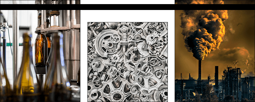
Consider the context when choosing a color. Marketers, in addition to analyzing the competition, also analyze the environment in which the logo will appear. For example, a new hair salon hired a branding agency to develop a logo. A few years later, it has become a well-known beauty salon with its own website and cosmetics line. Will the blue color in the logo always be relevant for it now? Before choosing a color, make sure the solution works in black and white. This way, the logo can adapt to any type of content.
There are several basic font styles. There are also many methods for sorting them. Some may focus on style, others on historical facts and image. Some fonts are divided into endless subcategories. But the most popular scheme among designers is to divide fonts into four main types.
Serif fonts
What's their distinguishing feature? "Serif" refers to the small stroke at the end of each letter or symbol in this family. It's one of the oldest and, it must be said, most widespread font types, with roots in the ancient Latin alphabet.
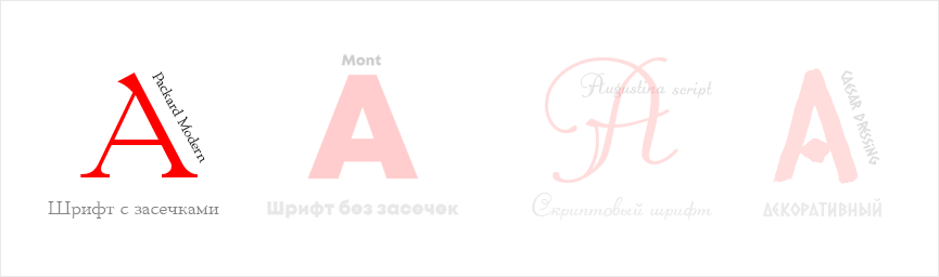
Its characteristics include frequent associations with history, science, and tradition. Therefore, it is typically used to denote wealth or authority.
Usage: For the main body of newspaper articles. Luxury brands also often use it in their logos. A more modern take on "flat" serif fonts is often used in branding. They have a creative and contemporary look.
Sans serif fonts
As the name suggests, this type of font doesn't use a distinctive stroke at the end of letters or symbols. This makes text written in a sans-serif font much easier to read on a computer screen.
Characteristics: This font family can be described as simple, modern, and minimalist. Designers claim it pairs beautifully with negative space, creating a polished and sophisticated impression.
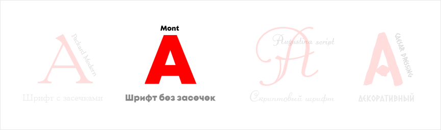
Usage: They are versatile, so brands use them with equal success for headlines, text, and logos. Sans-serif fonts are typically favored by brands that strive to convey a sense of innovation, a passion for innovation, and a commitment to trends.
Script fonts
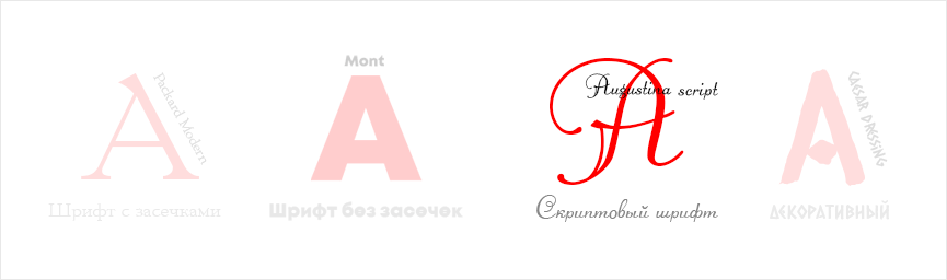
These are calligraphic derivatives. The style is universal and is used by brands serving a luxury audience and those looking to showcase a creative approach. Characteristics: This group of fonts provides an opportunity to humanize text. They convey individuality and change the overall mood of the logo. When to use: They should not be used thoughtlessly. They are not suitable for body copy. In branding: They can be used to create a sense of romance, passion, and luxury.
Decorative fonts
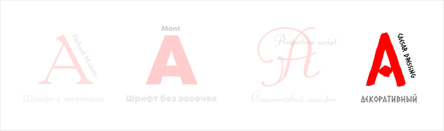
This group isn't amenable to typographic conventions because it easily conveys a wide range of moods and can be focused on a specific theme. Fonts in this family are often specifically designed for a specific brand.
Characteristics: Due to certain difficulties with text recognition, decorative fonts are not suitable for the main body of a design. This is because they rely on aesthetic trends and quickly become outdated. Designers recommend refraining from actively using decorative fonts this year. However, individual characters of this font in a logo can be a good idea to emphasize the brand's individuality.
Both font and color convey a variety of messages in a logo. When creating a logo, using more than one font is acceptable. The key is achieving harmony. Switching between different fonts over and over can create a feeling of indecision in the brand. This can lead to mistrust from clients. Finding suitable fonts isn't always easy. But narrowing down your choices is possible by considering several factors. Font attributes convey brand information:
1. Thick or thin lines . If you want to create a sense of authority and stability, consider asymmetrical, flat serifs. If you're aiming for a sense of elegance and progress, thinner fonts are an excellent choice.
2. Low or high contrast . Low-contrast fonts are certainly less legible, but also less formal. High-contrast fonts, on the other hand, are more modern and authoritative.
3. Format and non-format . Mood. It can be classic or modern. Drama or tranquility. Understanding the "mood" of a font is no easy task. Serif fonts are considered classic, old script fonts look dramatic, and sans-serif fonts convey a desire for modern trends and innovation. Decorative fonts can equally incorporate all of the above, but at the same time, they seem more dramatic. Before choosing a font, it's worth asking yourself: what qualities are characteristic of your brand?
Often, the best way to convey your brand's potential is by using an icon in your logo, as your company name can convey a powerful message and evoke emotion in the viewer. But pairing your company name with an icon has a chance to attract buyers' attention, be memorable, and, in particularly successful cases, even evoke a strong reaction. To significantly narrow down the options, let's try dividing icons into six groups.
Abstract symbols
These icons are considered the most difficult to implement. Instead of a familiar, easily recognizable image, a geometric shape is used, for example. Incidentally, Pepsi used this technique. If your goal is to create a logo that will be difficult to copy, this solution is the best option. However, if the brand is still young and its reach leaves much to be desired, it will be quite difficult for the designer to convey feelings and emotions on an associative level.
Illustrated
The legendary Apple company used this technique to illustrate its name. And the bite fragment is what made the logo so unique. Illustrating what the brand does helps cement its name in customers' minds, and, thanks to the interesting ideas behind the fragments, attracts their attention.
Emblem
This option is suitable for companies that want to emphasize their commitment to tradition, longevity, and classicism. Typically, it involves text included in a frame or icon.
Mascot
If your brand has a unique history or an unusual tradition, a mascot in your logo is a great way to grab consumer attention. A mascot can create a powerful personal connection that humanizes your brand.
Your logo is a vital part of your branding, so the design should not only communicate what you do but also who you are and how you do it. So, what can we expect this year?
Yes, the trend is returning, but not in the simplified form of the past, when logos simply featured triangles, squares, and other geometric shapes. This year, the trend calls for the use of original mosaics of simple shapes. But this won't always look sharp; the smooth curves of circles and ovals will also become popular.
The human eye adores moving elements in logo design: waves, funny jumping figures, blazing fire, or waterfalls. This fascination has inspired the trend of animated logos and offers business owners a way to capture the viewer's attention among the crowded offerings of their competitors.
The rebellion of asymmetry is clearly evident in logo design this year. Freeform design, freedom in composition, and the break with the structured grid are now popular. Creative chaos makes designs unique. For every designer, working in this style offers a chance to push the boundaries of creative ideas. This year, asymmetry firmly holds its leading position.
This trend will make logo designs elegant and aesthetically pleasing. Thick lines are undoubtedly easier to see and recognize, but it's precisely this elegance that draws the viewer to the logo's concept. The brand's personality appears fluid, composed, and meticulously crafted.
In our region, the maxim "They judge a book by its cover..." isn't just on paper. It's a fundamental principle. Therefore, it's hard to imagine a serious industrial enterprise without a logo. Despite the strict set of standards, when creating a factory logo, it's still important not to follow a cookie-cutter approach. Therefore, it's crucial to have a personalized approach and, of course, pay close attention to detail.
Inko
A strict translucent black background combined with light gray and brown.

KIZH
This design solution is simply stunning. Typically, there's a set of strict (unspoken) rules that designers use when creating a factory logo. Apparently, they weren't heard here. And so, instead of a dull graphic element, we can appreciate the vibrant character of a bear being electrocuted. Yes. This is clear proof that, with a creative approach, anything boring and serious can be transformed into a powerful marketing tool.

UZPO
A successful combination of industry and product. How so? you ask. A drop of milk inside the Latin letter U (for Ural). This same letter serves as a container for the drop of milk. This logo could well be called dairy-like.
American marketers confidently assert that a clear and concise logo in the business world is as important as a confident handshake. In other words, the logo's presence on a website and other advertising materials becomes a kind of visual handshake. A logo should have three essential components:
Name
Unique image
Slogan
These components are used in a variety of combinations. I suggest considering three logos of well-known manufacturing companies. Most consumers around the world associate quality with products made in the USA. Therefore, some manufacturers resort to the subtlety of using the colors of the US flag in their logos to subconsciously convince the viewer of the quality of their products.
Fuji
This technique was used by bicycle manufacturer Fuji. Initially considered a Japanese manufacturer, the company was acquired by an American company in 1971. The name was retained in honor of its Japanese origins, though the red color was removed from the logo.
Ford
A blue horizontal oval and gradient are used here. The font was developed specifically for the company. These two elements wouldn't work on their own. Consumers wouldn't recognize the blue horizontal oval without the company name and its signature font. Each element contributes to the manufacturer's reputation.
Mitsubishi
The logo consists of two elements: a circle of three different diamonds and three black letters. Incidentally, they can appear alone and still be recognizable, as can the diamond-shaped triangle.
We invite you to compare the professionalism, risks, and capabilities of our contractors.
Freelancer
Naturally, much will depend on the performer's personal qualities and, yes, the platform where the search is conducted. So, if you search for a professional on social media and find one, your luck can be compared to finding a diamond in the rough. Professionals generally prefer specialized resources.
 The benefits of working with a remote specialist:
Inexpensive
Fast
Negotiable
Direct connection with the designer.
 Cons :
Risk of plagiarism
Missed deadlines
Lack of documents
The chance of running into a scammer
Agency
Everything that involves a team of professionals is unique, exciting, time-consuming, and expensive. If you're looking for the end result, not the minimum budget, the WeLoweBrands branding agency is your choice.
Benefits of cooperation:
A comprehensive approach is guaranteed (market analysis, collaboration between the designer, marketer, brand manager, and illustrator)
No plagiarism. We create only unique logos.
We strictly adhere to deadlines
We provide legal entities with all necessary documents
A comfortable office for brainstorming