Receive a presentation of services and expert advice
The best experts in the industry will oversee your brand development process.
→ Need branding, design, or creative solutions? Call us at +48 505 648 022 or message us on WhatsApp.
 WeLoveBrands.pptx

The best experts in the industry will oversee your brand development process.
A logo is an integral part of a brand and one of the most important investments in branding. A trademark is essential for differentiating from competitors and attracting customers; it shapes image and builds trust. Therefore, it's essential in business, especially in highly competitive niches like food production.
During the pandemic, consumers have become more selective in their product selection and purchases. This means that food brands must present logos that convey a positive image and evoke positive emotions in potential customers.
Regardless of the company's size or product type, it's important to evoke an immediate response from customers—they need to like what they see. Therefore, developing a good logo is the most effective way to communicate brand information, as well as:
 to arouse consumer interest ;
 stand out from the competition ;
 promote brand awareness .
When consumers encounter a company logo on social media, a website, outdoor advertising, or TV, they unconsciously associate it with the product. And if this connection is based on positive emotions and associations, brand loyalty and trust are formed. Over time, even seeing a fragment of the logo, customers will recognize the company behind it.
Food brands often use an element in their logo that evokes the brand's name or products. For example, seafood producers might choose an image of a fish, crab, or octopus. A similar approach applies to confectionery brands, where a cake, pastry, croissant, and other elements are often part of the logo.
Companies that specialize in organic products or natural ingredients may use the words "organic," "bio," or "eco," along with images of a leaf or plant.
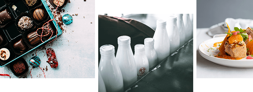
Research shows that people recognize logos with images more quickly than those limited to text. Images convey information about the company and help highlight the product's benefits.
We recommend sticking to minimalism when creating a logo: white space will make the emblem legible and also place the necessary emphasis. It's important to choose fonts based on their placement across various assets: the website, the main photo on social media, branded products, and so on. Also, avoid long slogans—they will make the logo illegible.
In branding, color perception is paramount. According to research, 90% of product impressions are influenced by the color of the logo or packaging. Another 85% of consumers say color is the primary reason they make a purchase. Colors can excite and provoke aggression, or they can convey a warm, welcoming atmosphere and even increase hunger.
This color has the strongest appetite-stimulating effect and encourages impulse purchases. For example, to make a salad appear more delicious, food marketers and gastronomy experts recommend garnishing it with a slice of red bell pepper. Serving the dish on a red plate also creates the illusion of a smaller portion.
Shades of red are used in the logos of popular food chains such as McDonald's, Pizza Hut, Burger King, Moe's, Domino's Pizza, and KFC. Furthermore, restaurants use red-hued décor indoors because the color encourages customers to finish their orders faster. This allows restaurants to serve more customers per day. The use of red in packaging branding and food logos has proven highly effective.
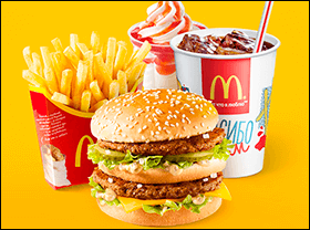
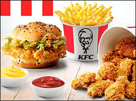
Keep in mind that staring at a red object for too long can cause irritation or even aggression. That's why this color is primarily used in fast-food restaurants, where people stop in for a quick bite but don't linger long.
Green indicates the natural origin of ingredients and evokes associations with healthy eating, dietary products, vegan, or gluten-free dishes. Using this hue also allows marketers to tap into the reptilian brain (neocortex) of consumers. Throughout history, people have been drawn to green-hued foods because they were considered edible and safe. Today, major brands like Whole Foods, Tropicana, and Starbucks effectively use green in their logos.
Yellow evokes a positive mood and stimulates digestive acid production. Its use in logos, packaging design, and decor also encourages return shopping or dining. It's often used in grocery store displays. M&M's, Del Taco, Subway, Lay's, Cheetos, and other companies use yellow in their logos. This color is effectively combined with red—in marketing, this technique is called the "ketchup and mustard effect."
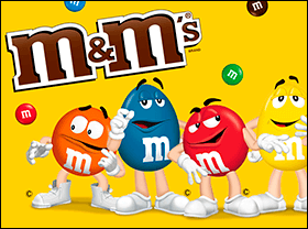
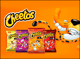
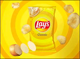
Use a combination of red, which stimulates appetite, and yellow, which evokes positive emotions, to enhance the logo's impact.
Bright hues are associated with richly flavored foods, such as spicy foods or desserts. Muted, darker colors convey rich, deep flavors. They are also suitable for savory dishes, snacks, and chocolate makers (and stores that sell them).
The following are considered "appetite killers" :
 blue - however, it can be used for brands that specialize in seafood;
 pink - evokes associations with artificial preservatives and raw meat;
 gray - associated with old, spoiled food;
 Brown - May evoke images of burnt or overcooked food; recommended for use only by baked goods or chocolate brands.
People make subconscious judgments about a product within seconds, and color is the first thing consumers notice. That's why color combinations are chosen to engage as many senses as possible when shopping in grocery stores. Carefully select colors and their combinations in your logo to enhance the impact of the emblem and increase sales.
Choosing a font for a product brand logo is based on the characteristics of your brand identity, as well as the feeling you want to evoke in the consumer.
There are two main types of fonts: serif and sans-serif. The former is primarily used by companies seeking to convey a sense of premium, conservative, and reliable design. For example, the Slab Serif font evokes a sense of solidity and confidence.
Brands that aim to convey their creativity and playfulness to their audiences can use handwritten fonts and italicized typefaces (like Script). Disney, Coca-Cola, and Johnson & Johnson have all adopted these.
Designer Ryan Ulrich, who selects fonts for brands, recommends choosing fonts according to this rule:
"If your company has employees in suits who always communicate with clients in a professional manner, use bold font. Otherwise, use a sans-serif font."
A unique food logo generates interest, earns trust, and builds loyalty among consumers. The key factors here are the concept, recognizability, and harmonious color scheme.
How can you test a logo's effectiveness, and what should you avoid when creating one? Let's take a look below:
# 1 Check out your competitors . The best way to create a logo from scratch is to take a closer look at the companies you compete with. Notice what colors, fonts, and graphic elements they use. What do you like about their logo? What would you add or improve?
# 2 Use a tagline . A creative tagline that hits your target audience's pain points will attract attention and create a strong connection with the brand. Make sure the tagline's typography aligns well with the logo design elements and the industry your business operates in.
# 3 Avoid complex details . Design your logo so people can immediately grasp the message you want to convey. Simplicity will help achieve this and also make it possible to place the logo on various objects without losing quality.
# 4 Experiment with shades . Changing just one color can attract more visitors and increase sales. This is confirmed by studies that changed the color of call-to-action buttons on websites and landing pages. As a result, conversions increased by 21% or more. However, be careful when changing colors, as a sudden, drastic change can result in consumers simply not finding your product on the shelf.
There are no universal rules for logo design—a trend might work for one brand, but prove ineffective for another. Qualified professionals, drawing on their experience, marketing research, and market analysis, can create a unique and distinctive food brand.
Due to the high competition in the food business, companies must design their logo in a way that will make people choose their product.
Let's look at five well-known brands as examples to see how to effectively use your logo and corporate identity.
Coca-Cola
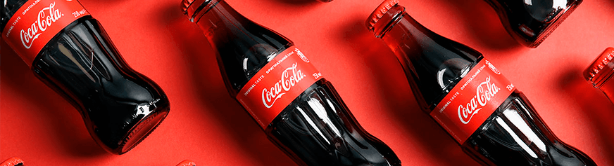
It's the most popular brand of carbonated beverages and one of the most valuable brands in the world, according to Forbes. The Coca-Cola logo is probably familiar to everyone. The red and white color scheme and interlocking letters, reflecting the dynamism and fluidity of life, are so ingrained in consumers' minds that they recognize bottles of their favorite drink even with a cursory glance at store shelves.
Lay's
This is the brand that introduced the world to such beloved snacks as chips. The company's logo has changed several times, and the version we know today is very different from the first version.
Since the brand wanted to attract a younger audience and convey its cheerful and fragrant nature, it was decided to use red, yellow, and white in the logo. Red enhances perception, yellow represents warmth, happiness, and joy, and white symbolizes kindness and unity. The use of a simple font with soft lines emphasizes friendliness and optimism.
Jacobs
Jacobs is a coffee brand with a centuries-old history. It all began with Johann Jacobs opening a small shop in Bremen, Germany, selling cocoa, tea, coffee, and chocolate. This happened in 1895. Coffee beans quickly became popular, so the shop soon moved to the city's main street. The first roasting factory was then opened, and the Jacobs brand was subsequently registered.
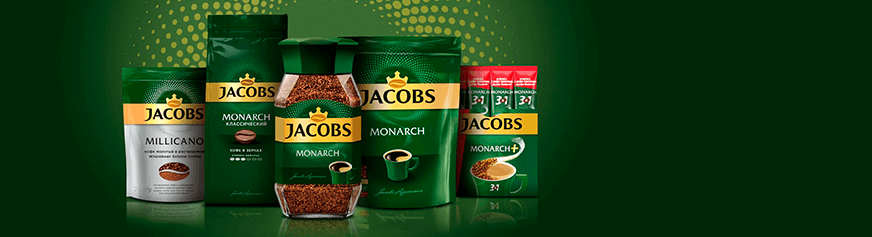
The brand's logo, although it has changed several times, remains recognizable to consumers. It currently features the name in black letters on a gold background, topped by a coffee bean and a crown. This composition is harmoniously accented by a velvety green stripe.
Nestle
The logo of the famous brand is based on the family coat of arms of the company's founder, Henri Nestlé. It depicted a bird in a nest, and the family name itself sounds similar to the word "Nest," which translates from German as "nest." Therefore, the coat of arms was adapted by adding three chicks being fed by their mother. This is how the well-known brand symbol emerged, reflecting family values and demonstrating the bond between mother and child.
In 1988, the logo was changed to feature a single chick "flying" from the nest. The company made this decision after conducting marketing research that showed that most families were raising two children. To attract more mothers and resonate with them, the brand introduced the updated logo, featuring two chicks and a mother nursing them.
Milka
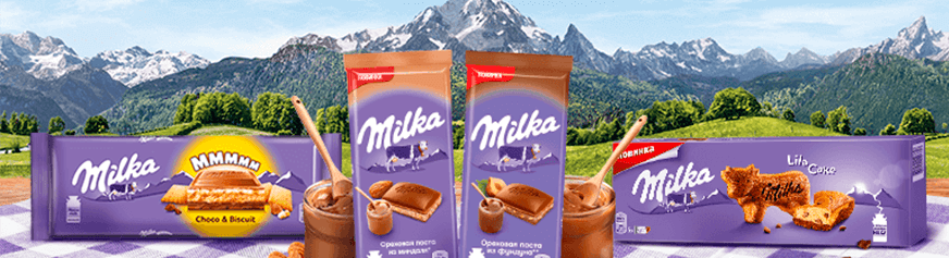
The Milka text logo has an interesting and stylish look thanks to its unusual color combination and unique font. The bold yet soft lines of the white letters evoke the image of spilled milk. And the use of purple for the background, unusual for chocolate makers, has become a signature feature of the brand.
Ukrainian food producers typically use font-based and combination logos. Even if a logo includes an image, it's usually a simple symbol or small image that highlights the company's specific activities and values.
Typically, food brand logos are designed in a minimalist style. They consist of the name, written in a simple font, and an additional element, and are painted in two or three colors (less often, just one).
The most common shades are red, blue, green, and yellow, but other colors can be used for accents. The choice of color scheme depends on the type of product being manufactured and the feelings the brand wants to evoke.
Logo development is a complex and extensive process that includes analyzing the target audience and competitors, searching for references, focusing on consumer psychology, color perception, and so on. That's why WeLoveBrands experts do not recommend creating logos on online platforms with ready-made templates.
You can entrust the creation of your emblem to:
Freelancer . The advantage of working with a freelance specialist is the low cost of development. Creating a logo will cost 40–50 $. However, there is a risk of entrusting the work to a low-skilled specialist. Before working with a freelancer, make sure they have sufficient experience in logo design in your niche. Review their portfolio and reviews from previous clients on various platforms.
A specialized design studio or branding agency. The most effective way to create a logo is to have it developed in-house. This involves a team of designers, marketers, and brand specialists who delve into the specifics of your business, develop a target customer profile, and monitor your competitors. The development process takes into account the psychology of color perception, design trends, and the objects on which the logo will be placed.
Want to create an effective logo that will enhance your company's image for ten years or more? Contact us to discuss the project and details of our collaboration in more detail! You can see examples of our work on our website.