Receive a presentation of services and expert advice
The best experts in the industry will oversee your brand development process.
→ Need branding, design, or creative solutions? Call us at +48 505 648 022 or message us on WhatsApp.
 WeLoveBrands.pptx

The best experts in the industry will oversee your brand development process.
Every children's brand communicates to two different audiences: children and their parents. Therefore, it shouldn't be condescending or simple. Children's design requires thoughtful sophistication and a careful prioritization of visual elements: symbols, colors, and pop-up fonts. A brand designed with a child-friendly style tells a story of adventure, which requires a character (mascot). These mascots can become friends for children, with whom they can meet every day at breakfast.
It's worth remembering that people of all ages love cute fairy-tale characters. Take, for example, the cartoon characters associated with Walt Disney – the friendly Mickey Mouse has become recognizable and beloved by millions of people of all ages and social statuses since the company's inception. So what's the essence of children's design? Subtle, sometimes bright colors , legible fonts, and fun characters.
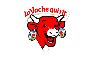
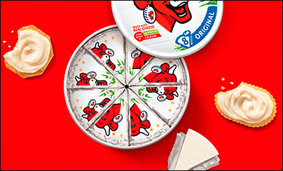
Now let's talk about companies that have nothing to do with children's products, even though their brand is designed with a child-friendly style. The Laughing Cow, a well-known American dairy company, chose a child-friendly style for its packaging design: the recognizable laughing cow. Millions of consumers associate this character with high-quality dairy products and win them over with its positive image. A simple and effective strategy.
A child-style logo (one of the first) appeared in 1894 for a tire company. The name of the funny character was Bibendum . The Michelin brothers unveiled it at the 1894 Lyon exhibition. The success of their brand depended largely on their choice of style: thanks to the fairy-tale character emerging from tires, their brand became recognizable to millions.

The children's style of the Planters brand wasn't conceived by famous designers in 1916, but by a fourteen-year-old boy 10 years after its founding. This year marks its 100th anniversary! And Mr. Peanut has proven that great design never gets old!


Green Giant, the leading frozen and canned vegetable brand, also became known for its kid-friendly design. The cheerful and friendly Jolly Green Giant superhuman became part of a memorable, enduring design. Well done, big guy!
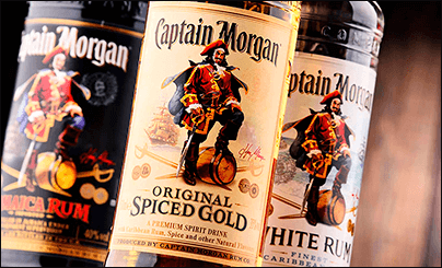
A children's character for a company that's not so children's. Yes, we're talking about Captain Morgan, who became the character of a famous rum company. And let's face it, the alcohol conglomerate Diageo, using this cartoon and historical character, made its rum recognizable not only in Germany, America, and South Africa, but throughout the world. Don Maitz, a master of fantasy illustration, was the designer who brought the pirate captain to life.
What makes childlike design appealing for marketing? It opens a dialogue with emotions: it first appeals to the heart and only then uses logical concepts to connect with the brain. This style is suitable for companies that want to build friendly relationships with their consumers, demonstrate empathy for their feelings, and make their brand more open and accessible. This design approach can be an excellent marketing tool for implementing unusual creative ideas.
The company cares about the environment, offers eco-friendly products, and wants to use a childlike style to convey this message. Who better to demonstrate this than a friendly-faced character placed on top of the world? Fairytale characters designed in a childlike style can give your business a competitive advantage.
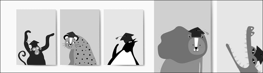
Homeowners want to hire a home service provider who is reliable, accessible, and friendly. To stand out from the competition, it's a great idea for a company providing such services to base its brand on a carefully crafted character.
And, of course, public organizations often use images of mothers, children, toys, and fairy-tale animals. Companies selling products for infants, maternity products, and children's toy stores also do. For example, the well-known company Nestlé, which produces and markets baby food, uses a blue teddy bear in its logo.
You should avoid using a photographic icon, unless you want the logo to look like a blurry, colored spot when scaled down.
When selecting elements, it's important to ensure the design isn't overly cluttered. It's worth considering hand-drawn, cartoonish characters. As for additional elements, icons that evoke associations with the business's activities are typically used.
To create a children's identity, use soft, sometimes bright, colors. For companies selling products for little ones, light pink, green, blue, orange, and yellow are preferred. If a children's business is involved in social projects for children, it's best to use block letters, handwritten fonts, or decorative fonts.
Needless to say, this style is adored by designers and illustrators? After all, it offers the opportunity to realize ideas that evoke the most powerful emotional response! Every element of graphic design or illustration executed in this style commands attention and must be thoughtfully crafted and meticulously executed. Therefore, children's graphic design and illustrations are boldly exploited by creative communities, children's studios, landing pages for newly established companies, and even the beauty industry!
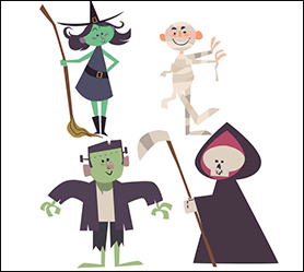
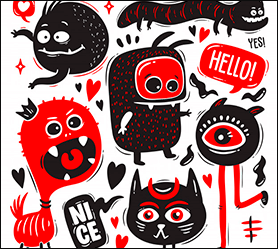
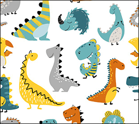
Children's-style illustrations are designed to be perceived on an emotional level, avoiding proportions and anatomy, as their primary goal is to evoke only positive emotions in the viewer. However, oversimplification should be avoided, as it's important to maintain the recognizability of the subject.
 Children's illustrators
 Animation artists
 Concert designers
 Decorative shading
Silhouette
Shaping
Texture
Tone
Color
When creating a children's brand identity , remember that the logo and other elements will appeal to two audiences: children and adults. Therefore, it's best to use bright colors and simple shapes.
Sleek and modern typography—no, that's not what you'd expect in a logo designed in a childish style. Therefore, consider only bold, playful, cheerful, and legible fonts. Incidentally, to create a youthful and appealing brand, serif fonts should also be avoided.
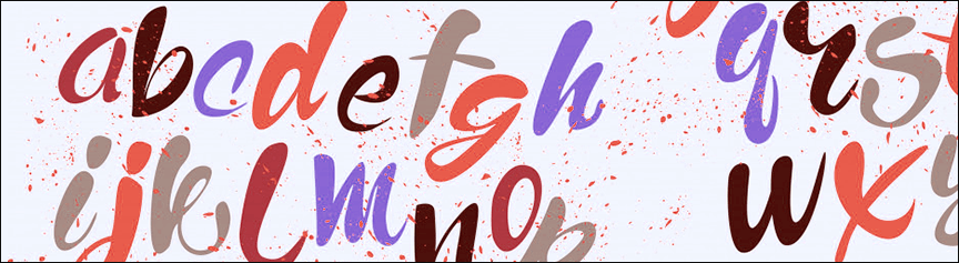
The choice of image depends on the products or services your brand offers. You might be interested in: helping hands, cartoon characters, animals, or toys.
What colors come to mind when you think of children? Depending on the age of your target audience, you can use "loud" or "muted" colors (for the little ones). For a sweeter, older audience, you can use a bold color scheme: orange, blue, purple, green, yellow, and red. To generate energy and excitement, use contrasting color combinations.

Your bold color palette and playful typography need to be offset, so choose a clean design with plenty of white space. If you're designing an identity for a children's clothing brand, make sure you can scale the logo to fit on products or clothing labels.
Let's imagine a world where children make decisions. According to research by psychologists and marketers at the University of California, 80% of family purchases are made because of children. This means it's impossible to ignore children as a market segment. In an experiment, the same product was packaged in plain white paper and in bright, colorful packaging. Guess which package won the competition? That's right, the food in colorful packaging was popular among children. Therefore, the scientists were able to prove that children evaluate the taste of the same products based on the attractiveness of the packaging.
Let's play? Cereals that children love to eat for breakfast are packaged in cardboard featuring a fairytale character. Each character has its own story and personality, encouraging children to play with the product. For example, a bakery company made a cute fish their character and named her Wilpuri. She loves the company's bread and buns.
 Don't have a lot of parts
 It must be suitable for use by children: no sharp corners or small parts.
 Corporate identity must appeal to two audiences: parents and children.
To design a website for children, it's important to understand that children's psychology differs from that of adults. However, the preferences of children cannot be considered separately from those of their parents. Therefore, developers face a challenging task: creating a website with a children's style that even adults will appreciate.
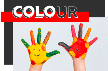
Color scheme . Avoid dark colors, focusing on bright, cheerful, and playful combinations. When creating a website or banner with a children's theme, the rule of using 2-3 colors doesn't work. Using 5-7 shades is considered ideal.
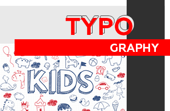
Typography . Recommendations vary depending on the age group. For younger children, everything should be as simple and accessible as possible. For teenagers, a serif font can be used, but it's best to avoid complex effects.
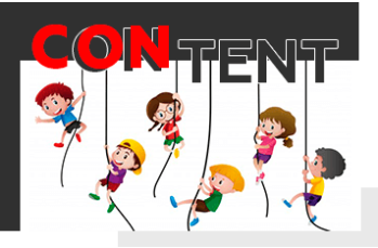
Content . Young children don't need a lot of text. Bright and attractive images are key. So, as an unspoken rule, the younger the child, the less text there should be on a website or banner.
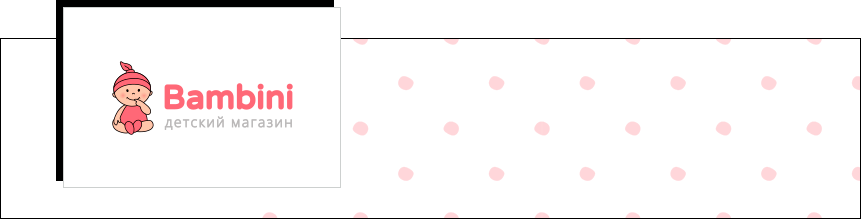
The company offers children's products: transportation, toys, medicine, children's clothing, etc. The Bombini logo is designed in a childish style, featuring a cartoon image of a child in a hat and, most importantly, a stunning, delicate shade of red paired with soft gray text. The fonts used were kept simple, sans serif.
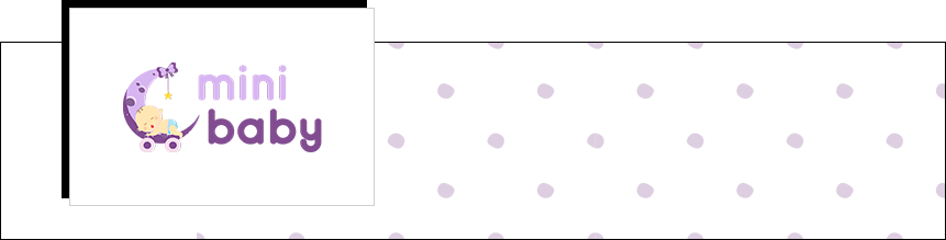
The company sells strollers, furniture, bicycles, and car seats. Light and dark lilac shades, a crescent moon on wheels (a reference to the strollers the company sells), and a sleeping baby are associated with evening, quiet family happiness, and magic. Because the online store sells products for little ones, a calm color scheme was used in the logo.
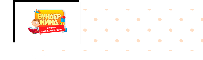
What do most parents associate with educational toys? That's right – blocks with letters and numbers, which you can see in the center's logo, along with a positive-minded child armed with pencils and a book. And most importantly – colors:
Yellow – concentrates attention
Red – energy and movement
Blue – calmness and perseverance
The Kita children's development center in Berlin offers active and rewarding activities for children. The logo's message: You'll find many friends here. We're all different. This is reflected in the friendly, multi-colored palms surrounding a smiling sun, which looks like it was drawn by a child's hand.

The Children's Praxis in Munich also used a vibrant style: the logo appears to be drawn by a child's hand. It clearly conveyed the Praxis's message: children will grow and develop with our help. It also highlights one of the core services—preparing children for school. The color scheme is vibrant: blue, yellow, light blue, orange, red, and pink.

The dance school used dancing figures of small children in its logo. One of the silhouettes can be identified as a child of African descent. In Germany, as in highly developed EU countries, racism is punishable, so every childcare facility strives to convey to parents that racism is not tolerated. The color scheme: standard children's colors – blue and pink – were used. This means that the school will be equally engaging for both boys and girls.

There are only 3 types of contractors: freelancer, agency, and online builder.
Pros
Price and communication are the immediate benefits of working with a remote designer. Our services will be 30% lower than those offered by web studios. And communication with the designer will be direct.
Cons
The credibility and professionalism of someone you know only by what they've written about themselves in their profile remains an open question. And most importantly, when starting to develop a brand logo, freelancers are typically unfamiliar with the brand's vision, and therefore unable to convey its message to the target audience.
There is no clear schedule
There are no guarantees
Your logo can be developed simultaneously with 10 projects.
The designer is unable to create a logo that will address the brand's key objectives:
Broadcasting of values,
Brand message to the target audience,
Unique competitive difference,
Company identification
Pros
Fast and very cheap
To ensure a logo communicates your brand's message and values to your target audience, marketers must analyze your business, products, and the competitive market. Based on this research, a team of designers develops creative ideas that convey your company's unique competitive advantage to consumers. Therefore, the work of specialists across various industries can significantly increase your sales.
For more information on delivery times and costs, please contact us online or by calling the number listed in the contact information .