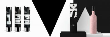
Receive a presentation of services and expert advice
The best experts in the industry will oversee your brand development process.
→ Need branding, design, or creative solutions? Call us at +48 505 648 022 or message us on WhatsApp.
 WeLoveBrands.pptx

The best experts in the industry will oversee your brand development process.
The mineral water market is so saturated that newcomers and small companies struggle to stay afloat. Large producers and established brands hold the lead, while smaller companies either focus on a specific region or get lost in the crowd. To stand out from the competition, attract attention, and be easily remembered, an interesting and distinctive water logo is essential.
When consumers encounter a brand or product, the logo is the first thing they notice. If the brand mark is eye-catching and intriguing, the chances that someone will pick up a bottle of water and buy it increase. And that's exactly what businesses need, right?
A logo creates the first impression of a brand, serving as a guarantee of quality and protection against counterfeiting. Its purpose is to attract and persuade. That's why a corporate identity is so important for business.
 Identifies the company in the market and helps it differentiate itself from competitors.
 Informs consumers about the product and its benefits.
 Reveals the brand's personality.
 Forms a certain image of the company in the minds of the audience.
 Increases trust and brand loyalty.
 Helps increase sales.
An original water logo attracts audiences, is easily remembered, and enhances a company's image. Therefore, its development should be approached responsibly, meaning carefully thought through and avoiding standard or banal solutions.
When we think of drinking or mineral water brands, images of water or nature automatically come to mind. After all, these are the images most often chosen for logos.
Symbols are selected based on the type of water being bottled, the volume of production, and the price range in which the product will be presented.
So, on the market you can find :
table drinking water in bottles;
mineral carbonated and still water;
mineral water with additives and flavors (mint, lemon, orange, etc.);
sweet carbonated drinks.
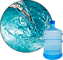
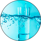


Companies often use drops, waves, mountains, and rivers in their logo designs. These images are good because they convey a clear message to the audience, but they are ineffective in winning customers because they don't differentiate the brand from competitors or generate interest among consumers.
To engage your audience, you need an unconventional approach and an interesting design solution. For example, you could eschew traditional water imagery and create a simple typographic logo, using an unusual font or a playful use of text. Such a logo will look concise, stylish, and prestigious.
Every logo creates a specific impression on its audience, evoking certain emotions and associations. To achieve the desired effect, it's important to carefully select design elements, including the image, color, and font.
They can be used to attract and interest consumers, as well as to create a desire in them to obtain the product.
Let's look at how to create an effective and efficient logo for mineral water.
Images of water, droplets, splashes, waves, ponds, leaves, and trees are common in this field. Water elements reflect movement and fluidity, while natural motifs symbolize naturalness and freshness.
Stylized images of water drops and traditional symbols with interesting interpretations are also often used. These symbols provide information about the product while also looking unique and stylish.

To develop unique water logos, you can choose unexpected images (animals, regional maps, etc.) or geometric shapes. Such symbols will stand out from the competition and attract attention. Creating an emblem is also an interesting option for companies with a history.
The specifics of this business are best reflected by shades of blue, light blue, white, and green. However, other bright colors, particularly red and yellow, are also actively used.
Blue is associated with the element of water and symbolizes calm and tranquility, green reflects life, health, and harmony, red stimulates the nervous system and speaks of energy, and yellow is a warm and friendly tone.
Bright shades are most often combined with other colors to create an accent, play on contrast and attract the attention of consumers.

To ensure a harmonious and unobtrusive logo, it's recommended to use 1-3 colors. Single-color logos have a sleek and stylish appearance, two-color logos allow you to highlight a detail, and multi-color logos are eye-catching, but if chosen thoughtlessly, they can be overwhelming and off-putting to customers.
If you want to stand out from the competition, choose colors that aren't standard for the industry—for example, pink, purple, or black. This logo will stand out and look impressive.
Font is one of the most important design elements. It not only conveys information to your audience but also creates a distinct image that consumers remember and subsequently associate with your brand.
Companies most often choose classic serif and sans-serif fonts. They also make extensive use of capital letters, soft lines, and slanted typefaces.
When choosing a font, remember that it must correspond to the specifics of the business, and therefore cannot be too strict.
To create original logos, it is better to develop a unique font or adapt an existing one to your needs.
Minimalism . Images of nature, waves, and water drops just don't cut it anymore. Therefore, well-known brands and large manufacturers are increasingly opting for simpler logos. They choose simple, uncluttered logos in one or two colors, using a minimum number of elements to stand out and attract attention.
Geometry . Geometric shapes are uncommon in this industry, so they're used to create unique water logos. You can choose any shape, as long as it reflects the character of your business. Combining geometry and character creates an engaging brand identity that attracts audiences.
Emphasis on font . If you forego an image and opt for a font logo, the font should be unique. This will create a striking and memorable look. You can choose handwritten or decorative fonts, or even play with classic ones in an interesting way. Regardless of the font style you choose for your logo, remember that it should be expressive and noticeable, as all attention will be focused on the text.

Unusual imagery . Consider what your logo can convey that others don't and that can highlight the unique features of your business. This could be a map of the region in which you operate, a character you've created, or an unexpected image that reflects specific traits and qualities. Such logos will attract, intrigue, and evoke specific associations.
If you need a unique and recognizable water logo, contact WeLoveBrands by phone or online chat. Our creative and experienced designers will study your strengths, competitors, and target audience, develop a strategy, and create a distinctive brand identity that enhances your company's reputation.
The Ukrainian water market is quite competitive. Numerous domestic and international brands offer their products, including large and small companies operating throughout the country and in specific regions.
The logos of popular Ukrainian water companies are distinguished by their simplicity. They are primarily font-based logos in one or two colors. Combination logos also exist, using traditional imagery (most often leaves and splashes of water).
The most common shades are red and blue, followed by green, light blue, and white.
A wide variety of fonts are used—classic, script, serif, and sans-serif. There are also cursive styles and interesting typographic styles.
American water brands don't stick to any specific logo type. They feature simple fonts combined with standard symbols and unexpected imagery, as well as emblems.
Mountains and nature are the most popular images. Animals and streams are also frequently used.
The most common shades are blue, red, and white. However, black and yellow are also popular here.

The fonts companies choose for logos are generally simple, with capital letters. Handwritten fonts are rare.
European logos are distinguished by their creativity. Although they feature many traditional and simple brand symbols, most are still quite interesting and unusual.
To attract attention, unique fonts, unusual color combinations, and unexpected images (such as a cloud with rain) are used. Geometry is also actively used.
Another characteristic of European logos is the creation of "antique" signs that reflect individuality and indicate the company's long history.
The shades used are varied – from the usual white, blue and red to unusual orange, pink and purple.
As for fonts, there are both simple and strict font styles, as well as decorative ones, with soft lines, playful letterforms and interesting styles.
In Asia, logo design actively utilizes bright colors to create contrasts. For single-color logos, red, green, and blue are most often chosen, and for multi-color logos, popular combinations include black and green, blue and yellow or orange, and green and red.
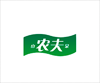
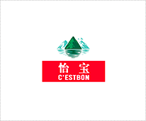
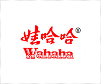
If we analyze the logos of Asian brands, we can say that the most common are combination signs with images of mountains or water symbols, logos using geometric shapes, and font logos.
The most common fonts are classical and handwritten styles.
To create an interesting and eye-catching logo that won't clash with competing companies' logos, it's best to entrust its development to an experienced designer. You can find one as a freelancer or in a design studio.
If you're looking for a budget-friendly option, choose a freelancer (the cost depends on the designer's qualifications, your deadline, and the region – on average, it's 30-40 $). Just keep in mind that ordering a service blindly runs the risk of choosing an unscrupulous specialist and ending up with a simple and uninspiring logo.
Companies value their reputation, so they'll complete the work within the agreed-upon deadline and with high quality. A logo design will cost a little more than freelancing (on average, starting at $150), but the results are worth it.
The studio's designers approach each specific task with utmost care. They first research the market, evaluate competitors, and determine what consumers expect from a water brand, and only then begin designing.
At WeLoveBrands, you can choose from three pricing plans. They vary in terms of deadlines, the number of logos submitted for your review, and the number of revisions you can make to the design. This means that when you choose a pricing plan, you'll have a clear understanding of what you'll get for a given price.
If you need a striking, modern, and memorable water logo, give us a call or send us a message in the chat.