Receive a presentation of services and expert advice
The best experts in the industry will oversee your brand development process.
→ Need branding, design, or creative solutions? Call us at +48 505 648 022 or message us on WhatsApp.
 WeLoveBrands.pptx

The best experts in the industry will oversee your brand development process.
Such an important element of corporate identity as a company logo cannot be interpreted in a single way. According to one perspective, a designed logo should be long-lasting. However, according to another point of view, the logo's appearance can be periodically adjusted to reflect market changes.
We present to you a review of the most successful logos of large companies, which you've probably heard of. Since their inception, they've undergone numerous changes, and today they look like the versions shown in the pictures. These logos can be roughly divided into several categories.
|
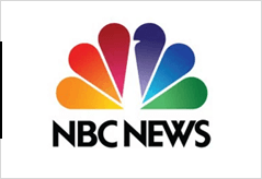 |
NBC. The peacock inspired the NBC channel's multicolored logo. When color televisions first appeared, it was a subtle marketing ploy aimed at enticing people to switch from black-and-white electronics to rainbow-colored televisions. |
|
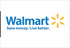 |
Walmart. The visual identity of the giant Walmart (USA) is embodied in a striking logo consisting of a lettering (the name and slogan below it) and a sparkle-shaped element located to the right. The lettering is light blue, and the sparkle is yellow, lending a friendly feel to the emblem. |
|
 |
eBay. The international online auction site eBay chose a lettering based on the name "eBay" for its logo. The lowercase letters, arranged in a single line, are boldly colored: red, blue, orange, and green, in order. According to the logo's creators, it reflects the place of retail sales in online commerce. |
|
 |
Pepsi. The stylish logo for the carbonated soft drink features a circle with two wavy lines inside. It uses a rather clever combination of colors (red, blue, and white)—reminiscent of the American flag. The developers of the current Pepsi logo incorporated multiple meanings: it intertwines feng shui, geodynamics, the Earth's magnetic field, and many other hidden meanings. |
|
 |
Facebook. The logo of the world's most popular social network, Facebook, needs no introduction. Its signature blue color, the square "F" on the website, and the company name have remained unchanged since its inception in 2005. However, the font was recently updated to Klavika, making the letters lower and thinner. |
|
 |
McDonald's. The first image that comes to mind when you hear the phrase "fast and delicious food" is the two yellow arches on the McDonald's logo. It's impossible to miss this vibrant logo, even from a distance. The rounded "M" was chosen deliberately: firstly, it represents the first letter of the company's name, and secondly, its shape evokes associations with breastfeeding. This subconsciously triggers feelings of hunger in those who see the logo. |
|
 |
Toyota Motor. The Japanese automobile manufacturer Toyota has a logo featuring a three-dimensional image in metallic silver and the inscription "Toyota Red." This emblem features three intertwined ellipses: the central one symbolizes the customer's heart, the horizontal one the heart of the intended product, and the outer one the company's mission, which is to advance technology. |
|
 |
Nike. This logo is recognized as the most recognizable in the history of this brand identity attribute. And this is despite the fact that its creation cost the client company only $35. The black swoosh on the Nike logo, combined with the slogan "just do it," symbolizes constant movement and motivates active people to take action and achieve their goals. |
|
 |
Nestlé. The logo of the Nestlé food corporation features the family crest of its founder, Henri Nestlé: a nest with a bird and two chicks. The number of chicks corresponds to the typical number of children in a typical European and American family. The logo's appearance embodies family values and maternal care for children. |
|
 |
Disney. The logo, featuring the actual signature of Walt Disney—the founder of the massive film company Walt Disney Pictures—appears in all of its films and cartoons, as well as on toys and merchandise produced by the Disney corporation. |
Do you want your company to be proud of its own logo? Then order a professional, original logo design from WeLoveBrands. With our help, we can create a logo design in any style within your preferred timeframe.