Receive a presentation of services and expert advice
The best experts in the industry will oversee your brand development process.
→ Need branding, design, or creative solutions? Call us at +48 505 648 022 or message us on WhatsApp.
 WeLoveBrands.pptx

The best experts in the industry will oversee your brand development process.
A university logo must reflect the philosophy, principles, and core values of the educational institution. Therefore, creating one is quite a complex task. Universities in the post-Soviet space don't offer much in the way of diversity and creativity, relying on standard approaches and symbols. Therefore, in this article, we will examine the logos of international universities that, in our opinion, look the most modern, original, and stylish.
Universities are serious institutions. That's probably why their logos are often designed in the same style—solid, demonstrating the status and seriousness of higher education, as if they weigh heavily on the textbooks and encyclopedias they typically depict. There's not a hint of lightness, humor, playfulness, or creativity.
This approach is primarily characteristic of universities in Eastern European countries and the centuries-old, classical universities of Great Britain and the United States. American university logo designs most often feature the symbols of a shield and an open book, denoting the strong and powerful education these institutions provide. This is especially evident in the logos of universities within the legendary Ivy League:
 |
 |
 |
 |
The entire identity of this logo is built around the missing letter "i" in the school's name, Think. This stylized element easily creates the letter "O" and is easy to use in illustrations for printed materials. Furthermore, this element conveys the school's philosophy that nothing can be done alone, but rather by thinking and acting together. The Bloomsbury Institute for Pathogen Research (UK)
 |
 |
This logo design is incredibly stylish and features a trendy minimalist style. Two asynchronously hovering dots evoke the ethereal nature of dance and two dancing partners. University of the Arts London (UK)
British universities typically use coats of arms, as well as images of the crown, to indicate affiliation, subordination, and service to the royal family. This is most clearly seen in the logos of the Universities of Cambridge and Oxford:
 |
 |
The logos of universities in the post-Soviet space are recognizable—usually a circle containing the university building, an open book, a coat of arms, and, in most cases, the abbreviation and year of foundation. The full name of the institution is usually written around the circle. The resulting image looks more like a doctor's seal than a cool logo:
 |
 |
 |
 |
Many European universities are rebranding, making their logos more modern, original, and stylish. This is especially true for universities focused on the arts, advertising, design, and research. Let's take a closer look at the most striking ones. Kendall College of Art and Design (USA)

This logo's design combines creative expression, imagination, and rigor. The left side features stylized doodles representing the university's various fields of study. The right half is a strict abbreviation of the university's name. Aalto University (Finland)
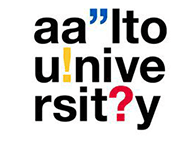
Quotation marks and other punctuation marks signify discussion, evaluation, and a willingness to change—all of which define the image of the educational institution. This logo has a very dynamic and youthful appearance—the very image a modern university should have. THNK The Amsterdam School of Creative Leadership (Netherlands)

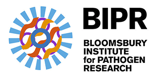
This institute's logo design is simple and elegant. It harmoniously combines elements symbolizing the institution's three areas of research: bacteria, viruses, and parasites. It features a stylized image of microorganisms, reminiscent of how scientists see them through a microscope. The logo is composed of three layers that can be combined in various ways to create images with varying dynamics and color palettes. MUD Dance Center (Italy)

Strict, laconic, stylish, and recognizable—that's how you can describe the logo design of this London university. The solution is more than simple: write the abbreviation of the university's name in Helvetica font and add a colon. But therein lies the beauty of this logo. Hochschule Hannover (Germany)
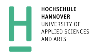
The logo design of this technical university, the second largest in Hanover, combines modernity and classicism. The logo's dynamic colors are contemporary and lend a light and playful feel, balanced by the strict lettering and the lack of detail.
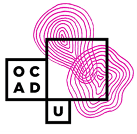
OCAD University (Canada)
 |
 |
 |
This university's core areas are design, painting, and other forms of creative personal development. It's a generative logo, striking in its elegance, simplicity, and creativity. Any image can be placed within the black frame, so each year a new group of university graduates changes the logo. This only adds to its dynamism and creativity.
Want a cool, unique, and progressive university logo? Then order it from WeLoveBrands. We embrace a youthful, bold, and vibrant style, embrace vibrant colors, and embrace creativity, and we know how to combine all of this with classicism, simplicity, and elegance.