Receive a presentation of services and expert advice
The best experts in the industry will oversee your brand development process.
→ Need branding, design, or creative solutions? Call us at +48 505 648 022 or message us on WhatsApp.
 WeLoveBrands.pptx

The best experts in the industry will oversee your brand development process.
Creating a truly compelling logo for a marketing agency is quite challenging, as it comes with a huge responsibility. It's crucial to showcase your company's capabilities and demonstrate through your logo that you're the best in the business. So, if you've created a successful visual identity for yourself, you can do the same for others.
Your logo should immediately grab a potential client's attention and make them want to work with you. Ideally, it should evoke emotion, trust, and a sense of reliability.
Let's be honest: in a competitive environment that's growing exponentially, it's simply impossible to earn trust through your work and professionalism alone. Well, it's possible, but it will take years, and you need clients here and now. Therefore, the first step is to establish yourself and your unique selling points, attract your audience's attention, and engage them in your services. A compelling logo will also help establish a connection with customers.
 Attracting the right clients
If you're a beginner, you'll likely be willing to work on a variety of projects, even if they're not your cup of tea, because you need to build a foundation and gain experience. In this case, a logo will help you introduce yourself, highlight your strengths, and let people understand the value you bring.
And if your company is at the level where you can choose only those projects that interest you, then you can use your logo to convey the audience you're targeting.
 Differentiation from competitors
By creating a memorable, easy-to-read logo, you'll differentiate your company in the marketplace, displace some competitors who haven't yet thought about a corporate identity, and attract the attention of consumers.
 Unquestioning trust and authority
A cool logo is part of a company's corporate identity, demonstrating its unique features and values. For most clients, a stylish, modern website and an attractive corporate identity are indicators of professionalism and creativity. And if a company markets itself so well, consumers think, then it will take their business to the next level.
It's important to back up a beautiful picture with tangible results, as no design will save the situation if it's not professionally done.
A good logo for a marketing company is a powerful promotional tool. It not only helps audiences identify the company among dozens of others but also appeals to people's emotions, motivating them to use the company's services.
To advertise to others, you first need to advertise yourself. A logo helps create a distinct impression on audiences when they first encounter your company and establish a strong connection with them. But to achieve success, it needs to be more than just a brand name—it needs to be a truly effective brand name. We'll explore how to create one below.

A brand name should be unique, first and foremost. So think about what it should reflect, what makes you unique. If you don't know what makes you unique, what hope is there for your logo to be exceptional?
 Reflection of the scope of activity
A logo should communicate what a company does, or at least hint at its specifics. Therefore, all design elements, be it color, font, or image, are selected to reflect the company's focus. It's easy to get confused if, for example, a soccer ball appears next to the name of a marketing agency.
 Following trends
Marketing companies are the first to remember fashion trends, track them, and incorporate them into design.
This doesn't mean you should change your logo and reprint all your business cards every six months. Quite the opposite. You'll present yourself as a professional if you can thoroughly analyze all trends, make specific forecasts, and develop a logo concept that will be relevant for years to come.
Once your brand name is ready, it's important to evaluate it based on the following criteria:
does it stand out from the competition;
does it protect you from companies that might copy your work style;
does it visually attract the audience;
inspires confidence and guarantees quality or not;
does it advertise your services?
If your logo fulfills all these functions, then you can confidently start using it. It will likely attract the attention your company deserves and a significant number of customers.
A logo is your weapon, which works not so much on an informational level as on a psychological one.
To create a visually pleasing, yet striking and memorable, brand identity for an advertising campaign, considerable effort must be put into selecting the right components.
Namely:
 Graphic elements
Pay close attention to the images you use in your logo. They should hint at your industry, essence, or mission. And if your name seems unclear to the client and they can't figure out what exactly you do, a picture will come in handy.
A successful solution for marketing agencies is to use abstract forms and communication symbols (telephone receivers, envelopes, speech bubbles). The former will hint to clients of your strong technical expertise, while the latter will be associated with communication and connection.
You can also use your imagination and choose unexpected images for your logo that are sure to intrigue consumers.
 Color combination
Experienced designers advise choosing colors that won't overwhelm the eye, but they don't necessarily have to be pale. After all, bright elements are the most eye-catching. The key is balance.
 Readable font
Swirls and experiments with acid wash are a bad idea when it comes to marketing agency logos.
Remember: simplicity is in fashion now! A minimalist, easy-to-read font is the best solution. But if you want to highlight your personality and unconventional approach, choose unusual, but definitely legible, font styles.
A well-chosen visual image can stick in people's minds for a long time, so don't rush into implementing your first idea. Sketch out several options and see which one suits you best.
# 1 Simplification and minimalism
Minimalism has been a popular design trend for quite some time now and shows no sign of abating. People are increasingly using their smartphones, which means more and more businesses, including marketing companies, are moving online. Therefore, there's no longer a place for cluttered details and ornate fonts.
Your brand should be clearly visible even in the smallest app icons. Therefore, it's best to opt for geometric shapes, clean lines, a calm color scheme, and sans-serif fonts.
# 2 Unique Fonts
The trend of creating custom fonts is gaining momentum. It's a proven and effective way to differentiate your agency from the competition.
# 3 Gradient
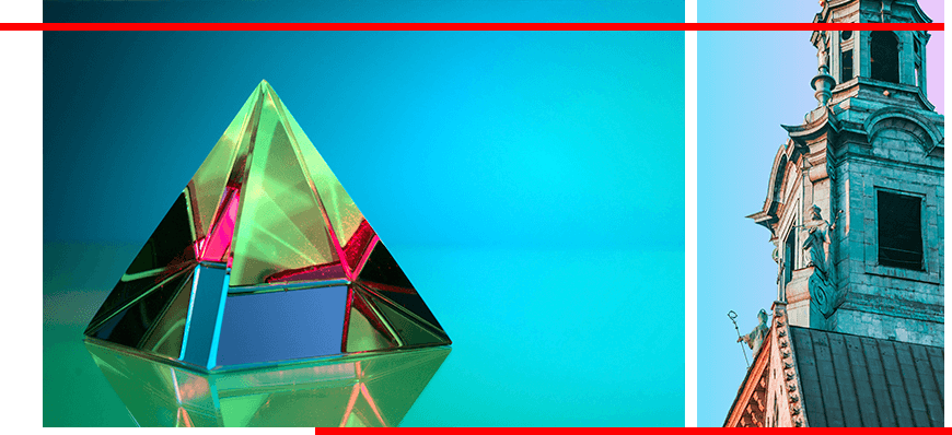
This trend has become popular lately. Smooth color transitions create a sense of volume and impart dynamism, which is particularly effective in logo design.
# 4 Disappearing Text
The human brain is a fascinating mechanism, one that both marketers and designers love to play with. What do you do when you see a word missing a part of a letter, or even a letter entirely? That's right, you look closer and try to decipher the inscription.
This helps you seamlessly memorize the text you've studied so carefully. This technique also works well with logos with unfinished lines and blurred letters. Such visual puzzles draw people's attention not only to the image but also to your company. However, you need to be careful not to overdo the mystery, as you risk making the text unreadable.
# 5 New Geometry
This trend has become a logical continuation of simplification and minimalism.
Advertising agency logo designs using geometric shapes are becoming increasingly diverse, thanks to the incorporation of various shapes, interesting color combinations, layouts, and more. This is a great way to liven up a logo by replacing letters with distinctive shapes or incorporating geometry into an emblem.
# 6 Negative Space
Negative space is used to create multi-layered logos that will attract attention and be studied with interest.
Using negative space, branding can be created in a variety of ways, adding additional meaning to the design to attract audience attention.
# 7 Fine Lines
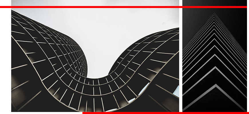
Sophisticated logos with thin lines are back in fashion. Against a backdrop of decorative fonts and geometric shapes, this clean and stylish design feels high-end and professional. However, when embracing this trend, avoid bulky and cluttered elements.
# 8 Chaotic composition
Audiences are increasingly beginning to encourage and support unconventional thinking. The chaotic arrangement of elements in a marketing company's logo rebels against simplistic norms and rules, which can highlight your creativity.
Feel free to twist the letters, mix them with geometric shapes, create unusual combinations, and arrange them however you like. But keep in mind that every creative decision should have a specific purpose in reflecting the company's personality.
# 9 Balance
Following this trend, you can create a streamlined and balanced logo. To achieve this, use a symmetrical arrangement of elements and clean typography. With careful work, you'll create a beautiful logo that conveys a strong and balanced atmosphere.
# 10 Monograms
This type of logo is suitable for you if your advertising agency name is too long or your business covers global markets. This logo is quickly remembered and stands out from the crowd of standard names.
# 11 Dynamics
It's worth remembering that a simple logo isn't impressive these days. But adding animation can give it a whole new meaning. Even just a few harmonious movements can create a sense of dynamism and make the logo stand out from the competition.
# 12 Perspective
What if we combined two trends: thin lines and monograms, and then played with them in perspective? This way, we could create two-dimensional and three-dimensional drawings, which are the essence of the new trend.
By playing with perspective, you can show depth and attract your audience's attention.
# 13 Faces and portraits
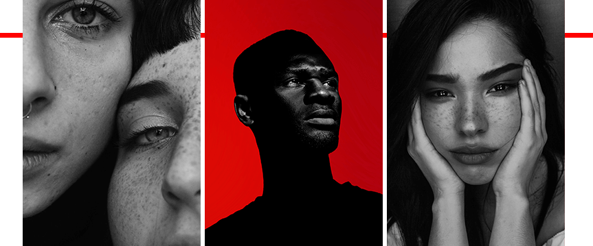
The popularity of selfies has fueled another trend: the use of portraits in logo design. Since people are naturally drawn to faces, incorporating portraits into logo designs allows brands to instantly connect with consumers. Such illustrations, in a variety of styles, are now widely available, lending a distinctive character to a company's brand identity.
# 14 Characters
This classic trend has never really gone out of style. Against the backdrop of logos featuring faces and portraits, some advertising agencies are leaning toward unusual and playful logos featuring memorable characters. Such an adventurous logo will be relatable, evoking pleasant emotions and associations.
# 15 Stained Glass
In 2021, the trend of applying stained glass concepts to logos is gaining popularity. Breaking up images into blocks using bright, contrasting colors brings a touch of abstraction to everyday life, thereby creating eye-catching logos.
The concept is crucial! Not only to stand out from the competition, but also to give your logo meaning. This will make it engaging to your audience, which will ultimately lead to them paying attention to your company. But how can you align your logo vision with popular trends? Just follow these simple rules.
Tips for creating a striking logo:
No cliches!
Fashionable ideas that people and designers love are unfortunately constantly being recycled. This quickly leads to them becoming boring and outdated. It's important to maintain a fine line between following popular examples and simply copying them.
Everything ingenious is simple
More often than not, it's simple and concise logos that stand the test of time and become iconic. They're easier to remember and easier to recognize.
Movement
Give your sign that missing impetus. This will help your audience feel like they're moving toward their desired outcome with you.
Color and light
If a logo seems boring, don't immediately overload it with additional elements. Try playing with color schemes and shadows.
Double meaning
You often come across logos that invite close examination and study. If you want to achieve a similar effect, the double entendre technique can help.

To do this, combine several elements in an image, caption, or icon that form a single, cohesive image.
Subtext and meaning
Your logo shouldn't just be a pretty image. It's important that it reflects an idea or conveys your values.
(Logo of a global partnership of organizations working to save birds and their habitats).
Focus on technology
Nowadays, marketers use information technology as their primary promotion tool because it is highly effective.
Therefore, it would be appropriate to include in your logo symbols and images that most people associate with IT and the internet. This will show you as a professional in your field.
The following elements would be suitable here:
hard intersecting lines(associated with computer circuits);
tangled knots(resembling wires);
neon colors(a reference to the unnatural light emitted by device screens);
sans-serif fonts(provide the strict writing we can achieve through printing).
But when choosing this method, it's important to keep balance in mind. There's always a risk that clients will mistake the logo for an IT company rather than a marketing agency.
Typography
Playing with text can easily create a stylish, minimalist logo. For example, bolding words you want to emphasize remains a popular technique. You can also experiment with text placement or color schemes.
And the main advice: enjoy the process! Then you simply won't have a chance to come up with something mediocre.

Ukrainian marketing and advertising agencies aren't afraid to experiment, creating unconventional, creative, and sometimes downright funny logos. However, the lion's share of logos in this field are still simple fonts or stylish combinations.
The images chosen include simple symbols, geometric shapes, abstract elements, portraits, and various characters. Fonts also vary widely, from laconic and austere to creative and intricate.
As for color, many noteworthy logos are two-color, specifically black and white. Their signature features include playful text manipulation, broken lines, missing letter sections, and animated elements.
Bright colors are used primarily for accents. Among the most popular are red, pink, yellow, and blue.
American marketing companies most often choose combination logos, while text-based ones are much less common. Fonts are characterized by their simplicity, they look stylish, and are used to convey status. Fonts are typically standard sans-serif or uppercase.
Combination logos are created using a variety of images, from geometric shapes to unexpected images (such as a glass, a tree, or mountains). These symbols either communicate the company's line of business or generate interest and a desire to learn more about it.
Popular colors are black, white, yellow, red and blue.
In European countries, most logos developed for marketing campaigns are font-based, with an emphasis on type and playful typography. These logos are modern and stylish, but lack a touch of creativity.
Combination logos most often use geometric shapes, dots, and lines. Black, white, red, and yellow are the preferred colors, and classic sans-serif fonts are used.
Marketing companies in Asian countries prefer to use concise and clear logos, so font-based logos are most common. Combination logos certainly exist, but they tend to be minimalist, using simple symbols and shapes.
Despite the simplicity of Asian logos, their main distinguishing feature is their vibrant colors. This means they make extensive use of a wide variety of colors. Among the most popular are pink, orange, blue, red, and white.
Fonts used are mostly sans serif, sometimes techniques are used to play with text, creating different effects.
A freelancer, a designer friend, or a specialized agency can handle the development of a brand logo. You can also create a logo yourself using online resources and templates, but this option will certainly not be unique or appealing.
An effective logo will help you achieve:
1. Freelance exchanges
You can find a decent developer here at an affordable price, but the quality remains questionable. You might run into an unscrupulous specialist who will miss deadlines or create a primitive logo, similar to those found on online platforms.
2. A familiar designer
If you know a talented designer, you can contact them. Just make sure you check their availability in advance so you can meet deadlines.
3. Branding agency WeLoweBrands
We begin working on your logo only after a thorough analysis of the market, competitors, and target audience, and familiarization with the specifics of your business.
By ordering a logo for your marketing agency from us, you'll receive a unique concept and original visual image that will attract consumers and stand out from the competition.
If you'd like to learn more about logo design, call us for a free consultation. You can also ask your questions using our website chat.