Receive a presentation of services and expert advice
The best experts in the industry will oversee your brand development process.
→ Need branding, design, or creative solutions? Call us at +48 505 648 022 or message us on WhatsApp.
 WeLoveBrands.pptx

The best experts in the industry will oversee your brand development process.
The pharmaceutical industry is considered one of the most dynamic and profitable in the world. The market is constantly evolving—new entrants emerge, existing companies expand, and leaders change.
Pharmaceutical manufacturers worldwide earn billions of dollars annually. Ukraine is no exception. The Ukrainian market is growing rapidly, and drug sales are increasing year after year. In 2019, medication sales totaled $42.7 billion.
Due to the highly competitive market, it's important for companies to stand out and be memorable. To effectively engage with the target audience and influence consumer behavior, a good pharmaceutical logo is essential. This means that the brand name should be associated with the industry, communicate the specifics of the business, differentiate the company from competitors, and be recognizable.
A clear and attractive logo design enhances the aesthetic value of a product and creates an emotional connection with its audience. People will recognize the company when they see the logo and make purchasing decisions.
The logo helps:
 stand out from the competition;
 identify the company;
 highlight the benefits;
 increase customer trust and loyalty;
 improve the company's image.
A good logo allows consumers to quickly navigate the market, distinguishing one manufacturer from another. It communicates the company's focus and creates a desired image in customers' minds, evoking specific emotions and associations.
Domestic and international pharmaceutical companies operate in Ukraine. Some Ukrainian manufacturers focus exclusively on the domestic market, while others export their products to other countries, and others acquire small foreign companies to expand and enter foreign markets.
Logo design can depend on a company's status, goals, and product range (whether the products will be sold, whether they are general-use medications or specialized products intended, for example, for surgeons, maternity hospitals, chemotherapy, etc.). Therefore, when choosing symbols and shapes, it is recommended to consider the company's line of business and customer expectations.
If all design elements are chosen correctly, the brand logo will attract the attention of the audience and help build a relationship of trust with them.
To ensure consumers recognize a logo easily, it must be original. Therefore, it's best to avoid traditional pharmaceutical and medical imagery. Instead of the usual images of a cross, a bowl with a snake, capsules, and tablets, choose a unique image or abstract elements associated with health, safety, and energy.
 Image .
Classic options for pharmaceutical logos include medical-themed images, pills, and natural symbols (leaves, trees, etc.). These images can be stylistically enhanced or incorporated into the text.

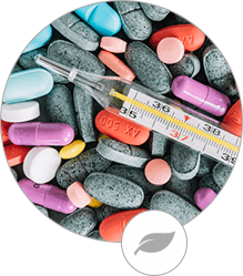

These logos communicate the company's activities. They are simple and understandable to the audience, but they don't make the company stand out. To create an original, rather than mediocre, logo, you need to step out of your comfort zone and implement an unconventional idea.
 Color .
The most common colors in this industry are white, green, and blue. They are associated with purity, health, and reliability.
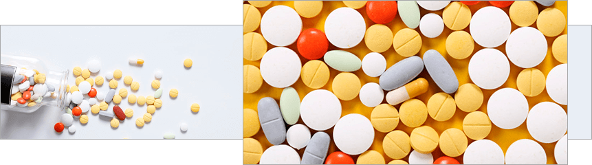
To make a logo more appealing and expressive, you can add a few bright colors to the light and muted tones. However, do this carefully to avoid turning the logo into something too garish. Such a logo will certainly attract attention, but it's unlikely to inspire trust.
 Font .
Pharmaceutical brands typically choose strong fonts and clear lines to give their logos a serious feel and emphasize the company's stability and safety.

To create a recognizable and original logo, it's best to use fresh, interesting fonts without flourishes or complex swashes. You can develop your own font style or adapt an existing one.
Many pharmaceutical companies use traditional imagery in logo design, so they've become familiar and no longer appealing. To ensure uniqueness, it's important to abandon formulaic solutions and experiment with symbols, shapes, and colors.
Industry clichés . That is, all those images that are directly related to a particular business. For pharmaceuticals, these include tablets, capsules, a red cross, a bowl with a snake, leaves to emphasize eco-friendliness, etc.

To differentiate a company and attract attention, it is necessary to imbue the logo with new meaning and use an interesting idea.
Abbreviations. The first letters of a company name and abbreviations are used quite often in logos, so this technique is no longer as effective. A simple logo without interesting letterforms will fail to stand out from the competition and convey the brand's message to consumers.
Abbreviations can only be used if you use your imagination and add some kind of feature to the design.
Trees and people . Trees, as a symbol of life, are great for pharmaceutical logos, but they also tend to be formulaic. The same goes for human figures, including stylized ones. Using such images in design can undermine uniqueness and identity.

If you want to achieve an original logo and a competitive advantage, choose unconventional ideas and images.
Arc . This element can be depicted in various variations. It symbolizes growth, flexibility, security, and dynamism, so it is often used in logo design. Unless this symbol has a deeper meaning, it is best to avoid it, opting for abstract elements and geometric shapes.
A logo is more than just a company's distinctive mark; it's a vital component of your brand. When competing for customers, it's crucial to use every effective means possible, so a logo should be attractive and intriguing. This will help you create the desired image in consumers' minds and build positive relationships with them.
 Geometry . Various geometric shapes make it possible to create interesting logos. They can also be adapted to your business, drawing parallels with your products. Such logos will reflect the essence of the company and attract attention.
 Animals . Images of birds and animals in pharmaceutical logos look unique and engaging. The key is to create a logo that's uncluttered and understated.
 A bright accent . The pharmaceutical industry discourages the use of multiple bright colors, but with careful color selection and accents, you can create a stylish and attractive logo. A bright shade can be added to black, white, gray, or dark blue for contrast.
To bring an interesting idea to life and create a stylish, trustworthy logo, contact WLB Studio. Our designers study your company's operations, competitors, and target audience, develop a strategy, and create several logo options tailored to your business goals. For a consultation and further details, please contact us by phone or send us a message via online chat.
Ukrainian pharmaceutical companies serve both the domestic and export markets. Ukraine ranks 61st globally among pharmaceutical exporters, with annual exports of $180 million.
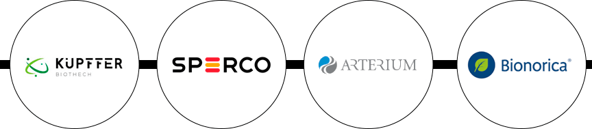
The largest companies opt for simple logos in a single color (sometimes two). The most common symbols are leaves and geometric shapes. Abbreviations are also widely used.
Popular colors are red, green, blue, gray and black.
American company logos feature unusual fonts and unusual imagery. Traditional pharmaceutical imagery is rarely used.
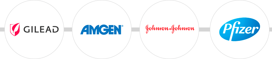
Single-color branding is more common, with common shades being red, blue, black, and green.
Well-known European pharmaceutical brands are opting for stylish and minimalist logos. Some companies have taken risks and used elements unconventional for the industry, such as soft fonts or unexpected images and colors.
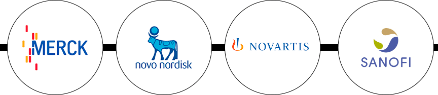
Geometric shapes and colors like blue, red, green, and gray are popular, but yellow is also common. European companies primarily choose one or three colors (two-color logos are less common).
The main distinguishing feature of Asian company logos is their brightness. They often use three or more bright colors in their designs, which is unusual for the pharmaceutical industry.
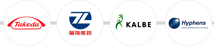
There are also two-color contrasting logos, where a neutral tone is combined with a bright one. Red, green, blue, and yellow shades are common.
As for the images, geometry is actively used.
You can get a simple logo with a standard, thematic icon using online resources. These sites allow you to quickly and inexpensively create a logo that matches your business. However, this method has one significant drawback: a lack of uniqueness. This means the system will give you a template-based solution that won't stand out from other similar logos.
To create a modern logo that attracts attention, evokes emotion, and builds trust, entrust its development to an experienced professional with a keen imagination. A creative designer will be able to explore and implement a variety of ideas to ensure you achieve an effective logo.
You can find such a specialist as a freelancer or in a design studio. The former option is considered budget-friendly, as logo development costs start at $30 (depending on the region, experience, and workload of the designer).
To achieve a high-quality result, you need to invest time and effort in finding the right person. Otherwise, trusting the first person who promises to do it quickly and cheaply could leave you with nothing. At best, an unscrupulous designer will miss the deadline, and at worst, they'll produce a bland and boring logo or disappear entirely.
When you contact a studio, you can be sure you'll get what you expect. Our companies employ designers who can bring even the most complex solutions to life. They value their reputation, so they'll deliver your project on time and create a unique brand identity. However, quality and uniqueness come at a premium (starting at $150, depending on the chosen package).
At WeLoveBrands, we offer exciting ideas and innovative approaches to your business. We'll do everything to ensure your business has a recognizable and trustworthy pharmaceutical logo. To order a design service or discuss the details, please call us or chat with us.