Receive a presentation of services and expert advice
The best experts in the industry will oversee your brand development process.
→ Need branding, design, or creative solutions? Call us at +48 505 648 022 or message us on WhatsApp.
 WeLoveBrands.pptx

The best experts in the industry will oversee your brand development process.
Recruiting is a very complex and responsible profession. The quality of your company's work determines the future success of your clients and their businesses. Therefore, it's important to create the impression at first glance that you are a true professional. And this effect is easily achieved with a well-designed logo.
When it comes to the recruitment business, a logo plays a vital role in increasing recognition and trust. By highlighting the company's strengths and reflecting its values, a corporate mark leaves a distinct impression on the audience. If your logo evokes the image of a reliable, professional agency, you're on the right track.
A logo is just one part of a brand, but it's vitally important. It's a symbolic way to represent your ideas, mission, and benefits.
A logo design should convey the company's activities and communicate the benefits of its services. A successful recruiting logo is simple, yet attractive and meaningful. It allows you to stand out from the competition, engage your audience, and convince them of your company's professionalism.
A recruitment agency logo helps achieve better results through the proper selection of colors, symbols, and fonts that have a psychological impact on consumers, evoking specific emotions and associations.
A well-designed logo makes a great first impression, increases brand recognition and boosts sales, while a simple recruitment agency logo can turn off a potential client because it creates blurred images when looking at it.
When thinking about logo design for a recruitment agency, you should consider several factors:

How does the logo fit into the overall brand image?
Does the brand mark convey the company's values and highlight its advantages?
What impression does the sign make on the target audience?
Will the logo look good on the current website? If not, do the website or brand design need to be changed?
Does a logo work as a social media profile picture? If not, what should be changed?
Do you need a printed version of your logo for business cards, envelopes, etc.?
What budget are you willing to allocate for this?
By answering these questions, you will be able to determine the concept and create a logo that will correspond to your activities and reflect your character and personality.
Once you've settled on an idea, a new question arises: what type of logo should you choose for your recruiting agency?
Combined sign
 A combination logo combines a symbol and typography. If you look at famous logos, you'll find this option quite popular because it combines the company name with an image, enhancing the overall effect. Such logos attract attention and are easily remembered, especially if the image is unique.
Wordmark
 This is a text logo, often designed with a custom font created specifically for the brand. A custom font allows you to emphasize your individuality and stand out from the competition. However, companies often also use classic, standard font styles. By choosing the one that best suits the specific nature of your work, you'll create a logo that inspires trust.
Symbol or icon
 Symbolic logos are images that are strongly associated with a specific company in people's minds. For example, the well-known Apple apple or the blue bird on Twitter. These symbols convey a specific idea, allowing them to influence the audience's subconscious, evoking clear associations.
Lettermark
 A letter logo is similar to a wordmark, but with a shortened version of the company name, containing an abbreviation (e.g., HP, GE, Novy Kanal, etc.). This logo is typically chosen when the agency name is too long. The emphasis in this case is on the font and color, which should align with the brand's spirit.
Emblem
 An emblem is a type of logo in which the company name is embedded within an image. This is rare in the recruiting world, as it is often considered too flashy and conspicuous, and is more suitable for companies with a long history and tradition.
To choose a logo type, start from the overall idea and also study the symbols of your competitors to understand how to differentiate yourself from them, or, conversely, align yourself with them.
Every detail matters in logo design. Individually, they have a specific impact on a person, but together, harmoniously combined, they create a unified image of the company.
The main elements of a logo are image, color and font.
If you're choosing a symbol or combination logo for a recruiting agency, consider the meanings you want it to convey. Then you'll be able to create an image that matches your business, reflects your values, and conveys your company's character.
It's important for a recruitment agency to project professionalism, credibility, and reliability. Therefore, geometric shapes and abstract symbols are the best logo choices for this industry.
Perception of forms:
circle – softness, infinity, magic;
square, rectangle – stability, precision, harmony;
triangle – reliability, strength, truth;
spiral – purposefulness, creativity, intelligence;
abstraction – fresh ideas, audacity.
But you don't have to limit yourself to geometry. You can experiment with unexpected imagery. The main thing is that it fits harmoniously into the design, reflects your business, and conveys the desired message to your audience.
Color influences the perception of a logo because it evokes certain emotions and associations. But there's no single winning shade. It's all individual, as clichéd as it may sound.
When choosing a color, consider the personality of your company and the emotions you want to evoke in your audience. Also, keep in mind that specific colors have different effects on potential customers. For example, soft pink is calming, while hot pink tends to excite.
Shades and the emotions they evoke:
 Pink: feminine, youthful, romantic, sweet.
 Red: passion, aggression, strength, adventure.
 Orange: passion, accessibility, youth.
 Yellow: happy, friendly, cautious.
 Green: naturalness, prosperity, freshness, money, stability.
 Blue: calm, trustworthy, professional, authoritative.
 Purple: royal, luxurious, romantic, creative.
 Brown: reliable, natural, simple, durable.
 Black : authoritative, strong, sophisticated, mysterious.
Colors also tend to be trendy or outdated. Trends change year after year, so it's important to choose a shade that will appeal to consumers and remain relevant for a long time.
Pantone, for example, makes predictions and annually presents the "Color of the Year." In 2021, it's "Ultimate Gray" and "Illuminating Yellow."
You should also keep in mind the colors that are common in your industry.
Based on the list of color and emotion correspondences, it's worth concluding that yellow, green, blue, brown, or black are the best colors to choose for a recruitment agency.
But that's not to say that all brands follow this pattern. Some deliberately push the envelope and choose unexpected shades to attract more attention and stand out in their industry.

Another consideration is color combination. This is also worth paying attention to. Designers recommend using 1-3 shades in a logo. If you choose multiple colors, make one the primary color and the others accent colors. This will create a harmonious brand identity that will attract, not intimidate.
Choosing typography can be a daunting task, as there are so many different fonts available. Each one has a different impact on people, so the best choice is one that reflects your personality and suits your style.
The following resources will help you choose a font:
Myfonts.com - A useful and reliable interface that allows you to enter text and preview fonts.
Dafont.com - here you will find a selection of amateur and professional fonts, ranging from free to expensive.
Fonts.com - The site boasts font previews and visuals combined with powerful search features.
You should choose a font style that will be relevant for years to come. If using two fonts, make sure they complement each other and work harmoniously together.
If you have the time and budget, you can develop a custom font. This way, you're sure to have a unique and eye-catching logo.
To develop an interesting logo for a recruitment agency, you can use popular trends.
# 1 Revival and modernization of the concept of basic primitive geometric forms
Even though shapes are the simplest building blocks in design and art, they still have the power to convey messages. Just look at some 20th-century logos that feature shapes and lines. Ask any branding expert, and they'll tell you that geometric logo design can be a powerful marketing tool when done correctly.
In 2021, these basic forms are making a comeback and are actively used. All you need is a great idea that will help you bring your vision to life and your recruitment agency logo. will stand out from the crowd with its simple, yet effective design.

Also, flat design and distorted proportions combined with multiple shapes or repeating patterns are increasingly being used when creating a logo.
# 2 Classic Symbols
Classic symbols in logo design are a great example of how designers use concepts from the past, reimagining them to create powerful and direct messages for their audience.
Design experts agree that new recruiting firms will incorporate well-known symbols into their logos, using modernized versions of motifs and iconography from years past to strengthen their brand message.
If you want to use this technique, find a symbol that conveys your idea. For example, a handshake as a symbol of partnership was a powerful business logo in the 1920s.
# 3 Hand drawing
In today's digital age, hand-drawn images are sure to attract attention because they look lifelike. So, if you want to engage your audience, consider using this technique in your logo design.
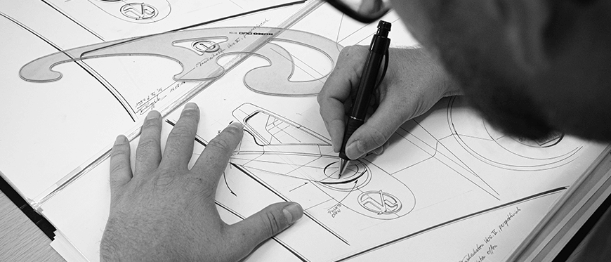
If you want to show the authenticity of your recruitment agency and give it a more human touch, this option will be a good solution.
# 4 Overlapping Text
Text logos have been and will always be popular because they incorporate the brand name instead of shapes and symbols. These logos are easily remembered and are closely associated with the company's activities.
Text-based logos always emphasize the font. To stand out from the crowd, you can use a signature font style or play with the text. A new trend—overlapping text—can add depth. It involves placing one letter or section of text over another letter or section of a word.
# 5 Analogous Colors
These are shades that are adjacent on the color wheel (for example, yellow and orange, red and purple). Such combinations allow for the creation of complex yet harmonious designs that will positively impact the target audience.
# 6 Authentic Portrait Painting
It's important to note that people tend to seek out other people's faces, so portraits can create a useful and powerful emotional connection in logo design. The more authentic and recognizable the faces, the deeper the connection.
For this reason, designers in 2021 are using portraiture to reflect different cultures, age groups, and more.

With the market becoming overwhelmed by homogenous logos, this approach will provide a breath of fresh air with its authenticity and real-world impact, ultimately helping people connect with the brand faster and more deeply.
# 7 Optical Illusions
If you want to experiment with something playful and creative, opt for optical illusions. They can instantly draw your audience's attention to your logo.
To create an illusion, play with letters, using geometric or abstract shapes. It's all up to your creativity.
But there's just one catch: don't overdo it. Optical illusions can really add an intriguing touch to your logo, but if they're too complex, they'll confuse your audience rather than engage them.
# 8 Using emoticons
We all use emojis in our messages because they help us express emotions. At first glance, this technique might seem inappropriate for a recruiting agency, but if used sparingly and correctly, it can add variety to your design. This way, you can stand out from the competition and convey your mood to your audience.
# 9 Violating composition rules
When it comes to logo design, most experts follow the rules of good composition. They use a central focal point, maintain balance, and achieve a consistent visual hierarchy.
However, rules are made to be broken. And breaking the canons of composition in logo design can be seen as a sophisticated move, going beyond the ordinary.
Breaking these rules doesn't necessarily mean creating something completely outlandish. Instead, focus on one element and let it stand out. For example, if you're using a logo with a wordmark, highlight one letter by reducing the font size or removing it from the composition grid. These simple steps will help impress clients and attract attention to your recruitment agency.
# 10 Use nature images
Nature itself can be a great source of inspiration. Just look around and you'll likely see logos that utilize natural motifs. Leaves, trees, flowers, mountains, and rivers are all actively used in design, evoking associations with ecology and naturalness.

When developing a concept and choosing implementation methods, remember that a recruitment agency logo should evoke a sense of reliability and professionalism. This will build trust and encourage customers to use the services. However, don't make the logo too serious – add some life and emotion to it to attract and engage your audience.
Ukrainian recruiting companies opt for simple and stylish logos. Many brand marks are minimalist, and most are font-based. When combined, logos are used with a simple symbol. Geometric shapes, lines, and abstract elements are most common. Playing with text (geometric shapes instead of letters, missing parts of letters, etc.) is also a popular technique.
Recruitment agencies prefer white, orange, red, blue, and black colors. The most popular combination remains a mix of red or orange and white.
Europe. Recruitment agencies in Europe primarily feature logos in shades of blue (lots of blue!), white, black, gray, and red. Companies favor single- and two-color text logos. Overall, the trends are the same as in Ukraine: minimalism, font-based logos, geometric combinations, and playful use of text.
Asia. The favorite colors of Asian recruitment agencies are not much different from those in Europe and Ukraine: gray, blue, red, black, and white. Companies prefer text-based logos, but often complement them with gradients, use negative space, and design letters in geometric shapes.
USA. Once again, we see the standard palette beloved by recruiting companies worldwide: orange, blue, black, white, and gray. Like Asian recruiting agencies, American ones often use negative space and monograms. Logos are created in a minimalist style with playful text.
Based on this, it can be concluded that the recruitment industry has established its own color palette, used by both Ukrainian and international companies. Orange, red, white, black, blue, and gray can safely be considered the defining colors for recruitment agencies worldwide.
Before you begin designing a logo, you should understand what resources you have and how much you are willing to invest in the project.
Please take into account the following points :
1. Allow yourself time. Of course, there's no need to rush such an important matter. More often than not, time directly impacts the quality of the result. So be prepared to wait at least two weeks, if not longer.
2. Do you have a clear concept ? This is a crucial point. It directly impacts the amount of time you'll spend on logo design. If you don't have a clear concept, we recommend working on it as soon as possible, as working with a professional can take a very long time. If you're unsure which direction to take, an experienced designer can help you with a concept and provide several logo options.
3. Budget. The more you can allocate for logo design, the better the designer will be. Consequently, the more experienced the designer, the more expensive their work will be and the better the result you'll get.
4. Usage strategy. This depends entirely on your needs. Do you just need a logo? Or do you also want a unique corporate identity? Or perhaps you also need a logo book or guidelines?
Once you've defined your idea, goals, and budget, you can begin designing your logo. You can order a logo from a freelance marketplace or a design studio, or you can create one using specialized online platforms.
1. Freelancer. This is one of the most popular methods. Suitable for those who already have a clear vision for the logo, can create detailed specifications, and have a moderate budget (from 30 $).
But when collaborating with freelancers, it's important to keep your eyes open: there's a risk of missed deadlines, plagiarism, and poor quality that doesn't match the price.
2. Online services. There are numerous automated resources that will help you create a logo in minutes for next to nothing. Naturally, such a logo lacks any individuality or effectiveness. If you want to make a strong statement about your recruitment agency and maintain its credibility over time, this method is not for you.
3. Working with an agency. This is undoubtedly the most effective and reliable option of all presented.
Designers approach the development of corporate identities and styles for various companies with the utmost care and attention. Only after thoroughly analyzing the market, competitors, and audience needs, and breaking down your business to its very core, do specialists begin logo development. Therefore, a logo design at a studio will cost you from $150.
To create an effective and engaging logo for your recruiting agency, contact WeLoweBrands. Our designers will develop a strategy that will help you stand out from the competition and attract new clients. For a consultation and further details, please call us or chat with us.
WeLoweBrands – with love for your brand!