Receive a presentation of services and expert advice
The best people in the industry oversee your brand development process
→ Need branding, design, or creative solutions? Call us at +48 505 648 022 or message us on WhatsApp.
 WeLoveBrands.pptx

The best people in the industry oversee your brand development process
Advertising your offline store and promoting your online store are essential for successful operation, growth, and increased sales. To reach as many potential customers as possible, it's important to utilize available advertising channels. Among offline promotion methods, the most popular are flyers, brochures, outdoor advertising, and business cards. However, business cards are also used for online store advertising.
If you want to learn what a business card should look like to attract customers and increase sales, as well as what design trends to follow when creating cards, read our article.
When promoting online stores, all efforts are often focused on online marketing. These efforts yield results, but for a significant portion of consumers, the physical attributes of a store's existence are still important. Business cards help attract these customers.
For this tool to be effective, it is necessary to adhere to a number of requirements and recommendations.
 high-quality - cheap business cards can cause mistrust of the store;
 designed in accordance with the company's corporate style to enhance recognition;
 easy to read and informative - buyers should spend a minimum of time searching for the necessary information;
 bright and memorable - to stand out among other business cards.
The difference between online and offline store business cards is that a traditional store only needs to attract customers once for them to remember its location and product range. Online stores face a more complex challenge—URLs, even the simplest ones, are rarely remembered, so a business card should serve as a hint and reminder, and the website address should be prominently displayed.
For standard retail outlets, a business card can be turned into a bonus card, a discount card, or an interactive card designed to fit a specific theme that will be useful to consumers (for example, a ruler for a stationery store, a size chart for a clothing store, a puzzle or jigsaw puzzle for a toy store, etc.). If the business card not only includes the name, contact information, and address but also offers a benefit, the chances of it not being thrown into the nearest trash bin will increase.
The business card format doesn't allow for a lot of information—too much text can overwhelm it. White space makes the card easier to read, so it's important to select the most essential information and keep the text as short and simple as possible.
The key information on an online store's business card is its name, address, and website link. Place this information in the center of the card, use a memorable font, and highlight it in a color that both evokes positive emotions and matches the specific business.
It's also important to highlight the brands or types of products available in the store. If the product range is extensive, highlight the product groups or provide more detailed information on the back of the business card. Additionally, include phone numbers and company social media profiles.
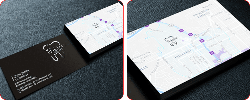
In addition to basic information, a business card for an offline store can include the address and a map with directions.
To attract potential customers to your business card and store, it's important to break away from standard techniques and embrace something unique. The best tools are an unusual shape, a vibrant style, and a consistent brand color scheme.
Traditional rectangular business cards can be made more distinctive by rounding the corners or cutting one off. However, if you want to attract customers, choose an unusual shape that matches the product you're selling.
For example, a clothing store's business card could be designed as a T-shirt, blouse, or jacket. It could also be shaped like a branded bag with the store's name or logo. A flower shop's business card could be in the form of a bouquet or basket, a toy shop's could be in the shape of a toy car or doll, a bag shop's could be in the form of a tote bag or backpack, and a cosmetics store could use the silhouette of a cosmetic bag or compact.
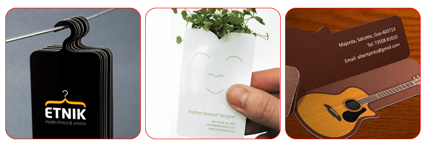
Corporate identity is the foundation of brand recognition. A consistent color scheme, logo, and slogan are associated with the company, helping audiences identify it and associate its products with it. Corporate visual elements help reduce advertising costs and increase customer trust and loyalty. Therefore, store business cards should align with the corporate identity to create a unified, harmonious image.
You should also choose a business card design style. Suitable for stores include minimalism with its sleek design, abstractionism, characterized by a play on shades, various combinations of lines and planes, geometric shapes, and Empire style with its majesty, rich hues, and exotic patterns.
The main thing when choosing a style is to start from the direction of activity, the needs of the target audience, the idea and values of the company.
For example, a business card for a handbag store might feature patterns that match the texture of genuine leather, while cards for gift shops selling premium brands are recommended to be designed in a restrained, conservative style.
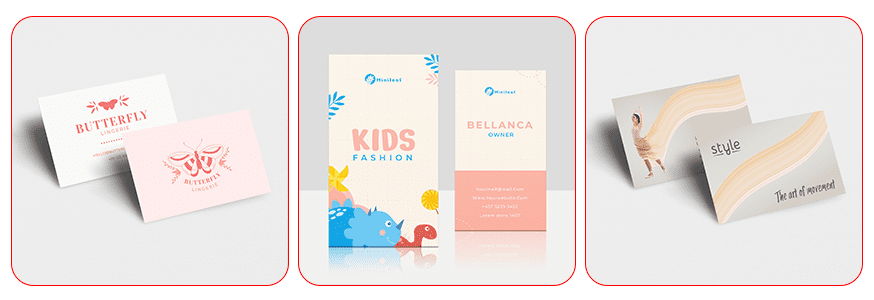
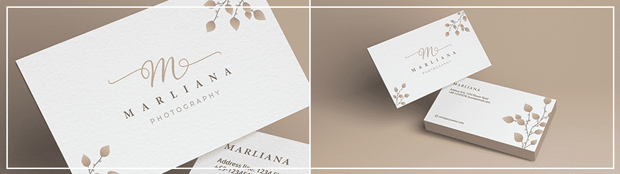
Business cards for children's clothing stores or youth clothing stores are typically the most vibrant and creative. These cards can embody dynamism, a desire for innovation, playfulness, and, for some brands, even aggressiveness. For classic men's clothing stores, business cards are designed in a formal, or sometimes distinctly conservative, style. Women's clothing boutique cards are designed in warm tones, featuring soft patterns, smooth lines, and calligraphic fonts. Lingerie business cards are designed similarly. Here, pastel colors and images symbolizing tenderness, beauty, and sexuality are preferred.
As for color, the perception of any information depends on it. Red, yellow, blue, and green have the greatest influence on people.
 red – strength, power, love, action;
 yellow – positive, warmth, friendliness;
 blue – calm, stability, balance;
 green – harmony, freshness, vitality, money.
Other colors affect perception differently due to mixing.
When choosing a color scheme, consider the brand's personality, specific features, and objectives. For example, a toy store's business card might be bright and colorful to emphasize cheerfulness, activity, and childlike spontaneity. An auto parts store's business card should be more subdued, using shades emphasizing reliability, stability, and safety. A cosmetics store's business card might be designed in delicate or vibrant shades of pink, purple, and red, as these are the most popular lipstick colors, yet also embody femininity, passion, and tenderness.
You don't have to use traditional colors for your niche—to stand out, attract attention, or evoke a reaction, you can choose other tones. The main thing is that the overall design looks harmonious and helps you achieve your goals.
Image is the number one priority for most fashionistas. Therefore, a clothing store's business card design should be trendy, casual, stylish, blend elegance and simplicity, and, most importantly, free from banality.
Designing a business card for a fashion store can be a challenging task, but leading global design agencies are transforming this business tool into masterpieces of design art.
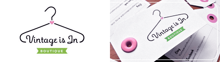
For example, the Canadian agency Agentillustrateur, led by Christine Roy, designed cheerful business cards for the trendy vintage clothing retailer, VintageisInBoutique . The combination of lime green and pink is eye-catching, while the whimsical font and stylized hanger logo convey the brand's retro character.
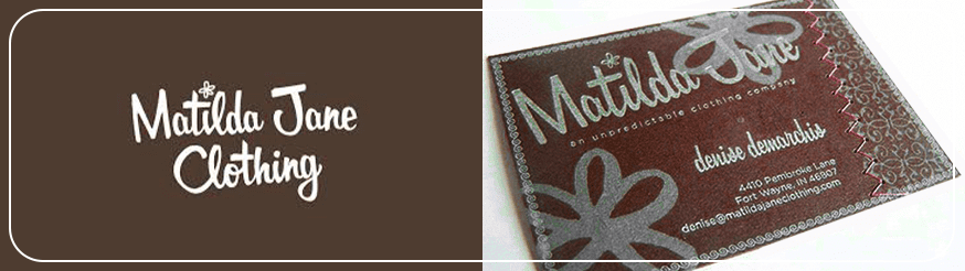
The online store Matilda Jane Clothing was founded in 2005 by creative artist and designer Denise DeMarchis. The website offers products for girls, teenagers, and women. The brand's slogan is "The Unpredictable Clothing Company." The company's unique business cards live up to this motto—they are stitched together from two pieces of exclusive French brown paper using a genuine machine zigzag stitch. The lettering is executed in signature fonts and printed with metallic Pantone inks.
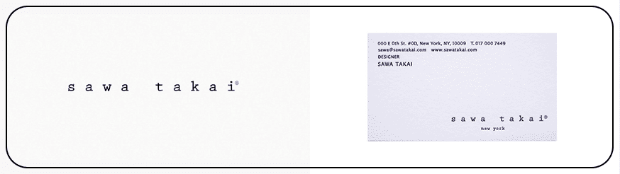
One of the most unique business cards was designed by the Japanese agency Otua for the Sawa Takai boutiques. The brand was founded in New York by two sisters, both Japanese fashion designers. The card's creators were inspired by the idea of replicating brand tags, which are embroidered with a single continuous thread and placed on clothing. The unique design, which is sure to stand out in any business card collection, earned Otua a Wood Pencil D&AD's 2016 Awards.
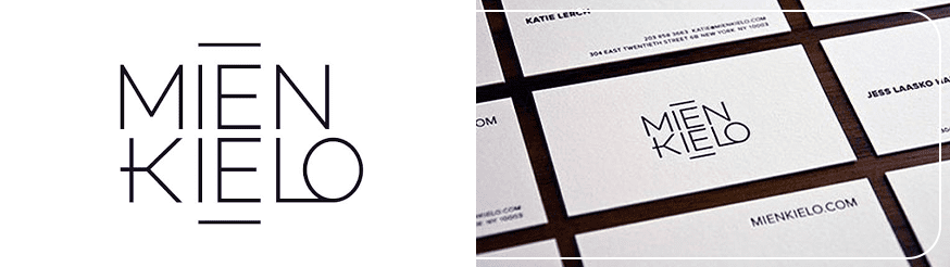
For the boutiques of New York fashion designer Mien Kielo , who specializes in clean lines and effortless elegance, designers Dan West & Jackie Menth of Westwerk created a minimalist business card. It perfectly reflects the brand's aesthetic. The minimalist white card features a contrasting black text logo in the signature font at the center, while the reverse side features the store's email and mailing address. The card truly exemplifies the motto "The Simpler the Better."
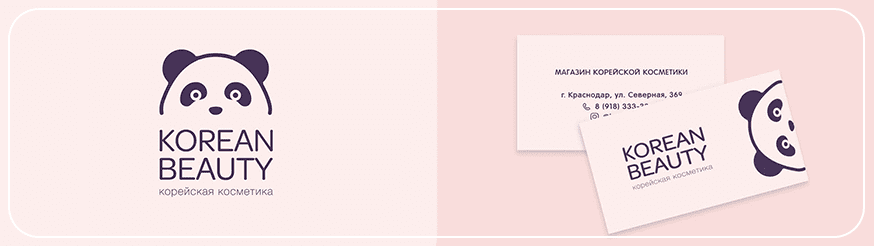
The business card for Korean Beauty , a Korean cosmetics store, is designed in traditional, delicate colors used in the beauty industry. The positive logo featuring a panda evokes pleasant associations and is easily recognizable.
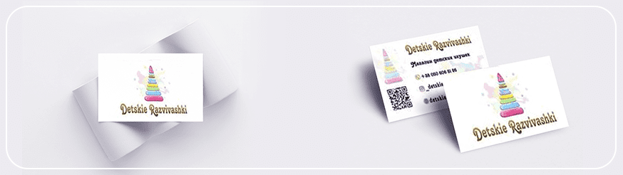
The business card for the toy store Detskie Razvivashki is simple yet vibrant. It doesn't overload the card with elements, but instead uses five distinct yet soft shades. The children's pyramid in the center of the card communicates the store's focus, and the variety of colors helps create a playful, cheerful atmosphere.
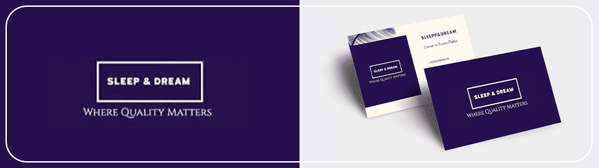
The Sleep&Dream bedding store's business card features an interesting design. It avoids traditional product images, such as the silhouette of a sleeping woman or a family picture. Instead, it uses a feather to emphasize lightness and softness, as well as abstract purple brushstrokes, hinting at dreams and reverie.
Industry experts predict that business cards will eventually become the driving force behind new communications. A smart chip that will activate instant profile sharing on a website and remind customers of upcoming appliance service appointments is the future of today's business cards.
Technologies that seemed unimaginable just recently are already being used in printing. These include spot and 3D varnish, soft touch, foiling, and transparent plastic.
 Spot varnish is a post-printing surface treatment method that involves applying a glossy varnish to specific areas of the printed material. This technology allows key elements to stand out against a matte background. Spot varnishing specific areas of a business card, such as the name, logo, or photo, creates a striking three-dimensional effect.
Spot varnish offers special benefits when combined with matte lamination. This combination emphasizes the contrast between the matte surface after lamination and the varnished area. For enhanced visual impact, it is recommended to use it on a dark background.
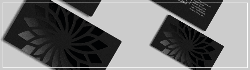
 Finishing business cards with 3D varnish is a relatively new but popular way to create a textured effect, adding volume and depth to images. This method is also used to highlight text or key motifs on printed items. The effect is achieved by using a black gradient layer: the higher the percentage of black, the greater the relief. Due to its volume and tactile feel, 3D varnish is also known as "drop varnish" and "Braille varnish." To highlight key brand elements and create a luxurious look, it is combined with other finishing methods, such as digital printing, special inks, and laser stamping.
 Soft Touch technology is another new way to stand out. It's a flexible matte coating similar to transparent rubber. Soft-touch business cards, known as Soft Touch and Soft Velvet, look completely different from traditional ones. The coating evokes a feeling similar to delicate velvet or velour. This technology results in unique cards—soft, moisture-resistant, durable, and memorable.
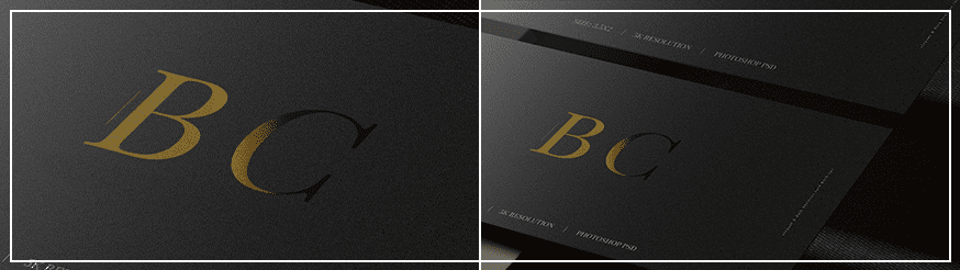
 Foiling is a finishing method for business cards that involves applying metallic foil to specific areas of the card surface. Silver, gold, and holographic foils are available.
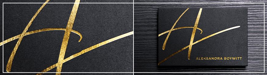
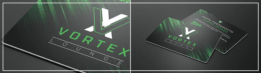
 Plastic is a promising new material for creating unique business cards. You can choose from standard, transparent, or matte options. Basic plastic business cards are the best choice for conservative, reputable companies. Transparent cards, on the other hand, allow for new design approaches, creating creative business cards with shadows, watermarks, and other forms of personalization.
Joseph Flint, owner of 3D Insider, a technology and information leader in 3D printing, said, "I think business cards will soon be 3D printed. This will make them unique and fully customizable. This will become possible as 3D printers become more common in people's homes."
Today, business cards are created in design studios and specialized printing houses. When choosing a designer, it's important to find a balance between quality, uniqueness, and cost. Another factor worth considering is the designer's ability to identify and convey the brand's unique features and personality in the finished business card.
WeLoveBrands design studio has been creating business cards for over 10 years that fully reflect a company's brand identity and status. We develop designs that showcase your personality and strengths.
Not sure what your store's business card should look like? Our goal is to help you make the right choice to attract customers. For a consultation, pricing, and design services, please contact us by phone, via messaging, or by filling out the form on our website for a callback.